
Recommended
More Related Content
Similar to Illuminate - Shawn Mendes - Digipak Analysis.pptx
Similar to Illuminate - Shawn Mendes - Digipak Analysis.pptx (20)
Recently uploaded
Recently uploaded (20)
Illuminate - Shawn Mendes - Digipak Analysis.pptx
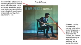
- 1. The font for the artists name is noticeably bigger than the title across the front cover. The is a common convention across most hip-hop and pop CD front covers, this technique is used for people to identify whois albums name it is. Shawn is looking directly at the camera whilst sitting on a chair playing a guitar. By looking away from the camera, this creates an effective way of attracting the audience with a sense of mystery. Front Cover
- 2. On the back cover of the album, the track list is displayed. Instead of choosing a standard font for the tracks on the back, he has used a ‘handwriting’ font. This gives a personal touch as it is almost as if Shawn has handwritten the tracks himself for each and every person who buys his albums. On the left of the back cover, Shawn’s guitar appears to be leaning against the wall. Shawn is known for playing his guitar therefore by feature a guitar on the back cover as well adds personal characteristics of Shawn to the back cover. Back Cover
- 3. The CD itself is very minimalistic, likewise with the rest of the album. It sticks to the theme of forest green and at the top it has the artists name in all caps. With the name of the album underneath. This is the same font and colour to the front of the album cover keeping it all very simple. Disc