
Recommended
More Related Content
Similar to Code and conventions, graphic elements and house style (1).pptx
Similar to Code and conventions, graphic elements and house style (1).pptx (20)
Recently uploaded
Recently uploaded (20)
Code and conventions, graphic elements and house style (1).pptx
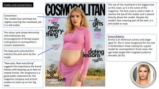
- 1. Convention: The models face and head are slightly covering the masthead, yet it is still visible. The colour pink shows femininity and emphasizes the encouragement of female power. Linking back to cosmopolitan’s mission statements. The baby pink coloured font matches the pink worn by the model. “New year, New everything” suggests the importance the brand follows with keeping up to date on newest trends. Her pregnancy is a good public statement for the magazine company and entices readers to catch up on her big news. The size of the masthead is the biggest text on the cover, as it is the name of the magazine. The font used is used in bold. It catches the eye of the reader and is placed directly above the model. Despite the model’s face covering part of the text, it is still visible to read. Emma Roberts: Emma is an American actress and singer aged 31. She is most recognised for her role in Nickelodeon show making her a good model for cosmopolitan’s front cover. Her age helps target their targeted audience (females 18-35) Codes and conventions
- 2. Once again the model’s face and head is covering the Masthead and Brand of the Magazine. The model’s name does not appear anywhere on this cover, Publicity of who is recruited as a model does not seem important for them. Small jokes to appear less formal to readers Possible sponsors linked closely to improving and living a healthier lifestyle A dominant colour of pink and light pastel making it more appealing to female readers. The sizing of ‘Women’s Health’ is the biggest on the cover as it titles the page. The font is thick like Cosmpolitan’s. The title does not catch the readers view as well as other texts on the page, they clash as they have a similar font and sizing. Michelle Keegan: Michelle is an English actress and aged 34. She is displayed as a good fitness enthusiast and an important figure for Women’s Health. Alike Emma Roberts on Cosmo’s cover she encourages readers of a similar age category to read. Included fitness plans and activities for readers to use and easily follow Codes and conventions
- 3. The masthead is centered at the very top of the cover, with no coverings around it. Soft fonts to appear more gentle The colour red and green illustrates the festivity being promoted. The size of the text varies according to the prominence of the feature on articles cover line Different fonts of green Promotes Festivity Codes and conventions No model or celebrity used The name of the brand is the largest thing on the page to attract readers
- 4. No skyline, avoids distraction of reading the masthead Large Masthead. Cosmopolitan uses it’s typical font and bold labelling. Colour scheme: Mostly Pink, black, white and baby blue The black is a simple and clear to read and doesn’t overpower the masthead. The White matches the models clothing, and the baby blue adds a hint of colour. Blush pink targets the companies balance of lifestyle and femininity. A Barcode is stamped on, and it provides the functional element. Main image Dianna Agron is positioned centre page as she represents the main article. Cover lines are placed along the edges of the page, as they are aside from the main cover story Graphic elements
- 5. Colour scheme: Mostly black, white and navy blue. The choice of Blue closely matches the models clothing. The shade of hot pink conveys femininity. Main image: The central shot of the model illustrates the main topic of women’s bodies and health Main cover line: ‘FITNESS RELOAD’ accompanies the model. The text is the second biggest on the page after the masthead. Cover lines: These texts assist the cover and demonstrate other topics inside of the magazine The date and price is located at the top beneath the masthead A Small barcode is placed along the bottom right of the page Graphic elements
- 6. Masthead is not obstructed by and texts or images Date of printing is located top right Colour scheme: Mint green, dark blue, black, pink and bits of white. This cover includes multiple different colour patterns and does not fit one colour scheme. The magazine was published in June so the seasonal theme comes into play when designing it. The display of different colour’s makes it appear brighter and more appealing. Cover lines are displayed slightly below the masthead. Main Image: The model Sheryl Crow and her dog and placed slightly out of the centre shot and appear to be shown at a wider camera angle than previous covers. Graphic elements
- 7. Contents page analysis Cosmopolitan The word contents indicates the content within the magazine. This cover mentions September beneath it, suggesting that this magazine was written in September. The different Sub-titles divides up the magazine into sections which readers can chose to read themselves, page numbers appear to be included. A key guide pinning out each cover story previous placed on the front cover. Date of publish and possible credits to the photographer who took the images, placed along the footer.
- 8. Women’s health No labelling of ‘contents’ on a contents page. Contents section is divided around the page and made up of different coloured text. Masthead is not featured Model’s information appears in bold, and text is quoted in italics The headline is written in bold and coloured red which contrasts the byline, which is written in black and made up of a mixture of fonts. Each different content contained in the magazine is labelled with a page number. Social media accounts tagged along the footer in the bottom right Contents page analysis
- 9. Country Living Contents page analysis Title of the page consists of one main article Editorial credits Additional images cover the right side of the page Colour’s remain simple and only the subheading is in bold. A clear blue is used for additional pieces of information, while the main headline remains in black. Date of issue is printed in footer One of the Main images includes the model and a small exclamation from her.
- 10. House style Cosmopolitan’s frame format is vertical. Common features within cosmopolitan’s covers overtime include their masthead remaining at the top of the page and in bold. The use of either Black, white, pink or a lighter shade of pink is consistent. Sans serif appears to be the style of font in which they apply onto their magazine covers, and small amounts of normal serif. Since the early years of the brand, they have always chosen to stick with a main image in the centre of the page, modelled by a women. Typically, the camera shots are Mid shots or close ups. The sub-topics and added text typically remains along the out- skirts.
- 11. House style A common feature that Women’s Health like to use is the font type being red (the masthead, texts and labelling) Their masthead has typically remained top of the page. They follow a similar structure on their front covers to Cosmopolitan and typically place a female model centre page. Serif font is displayed in the title and Sans serif appears in bold within the sub text around the page. The main image on their covers is taken with a wider shot and usually captures the model’s whole body.
- 12. House style Country living’s frame format is vertical. Common features of the magazine include the masthead being located at the top of the page, sub text around the sides and occasionally a white or black border covering the corners of the page. The colour’s of the masthead change to suit the theme of each magazine, along with the colour of added text and annotations. A central camera shot is used for the middle of the front page, commonly a wide camera angle is used to capture the full environment which relates to the magazine. Serif font is used for their title and continues to be a common font for the text displayed in the article.