Font analysis
•Download as DOCX, PDF•
0 likes•80 views

This document discusses different font styles for a band's album cover and materials. The writer likes the large capital style of "Best Prices" as it can capture attention, and likes how the text is scruffily colored, though small text may be too small. They feel "Smerkan" is too plain and boring, and "Magicians Daughter" is too flashy and doesn't fit their alternative rock/indie genre. They like the boldness of "Children Theatre" but ultimately choose "Best Prices" as its scruffy style matches the band's attitude while still being understandable.

Recommended
More Related Content
Similar to Font analysis
Similar to Font analysis (20)
More from GrevattJ
More from GrevattJ (20)
Recently uploaded
Recently uploaded (20)
Font analysis
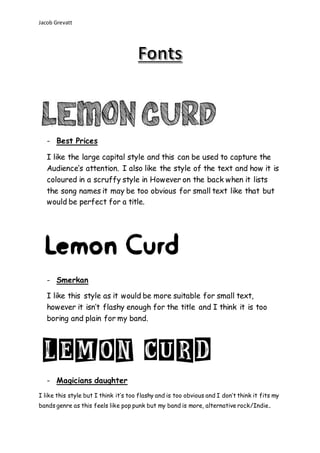
- 1. Jacob Grevatt - Best Prices I like the large capital style and this can be used to capture the Audience’s attention. I also like the style of the text and how it is coloured in a scruffy style in However on the back when it lists the song names it may be too obvious for small text like that but would be perfect for a title. - Smerkan I like this style as it would be more suitable for small text, however it isn’t flashy enough for the title and I think it is too boring and plain for my band. - Magicians daughter I like this style but I think it’s too flashy and is too obvious and I don’t think it fits my bands genre as this feels like pop punk but my band is more, alternative rock/Indie.
- 2. Jacob Grevatt - Children Theatre I like this style it’s bold and noticeable however the coloured in scruffy style has a nice attitude and matches the band it is hard to understand. I Choose best prices from Da Font and suits the artist in a scruff, understandable but still matches the attitude of the band.