Album and advertss
•Download as DOCX, PDF•
0 likes•66 views

This document discusses three different album covers and advertisements. The first uses layered Polaroid photos with bright colors and no text to evoke feelings of nostalgia and appeal to young adults who remember this style from the 1990s-2000s. The second advertisement uses a plain black background and bold white text to depict the band's simple and casual style. The third stands out with a yellow background and image of a rubber duck overlaying the text, meant to portray the band as peculiar and indie. This is aimed at teenagers and younger audiences seeking something innocent and different.

Recommended
More Related Content
What's hot
What's hot (19)
Similar to Album and advertss
Similar to Album and advertss (20)
More from GrevattJ
More from GrevattJ (20)
Recently uploaded
Recently uploaded (20)
Album and advertss
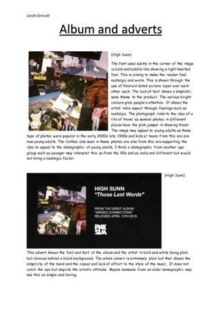
- 1. Jacob Grevatt (High Sunn) The font used subtly in the corner of the image is bold and bubble like showing a light hearted feel. This is aiming to make the reader feel nostalgia and warm. This is shown through the use of Polaroid dated picture layer over each other each. The lack of text shows a simplistic sane theme to the product. The various bright colours grab people’s attention. It shows the artist indie aspect through feelings such as nostalgia. The photograph links to the idea of a life of travel as several photos in different places have the pink jumper in showing travel. The image may appeal to young adults as these type of photos were popular in the early 2000s late 1900s and kids or teens from this era are now young adults. The clothes also seen in these photos are also from this era supporting the idea to appeal to the demographic of young adults. I think a demographic from another age group such as younger may interpret this as from the 90s and as indie and different but would not bring a nostalgia factor. (High Sunn) This advert shows the font and text of the album and the artist in bold and white being plain but obvious behind a black background. The whole advert is extremely plain but that shows the simplicity of the band and the casual and lack of effort to the style of the music. It does not catch the eye but depicts the artist’s attitude. Maybe someone from an older demographic may see this as simple and boring. Album and adverts
- 2. Jacob Grevatt (Super Whatevr) The Colour and the font of the image show a simple bold sharp font with the duck overlaying the Text suggesting it is the main focus however still clearly showing the titles through the obvious colour contrast of white and yellow. The focus on the duck shows the artists are silly and creates a lack of care or casualness but the duck is a form of hyperbole to show the audience how peculiar and standing/indie the artists are. This image gabs our attention as it is mainly yellow an outstanding colour with the form of a rubber duck in focus showing something that may not be usually associated with music also relating to the indie aspect of the band. I think this may appeal to teen demographic as it is innocent and peculiar perhaps appealing to a teenager or even a younger demographic. Perhaps this may appeal to a young adult demographic but I do not think an older middle aged audience would be inclined to listen to the album. The album cover clearly values a young, playful feeling however, may also be interpreted as different, Peculiar and indie related. (Super Whatevr) The font is playful and clear taking up half of the screen in white taking the audience’s attention clearly however, the font for the name of the song is different also supporting a playful and casual nature which also supports the artist’s style and attitude. The text relates to the i8mage in the aspect that both are casual and fun as the images are set in a kitchen with a baldish man wearing a woolly jumper (which has indie connotations) while eating a bowl of cereal adding to the casual aspect of the font and has a sense of informality.