Redesigning the Kool Skool magazine masthead and layout
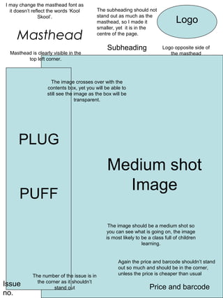
1. I may change the masthead font as
it doesn’t reflect the words ‘Kool The subheading should not
stand out as much as the
Skool’.
masthead, so I made it Logo
smaller, yet it is in the
Masthead centre of the page.
Subheading Logo opposite side of
Masthead is clearly visible in the the masthead
top left corner.
The image crosses over with the
contents box, yet you will be able to
still see the image as the box will be
transparent.
PLUG
Medium shot
Image
PUFF
The image should be a medium shot so
you can see what is going on, the image
is most likely to be a class full of children
learning.
Again the price and barcode shouldn’t stand
out so much and should be in the corner,
The number of the issue is in unless the price is cheaper than usual
the corner as it shouldn’t
Issue stand out Price and barcode
no.
2. The logo has changed to the opposite Price
Logo side so now it will be one of the first
things you notice The price has
Masthead
been separated
from the barcode
and is now more
noticeable than
The masthead and the subheading are now
before
organized in the middle. And are more
noticeable Subheading
Long shot image so you can fit more on with this image
Exclusive
This engages the audience
Long shot Image
Again the image will contain children learning, except they will
be learning by having fun, which reflects the name ‘Kool Skool’.
Which means a more relaxed school.
The layout of this front cover is more formal and
organized than the first attempt, yet this could
suggest it is too formal which my name doesn’t
suggest.
Text about what is in the magazine, PLUG, PUFF
Issue no. The issue no. and barcode remain in the corners. Barcode