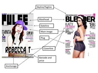
1. Skyline/Tagline
Masthead
Dateline
Main image
Plug
Coverline
Barcode and
price
Anchorage
2. Masthead Dateline
Page numbers
Cover stories
Main image
Anchorage
Consistent colour
scheme
Competition to
entice readers
Simple layout
Sub-headings
‘Features’ and ‘news’ section
3. Drop cap Pull quote
Photo credit and article credit
Colour scheme: Black, grey and purple
Natural image, relates to the audience
Indicates that there is more on this
article
White background is common as this
makes the image and text stand out
2nd image to support main image
Page numbers
Main image takes up a full page of A4
which shows who the article is about
Introductory paragraph
Large headline
4. Before and after pictures from using
Photoshop
Using Photoshop allowed me to quick select my picture to cut out the background, brighten
the picture and use the blur tool to get rid of rigid edges. I could then also use the transform
scale to increase the size of my image. I then used spot fix to get rid of any blemishes to
make the picture look a lot more professional.
5. On the left is my college magazine and on my right is my music magazine. Since making my
college magazine, I have learnt a lot more. I now know how to insert text off the internet and
use the magic eraser to delete the background of it. I have also learnt how to blur the image to
make it look smoother and more professional. I have also learnt more about the layout of the
magazine and to make a large heading with subheadings. A masthead of the left third also
looks appealing as when it is bought on the shelf this is what is seen to the consumer. Also a
skyline and byline looks more appealing. I have also learnt that using more than one font looks
a lot more effective and making use of the space available makes the magazine look a lot
better. Using a lighter background also helps the text and image stand out more.