Titles research
•Download as PPTX, PDF•
0 likes•194 views

Titles Research for Media AS Level main task

Recommended
More Related Content
What's hot
What's hot (20)
Similar to Titles research
Similar to Titles research (20)
More from Daniel Crame
Recently uploaded
Recently uploaded (20)
Titles research
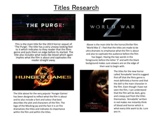
- 1. Titles Research This is the main title for the 2013 horror sequel of ‘The Purge’. The title has a very uneasy looking feel to it which indicates to they reader that the films genre and puts them on edge before its started. The title also includes what looks like blood which again implies what the film is about and captivates the reader straight away. Above is the main title for the horror/thriller film ‘World War Z’. I feel that the titles are made to be ultra dramatic to emphasise what the film is about and also to captivate the audience before the film has began. Having the two words in the foreground, before the letter ‘Z’ and with the black background makes sure viewers are on the edge of their seat to begin with. The title above for the very popular ‘Hunger Games’ has been designed to reflect what the film is about and to also include a font and colour that best describes the plot and characters of the film. The logo of the Mocking jay and the fact it is on fire dramatizes the titles and indicates its importance within the film and within the titles. The titles for the new horror called ‘Annabelle’ tend to suggest first off that the films genre is most definitely a horror and that the doll is the main character in the film. Even though I have not seen the film, I can understand that the film will be dark, gory and creepy just from the titles themselves. ‘Annabelle’ written in red makes me instantly think of blood and horror which is what every title want to do. Lure you in.