Mattingly "AI & Prompt Design: The Basics of Prompt Design"
Poster
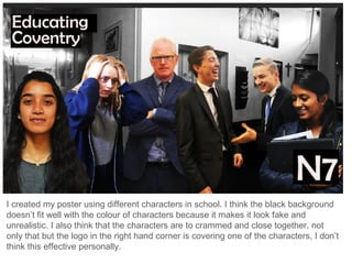
1. I created my poster using different characters in school. I think the black background
doesn’t fit well with the colour of characters because it makes it look fake and
unrealistic. I also think that the characters are to crammed and close together, not
only that but the logo in the right hand corner is covering one of the characters, I don’t
think this effective personally.
2. From what I created initially, I decided to change the background to colour which I
think fits the overall theme much better as it looks as though the characters are a part
of the scene. I still think I need to move the characters around, refine the edges and
maybe remove the logo.