1. Digipackanalysisno.1- Jade Dowse
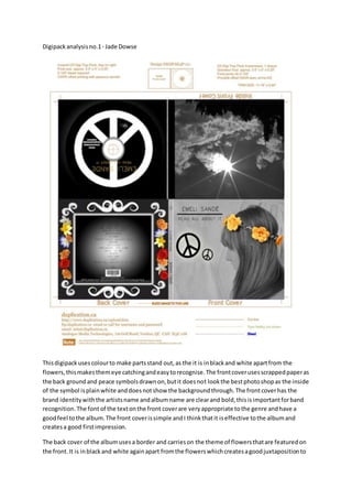
Thisdigipackusescolourto make partsstand out,as the it is inblackand white apartfrom the
flowers,thismakesthemeye catchingandeasytorecognise.The frontcoverusesscrappedpaperas
the back ground and peace symbolsdrawnon,butit doesnot lookthe bestphotoshopas the inside
of the symbol isplainwhite anddoesnotshow the backgroundthrough.The frontcoverhas the
brand identitywiththe artistsname andalbumname are clearand bold,thisisimportantforband
recognition.The font of the textonthe front coverare veryappropriate tothe genre andhave a
goodfeel tothe album.The front coverissimple andI thinkthatit iseffective tothe albumand
createsa good firstimpression.
The back cover of the albumusesa border and carrieson the theme of flowersthatare featuredon
the front.It is inblackand white againapart fromthe flowerswhichcreatesagoodjuxtapositionto
2. the theme.The track listare writtenina fontthat is appropriate tothe genre andare well placedin
the centre of the back cover.The spot lightthatis placedonthemisveryeffective tocatchingyour
attentionandhake the back come together.There isall the legal informationthatisneededtomake
lookprofessional andIwell placedatthe bottom, butstill placedinthe border.The barcode isalso
placedinside the borderandininthe centre,butyou do notnotice itas it ishiddeninplainsight.I
feel thatthe mainfocusof thisback coveristhe borderthat surroundsthe back.Its bolduse of
moustache like linesthatcoverthe border.Thisisaccompaniedbythe flowerswhichare the only
thingincolour.
The inside frontcoverisverysimple andIdo not believe thatitfitsverywell withthe genre asitisa
highresolutionpicture of the sunthroughsome cloudsanddoesnotfitwiththe restof the albumas
the rest of the albumhas a rustic feel andisdrawnmostly.Butit doescontinue the theme of black
and white.
Disc side inside coverdoeshave the peace sight foundatthe front cover andis the size of the disc.
But this doesnotfollowthe blackandwhite theme asthe titlesare inorange whichbreaksthe
theme of the album.The signature onthe disc isa verygood ideaanddo relate tothe genre.
The spine isa genericspine withthe albumname andthe artistname in the same fontas the rest of
the album.But there isa lack of emblemandrecordlabel.
In conclusionthe albumonlyhasa fewminorproblemsandfollow agoodthemthat make itlook
veryiconicand hasa goodfeel.Butthe mainthingthat I wouldimprove isthe lackof peace signon
the spine andthe lack of recordlabel all over.
3. Digipackanalysisno.2MACRAEBilly
Thisdigipackalbumhasa verycleartheme toit withthe syntheticscience fictionlook,the overall
lookof thisalbumis verygoodand simple inplacesandhasa verystrong theme of blue.
The front coverissimple and has one of the character of the videoonthe frontbut thisdoesnot
have enoughbrandidentityasthere isnotband or artists seen,butthiscouldbe okaywiththissort
of genre asa lotof bands donot advertise theirfaces ontheiralbums.The fontof the titlesare ina
goodplace and have a veryfittingfont.The use of black at the start is alsogood.
The back cover has the syntheticface of the persononthe front. The track listisa bithard to read
and the legal informationisnearlyimpossibletoread.The titlesare locatedinthe centre of the
albumand are (butthe wrongcolour) fittingtothe genre andworkswell inthe centre.The emblem
isalso there butfor some reason isnotfeaturedonthe front cover,butthe emblemdoeslookvery
good.The bare code is foundat the bottomrightof the back coverof the album.
The inside frontcoverisjusta photoof the character on the front of the albumbut witha pixelled
face so the face isnot properlyseengivingenigmaTothe artists.
4. The inside discside hasa blue backgroundanda blue sparkleddisccover,thisfollowsthe theme
throughoutthe albumbutit isa bit plane comparedtothe back and doesnot muchto do withthe
videoasit isfibre opticsthatare on the discwhichare not featuredinthe videoorname at all,but
theydo give a goodeffect. The simple use of coloursandpicturesbringsoutthe creativenessof the
artistand there distancedstyle.
In conclusionthispiece usedsimplicitytocreate a full andrichperspective onthe style thatis
science fictionandthere productionof synthetic.
Thisis a distanceduse of colouras the outside ispurple andthe inside isblack,purple andblack
workverywell togetherandinthisalbumthatis true.The inside andthe outside atfirst
glance don’thave anythingtodo witheachother.The emblemis differentandIdon’tknow
the significance of the three triangleandthere meaningsbutthismightbecome clearer
towardsthe end.
The front coverconsistsof an emblem,the albumname atthe top andthe artistsname at the
bottom.Thisisit apart from the backgroundwhichisa purple blue colour.The triangle could
meana 3 personbandand each of the trianglesrepresentingadifferentartists. Itisa very
simple design.
The back cover alsohas the brand recognition withthe three trianglesatthe bottomalongwiththe
legal informationandthe barcode,the recordingstudiologoandmore legal information.
The track listis veryspacedout andthisfirstthe genre andtheme of the album.
5. The inside frontcoverisa picture of a fire comingoutof a pipe or a longstickon fire,butI feel it
doesnotfit withthe genre andjuxtaposesthe coverandthe back cover. There issome
more legal informationfollowedwiththe recordingstudiologo.The blackandorange work
well togetherbutIdon’tfindanyrelevance tothe genre withthispicture.
The inside discside justhasa sparklerbehindthe disc,Ifeel thatthispartwas justthrownintothe
albumto getit finished,itlooksabitrushed.
In conclusionthe frontcoverandback coverhave the brand recognitionbutforsome reasonthe
back coverlogois distortedandoutof shape,thiscouldhave beenchangedveryeasily.The
spine alsohasthe brand recognitionandthe logoandthe band and albumname, these are
all conventions of digipacks.Ingeneral the albumissimpleandafeel abit rushedbutoverall
it hasa goodeffect.
Adverts
Thisis the firstof the advertsandthisis one that keepsthe consistence fromthe album.The
backgroundisthe same keepingthe levelof rememberabilitytothe advert.Thisisenforcedbythe
incorporationof the albumcoveronthe advert.The coloursare the same withthe blackand white
and hintof orange.Titlesare little dull andsimple,buttheyare the same as the oneson the also
pointsforconsistencythere. The conventionof the recordingartistisonthere withthe Virgin
Recordings,thisinina small areaat the bottomrightof the poster. There isartistpromotionwith
the face of the artist on the advert.
6. The nextalbum coveris againconsistentwiththe albumandevenincorporatesthe album
ontothe advert.The use of blue flyingorbthingisveryeffective. There isthe date of June the 12,
thisisnot to conventionasthe date is usually one of the biggestthings there isacertainlevel of
artistpromotion, andthis meansthat the blue orb is the recognitiontothe audience.The posteris
reasonable blankandthere isnotmuchmore to itapart from wantsalreadyonthe album.
7. Thisis the lastposter,thisissimilartothe albumcontinuingthe consistence acrossall
ancillaries.There isaratingof the albumon the posterwhichisgood for the audience.The date is
on the frontbut againlike the othersisnot the biggestthingonthe postergoingagainstconvention.
There are some website atthe bottomanda Facebooklink,thisisgoodforpromotionof the album.
The top titlesaren’tverycentredmakingitlookabit bad,but thisisreallythe onlyproblem.