2. Editing process
Once I had all the
materials and
components to make my
product I started to
compile them into one
document to start editing.
I first put all of my images
into an online background
remover so that I could
place reposition and
collage the images easier.
I did this all on my
publisher which is
unconventional however I
had never used
photoshop before and
wanted to try and work it
out on my own.
3. Editing process
By this point in the
editing process, I
realised that my
images were clashing
with one another, and
the poster was
becoming too busy
therefore I decided to
change the concept
slightly to allow the
concept to work with
only slight changes.
4. Editing process
I decided to change the idea to
where the images made up the
background however, I quickly
changed this idea as I wanted it to be
closer to my original idea.
When I went back to work on this again it had not
saved from the previous day therefore, I had to start
over
5. Editing process
I was very happy with this
edit and how it came out
however I wanted to put it
into photoshop to develop
my skills preparing for
industry practice therefore
with guidance and help I am
going to transform this and
put it into photoshop.
6. Skills used
Eraser tool-remove and erase
Control c-copy
Control d-removes magic wand lines
Control v-paste
Control t -transform
Magic wand-highlights parts to remove
Delete-deletes
Move tool-allows the image to be moved
Eye dropper tool-select colours from images
Brush tool –paints and colours areas
Gradient –adds a gradient to selected area
Paint bucket-fills in an area
Horizontal type tool-allows for text to be added to the project
Photography
7. I like the overall layout and theme of this poster using flowers
from my garden and pictures of alcohol from my house with
an overall message of alcohol killing the flowers such as how
it can destroy your body and make you ill such as making
more likely to get multiple types of cancer liver and kidney
disease along with a weak immune system and early death.
However, I don’t think the slogan pops off the page as much
as I would like it to, and proper grammar hasn’t been used.
Evaluating my poster
In this poster I have kept the same focal images however
changed the background to almost match the colour of the
bottles almost like the alcohol was taking over the page
however the slogan almost gets lost in the brightly coloured
background and the better health logo completely
disappears therefore this wasn’t the right background for
the poster as well as proper grammar not being used.
8. Evaluating my poster
I decided to make the whole background black and
even though both logos were visible, and the slogan
was not lost and able to pop out at the consumer,
details especially on the right-hand side of the page
became lost and hard to see.
After the previous edit I decided to add black to keep
the theme of the alcohol consuming the poster which
allowed for the better health logo to become visible
again however the bottles on the right-hand side
almost became lost and the slogan still didn’t have
proper grammar whilst also being lost in the pink and
white of the poster.
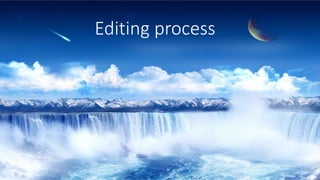
9. Final edit Connotations
Black: Evil, death, grief,
mourning, mystery,
bleakness, heaviness,
depression, rebellion, fear.
White: The color white often
evokes ideas of purity,
simplicity, and cleanliness
Flowers: With their colorful
and beautiful blooms,
flowers are often seen as
symbols of joy and pleasure
however each flower can
have a different meaning
reflecting the complexity of
the human body and how no
two people are exactly the
same.
Blue: open spaces, freedom,
intuition, imagination,
inspiration, and sensitivity
Instead of using a fully black
background I decided to add a
gradient from black to white
therefore the elements on the
right-hand side are not as lost
and able to pop off the poster
with details being able to be
seen clearly.
I also changed the colour of the
slogan to white not only to
match the colour of the logos
but to be able to stand out on
the poster especially given the
colourful nature of the images
on the poster.
The grammar on the slogan has
also been corrected using
capital letters .
10. Poster meaning
and message
The meaning behind the poster is an
abstract approach to a real issue for
so many people this poster aims to
shows the flowers and blue glow as a
person's body as emotions with the
alcohol surrounding it as almost the
societal expectation that to enjoy
yourself you need to go out and drink
especially a problem for the target
audience due to peer pressure and
wanting to fit in it also shows that for
a flower to grow it needs water
however it doesn’t need alcohol and
if you water a flower constantly with
alcohol it eventually dies almost
representing what can happen to the
human body if you are a constant
drinker or alcoholic.