
Recommended
More Related Content
What's hot
Viewers also liked
Viewers also liked (14)
Similar to Dps analysis
Similar to Dps analysis (20)
More from Charis Creber
More from Charis Creber (20)
Dps analysis
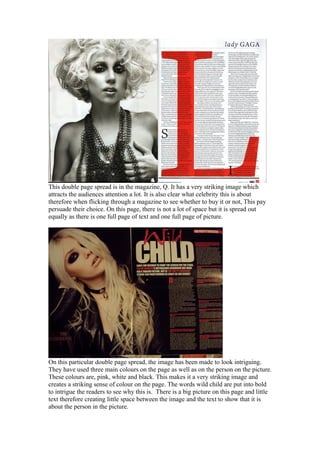
- 1. This double page spread is in the magazine, Q. It has a very striking image which attracts the audiences attention a lot. It is also clear what celebrity this is about therefore when flicking through a magazine to see whether to buy it or not, This pay persuade their choice. On this page, there is not a lot of space but it is spread out equally as there is one full page of text and one full page of picture. On this particular double page spread, the image has been made to look intriguing. They have used three main colours on the page as well as on the person on the picture. These colours are, pink, white and black. This makes it a very striking image and creates a striking sense of colour on the page. The words wild child are put into bold to intrigue the readers to see why this is. There is a big picture on this page and little text therefore creating little space between the image and the text to show that it is about the person in the picture.
- 2. On this one, there is very little text and a big picture, showing that the person in the picture is of great importance and superiority. The colours, black white and red are used as these are bold yet simple colours. The person in the image is higher than the text making her seem to have power and significance. Also the country USA, is in a very large font making them seem like they would like to possess her fame and have her for their country. It is a nice use of space between text and image but they still look connected in some way.