SlideShare a Scribd company logo
1 of 8
Download to read offline
Exercise 2. Analyzing and Presenting Scientific Data
Effectiveness of Antibacterial Substances
During the last lab, you developed a series of hypotheses about the effectiveness of different types of
household products, and initiated an experiment to test those hypotheses. Now you will analyze the data to
determine whether your hypotheses are supported or refuted.
Goals
• Create scientific graphs in MSExcel.
• Interpret data using statistical tools.
• Understand the concept of statistical significance.
• Use graphs and statistics to support conclusions.
• Write figure captions and conclusions using scientific language.
Data Collection
Collect your group’s plates from last week. Draw pictures of your plates and their zones of inhibition:
A. Soap solutions: B. Household cleaners: C. Medical disinfectants:
Using the rulers provided, measure the diameter of the zone of inhibition (in mm) for each of your
substances and controls. Enter the data in the table below:
Disk Zone of inhibition
diameter (mm)
Soap solutions
Control
Household cleaners
Control
Medical disinfectants
Control
Statistics and Sample Size
Individuals in a study represent a single sample of the population that they come from. In our section-wide
experiment, each group is one sample. Your experimental treatments could differ from each other for two
basic reasons:
1) There is an actual difference in the effects of different treatments.
2) The difference is due to chance.
Statistical tests give us the probability that the difference is due to chance. If this probability is low (< 0.05),
then we can say that the difference is statistically significant.
By collecting many samples, we minimize the probability that our results are due to chance alone.
Entering Data into Spreadsheets
Input your data into the spreadsheet provided by your instructor, or on the whiteboard. Then, enter the
section’s soap solution data into your own spreadsheet. Spreadsheets are a valuable tool scientists use to
compile, analyze, visualize, and summarize data. They contain a series of cells with row (1, 2, 3) and column
(A, B, C) identification. Both text and numbers can be entered into cells. Enter the column headings
“Sample,” “Antibacterial soap,” “General soap,” and “Control.” Your spreadsheet should look like this:
Enter the sizes of the zones of inhibition for the entire section in their designated columns. Calculate the
section mean and standard deviation for each treatment and the control. The mean is just the average. The
standard deviation is a measure of the data’s variability. If the samples for a particular treatment are very
different from each other, the standard deviation will be high. If the standard deviation is high, then there is a
higher probability that treatment differences are due to chance.
Calculate the Mean
1. Type “Mean” in the sample column below your last sample.
2. Type “=AVERAGE(highlight data)” into the next cell.
3. Move the cursor to the lower right corner until it forms a small box.
4. Click and drag the small box over the next two cells to copy the formula for the other data.
Calculate the Standard Deviation
1. Type “StDev” in the sample column below mean.
2. Type “=STDEV(highlight data)” into the next cell.
3. Repeat the click and drag maneuver to copy this formula for the other treatments.
Look at the standard deviations. Which samples are the most variable compared to their means, those for the
control, antibacterial, or general soap?
Calculate the 95% Confidence Interval
The true population mean has a 95% chance of falling within the 95% confidence interval. If your samples
are highly variable, the confidence interval will be large. If your samples are all the same, the confidence
interval will be small. The mean minus the confidence statistic is the low end of the interval, and the mean
plus the confidence statistic is the high end of the interval. You will use the standard deviation to calculate the
confidence statistic.
1. Type “Confidence statistic” into the sample column below the standard deviation.
2. Type “=confidence(0.05,highlight stdev , type in sample size)”
3. Repeat the click and drag maneuver to copy this formula for the other treatments.
Data analysis and Visualization
Now that you’ve calculated some statistics, it’s time to evaluate your results.
Making a Graph in Excel
To make a graph, you first need to enter the data on an Excel spreadsheet in the format shown below. From
this, you will generate your graph. (Note: you should not include the table you used to generate your graph in
your lab report).
Antimicrobial agents
#1 #2 Control
Averages 11.00 5.83 0.3333
Confidence statistic 1.43135 1.178 0.4132
Making the bar graph for one product type
1. Highlight the three averages.
2. Click on the graph icon.
3. Choose “column bar graph.” Hit “next.”
4. When you see your graph, hit “next.”
5. Select the “titles” tab and add a title for the graph and x and y axis labels.
6. Select the “gridlines” tab and remove major gridlines. Hit “next” and then “finish.”
Putting 95% confidence intervals onto your graph
1. Right click on one of the graph columns and choose “Format data series.”
2. Choose the “y error bars” tab.
3. Choose “custom.”
4. Click in the “+” box and then highlight the row of data labeled “confidence statistic.”
5. Then click in the “-“ box and highlight the same row of data labeled “confidence statistic.”
6. Hit enter.
You should now have a graph that shows the means of each of the kinds of products tested in a category.
The bar graph should have error bars so that you can determine whether the products differ significantly in
their effectiveness.
The following is an example of how your graph might look:
Do NOT include a table that
looks like this in your lab
report. This is used only to
generate your graph.
0
1
2
3
4
5
6
Soap (Softsoap) Antibacterial Soap Control
Antimicrobial Agents
ZoneofInhibition(mm)
Evaluating your Results
We will evaluate results using the confidence intervals. There are many formulas that would allow us to
numerically evaluate the statistical significance of the difference between our different treatments, but we will
use visual analysis for now.
If the confidence interval is small, there is not a lot of
variability in your samples, and your confidence in the result
is strong. For example, you would have a small confidence
interval if all of the plates you measured for antibacterial
soap had the same size zone of inhibition. Columns 2 and 3
in the example graph have relatively small confidence
intervals. Column 1 in the example graph shows data with a
large confidence interval.
You can use the confidence intervals to determine whether
there is a statistically significant difference between your
products. If the confidence intervals overlap (as in Column
1 and 2), there is no statistically significant difference even though the means may appear to be different.
There is a > 5% chance that the difference is due to chance.
You would conclude that those two products did not differ in their antimicrobial properties.
However, if the confidence intervals do not overlap (as in Columns 2 and 3, and 1 and 3), there is a
statistically significant difference between the treatments. There is a <5% chance that the difference is due to
chance, and that is acceptable to scientists.
From this graph, you would conclude that both Products 1 and 2 are significantly more effective than
Product 3 but that there is no difference between 1 and 2.
0
5
10
15
20
1 2 3
Zone of Inhibition Lab Report (10 points)
Scientists communicate their results to other scientists by writing and publishing scientific papers. Papers
include figures and tables along with a written description of the data and their interpretation.
Format
Your initial lab report will be in an abbreviated format, in order to develop your writing and data analysis
skills over the course of the semester. The report must be typed, spell-checked, and double-spaced. Each
comparison type should be on its own page (3 pages total). Late lab
reports will not be accepted.
The report must include 4 components:
1. Clearly stated hypothesis for each type of product (you will
have 3).
2. Figure pasted from Excel.
3. A well-written, clear figure caption (see below for
guidelines).
4. Logical conclusions including whether AND how your data
support or refute your hypothesis. In the conclusion, you
should refer to your figures by number. For example:
Leaves of plants grown with the inoculum were 46 %
larger than those that were not (Figure 1).
Writing figure captions
Each figure should have a caption that does three things: 1) states what the data is, 2) tells where the data
came from (Bacteria name, number of samples, etc…), and 3) describes the important features of the data in
the figure. Note that the figure caption goes below the figure. The first sentence in a figure caption is a
fragment. All subsequent sentences are full. DO NOT simply write “Figure 1. Graph of zone of inhibition
versus type of product.” Read the captions on the figures below as examples – it is not important that you
understand the graph.
Hypothesis: Blah blah …
Figure 1. Antimicrobial activity…
Conclusions: Blah blah…
Writing scientifically
Whole books have been written about the subject of scientific writing. You will get a brief intro here. Here
are a few rules we expect you to follow:
Do not use casual language or slang.
Bad example: “Barr’s (1980) statement is merely a “cop out” because he refuses to acknowledge that
there are major differences between the two groups.”
Revised: “Barr (1980) fails to address this issue, because he does not acknowledge…”
Be concise.
• Don't use more words than are necessary.
• Don't use complicated jargon when simple terms will do.
• Read over your work to make sure sentences are not redundant.
Bad example: The procedure was that approximately one hour prior to the initiation of the experiment,
each avian subject was transported by the experimenter to the observation cage. That specific individual
subject was presented with various edible materials and ingestion preferences were investigated utilizing
the method developed by Wilbur (1965). When indices and measurements of the data collection were
finalized and the experiment terminated, the subject was transferred back to the holding cage.
Revised: One hour before the experiment, I put each bird in the observation cage, where I studied
feeding preferences using Wilbur's (1965) method. The bird was then returned to the holding cage.
Use active voice, not passive voice.
• It has been reported by Smith = Smith reported
• There is reason to hypothesize = My hypothesis is
Change from the following sentences from the passive voice to the active voice.
o Lactate was produced by S. aureus.
o The breakdown of hydrogen peroxide is catalyzed by peroxidase.
o It has been shown by evidence from genetic studies that genes are arranged in a linear order.
o Nearly half the seedlings were eaten by woodchucks.
o It was found that the population decreased with time.
o Absorbance measurements were taken by the author every 15 minutes.
Writing for conciseness: Reduce these jargon terms to a single word.
1. red in color _______________
2. a majority of _______________
3. a great number of _______________
4. due to the fact that _______________
5. during the course of _______________
6. small in size ______________
7. fewer in number _______________
Revising Sentences: These are actual sentences from past student papers. Rewrite them.
1. After analyzing the information attained through our calculations and illustrated in the graphs and charts that all of
my hypotheses were unsupported by the results.
2. Granitic rocks are harder than basic rocks, so when there is an interaction between the two, the basic rocks are the
victim and, so to speak, lose ground to the granitic rock.
3. I am a little puzzled as to why there would be higher error and affect for regularly dispersed populations because I
would think that because it is regularly dispersed it would be easier to get an accurate representation than with the
clumped group.
4. There are many environmental/ chemical factors that may be looked at.
5. The relationship between zooplankton abundance and the different chemical/environmental factors has become
clearer thanks to figures 2-A, 2-B, and Table 2.
6. This refers to the diamonds ability to scathe virtually any surface, while at the same time it is virtually unscatheable.
7. Corundum is a mineral that is created naturally in nature.
8. for the purpose of _______________
9. in all cases _______________
10. was of the opinion that _______________
11. with the possible exception of _______________
12. take into consideration _______________
13. at the present time _______________
14. it is often the case that _____________
8. We got the ideas for what variables to test by previous research that has been done.
9. In our experiment we predicted that the higher the discharge the lower the abundance of most zooplankton taxa.
We did show this to be true in our case because the discharge was higher in Amity and it had a lower density than
Chester.
10. Many factors are involved when looking at a stream’s features.
11. This study has shown us that there was either too much error in our data collection or there were other factors that
we did not hypothesize and test that were a bigger factor than the ones that we tested.
12. The diversity of the creeks were also determined and it was found that Chester Creek had a higher taxon richness,
with 28 species present, than in Amity Creek, which only had 22 species present.
Figure Captions: These are poor figure captions. Discuss how to improve them.
Figure 1. This figure shows Chlorophyll A and Secchi depth for each of the four sites. There is also a trend line to
show the overall shape of the data.
0.00
1.00
2.00
3.00
4.00
5.00
6.00
0 1 2 3 4 5
Site #
SecchiDisk(m)&ChrolophyllA
0.00
5.00
10.00
15.00
20.00
25.00
30.00
35.00
40.00
45.00
50.00
0 5 10 15 20
Temperature(oC) and D.O. (mg/L)
Depth(m)
Figure 2. Temperature (blue) Dissolved Oxygen (pink). The cooler the water, the easier oxygen is absorbed, hence DO
increases.

More Related Content

What's hot

Biology statistics made_simple_using_excel
Biology statistics made_simple_using_excelBiology statistics made_simple_using_excel
Biology statistics made_simple_using_excel
haramaya university
 
SPSS User Guide
SPSS User GuideSPSS User Guide
SPSS User Guide
Brian Bond
 
20140602 statistical power - husnul and nur
20140602   statistical power - husnul and nur20140602   statistical power - husnul and nur
20140602 statistical power - husnul and nur
Muhammad Khuluq
 
Summarize Data Using a Formula
Summarize Data Using a FormulaSummarize Data Using a Formula
Summarize Data Using a Formula
coachhahn
 
Power Analysis for Beginners
Power Analysis for BeginnersPower Analysis for Beginners
Power Analysis for Beginners
gfb1
 
Statistical Methods to Handle Missing Data
Statistical Methods to Handle Missing DataStatistical Methods to Handle Missing Data
Statistical Methods to Handle Missing Data
Tianfan Song
 

What's hot (19)

Introduction to Power Analysis
Introduction to Power AnalysisIntroduction to Power Analysis
Introduction to Power Analysis
 
Biology statistics made_simple_using_excel
Biology statistics made_simple_using_excelBiology statistics made_simple_using_excel
Biology statistics made_simple_using_excel
 
Spss &amp; rsm copy
Spss &amp; rsm   copySpss &amp; rsm   copy
Spss &amp; rsm copy
 
How to calculate power in statistics
How to calculate power in statisticsHow to calculate power in statistics
How to calculate power in statistics
 
Sample size and power
Sample size and powerSample size and power
Sample size and power
 
Data Creation and Importing in IBM SPSS
Data Creation and Importing in IBM SPSSData Creation and Importing in IBM SPSS
Data Creation and Importing in IBM SPSS
 
Advanced Excel, Day 1
Advanced Excel, Day 1Advanced Excel, Day 1
Advanced Excel, Day 1
 
ppt on data tab in ms.excel
ppt on data tab in ms.excelppt on data tab in ms.excel
ppt on data tab in ms.excel
 
SPSS User Guide
SPSS User GuideSPSS User Guide
SPSS User Guide
 
20140602 statistical power - husnul and nur
20140602   statistical power - husnul and nur20140602   statistical power - husnul and nur
20140602 statistical power - husnul and nur
 
Excel2002
Excel2002Excel2002
Excel2002
 
Summarize Data Using a Formula
Summarize Data Using a FormulaSummarize Data Using a Formula
Summarize Data Using a Formula
 
Understanding Statistical Power for Non-Statisticians
Understanding Statistical Power for Non-StatisticiansUnderstanding Statistical Power for Non-Statisticians
Understanding Statistical Power for Non-Statisticians
 
Power Analysis for Beginners
Power Analysis for BeginnersPower Analysis for Beginners
Power Analysis for Beginners
 
DATA HANDLING FOR SPSS
DATA HANDLING FOR SPSSDATA HANDLING FOR SPSS
DATA HANDLING FOR SPSS
 
Statistical Approaches to Missing Data
Statistical Approaches to Missing DataStatistical Approaches to Missing Data
Statistical Approaches to Missing Data
 
Statistical Methods to Handle Missing Data
Statistical Methods to Handle Missing DataStatistical Methods to Handle Missing Data
Statistical Methods to Handle Missing Data
 
Statistics for Business Decision-making
Statistics for Business Decision-makingStatistics for Business Decision-making
Statistics for Business Decision-making
 
Chapter 11
Chapter 11Chapter 11
Chapter 11
 

Similar to Ex2 analysis 000

1 Week 5 Quantitative Analysis Assignment Instru.docx
1  Week 5 Quantitative Analysis Assignment Instru.docx1  Week 5 Quantitative Analysis Assignment Instru.docx
1 Week 5 Quantitative Analysis Assignment Instru.docx
jeremylockett77
 
1 Week 5 Quantitative Analysis Assignment Instru.docx
1  Week 5 Quantitative Analysis Assignment Instru.docx1  Week 5 Quantitative Analysis Assignment Instru.docx
1 Week 5 Quantitative Analysis Assignment Instru.docx
aulasnilda
 
About Your Signature Assignment.docxAbout Your Signature Assig.docx
About Your Signature Assignment.docxAbout Your Signature Assig.docxAbout Your Signature Assignment.docxAbout Your Signature Assig.docx
About Your Signature Assignment.docxAbout Your Signature Assig.docx
ransayo
 
Using References in your Lab Writeup Make sure you both c.docx
Using References in your Lab Writeup  Make sure you both c.docxUsing References in your Lab Writeup  Make sure you both c.docx
Using References in your Lab Writeup Make sure you both c.docx
dickonsondorris
 
Assignment 2 Tests of SignificanceThroughout this assignment yo.docx
Assignment 2 Tests of SignificanceThroughout this assignment yo.docxAssignment 2 Tests of SignificanceThroughout this assignment yo.docx
Assignment 2 Tests of SignificanceThroughout this assignment yo.docx
rock73
 
Assignment 3.1 Determining Causes and Effects– Draft VersionThe.docx
Assignment 3.1 Determining Causes and Effects– Draft VersionThe.docxAssignment 3.1 Determining Causes and Effects– Draft VersionThe.docx
Assignment 3.1 Determining Causes and Effects– Draft VersionThe.docx
rock73
 
TMGT 361Assignment VII A InstructionsLectureEssayControl Ch.docx
TMGT 361Assignment VII A InstructionsLectureEssayControl Ch.docxTMGT 361Assignment VII A InstructionsLectureEssayControl Ch.docx
TMGT 361Assignment VII A InstructionsLectureEssayControl Ch.docx
herthalearmont
 
About Your Signature AssignmentThis signature assignment is de.docx
About Your Signature AssignmentThis signature assignment is de.docxAbout Your Signature AssignmentThis signature assignment is de.docx
About Your Signature AssignmentThis signature assignment is de.docx
ransayo
 
Assessment 3 – Hypothesis, Effect Size, Power, and t Tests.docx
Assessment 3 – Hypothesis, Effect Size, Power, and t Tests.docxAssessment 3 – Hypothesis, Effect Size, Power, and t Tests.docx
Assessment 3 – Hypothesis, Effect Size, Power, and t Tests.docx
cargillfilberto
 
Factor analysis using SPSS
Factor analysis using SPSSFactor analysis using SPSS
Factor analysis using SPSS
Remas Mohamed
 
1. F A Using S P S S1 (Saq.Sav) Q Ti A
1.  F A Using  S P S S1 (Saq.Sav)   Q Ti A1.  F A Using  S P S S1 (Saq.Sav)   Q Ti A
1. F A Using S P S S1 (Saq.Sav) Q Ti A
Zoha Qureshi
 
I need this done ASAP, You have to have SPSS Software on your comput.docx
I need this done ASAP, You have to have SPSS Software on your comput.docxI need this done ASAP, You have to have SPSS Software on your comput.docx
I need this done ASAP, You have to have SPSS Software on your comput.docx
anthonybrooks84958
 
BUSI 331Marketing Research Report Part 3 InstructionsData .docx
BUSI 331Marketing Research Report Part 3 InstructionsData .docxBUSI 331Marketing Research Report Part 3 InstructionsData .docx
BUSI 331Marketing Research Report Part 3 InstructionsData .docx
humphrieskalyn
 

Similar to Ex2 analysis 000 (20)

1 Week 5 Quantitative Analysis Assignment Instru.docx
1  Week 5 Quantitative Analysis Assignment Instru.docx1  Week 5 Quantitative Analysis Assignment Instru.docx
1 Week 5 Quantitative Analysis Assignment Instru.docx
 
1 Week 5 Quantitative Analysis Assignment Instru.docx
1  Week 5 Quantitative Analysis Assignment Instru.docx1  Week 5 Quantitative Analysis Assignment Instru.docx
1 Week 5 Quantitative Analysis Assignment Instru.docx
 
Btm8107 8 week2 activity understanding and exploring assumptions a+ work
Btm8107 8 week2 activity understanding and exploring assumptions a+ workBtm8107 8 week2 activity understanding and exploring assumptions a+ work
Btm8107 8 week2 activity understanding and exploring assumptions a+ work
 
About Your Signature Assignment.docxAbout Your Signature Assig.docx
About Your Signature Assignment.docxAbout Your Signature Assig.docxAbout Your Signature Assignment.docxAbout Your Signature Assig.docx
About Your Signature Assignment.docxAbout Your Signature Assig.docx
 
Using References in your Lab Writeup Make sure you both c.docx
Using References in your Lab Writeup  Make sure you both c.docxUsing References in your Lab Writeup  Make sure you both c.docx
Using References in your Lab Writeup Make sure you both c.docx
 
Assignment 2 Tests of SignificanceThroughout this assignment yo.docx
Assignment 2 Tests of SignificanceThroughout this assignment yo.docxAssignment 2 Tests of SignificanceThroughout this assignment yo.docx
Assignment 2 Tests of SignificanceThroughout this assignment yo.docx
 
Assignment 3.1 Determining Causes and Effects– Draft VersionThe.docx
Assignment 3.1 Determining Causes and Effects– Draft VersionThe.docxAssignment 3.1 Determining Causes and Effects– Draft VersionThe.docx
Assignment 3.1 Determining Causes and Effects– Draft VersionThe.docx
 
Statistics
StatisticsStatistics
Statistics
 
TMGT 361Assignment VII A InstructionsLectureEssayControl Ch.docx
TMGT 361Assignment VII A InstructionsLectureEssayControl Ch.docxTMGT 361Assignment VII A InstructionsLectureEssayControl Ch.docx
TMGT 361Assignment VII A InstructionsLectureEssayControl Ch.docx
 
About Your Signature AssignmentThis signature assignment is de.docx
About Your Signature AssignmentThis signature assignment is de.docxAbout Your Signature AssignmentThis signature assignment is de.docx
About Your Signature AssignmentThis signature assignment is de.docx
 
Teaching students how to critically appraise organizational data
Teaching students how to critically appraise organizational dataTeaching students how to critically appraise organizational data
Teaching students how to critically appraise organizational data
 
Spss basic Dr Marwa Zalat
Spss basic Dr Marwa ZalatSpss basic Dr Marwa Zalat
Spss basic Dr Marwa Zalat
 
Psy 870 module 3 problem set answers
Psy 870  module 3 problem set answersPsy 870  module 3 problem set answers
Psy 870 module 3 problem set answers
 
Assessment 3 – Hypothesis, Effect Size, Power, and t Tests.docx
Assessment 3 – Hypothesis, Effect Size, Power, and t Tests.docxAssessment 3 – Hypothesis, Effect Size, Power, and t Tests.docx
Assessment 3 – Hypothesis, Effect Size, Power, and t Tests.docx
 
Writing a lab report
Writing a lab reportWriting a lab report
Writing a lab report
 
Writing a lab report
Writing a lab reportWriting a lab report
Writing a lab report
 
Factor analysis using SPSS
Factor analysis using SPSSFactor analysis using SPSS
Factor analysis using SPSS
 
1. F A Using S P S S1 (Saq.Sav) Q Ti A
1.  F A Using  S P S S1 (Saq.Sav)   Q Ti A1.  F A Using  S P S S1 (Saq.Sav)   Q Ti A
1. F A Using S P S S1 (Saq.Sav) Q Ti A
 
I need this done ASAP, You have to have SPSS Software on your comput.docx
I need this done ASAP, You have to have SPSS Software on your comput.docxI need this done ASAP, You have to have SPSS Software on your comput.docx
I need this done ASAP, You have to have SPSS Software on your comput.docx
 
BUSI 331Marketing Research Report Part 3 InstructionsData .docx
BUSI 331Marketing Research Report Part 3 InstructionsData .docxBUSI 331Marketing Research Report Part 3 InstructionsData .docx
BUSI 331Marketing Research Report Part 3 InstructionsData .docx
 

Ex2 analysis 000

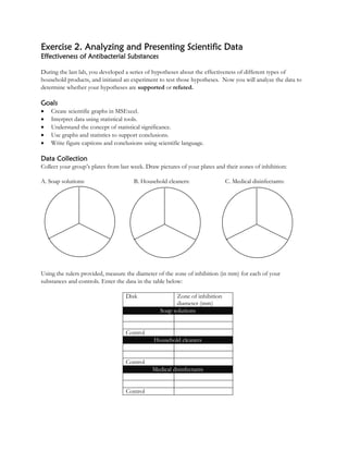
  • 1. Exercise 2. Analyzing and Presenting Scientific Data Effectiveness of Antibacterial Substances During the last lab, you developed a series of hypotheses about the effectiveness of different types of household products, and initiated an experiment to test those hypotheses. Now you will analyze the data to determine whether your hypotheses are supported or refuted. Goals • Create scientific graphs in MSExcel. • Interpret data using statistical tools. • Understand the concept of statistical significance. • Use graphs and statistics to support conclusions. • Write figure captions and conclusions using scientific language. Data Collection Collect your group’s plates from last week. Draw pictures of your plates and their zones of inhibition: A. Soap solutions: B. Household cleaners: C. Medical disinfectants: Using the rulers provided, measure the diameter of the zone of inhibition (in mm) for each of your substances and controls. Enter the data in the table below: Disk Zone of inhibition diameter (mm) Soap solutions Control Household cleaners Control Medical disinfectants Control
  • 2. Statistics and Sample Size Individuals in a study represent a single sample of the population that they come from. In our section-wide experiment, each group is one sample. Your experimental treatments could differ from each other for two basic reasons: 1) There is an actual difference in the effects of different treatments. 2) The difference is due to chance. Statistical tests give us the probability that the difference is due to chance. If this probability is low (< 0.05), then we can say that the difference is statistically significant. By collecting many samples, we minimize the probability that our results are due to chance alone. Entering Data into Spreadsheets Input your data into the spreadsheet provided by your instructor, or on the whiteboard. Then, enter the section’s soap solution data into your own spreadsheet. Spreadsheets are a valuable tool scientists use to compile, analyze, visualize, and summarize data. They contain a series of cells with row (1, 2, 3) and column (A, B, C) identification. Both text and numbers can be entered into cells. Enter the column headings “Sample,” “Antibacterial soap,” “General soap,” and “Control.” Your spreadsheet should look like this: Enter the sizes of the zones of inhibition for the entire section in their designated columns. Calculate the section mean and standard deviation for each treatment and the control. The mean is just the average. The standard deviation is a measure of the data’s variability. If the samples for a particular treatment are very different from each other, the standard deviation will be high. If the standard deviation is high, then there is a higher probability that treatment differences are due to chance. Calculate the Mean 1. Type “Mean” in the sample column below your last sample. 2. Type “=AVERAGE(highlight data)” into the next cell. 3. Move the cursor to the lower right corner until it forms a small box. 4. Click and drag the small box over the next two cells to copy the formula for the other data. Calculate the Standard Deviation 1. Type “StDev” in the sample column below mean. 2. Type “=STDEV(highlight data)” into the next cell. 3. Repeat the click and drag maneuver to copy this formula for the other treatments. Look at the standard deviations. Which samples are the most variable compared to their means, those for the control, antibacterial, or general soap?
  • 3. Calculate the 95% Confidence Interval The true population mean has a 95% chance of falling within the 95% confidence interval. If your samples are highly variable, the confidence interval will be large. If your samples are all the same, the confidence interval will be small. The mean minus the confidence statistic is the low end of the interval, and the mean plus the confidence statistic is the high end of the interval. You will use the standard deviation to calculate the confidence statistic. 1. Type “Confidence statistic” into the sample column below the standard deviation. 2. Type “=confidence(0.05,highlight stdev , type in sample size)” 3. Repeat the click and drag maneuver to copy this formula for the other treatments. Data analysis and Visualization Now that you’ve calculated some statistics, it’s time to evaluate your results. Making a Graph in Excel To make a graph, you first need to enter the data on an Excel spreadsheet in the format shown below. From this, you will generate your graph. (Note: you should not include the table you used to generate your graph in your lab report). Antimicrobial agents #1 #2 Control Averages 11.00 5.83 0.3333 Confidence statistic 1.43135 1.178 0.4132 Making the bar graph for one product type 1. Highlight the three averages. 2. Click on the graph icon. 3. Choose “column bar graph.” Hit “next.” 4. When you see your graph, hit “next.” 5. Select the “titles” tab and add a title for the graph and x and y axis labels. 6. Select the “gridlines” tab and remove major gridlines. Hit “next” and then “finish.” Putting 95% confidence intervals onto your graph 1. Right click on one of the graph columns and choose “Format data series.” 2. Choose the “y error bars” tab. 3. Choose “custom.” 4. Click in the “+” box and then highlight the row of data labeled “confidence statistic.” 5. Then click in the “-“ box and highlight the same row of data labeled “confidence statistic.” 6. Hit enter. You should now have a graph that shows the means of each of the kinds of products tested in a category. The bar graph should have error bars so that you can determine whether the products differ significantly in their effectiveness. The following is an example of how your graph might look: Do NOT include a table that looks like this in your lab report. This is used only to generate your graph.
  • 4. 0 1 2 3 4 5 6 Soap (Softsoap) Antibacterial Soap Control Antimicrobial Agents ZoneofInhibition(mm) Evaluating your Results We will evaluate results using the confidence intervals. There are many formulas that would allow us to numerically evaluate the statistical significance of the difference between our different treatments, but we will use visual analysis for now. If the confidence interval is small, there is not a lot of variability in your samples, and your confidence in the result is strong. For example, you would have a small confidence interval if all of the plates you measured for antibacterial soap had the same size zone of inhibition. Columns 2 and 3 in the example graph have relatively small confidence intervals. Column 1 in the example graph shows data with a large confidence interval. You can use the confidence intervals to determine whether there is a statistically significant difference between your products. If the confidence intervals overlap (as in Column 1 and 2), there is no statistically significant difference even though the means may appear to be different. There is a > 5% chance that the difference is due to chance. You would conclude that those two products did not differ in their antimicrobial properties. However, if the confidence intervals do not overlap (as in Columns 2 and 3, and 1 and 3), there is a statistically significant difference between the treatments. There is a <5% chance that the difference is due to chance, and that is acceptable to scientists. From this graph, you would conclude that both Products 1 and 2 are significantly more effective than Product 3 but that there is no difference between 1 and 2. 0 5 10 15 20 1 2 3
  • 5. Zone of Inhibition Lab Report (10 points) Scientists communicate their results to other scientists by writing and publishing scientific papers. Papers include figures and tables along with a written description of the data and their interpretation. Format Your initial lab report will be in an abbreviated format, in order to develop your writing and data analysis skills over the course of the semester. The report must be typed, spell-checked, and double-spaced. Each comparison type should be on its own page (3 pages total). Late lab reports will not be accepted. The report must include 4 components: 1. Clearly stated hypothesis for each type of product (you will have 3). 2. Figure pasted from Excel. 3. A well-written, clear figure caption (see below for guidelines). 4. Logical conclusions including whether AND how your data support or refute your hypothesis. In the conclusion, you should refer to your figures by number. For example: Leaves of plants grown with the inoculum were 46 % larger than those that were not (Figure 1). Writing figure captions Each figure should have a caption that does three things: 1) states what the data is, 2) tells where the data came from (Bacteria name, number of samples, etc…), and 3) describes the important features of the data in the figure. Note that the figure caption goes below the figure. The first sentence in a figure caption is a fragment. All subsequent sentences are full. DO NOT simply write “Figure 1. Graph of zone of inhibition versus type of product.” Read the captions on the figures below as examples – it is not important that you understand the graph. Hypothesis: Blah blah … Figure 1. Antimicrobial activity… Conclusions: Blah blah…
  • 6. Writing scientifically Whole books have been written about the subject of scientific writing. You will get a brief intro here. Here are a few rules we expect you to follow: Do not use casual language or slang. Bad example: “Barr’s (1980) statement is merely a “cop out” because he refuses to acknowledge that there are major differences between the two groups.” Revised: “Barr (1980) fails to address this issue, because he does not acknowledge…” Be concise. • Don't use more words than are necessary. • Don't use complicated jargon when simple terms will do. • Read over your work to make sure sentences are not redundant. Bad example: The procedure was that approximately one hour prior to the initiation of the experiment, each avian subject was transported by the experimenter to the observation cage. That specific individual subject was presented with various edible materials and ingestion preferences were investigated utilizing the method developed by Wilbur (1965). When indices and measurements of the data collection were finalized and the experiment terminated, the subject was transferred back to the holding cage. Revised: One hour before the experiment, I put each bird in the observation cage, where I studied feeding preferences using Wilbur's (1965) method. The bird was then returned to the holding cage. Use active voice, not passive voice. • It has been reported by Smith = Smith reported • There is reason to hypothesize = My hypothesis is Change from the following sentences from the passive voice to the active voice. o Lactate was produced by S. aureus. o The breakdown of hydrogen peroxide is catalyzed by peroxidase. o It has been shown by evidence from genetic studies that genes are arranged in a linear order. o Nearly half the seedlings were eaten by woodchucks. o It was found that the population decreased with time. o Absorbance measurements were taken by the author every 15 minutes.
  • 7. Writing for conciseness: Reduce these jargon terms to a single word. 1. red in color _______________ 2. a majority of _______________ 3. a great number of _______________ 4. due to the fact that _______________ 5. during the course of _______________ 6. small in size ______________ 7. fewer in number _______________ Revising Sentences: These are actual sentences from past student papers. Rewrite them. 1. After analyzing the information attained through our calculations and illustrated in the graphs and charts that all of my hypotheses were unsupported by the results. 2. Granitic rocks are harder than basic rocks, so when there is an interaction between the two, the basic rocks are the victim and, so to speak, lose ground to the granitic rock. 3. I am a little puzzled as to why there would be higher error and affect for regularly dispersed populations because I would think that because it is regularly dispersed it would be easier to get an accurate representation than with the clumped group. 4. There are many environmental/ chemical factors that may be looked at. 5. The relationship between zooplankton abundance and the different chemical/environmental factors has become clearer thanks to figures 2-A, 2-B, and Table 2. 6. This refers to the diamonds ability to scathe virtually any surface, while at the same time it is virtually unscatheable. 7. Corundum is a mineral that is created naturally in nature. 8. for the purpose of _______________ 9. in all cases _______________ 10. was of the opinion that _______________ 11. with the possible exception of _______________ 12. take into consideration _______________ 13. at the present time _______________ 14. it is often the case that _____________
  • 8. 8. We got the ideas for what variables to test by previous research that has been done. 9. In our experiment we predicted that the higher the discharge the lower the abundance of most zooplankton taxa. We did show this to be true in our case because the discharge was higher in Amity and it had a lower density than Chester. 10. Many factors are involved when looking at a stream’s features. 11. This study has shown us that there was either too much error in our data collection or there were other factors that we did not hypothesize and test that were a bigger factor than the ones that we tested. 12. The diversity of the creeks were also determined and it was found that Chester Creek had a higher taxon richness, with 28 species present, than in Amity Creek, which only had 22 species present. Figure Captions: These are poor figure captions. Discuss how to improve them. Figure 1. This figure shows Chlorophyll A and Secchi depth for each of the four sites. There is also a trend line to show the overall shape of the data. 0.00 1.00 2.00 3.00 4.00 5.00 6.00 0 1 2 3 4 5 Site # SecchiDisk(m)&ChrolophyllA 0.00 5.00 10.00 15.00 20.00 25.00 30.00 35.00 40.00 45.00 50.00 0 5 10 15 20 Temperature(oC) and D.O. (mg/L) Depth(m) Figure 2. Temperature (blue) Dissolved Oxygen (pink). The cooler the water, the easier oxygen is absorbed, hence DO increases.