Choosing a Quirky Font to Complement Our Record Label Logo
1. Record Label Idea’s (Font)
(1)
(2)
(3)
(4)
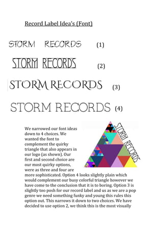
We narrowed our font ideas
down to 4 choices. We
wanted the font to
complement the quirky
triangle that also appears in
our logo (as shown). Our
first and second choice are
our most quirky options,
were as three and four are
more sophisticated. Option 4 looks slightly plain which
would complement our busy colorful triangle however we
have come to the conclusion that it is to boring. Option 3 is
slightly too posh for our record label and us as we are a pop
genre we need something funky and young this rules this
option out. This narrows it down to two choices. We have
decided to use option 2, we think this is the most visually
2. effective to complement our triangle, we like the clean
straight lines featured in the font. We did like the first option
we just felt the second choice was the most appropriate
option for our genre and record label.