Global Scenario On Sustainable and Resilient Coconut Industry by Dr. Jelfina...
Learning aim a
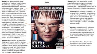
1. Dominant image – The dominant image is a
close-up shot of Rou Reynolds who is a
member of the rock band Enter Shikari.
Rou’s facial expression shows confidence
and he is looking directly at the camera
making him eye level with the audience
which is effective because it could suggest
the audience is part of the band. Rou is
wearing glasses in this picture which is
unusual because he doesn’t normally wear
them. This challenges conventions of rock
music because it makes the lead band
member seem academic and professional
which is unusual for rock bands..
Skyline – The skyline promotes things
featured in the magazine. It uses the word
”Klassik” which is spelt wrong. This is
effective because it shows that the target
audience are people of a lower social
grade, around D or E and “Klassik” would
attract to that audience. This is following
typical conventions for a rock music genre.
Essential information – This shows the
barcode, price (and prices in different
currencies), date and issue number.
Masthead – The masthead is large and is all
in capital letters followed by an exclamation
mark which fits the conventions of the rock
genre because rock music is loud. The
masthead is also at a low opacity which
allows you to see Rou Reynolds full face
without putting the masthead behind the
dominant image.
Main sell line – The main sell line is Enter
Shikari which is a rock band. The dominant
image is one of the lead members of the
band which means this sell line compliments
the dominant image well, this is effective
and fulfills the purpose of the magazine
because if someone recognises the band
they are likely to buy the magazine.
Tagline – There is no tagline in this Kerrang
magazine because Kerrang is already a well
known brand and one of the biggest music
magazines with a large audience who will read on
because of the quality of the Kerrang magazines.
Sell lines – These sell lines are promoting
other rock music/bands which the target
audience would be interested in. This is
effective because it could attract more of
an audience if they are familiar with these
bands but not Enter Shikari which is the
main sell line.
Print
2. PrintThe genre of this magazine is rock music.
The target audience of this magazine are
people who are interested in rock music as
the magazine is a rock genre magazine. The
fact that it has posters in the magazine
suggests that the target audience are in their
late teens or early 20s so around 14-21 and a
low social grade around E, D or C2. However,
the use of swear words could mean the target
audience is a bit older like 18-21 but the same
social grade. However, the target audience
could be younger (below 16) because it is a
print magazine meaning you have to buy the
magazine from a supermarket as opposed to
buying online. This means you can buy the
magazine with cash rather than online
banking because most young people don’t
have bank accounts.
The purpose of this magazine is to inform fans
about new / upcoming artists and provide the
audience with things like posters.
The distribution channels for print magazines
like this one are newsagents, supermarkets
and delivery (online subscriptions). If you go
to a supermarket to buy a print magazine you
may not be able to find the magazine you are
looking for.
3. Print
Pull Quote – The pull quote is by
the band’s lead vocalist Jeremy
McKinnon. Using him as the pull
quote is effective because the
target audience can imagine him
saying it since he is the biggest
voice of the band. The font and size
of the text makes it stand out
making it one of the first things the
reader will read.
Dominant image – The dominant
image is a photo of the entire band.
It is a wide shot from above which
slightly challenges typical rock
music codes and conventions as
usually the band / artist is eye level
or looking down at the audience.
The facial expressions show that
each member is having a good time
and they are happy. The lighting is
focused on the band members even
though the environment in the
image is dark.
Byline – Credits for article and
photography.
Article title – The article title is the band name near the
bottom right of the double page spread, so if someone is
flicking through the pages they will see the band name and
want to read on. The font looks hand drawn which makes it
look unique and it stands out and fans might recognise it.
Main body of text – The main body of text is white and in a
small font over a black background. There is no use of columns
and each line is a different length which shows that the article
isn’t very serious and it’s more informal which would attract the
target audience of young adults / teenagers.
This double page spread only
challenges codes and conventions
slightly by using a picture of the
band as the dominant image where
the audience is above the band,
because normally the band would
be eye-level or looking down at the
audience (as if they were on a
stage) It also challenges codes and
conventions by the location of the
kicker as it is usually the first
paragraph of the article. The target
audience for this double page
spread are young adults aged
around 18-25 with social grades
E/D
Kicker – The kicker in this double page
spread is unconventional because it is
usually the first paragraph of the main
article.
Strapline – The strapline is used to
get the attention of the reader.
The use of capital letters makes
the reader read it as if it’s being
shouted or it’s important.
Caption – Uses humour to appeal to the
audience.
4. Dominant image – The dominant image is a
medium shot showing the Arctic Monkeys
band. They are looking down on the reader
and they go over the masthead which
shows superiority. The facial expression of
each member is very serious and confident.
This is effective because the target
audience are younger people (teenagers /
young adults) who look up to the band. It
makes the Arctic Monkeys seem powerful
which is complimented by ”Now we can do
anything!” in the sell line.
Main sell line – The main sell line is Arctic
Monkeys which is the band in the
dominant image. The phrase ”Now we
can do anything!” shows superiority and
power. This is effective because the
target audience are younger people
(teenagers / young adults) who may look
up to this band.
Sub images / skyline – The skyline shows
smaller artists that are similar to the Artic
Monkeys. They use sub images which are
close-up shots of the artists. This is
effective because it will promote and give
more attention to these smaller artists
because the audience will read on through
the magazine.
Masthead / tagline – The masthead along
with the tagline are only partially visible
because Mojo is a very popular music
magazine which already has a large
audience. The dominant image of the Arctic
Monkeys goes over the masthead and
tagline to show dominance and superiority.
Digital
Sell lines – These sell lines are other artists
who the target audience may be interested
in. They are put in the front cover to
promote the artists. The fact that these
artists are on the side and smaller than
Arctic Monkeys shows that they are less
relevant artists and are less of a selling
point than Arctic Monkeys. The white and
gray text fits the theme of colours
throughout the front cover.
This front cover doesn’t have a barcode because
it’s a digital magazine therefore it doesn’t need
to be scanned by anything in order to be
purchased.
The target audience for this front cover are people of
any age who like rock music. This double page spread
is effective because it doesn’t use bad language
meaning it is appropriate for a young audience but it
isn’t childish and includes other artists who an older
audience may recognise.
5. Digital
The genre of this magazine is rock music.
The target audience of this magazine are people
who enjoy rock music which is shown by the
popular rock band Arctic Monkeys on the front
cover as the main sell line and dominant image.
The audience are most likely teenagers or young
adults (14-21) and are social grades E, D or C2
because C1 and above are professional.
The purpose of this magazine is to inform and
entertain the target audience. It includes
upcoming events and new artists/songs to listen
to. People could hear about events from this
magazine and make plans to go to them with
friends and potentially meet new people. It
entertains the audience by providing articles
about certain artists that they are interested in
including interviews.
The distribution of digital magazines is online.
You have to visit the publisher’s website to
purchase and download the magazine. The good
thing about this is that it saves time because you
don’t need to go to a supermarket to buy a
magazine like with print magazines, but the
downside of this is it takes up storage on your
device and it requires an internet connection or
may be difficult to use with a slow connection. It
also means you can’t purchase the magazine with
cash and requires a bank account or some form of
online banking.
6. Digital
Plug – The word ‘incoming’
shows that something is coming
up involving Liam Gallagher who
is in the dominant image. They
did this because if someone
recognizes Liam Gallagher the
first thing they will read is
“incoming” which will intrigue
the reader and they will want to
read on.
Dominant image – The dominant image is a mid shot to wide shot of Liam Gallagher who is a recognisable artist. In this shot
the audience is looking up at him which is conventional for music magazines because it is as if they are on stage. He is singing
into a microphone with a famous stance which suggests the picture was taken during a concert which could also intrigue fans
of him because they want to see him at a show. The props used in the image are maracas which are being played by Liam.
Article title – The title of this
article uses the same colour
scheme as the plug, red and
black. The red highlights the
name of the key artist on the
double page spread which could
catch the eye of the reader
whereas if the entire heading
was black or red it wouldn’t
catch the eye as easily. The
article includes a drop cap
within the kicker (first
paragraph) to help the reader
with navigation and allies within
the columns of text.
Pull quote – The pull quote
continues the red/black theme
that is repeated throughout the
double page spread, and it says
”but I couldn’t handle him full-
time.” which sounds harsh and
dramatic which could cause
people to start talking about it
and sharing the magazine with
other people.
Caption – Shows information about
an upcoming concert (date and
location) and uses personal
pronouns such as “you” which uses
direct mode of address to appeal to
the reader.
This double page spread doesn’t challenge codes and conventions of rock music magazines very much,
although the pull quote could be taken in a dramatic or bad way which is unusual for music magazines
because usually they would only promote the artist and not say anything controversial. It is effective to the
target audience which is people who are fans of
Language and register – “First
look” gives an exclusive feel to
the reader as if nobody has
heard it before.
The double page spread doesn’t
use any sub images which shows
that Liam is the main focus and
enough to appeal to the audience
to read the full article.
7. Pros and cons of print vs digital magazines
Print
Print magazines are good because they are accessible at any time due to their portability. Unlike digital magazines, you are not required to have battery life or
an internet connection. Articles have described print magazines as private ”me time” without being invaded by targeted digital ads being served up in real-time
based on your browsing history or digital footprint. When buying a magazine, you aren’t required to use a bank account as you can use cash whereas you can’t
use cash to buy digital magazines.
However, they are bad because unlike digital, they can be lost or damaged easily. They can also be a lot more expensive than digital magazines, and you have
to buy them from a store rather than accessing them through a device.
Digital
Digital magazines are good because they can fit on screens as small as mobile phones, meaning they don’t take up any room and can be resized which can be
useful. They can be accessed through apps are websites which is a lot easier than going to a store to buy them like print magazines. They can’t be damaged or
lost unlike print magazines, as they are always stored online and as long as you have an account on the app / website you bought the magazine on, you won’t
lose it. Analytics can be used on digital magazines such as how long people spend on a certain page which can help improve future issues of the magazine.
However, they are bad because they require internet connection to download them or access the website they are saved on. This means unless you have
mobile data you can’t read the magazines remotely. Also, workers for print magazines are put out of employment when they switch to digital magazines
Conclusion
In conclusion, I believe that digital magazines are more beneficial because, as long as you have an internet connection, you can access the magazine anywhere
and analytics can be used to improve the magazine by the publishers. Digital magazines are also a lot easier to purchase than print magazines because you
don’t have to physically buy one from a store, you just buy it online through a phone or computer.
8. Technical considerations of print and digital magazines
Print
Technical considerations of print magazines include the size of paper whether it should be A4 or A5 and how text should be formatted and what colours or
fonts should be used in it. All Photoshop files should be saved in RGB mode which allows a variety of colours to be used and allows one image to be used for
several media including print and web. Using an RGB image in Adobe InDesign you first need to specify the appropriate colour settings. Bleedlines should be
used to ensure you don’t cover the whole canvas because some words or image could be missing when printed. Use an even gutter line for columns making it
easier for the reader to navigate through the magazine. The contents page should highlight key pages and have correct page numbers, Articles should use a
running head so the reader can see what article they want to read. All pages should be numbered throughout the magazine and be correct. Content needs to
be laid out evenly and headings should be kept on the same page as the text that follows them. Unlike digital, readers will not be scrolling down a page but
flipping pages. Readers should be able to buy a copy of the magazine at supermarkets, festivals and music shops.
Digital
Technical considers of digital magazines include some apps don’t fully support all digital magazines, therefore the look of the magazine will not be as intended
by the editor when moving from portrait to landscape as the reader will have to scroll to continue reading the page or article. Some devices do not support
digital magazines and therefore some buttons the reader would usually use of their device will not like with the magazine which will be uneasy for the reader.
Some colours and fonts won’t translate into digital and won’t look exactly the same which could impact on the message or meaning which is embedded into a
text by the reader. For digital distribution there is Amazon which exclusively uses Mobe, and Barnes and Noble use epub. Options for distribution are more
limited for digital magazines. The desire to be creative is lost due to the limited digital distributors. You would be forced to use their templates and formats.
How the reader will navigate through the magazine, skip pages, how audio files or videos will be displayed. Losing secondary source files and the video/audio
being withdrawn from the internet would impact on your readers experience and relevance to the article/review. The reader may have to zoom in and out to
read smaller text when on a small device like a smartphone.