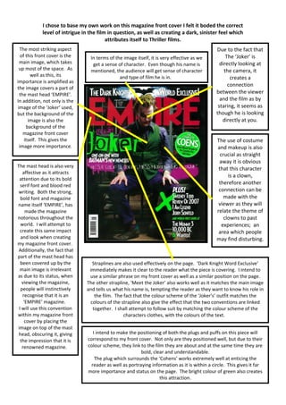
1. I chose to base my own work on this magazine front cover I felt it boded the correct
level of intrigue in the film in question, as well as creating a dark, sinister feel which
attributes itself to Thriller films.
The most striking aspect Due to the fact that
of this front cover is the In terms of the image itself, it is very effective as we The ‘Joker’ is
In Due to the
main image, which takes get a sense of character. Even though his name is directly looking at
up most of the space. As mentioned, the audience will get sense of character the camera, it
well as this, its and type of film he is in. creates a
importance is amplified as
connection
the image covers a part of
the mast head ‘EMPIRE’. between the viewer
In addition, not only is the and the film as by
image of the ‘Joker’ used, staring, it seems as
but the background of the though he is looking
image is also the directly at you.
background of the
magazine front cover
itself. This gives the The use of costume
image more importance. and makeup is also
crucial as straight
away it is obvious
The mast head is also very
that this character
affective as it attracts
is a clown,
attention due to its bold
serif font and blood red therefore another
writing. Both the strong, connection can be
bold font and magazine made with the
name itself ‘EMPIRE’, has viewer as they will
made the magazine relate the theme of
notorious throughout the clowns to past
world. I will attempt to experiences; an
create this same impact area which people
and look when creating may find disturbing.
my magazine front cover.
Additionally, the fact that
part of the mast head has
been covered up by the Straplines are also used effectively on the page. ‘Dark Knight Word Exclusive’
main image is irrelevant immediately makes it clear to the reader what the piece is covering. I intend to
as due to its status, when use a similar phrase on my front cover as well as a similar position on the page.
viewing the magazine, The other strapline, ‘Meet the Joker’ also works well as it matches the main image
people will instinctively and tells us what his name is, tempting the reader as they want to know his role in
recognise that it is an the film. The fact that the colour scheme of the ‘Joker’s’ outfit matches the
‘EMPIRE’ magazine. colours of the strapline also give the effect that the two conventions are linked
I will use this convention together. I shall attempt to follow suit by matching the colour scheme of the
within my magazine front characters clothes, with the colours of the text.
cover by placing the
image on top of the mast
head, obscuring it, giving I intend to make the positioning of both the plugs and puffs on this piece will
the impression that it is correspond to my front cover. Not only are they positioned well, but due to their
renowned magazine. colour scheme, they link to the film they are about and at the same time they are
bold, clear and understandable.
The plug which surrounds the ‘Cohens’ works extremely well at enticing the
reader as well as portraying information as it is within a circle. This gives it far
more importance and status on the page. The bright colour of green also creates
this attraction.