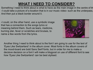
The document discusses features the author has discovered from analyzing album cover designs for bands with similar aesthetics to Eyes Like Switzerland. Specifically, it notes the extensive use of black and white color schemes and central images surrounded by borders. It considers using these design elements for its own album cover for the song "f e v e r" given the dark and moody nature of the music. The author also discusses options for the main central image and font style to reflect the lyrics and meaning of the songs.