
Recommended
More Related Content
Similar to Enthusiastic Organised Person Shares Creativity
Similar to Enthusiastic Organised Person Shares Creativity (20)
More from AmolSawant52
More from AmolSawant52 (20)
Recently uploaded
Recently uploaded (20)
Enthusiastic Organised Person Shares Creativity
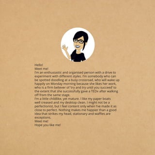
- 1. Hello! Meet me! I’m an enthusiastic and organised person with a drive to experiment with different styles. I’m somebody who can be spotted doodling at a busy crossroad, who will wake up happily on Monday morning because she likes her work, who is a firm believer of ‘try and try until you succeed’ to the extent that she successfully gave a TEDx after walking off from the same stage. I’m a little childlike, yet mature. I like my paper boats well creased and my desktop clean. I might not be a perfectionist, but I feel content only when I’ve made it as close to perfect. Nothing makes me happier than a good idea that strikes my head, stationary and waffles are exceptions. Meet me! Hope you like me!
- 2. CONTENT HelpUsGreen Art Direction Taper Poy Gift Box Design DIY Incense Kit Design Lentils Packaging Alice In Wonderland Silk Ikat: Branding Craft Cluster Flipkart: Website Redesign Coming Soon Contact ..01-06 ..07-16 ..17-24 ..25-34 ..35-42 ..43-46 ..47-50 ..51-58 ..59 ..60
- 3. 1 2 BRIEF: HELPUSGREEN ART DIRECTION CLIENT: KEY FIELDS: TOOLS USED: To direct a visual language for HelpUsGreen’s Incense product photography to be used on their social media handles, and to craft frames for the same. HelpUsGreen Art Direction, Social Media Adobe Photoshop RESEARCH VISUAL LANGUAGE SOURCING SETUP Looking into other brands social media handles and analysing their grid and other elements. The steps in process followed for this project were: Creating a visual language for the pictures by trying and testing different arrangements and elements. Sourcing material and other props for the shoot. Seting up each frame for the shoot.
- 4. 3 4
- 5. 5 6
- 6. 7 8 BRIEF: TAPER POY CLIENT: KEY FIELDS: TOOLS USED: To create a hypothetical brand in category of your choice, and to design a logo for it based on branding research of similar brands Taper Poy (Hypothetical) Branding, Illustration, Logo Design Adobe Illustrator, Adobe Photoshop RESEARCH BRAINSTORMING IDEATION LOGO DESIGN Creating a brand for Paper Toys, the project combined my love for toys and papercraft. Looking into brands like Crossword, Lego and Kreeda to understand the points to tap into the toy market, for which the consumers are kids, but the buyers are parents. The steps in process followed for this project were: To decide upon the name and the logo style for the brand. Finalising the concept for the logo design. To design a logo that is reflective of the brands values.
- 8. 11 12
- 9. 13 14 C: 0% M: 50% Y: 100% K: 0% R: 243 G: 146 B: 0 #F39200 C: 75% M: 100% Y: 0% K: 0% R: 102 G: 36 B: 131 #662483 C: 67% M: 58% Y: 55% K: 61% R: 58 G: 58 B: 58 #3A3A3A Aa Bb Cc Dd Ee Ff Gg Hh Ii Jj Kk Ll Mm Nn Oo Pp Qq Rr Ss Tt Uu Vv Ww Xx Yy Zz 0 1 2 3 4 5 6 7 8 9 PanRoman Regular::: For Body- Aa Bb Cc Dd Ee Ff Gg Hh Ii Jj Kk Ll Mm Nn Oo Pp Qq Rr Ss Tt Uu Vv Ww Xx Yy Zz 0 1 2 3 4 5 6 7 8 9 Century Gothic Regular: For headings Aa Bb Cc Dd Ee Ff Gg Hh Ii Jj Kk Ll Mm Nn Oo Pp Qq Rr Ss Tt Uu Vv Ww Xx Yy Zz 0 1 2 3 4 5 6 7 8 9 Century Gothic Bold: For accent text
- 10. 15 16
- 11. 17 18 BRIEF: GIFT BOX DESIGN CLIENT: KEY FIELDS: TOOLS USED: To design illustrations for HelpUsGreen’s gift box based on their existing visual language, revealing the fragrances of the particular collection. HelpUsGreen Illustration, Packaging Adobe Photoshop, Adobe Illustrator RESEARCH VISUAL LANGUAGE IDEATION MOCKUPS Looking into Gift Boxes and Combo Boxes of brands with similar niche. Tapping into communication points used by these. The steps in process followed for this project were: Understanding the graphic language and the application on products of Helpusgreen Generating ideas based on the fragrance classification Making mockups to present the idea to the client
- 13. 21 22 CITRAL COLLECTION CLASSIC COLLECTION
- 14. 23 24 FLORAL COLLECTION The Gift Box was HepUsGreen’s first product to enter into the market after their relaunch. The design has received a lot of appreciation from their consumers as well as other brands, and over a lakh boxes have been sold since October. Hon. Vice President Venkaiah Naidu being presented the Gift Box at InkTalk Event. IMPACT
- 15. 25 26 BRIEF: DIY INCENSE KIT DESIGN CLIENT: KEY FIELDS: TOOLS USED: To design the packaging for HelpUsGreen’s DIY Kit based on their existing visual language, including the design for material inside. HelpUsGreen Illustration, Packaging Adobe Photoshop, Adobe Illustrator RESEARCH VISUAL LANGUAGE IDEATION MOCKUPS Looking into DIY and other activity kits from different categories. Tapping into communication points used by these. The steps in process followed for this project were: Understanding the graphic language and the application on products of HelpUsGreen Generating ideas based on the fragrance classification Making mockups to present the idea to the client
- 16. 27 28 ITERATIONS
- 18. 31 32 INDIAN ROSE PATCHOULI
- 19. 33 34 LEMONGRASS HelpUsGreen launched India’s first ever DIY Incense Making Kit. These incenses are made from temple flowers that are sorted by women who were earlier involved in odd jobs like manual scavenging. The Kit goes live in April 2019 and can be purchased through their website, amazon, and qtrove.
- 20. 35 36 BRIEF: LENTILS PACKAGING KEY FIELDS: TOOLS USED: To identify a daily use product and design a packaging for it based on usage and other needs. Branding, Illustration Adobe Photoshop, Adobe Illustrator RESEARCH
- 21. 37 38 IDEATION
- 22. 39 40
- 23. 41 42 1 2/ CUP HABIT TOOR DAL COOKY OUR MUM’S RECIPE MAKE A FANCY S ALAD Better than your Boring Diet! You’ve a secret super power! Bye- Bye Instant Food! Trip to the grocery store! Reinforcement messages as the quantity decreases.
- 24. 43 44 BRIEF: ALICE IN WONDERLAND KEY FIELDS: TOOLS USED: To design a series of 4 postcards based on the 2010 movie ‘Alice in Wonderland. Adding another layer to the brief was a challenge to create the postcards in a way that they created a composition together, but can also be used individually. Illustration, Graphic Merchandise, Print Design Adobe Photoshop, Adobe Illustrator BRAINSTORMING
- 25. 45 46
- 26. 47 48 BRIEF: BRANDING CRAFT CLUSTER SILK IKAT: KEY FIELDS: TOOLS USED: To design an artisan centric branding for Silk Ikat craft artisans of Surendranagar, aimed at its promotion. The project had to be carried out on the basis of both primary and secondary research about the craft. Branding, Illustration Adobe Photoshop, Adobe Illustrator BRAINSTORMING
- 28. 51 52 BRIEF: WEBSITE REDESIGN FLIPKART: KEY FIELDS: TOOLS USED: To design a simple intuitive experience for online users for a sale campaign on Flipkart. The sale could be any popular one on Flipkart around the calendar. The visual appeal should evoke a sense of urgency, as well as celebration. UI/UX Adobe Photoshop, Adobe Illustrator BRAINSTORMING
- 29. 53 54 WIREFRAMES BANNERS & WELCOME SCREEN
- 30. 55 56 PRODUCT LISTING PRODUCT LANDING
- 31. 57 58 Keeping the navigation simple, intuitive, and user-centric, the design was altered to induce a sense of urgency and celebration. Based on colour psychology and human eye perception, the colour red was used amongst blue and yellow to gain attention on the availability of the product to drive sales. Pop/up messages were also added in the corner for the reinforcement of consumer.