
Recommended
More Related Content
Similar to Greenpeace Brand Redesign
Similar to Greenpeace Brand Redesign (20)
More from Allison Donahue
Recently uploaded
Recently uploaded (20)
Greenpeace Brand Redesign
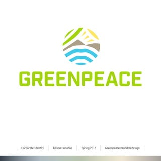
- 1. Allison DonahueCorporate Identity Spring 2016 Greenpeace Brand Redesign
- 2. Written Articulation 2/26 WRITTEN ARTICULATION I found this project to be tougher than I imagined. Staying on top of all of the components was tough, but overall a huge learning experience. Due to this being a hybrid class, self-motivation is also a huge part of this project. With only meeting once a week, it is sometimes difficult to sit down on the off day and get work done. In the beginning, I was not too sure what to research or where to find it. As the project went on, I continued to dial in what I was looking for, which helped my end product. I did a lot of research on my competitors to find what my logo pool looked like and what mine should turn out to be, but better. I found that my logo should reflect I should make my design reflect: circles, thick line quality, blues & greens, type in all caps & it should be bold. It also took me awhile to find a certain direction for my logo concept. Without a concept it is not easy to come up with an actual idea. My concept is that “Greenpeace exists because our fragile earth needs a voice.” I put this into my logo in a view ways. I created our earth out of pieces of things that Greenpeace represents. Generally, Greenpeace wants to protect the ecological sys- tems in the ocean (portrayed as the 3 blue lines at the bottom of the logo), prevent deforestation (portrayed as the 2 brown mountains in the middle), stop global warming (portrayed as the sun in the top right), and it wants to plant more trees all over the world (portrayed as the top left green lines).The 3 blue lines also represent a speaking symbol portraying that Greenpeace exists as our earth’s voice. It’s situated above the logo to further show the voice idea. My type choices includeTenso as my display type and Bell Centennial Std as my body type. These are both AdobeTypekit fonts. I like the way these two go together because my display type can be seen big and bold over top of imagery, while my body type can be used in letterhead formats, or in smaller situations.They go well with the serious, inspiring brand redesign. My color choices are generally based off of my competitor research in the beginning of the se- mester.These were the top colors that all of the brands used. Many brands only used maybe one or two of these, but I wanted mine to stand out. Furthermore, Greenpeace doesn’t just represent wildlife, or global warming. It stands for a plethora of different environmental issues. Besides my main blue and green, yellow, dark blue and brown were needed to make my logo complete. Patterns and textures were hard for me to come up with. My logo has a lot of color, shape, and pattern already in it. I tried out at least 10 different pattern options. After all, I believe the gradient pattern I chose goes well with my concept and redesign. It encompasses everything Greenpeace stands for in color form. It goes well with the fact that Greenpeace is a bold, independent worldly agency.They stand up for themselves against huge companies in order to save our environment. The texture of paper I’m using on my stationery represents a natural recycled paper. The tone of my images ranges from serious to inspiring, to wanting to learn more. Greenpeace can be one to ask you to join their team, or they can be one fighting or teaching you an issue. The layout of my stationery stems from my letterhead. I wanted the logo to be as big and bold on everything, and then I based the design elements around it. I enjoyed playing around with different stationery ideas and designs. I used a lot of white space, with blocks of color to match my logo.
- 3. Toc 3/26 TABLE OF CONTENTS RESEARCH History Core Concept New Brand Adjectives & Description Brand Moodboard Competitors New Visual Direction CREATIVE PROCESS Logo Comp Logo Construction Logo Sizes Logo Math Positive and Negative of Logo New Vs Old Logo BrandTone STATIONERY Full Stationery System Business Cards Envelopes Mailing Labels Letterhead WEB Web Banners
- 4. History 4/26 1971 A group of thoughtful, committed citizens came together to create Greenpeace. Determined activists leased a small fishing vessel, and set sail from Vancouver for Amchitka Island in Alaska. Despite being intercepted by the U.S. Coast Guard, these daring activists sailed into history by bringing worldwide attention to the dangers of nuclear testing. 1977 Now there are 15-20 Greenpeace groups around the world. 1979 Greenpeace International comes into existence. 2016 Greenpeace International is based in Amsterdam, Netherlands. It now has 28 offices operating in 45 different countries. Since 1971, Greenpeace has indeed changed the world. HISTORY
- 5. Concept 5/26 CORE CONCEPT Greenpeace exists because this fragile earth deserves a voice. It needs solutions. It needs change. It needs action.
- 6. New Description 6/26 NEW BRAND ADJECTIVES & DESCRIPTION Independent, Creative, Peaceful, Inspiring, Green What’s the big idea? Greenpeace is the leading independent campaigning organization that uses peaceful protest and creative communication to expose global environmental problems and to promote solutions that are essential to a green and peaceful future. Core purpose? Greenpeace’s goal is to ensure the ability of the earth to nurture life in all its diversity. Greenpeace exists because our fragile earth needs a voice. Core person that relates to my brand? A person who wants to make a difference in the environment and/or learn about environmental issues happening all around us. Age, sex, mobility, marital status, home ownership, employment, income, shopping habits? 38-53, Male or Female, Married, owns a nice 3 bedroom house, makes 40,000-70,000 a year. Most likely right brained and working in some sort of job where they can be creative Shopping habits include Amazon Prime,Target, buying local, supporting art walks, DSW, Ann Taylor, Jcrew, Nordstrom, Adidas, Polo, Levis, LL Bean Core attitudes? Protect, prevent, promote, show peace & non violence, and speaking out What celebrity or musician could be used to endorse this company and why Sheryl Crow (F): Reduces carbon footprint. She limits tour practices; her crew uses reusable water bottles and compostable materials. She’s 53 years old and inspirational to younger people. Coldplay (M):They sing about environmental issues.They’re partnered with ClientEarth, a group that enforces environmental laws throughout different countries, working with local governments and local green groups.They also pioneered strategies such as carbon neutral CDs and tree planting in areas that struggle economically. If your company was a cross between 2 popular movies, what would they be? Wall-E because it’s a very well known creative, environmental movie about the small waste collecting robot. I would combine it with Remember theTitans. Remember theTitans is a very inspirational movie where the squad pushes through adversity. My adjectives are shown in both.
- 7. Moodboard 7/26 BRAND MOODBOARD IndependentPeaceful Inspiring Creative Green
- 9. Competitor Analysis 9/26 COMPETITOR ANALYSYS Generally, the design aspects that are the most prevalent in my competitors are: Imagery: Lots of circles, worlds, and globes Line Quality: Thicker line quality, & images where the details are easy to see. Color Range: Blues, Greens, Black Only a few logos have a wider color range Scale: The same amount of logos that are built in a square as the ones built horizontally Type: Almost all logos are in all caps and bold. Only a few were lowercase and not bold. My conclusion for the structure of my logo: I should make my design reflect: circles, thick line quality, blues & greens, type in all caps & bold.
- 10. Visual Direction 10/26 NEWVISUAL DIRECTION Questions to help with the creation of logo thumbnails: List at least 10 physical things that come into play with your company? Peace sign, trees, animals, rain (or a rain drop), hand (like a helping hand), boats, people, world/ earth, ice from the arctic, the ocean, colors: blue, green, brown, yellow, speech bubbles, and the “talking” symbol List at least 10 things that relate to the company name or what they do? Save the climate, save the arctic, fight global warning, accept donations, lend a helping hand (in all aspects: volunteers, to animals, to companies), greenpeace is people powered so there are tons of activists and people holding up posters, it connects people from all over the world of all cultures and languages, they investigate environmental issues and crimes and expose them to the public, they stand up for their beliefs, they want to have a “green” or sustainable environ- ment. But, they handle things in a peaceful way. Besides the environmental part, they generally just want peace in the world, saving endangered species and animals, & greenpeace is here because our fragile earth needs a voice. How will the core purpose be achieved with your proposed graphic treatment? I want my concept to be “broken/fragile” in order to portray the core purpose. I want it to be bright, and bold in order to be inspiring. I want it to possibly include the symbols listed above, but in a new way. I want my target audience to look at my logo and be inspired. I want them to be excited to learn more about greenpeace, volunteer, and donate. What is the overall planned aesthetic? Is this new and unique, have you combined/ reused 2 or more different aesthetics to be unique? I want to give some of my symbols a mathematical, geometric look, combined with a minimalistic approach. What is important to the aesthetic to work as intended? Relate to question 3 based on your design choices; color, graphic style, imagery, type treatments, etc. Type: bold/organic.This could be done in a hand lettered way or by adjusting a current font Color: My color ideas are greens, blues, and browns Graphic Style: bold, fun, inviting Imagery:Trying out different ways to incorporate minimalistic and geometric symbols
- 11. Completed Logo 11/26 LOGO COMP
- 12. Logotype 12/26 LOGOTYPE CONSTRUCTION GREENPEACE GREENPEACE I took into consideration my research from Greenpeace’s competitors.The original font is called Industry. It’s from AdobeTypekit. I like the bold part of Industry, and that it looks serious. I changed the corners of the letters to make them more rounded to relate to my logo image, which I’ve shown by placing blue dots below.Then, I made sure all of the spaces between the letters were even.The space is consistant with the spacing in the image part of my logo.
- 13. Logo Sizes 13/26 LOGO SIZES 2cm x 2cm 4cm x 4cm 6cm x 6cm
- 14. Logo Math 14/26 LOGO MATH 1.5cm 2cm .5cm 1cm 1cm minimum clear space = 1cm .15cm minimum clear space = 1cm .25cm .25cm 3.6cm 3.5cm
- 15. Positive / Neg 15/26 POSITIVE / NEGATIVE
- 16. New Vs Old 16/26 NEWVS OLD LOGO
- 17. Brand Tone 17/26 BRAND TONE C M Y K 46 0 100 0 Pantone 375C R=149 G=214 B=0 Pantone 305C R=81 G=199 B=230 C M Y K 59 0 7 0 Pantone 305C C100 M73 Y28 K13 R=81 G=199 B=230 Pantone 305C C36 M33 Y48 K0 R=81 G=199 B=230 Pantone 305C C6 M2 Y78 K0 R=81 G=199 B=230 C M Y K 46 0 100 0 C M Y K 46 0 100 0 C M Y K 46 0 100 0 C M Y K 46 0 100 0 Tint =80% Tint=80% Tint =60% Tint=60% Tenso is used for my display type. It’s used in bold. OR IN ALL CAPS. Bell Centennial Std is used for my body type.
- 18. Stationery 18/26 STATIONERY SYSTEM 702 H Street, NW, Suite 300 Washington, DC 20001 702 H Street, NW, Suite 300 Washington, DC 20001 702 H Street, NW, Suite 300 Washington, DC 20001 .75in .5in .25in .5in .75in .5in .25in .5in www.greenpeace.org Greenpeace exists because this fragile earth deserves a voice. It needs solutions. It needs change. It needs action. t 702 H Street, NW Suite 300 Washington, DC 20001 +1 (202) 462-1177 f +1 (202) 462-4507 22 February 2016 Jonathan Plias President of the American Environmental Council 324 Circle Ave Santa Barbara, California 93101 Mr. Jonathan Plias, As environmental organizations with more than 200 million members in the United States, we welcome that you will address innovation at the American Environmental Union next week.The American Environmental Council faces critical economic challenges, including dwindling natural resources and increasing expensies linked to pollution and related health problems. Business as usual is destroying the natural foundations on which our economies and societies ultimately depend. Without further action, degradation of nature will cost the AEC $1 trillion every year by 2050.Therefore, our organizations support research, development and application of resource efficient sustainable technologies and practices, and we call on you to promote sustainable innovation at the highest political levels. We are writing to you out of concern that certain companies who masquerade as innovators are actually seeking to block policies that challenge the status quo. We encourage you to consider the following points in your discussions: 1.The need for a wider concept of innovation. 2.The stimulating role of public policies. If you have any questions about the presentation please let us know. Sincerely, Allen Hitley Campaign Event Manager Greenpeace 702 H Street, NW, Suite 300 Washington, DC 20001 702 H Street, NW, Suite 300 Washington, DC 20001 .75in .5in .25in .5in .75in .5in .25in .5in RoryJonas Volunteer t m +1 (202) 462-1177 info@wdc.greenpeace.org a 702 H Street, NW Suite 300 Washington, DC 20001 RoryJonas Volunteer t m +1 (202) 462-1177 info@wdc.greenpeace.org a 702 H Street, NW Suite 300 Washington, DC 20001 RoryJonas Volunteer t m +1 (202) 462-1177 info@wdc.greenpeace.org a 702 H Street, NW Suite 300 Washington, DC 20001 earth needs a voice. We exist because our fragile RoryJonas Volunteer t m +1 (202) 462-1177 info@wdc.greenpeace.org a 702 H Street, NW Suite 300 Washington, DC 20001 RoryJonas Volunteer t m +1 (202) 462-1177 info@wdc.greenpeace.org a 702 H Street, NW Suite 300 Washington, DC 20001 RoryJonas Volunteer t m +1 (202) 462-1177 info@wdc.greenpeace.org a 702 H Street, NW Suite 300 Washington, DC 20001 earth needs a voice. We exist because our fragile
- 19. Business Cards 19/26 BUSINESS CARDS t m +1 (202) 462-1177 info@wdc.greenpeace.org a 702 H Street, NW Suite 300 Washington, DC 20001 RoryJonas Volunteer t m +1 (202) 462-1177 info@wdc.greenpeace.org a 702 H Street, NW Suite 300 Washington, DC 20001 earth needs a voice. We exist because our fragile
- 20. Envelope Comps 20/26 ENVELOPE COMPS 702 H Street, NW, Suite 300 Washington, DC 20001
- 21. Mailing Labels 21/26 MAILING LABELS 702 H Street, NW, Suite 300 Washington, DC 20001 702 H Street, NW, Suite 300 Washington, DC 20001 .75in .5in .25in .5in .75in .5in .25in .5in My mailing labels are 4in by 2in.
- 22. Letterhead 22/26 LETTERHEAD www.greenpeace.org Greenpeace exists because this fragile earth deserves a voice. It needs solutions. It needs change. It needs action. t 702 H Street, NW Suite 300 Washington, DC 20001 +1 (202) 462-1177 f +1 (202) 462-4507 22 February 2016 Jonathan Plias President of the American Environmental Council 324 Circle Ave Santa Barbara, California 93101 Mr. Jonathan Plias, As environmental organizations with more than 200 million members in the United States, we welcome that you will address innovation at the American Environmental Union next week.The American Environmental Council faces critical economic challenges, including dwindling natural resources and increasing expensies linked to pollution and related health problems. Business as usual is destroying the natural foundations on which our economies and societies ultimately depend. Without further action, degradation of nature will cost the AEC $1 trillion every year by 2050.Therefore, our organizations support research, development and application of resource efficient sustainable technologies and practices, and we call on you to promote sustainable innovation at the highest political levels. We are writing to you out of concern that certain companies who masquerade as innovators are actually seeking to block policies that challenge the status quo. We encourage you to consider the following points in your discussions: 1.The need for a wider concept of innovation. 2.The stimulating role of public policies. If you have any questions about the presentation please let us know. Sincerely, Allen Hitley Campaign Event Manager Greenpeace
- 23. WEB BANNERS 23/26 WEB BANNERS
- 24. WEB BANNERS 24/26 WEB BANNERS
- 25. WEB BANNERS 25/26 WEB BANNERS
- 26. WEB BANNERS 26/26 WEB BANNERS