The document describes the process of developing print productions for an album. It involves:
1) Tracing a mask photograph and drawing lines for the band and album names. Space was left for the lines but not at the bottom, though this was fixed with correction fluid.
2) Sketching line designs with pencils before finalizing with a fine liner.
3) Drawing the back and inside panels from imagination rather than photographs. Lines were connected across panels.
4) Scanning the drawing and editing it in Photoshop before pasting it onto the album template. Text was added on top.
1. Development of print productions (Digipak)
After taking pictures of the mask and selecting the one I was
going to use for my print production, I printed out the
photograph in A4. I then traced over the photo, making sure
I precisely get the outline of the mask and the eye sockets &
mouth. Three quarters down of the mask, I drew two lines,
one out of each side. This would be where the band name
and album name would be constructed by the outward lines
(as that was the plan). I left space for the lines to depart
upwards at the top of the mask, but I accidentally forgot to
leave space at the bottom of the mask. However this did not
cause too much of an issue because I could erase the line
with tippex.
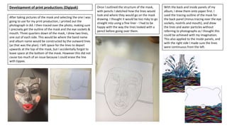
Once I outlined the structure of the mask,
with pencils I sketched how the lines would
look and where they would go on the mask
drawing. I thought it would be too risky to go
straight into using a fine liner - I had to be
happy with the way the lines looked with a
pencil before going over them.
With the back and inside panels of my
album, I drew them onto paper first. I
used the tracing outline of the mask for
the back panel (minus tracing over the eye
sockets, nostrils and mouth), and drew
the lines and water particles without
referring to photographs as I thought this
could be achieved with my imagination.
This also applied to the inside panels, and
with the right side I made sure the lines
were continuous from the left.
2. It was a rather long and continuous process drawing the lines but I
was really pleased with the outcome, it was most definitely
worthwhile the time because it looked just how I imagined it. I was
able to scan in the drawing with the printer at home and I was
surprised with how good the resolution was & how it excluded some
minimal marks and shadows. I decided not to write the text with a
fine liner because my handwriting is not the best to read and I am
not sure if my style of writing would be appropriate for the whole
contemporary look of the cover.
I did not make too many changes to the drawing as I did not feel as
though this was necessary, although with the eraser tool I got rid of
some small marks in between the lines that gave them a smoother
edge. I had to open the drawing in a separate file to the digipak front
cover template, then reselect it with the rectangular marquee tool
and copy and paste it. Once I did this, I had to hold Ctrl+T to alter the
size of the drawing - I made it wider so the lines would connect to
the sides of the canvas, and luckily this did not make it lose quality. I
made the lines more bold by slightly decreasing the brightness of the
image by going on Image > Adjustments > Brightness/contrast. The
screenshot on the right shows the order in which the layers went in -
the text being positioned in front of the drawing and white
background.
For the font, I screen-shotted my text in the chosen style from
Dafont.com, opened a separate file on Adobe Photoshop CC,
cropped the image and selected the entire thing with the Quick
Selection tool. After this, I copied and pasted it into the files of my
album panels, moving and altering the size of them with Ctrl+T so it
aligns equally with the drawing. On the album cover for added
effect, I selected the paint tool and made the letters join up with
each other and the lines going across the canvas – adapting to the
continuous line style.
Development of print productions (Digipak)
3. Development of print productions (Advert)
First of all, I wrote ‘Tempesst’ and ‘Currents’ in the
recognised font in dafont.com. I Placed them on a Microsoft
Word document then printed them out. Whilst looking at
the image of Katy for reference, I drew the image and the
lines with a fine liner and ruler. I scanned the picture back
onto a computer so I could add the text in Photoshop.
I found these 5 stars on a copyright-free website. I thought
it would have been a faster process to save the image,
incorporate them in the file and make them black and
white, than downloading the symbol onto my computer.
This is because I did not want to risk my computer catching
viruses.
After this, I placed the album cover in the bottom corner of
the poster. I did this by opening it separately in Photoshop,
selecting the whole image with the rectangle marquee tool,
and then copying and pasting it. Adding the text was not
tricky as I simply clicked the text tool in the toolbar, wrote
out information then moved it to where I wanted to
position it.
4. Development of print productions (Digipak)
These are the drafts I created, although the final one will be chosen and discussed in the 'Evaluation of two ideas' blog post. I cannot decide which one
to chose so I am going to ask my teacher and classmates for advice. I feel as though either of the text compositions work well but I can't decide if the
album cover looks better with the outward lines or not. Knowing which text font to choose is the most difficult decision because I cannot tell whether
it makes the overall cover look dated or modern. I like how the mask on the far left reveals its form and shape better than the other two as I erased
some lines that did not give the drawing much justice, but I feel as though it looks more like an acorn.
These are the designs I made before my final design. However, I thought it would be good to
include them in this powerpoint to show my development.