
Recommended
More Related Content
What's hot
What's hot (19)
Similar to Music Magazine Analysis
Similar to Music Magazine Analysis (20)
More from Alexandrav223
More from Alexandrav223 (20)
Recently uploaded
Recently uploaded (20)
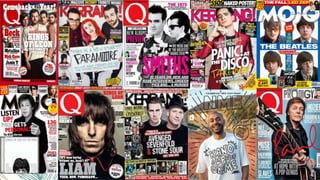
Music Magazine Analysis
- 4. .KERRANG! Is a weekly magazine that is published in the UK by Bauer .It is aimed at rock music fans .KERRANG! Was first published in 1981 as a one of supplement in the sounds newspaper .They publish 51 issues a year .KERRANG! Costs £2.20 .In the early 2000s it became Britain's best selling music newspaper
- 5. Mission Statement: – Kerrang! will ensure that we are constantly appealing to our spectrum of readers. – From the younger teenage readers who are more open to different genres of – rock music – from emo to thrash etc, to the readers who respect Kerrang! as an – authority when it comes to our scene’s heritage bands. – Each issue will include a balance of bands and scenes to guarantee that we’re providing – for our readers’ need for variety and their passionate appetite for their favourite bands – as well as their desire to be introduced to new music within our world. – We will focus on the BIGGEST things that are going on in our world each week, as – well as guaranteeing that we are giving our main base of younger readers everything – they need to get into, on top of this the interest in older, harder bands, cementing our – role as an educator
- 6. Reader Profile – Circulation 44,013* – Readership 421,000** – abc1 profile 52%** – Mean Age 22** * – ABC Jan - June 2010 ** – NRS Jan-Jun 2010 *** – NRS Jan - Jun 2010 - vs. Mojo, Q & NME l – 70%*** SOLUS READERSHIP 87% OF K! READERS BUY EVERY Issue Kerrang! is actually really young with a median age of 22. Having a younger profile is a big advantage as traditionally this age group is elusive (and expensive) to reach. As well as music releases this makes Kerrang! perfect for film and games, and also mobile technology and government messages. Kerrang! is the original multimedia platform boasting magazine, online, radio, TV, K! Awards, K! Tour, and K! podcasts. Kerrang! loves music, especially rock. Kerrang! is considered by its readers to be an integral part of the scene rather than just a commentator. Kerrang! readers are the heaviest music consumers purchasing over 6 albums per month on average (53% more than the national average) and 8 times more likely to spend over £200 a year on albums. The readers are also 5.5 times more likely to attend a rock gig.
- 7. .Q is a music magazine published in the UK by Bauer .It was originally subtitled “the modern guide to music and more” .Q is aimed at fans of pop music .Q is published monthly .They produce 13 issues a year .Q costs £ Q was originally going to be called cue but was changed so not to be confused with a snooker magazine .Q was first published in 1986 by EMAP
- 8. Mission Statement: – Q is the ultimate guide to modern music, distilling it down to the good stuff. Well respected by artists and labels, we have unrivalled access to modern music’s biggest names. – Employing the world’s best music writers and photographers, we deliver our features with the depth and craft only a monthly music mag can – taking the time to get to the core of a story and producing a magazine you can truly luxuriate in. – ACCESS – Q’s unrivalled access to the biggest names brings music’s most exciting characters to life. We put the reader in the room with their favourite artists, helping them understand what the stars are like to be with, what they stand for and how their own journeys have shaped their music. – Authority – Our reviews section, Q Review, filters modern music down to the best and most important records and gigs every month. We investigate more music each issue than any other magazine and employ the world’s best music writers. In-depth but never intimidating, Q prides itself on accessibility and warmth. – Breadth – Our readers are serious about music. They’re proud of their record collections, playlists and music libraries and are a broad-minded bunch – in the infinite choice world of streaming, they don’t confine themselves to single genres.
- 9. reader profile – Chris is 29 years old and lives in Leeds. Music is more important to him than anything else. It’s at the centre of his social life. It soundtracks the best moments in his life. Its his identity, social currency and his world. – Chris lives for gigs, festivals and those electrifying moments of togetherness that only music can provide. He is the one who sorts out gig tickets for his friends, turns them on to new and sets up the big festival weekend. – Chris works in a professional job and finally has the money and time to indulge his music habit to the full. He has a partner(no kids, yet) who is similarly music mad. He is ‘discovering quality’ in all areas, from sound systems to deluxe reissues of cars, travel and clothes. Chris loves technology- he was first with the iPod, iPhone, iPad and now streaming services. He downloads music but still prefers to own CDs. And he spends more on music than anything else: a big gig every week ABC1 Profile: 71.8% Median Age: 34 In Employment: 74%
- 10. .MOJO is a music magazine published by Bauer following the success of Q .MOJO is published in the UK monthly .Each issue comes with a free CD inspired by the artist on the cover .The magazine is aimed at people who listen to rock and roll music . MOJO is sometimes criticised for its frequent coverage of classic rock acts such as Bob Dylan and The Beatles .MOJO costs £5.25 .There are 12 issues published a year
- 11. Mission Statement: – Mojo is an educator, a living archive and a trusted source of musical excellence. Mojo provides – its audience with an authentic, independent, and emotional connection to the music. Its also – the last word on whats good, for music that is timeless, and where to go next. Mojo is loved – by its readers, the music industry, and by musicians alike, because it engages them on the – subject they love the most. – Its basic editorial proposition every month consists of: A definitive, book-like cover feature (i.e. – you dont need to read a book on the subject, you can just read Mojo to know everything). – An editorially themed cover mounted CD. A 30 page plus reviews section known as Filter, – which brings you the best in music that month. – Mojo goes in deeper than any other magazine and creates an experience that is immersive, – and that the readers can luxuriate in. From The Beatles to Battles, and The Ramones to – Radiohead. Classic, sitting comfortably with cutting edge, and quality being the one constant
- 12. MOJO Reader Profile – Circulation – 91,678* – Readership – 218,000** – abc1 profile – 66%** – Mean Age – 37 MOJO is the world’s largest UK music magazine, delivering a monthly dose of world class journalism and iconic photography to an audience of extremely passionate music consumers. If you’re featured in MOJO, you matter. MOJO is the brand for those truly OBSESSED with music MOJO is THE MUSIC EXPERT – a magazine of high brand values and integrity. A carefully crafted musical archive covering the very best of music across genres. From classic and modern rock, folk, soul, country to reggae, electronic and experimental. It prefers to celebrate quality over popularity – music that will stand the test of time. MOJO provides a “hand-made” experience in a mass market environment, and as a result is a valued and trusted brand. John is 37, a passionate and discerning music fan, long-time musician himself and dedicated record collector. With his high disposable income, John loves nothing more than sneaking off to the local independent record store to see what’s in. John proudly invests in an extensive mixture of vinyl (classics and rarities), CD’s, and carries a well stocked iPod that covers everything from prog to nu-folk, Motown to 60’s garage, blues and psychedelia. John’s heroes are Bowie and Jimmy Page, he has played the guitar since his school days and gets together now and again for a jam with his muso pals. A heavy gig goer, he also likes the more ‘boutique’ festival experience, having begun to outgrow Glastonbury, he is now just as likely to head to a smaller scale shindig such as Latitude or Green Man Festival. John and his partner occasionally like to unwind at the weekend by packing the toddlers off to their grandparents and inviting their friends around for dinner, whiskey and a rifle through his record collection to unearth some hidden gems. Well read and media-savvy, they chat into the small hours about music, books and films.
- 13. The masthead of KERRANG! is bright yellow and partially covered. Because is it is bright it will attract potential buyers. The fact that it is partially colours shows how much faith the publishers have in the brand as even though some of it is covered they know readers will recognise it immediately regardless. The font looks as though it has been shattered by music being played too loud which reinforces the idea that KERRANG! is noisy. The cover image that KERRANG! Have used for the magazine cover is two members from the metal core band ‘Asking Alexandria’. Danny Worsnop is in the foreground and is dressed in dark clothing. He is the frontman in the band and so would stereotypically be the one in the group that people take most notice of and so is represented by Danny being the -. In the background of the image the founder of the group and lead guitarist Ben Bruce is stood wearing a black t shirt, black leather jacket and a black hat worn on a slight angle. As he is in the background this could symbolise that people would tend to see him after Danny and the way that photo was ---- seems to represent that. The plug shows the offer of 6 amazing posters sets KERRANG! Apart from other music magazines in its genre. The use of the word ‘amazing’ makes them seem more appealing to the audience. As KERRANG! are giving away posters with their magazine it helps us identify the age of the average KERRANG! Reader. Magazines aimed at older audiences don’t often contain posters so its safe top assume that KERRANG! Is aimed at a younger audience than MOJO. Underneath the splash feature there is a cover line. Because they have underlined the word truth KERRANG! Are implying that there is a lot of lies and gossip surrounding “2016’s most surprising reunion "and that only they have the truth. The use of the word “most” tells the reader that there wont be another reunion as shocking as the one in the magazine and sells the idea to the audience that KERRANG! Can get them more information than other magazines can. The plug is telling the reader what else is on offer in the issue. By using the word gazillions KERRANG! is appealing to its target audience as it is using informal language instead of talking down to the reader. This makes the magazine more relatable because it is using language that the reader would use. The word “new” is bright, bold and yellow and stands out against the smaller white font of the writing around it and the red background behind it. By making the word “new” stand out to the reader and is once again selling the idea that KERRANG! can get the newest and exclusive interviews that there are. The plug shows the band Twenty One Pilots and underneath there is a cover line which is about their greatest songs. By adding “and you!” Kerrang! are making the audience feel included with their favourite bands. It gives the impression that they are on the same level with the bands that they admire so much.
- 14. The layout of the magazine is arranged so that a lot of information about what's in the magazine is displayed on the left third of the magazine. This could be so that when the magazines are arranged so that they are overlapping each other, readers can still see the main features inside. The use of four colours (red, white , yellow and black) on the front cover help to attract attention to the magazine. The cover page is very loud and busy and this may be as KERRANG! is aimed at a younger audience who's lives are also loud and busy and the cover page reflects on that. The plug shows the reader that KERRANG! Has a lot on offer. As the word first is underlined it once again sells the idea to the audience that KERRANG! Can get them exclusive information that other music magazines such as – and – couldn’t. As it is bright red it stands out against the yellow, white and grey around it. The use of the white font inside clashes with the red surrounding it. As well as this by using two bands that are extremely popular with their target audience it makes the reader feel as though they have a lot on offer as its not just the first review of one album but of two instead. By using buzz words such as “world exclusive” makes the reader feel as though they are the first people to know about what the article has to tell them. It sells the idea to the audience that KERRANG! Is the only music magazine that can get them interviews like this and so to find out more about the band they'll have to read the interview as they wont be able to find it anywhere else but in this magazine. Underneath this is a --- --. It reads “I only agreed because I was drunk” by using this quote it adds some humor to the magazine and makes the reader want to find out more as “2016’s most surprising reunion” is only happening because the group member who agreed was drunk. The use of the splash feature draws attention to the cover image used and informs the reader of the band the article is about. KERRANG! Has used the logo for Asking Alexandria as their splash feature and by doing that are showing their knowledge on the band and make themselves seem more professional as not only did they secure this “world exclusive” interview but they know more minor details about the band such as the logo. Underneath this in a different font are the words “DANNY’S BACK!” that look as though they have been printed on top. The puff is about “Rock’s biggest gig and merch guides”. Once again the magazine is using abbreviated words such as “merch” to relate more to the reader instead of using the full word. This makes the magazine seem informal and relatable. By using the word “biggest” KERRANG! Is telling the reader that this guide will get them the most popular guide to the biggest gigs. The background of the puff is hot pink and the writing inside is white and yellow. Even though it is quite small because it is hot pink it stands out against the dark cover image behind it. Bright colours are used in the plug to help draw attention to the band featured. As it is a popular band and is displayed so clearly it means that fans of Greenday will pick up a copy to find out more about what Billie Joe Armstrong has to say.
- 15. At the (left side) of the magazine the page is split in two diagonally and made to look like two different sheets of paper have been ripped. The left third is being used to promote two albums that have been released at the same time. On top is the logo for Avenged Sevenfold and their logo with the page number of the review underneath. Below that is the Metallica logo with the band logo underneath and page number. The top half of the page is in white and the bottom in black. These two colours contrast with each other and attract the readers attention. Avenged Sevenfold Compared to the cover page KERRANG!s cover page is simpler. KERRANG! Continue the colour scheme using yellow, black, white and red. This keeps continuity through out the magazine. The text is arranged far neater than on the cover as the text is mainly down the right hand side of the page. It contrasts quite heavily to the cover page as there are less images. This could be because the purpose of the cover page is to attract readers and sell the magazine to them with images and catchy plugs and coverlines where as the purpose of the contents page is to tell you where you can find the articles you are interested in. Down the right hand side `of the contents page in- between the contents and the end of the page the black and yellow are in stripes made to look like warning tape this could symbolise that KERRANG! Readers are rebellious and defiant . The title is in a bold white font in capital letters and outlined in black on a white background. Underneath it are illustrations of a shot glass, Ouija board, Saint Peters cross, a snake, a megaphone, an empty glass bottle, bones and a skull. All of these illustrations are either quite dark or are associated with rebellion, a concept that KERRANG! Try and identify with. In the right third the articles in the magazine are split up into five categories. The headings for these categories are in bold black font on a bright yellow background. This makes them stand put more for the reader so that they can find what they are looking for by searching the category it would be in. Down at the bottom of the page the same posters from the cover page are advertised again to remind the readers that they are not only getting “world exclusive interviews” but six free posters as well. The use of the word killer has dangerous connotations which would appeal to the KEERRANG! Reader as part of the idea that KERRANG! Sells with its magazine is the idea of being defiant or rebellious. Over in the top right hand side of the page there is a black box with white writing in it that explains to the reader what will be in this weeks issue. Its written by George the deputy editor of KERRANG! The black and the white contrast each other and stand out. This ----- is the biggest section of writing on the page and so attracts the readers eye and means there more likely to read it. George starts off with “HELLO READERS”. This already sets the tone for the rest of the magazine and lets the readers know to expect that the rest of the magazine will be just as informal. He goes on to write about what to expect in the rest of the magazine and informs the reader of what else is happening.
- 16. By using direct quotes from the article and naming the band member who says it KERRANG! Is adding credibility to the quote. The quote reads “ THIS ALBUM WILL BE A SLAP IN THE FACE!” the use of the word “will” adds certainty to quote as it isn’t the album might be a slap in the face it is the album will be a slap in the face. The use of this quote makes the album seem more exciting to the reader as by saying it will be a slap in the face it makes the reader think it will unexpected and different , like a slap in the face would be. As it is an unusual way to describe an album it could shock the reader and make them want to read more as it makes the interview seem exciting and new. At the top left hand corner of the double page spread KERRANG! Once again uses images similar to the ones used to underline the contents page title. This creates continuity throughout the magazine however KERRANG! also creates continuity throughout the magazine in other ways. For example the colour scheme used on the double page spread is the same that is used for the contents page and the cover page minus red. By keeping continuity throughout the magazine it makes KERRANG! Identifiable and easy to spot. Beneath the heading of news there is ---- -- that reads “THE BIG STORY” and beneath that “THE MOST IMPORTANT THING EVER” by using words such as “big” and “most” it makes article seem important and a must read. The title of the article is a pun on the bands name which is Mallory Knox. This links into the article as the band talk about how they hope the album will give them new opportunities. The title is in yellow and white with the word “opportunity” in white and the word “Knox” in yellow this stands out against the quite dark background image. The image above the interview shows the album art of the new album “wired” by the band in the article. This links to the interview was it means if the reader decides to go out and by the album they know what to look for. Down the right hand side of the article there is a black and yellow striped strip like the one used on the contents page. This represents warning tape and once again reinforces the idea that KERRANG! Is rebellious. Mallory Knox are all sitting down with three out of the five of them looking directly into the camera. The three that are looking directly into the camera are all sitting close together and are on the left hand page of the double page spread. The three who are looking directly into the camera are all in darker lighting. One of the members is sat behind the other four and is slightly higher up and is the only member wearing hat. As he is the only member wearing a hat and is the only one sitting higher than the others. The other two members are sat further away and are in the light. One of the group is looking ahead and the other is looking to his right. They are all dressed similarly in dark trousers and black jackets. This could suggest that they are very close as band as they are all dressed so alike. Behind them is window with blinds which could symbolise bars as they felt trapped in the music they have done before.
- 17. The puff is for Q music reviews and is smaller than the other plugs on the cover page. It reads along the inside as “new! Improved!”. By using these words Q is making the review sound as though its better than ever before. By using the phrase “all the music you need this month” is selling the idea that Q knows all the best music. As well as this the fact that its for the month means that it’s all the music you need until the next issue of Q comes out as Q is published monthly. The plug shows a picture of Johnny Marr with cover lines with a quote from Marr about what the article is on. In the picture Johnny Marr is dressed in red which matches the colours used on the rest of the cover page (red, white and blue). There is a puff next to it that reads “14 page exclusive his full story”. By using buzzwords such as “exclusive” implies to the reader that they are the only ones to get this story thus reinforcing the idea that Q is “the worlds greatest music magazine”. As well as this by including how many pages the “exclusive” article is makes the reader feel as though they are really getting value for money. The cover image for this issue of Q is a medium long shot of American band Green day. In the foreground is the lead singer Billie Joe Armstrong who is staring directly into the camera. He is dressed in a dark green tartan jacket with matching trousers. Behind him on his left hand side is Tre Cool. He is dressed in a black t shirt and jeans. On the right is Mike Dirnt who is also in a black t shirt and jeans. The dark background and clothing contrasts greatly with the red white and blue. The cover lines are about the 1975 and are about an interview with them. Unlike KERRANG! And MOJO Q hasn’t put a lot about the interview except three topics they discuss during it. They have chosen three of the most surreal topics and left it at that, making the reader want to read more in order to put it in some sort of context. The splash feature tells the reader not only the name of the band on the cover image but other bands that are in the same article. Green day is in red and goes across the top of the strip with Metallica and madness underneath in blue. This makes their names stand out against the white background and catches the readers eye. The bottom strip shows other bands and artists that are featured in the issue. The bands and artists are alternately coloured red or white. In-between each band or artist is a grey star. The cover line for a new band that are featured in the magazine. By leaving it simply as the bands name and “Rocks newest heroes!” it creates a sort of surprise for the reader. The masthead for Q is a simple white Q inside a red square. This makes it easy to recognise when on the shelves. The tagline for Q is “the worlds greatest magazine”. By using the phrase “worlds greatest” Q is selling the idea that it is the best as far as music magazines go. The plug is advertising the Q awards and is telling the reader how they can get there tickets. As there is a Q awards it shows just how popular the magazine is. With the other plugs the page number hasn’t been listed where as with the Q awards it has. This could be so that even if someone doesn’t buy the magazine they could still know where to buy tickits fior the awards. Unlike MOJO and KERRANG! Q hasn’t placed the artists and bands featured in the magazine along the left third of the magazine but instead along the bottom strip, one cover line on both the left and right thirds and along a strip two thirds down. The cover page of this issue of Q is fairly symmetrical with how cover lines are distributed. The colour scheme Q is similar to the American flag as the main colours used are red white and blue. The only other colour used is grey.
- 18. The contents title is bold and in black and stands out clearly against the white background. Next to the title is Qs logo. By having it by the contents page Q is keeping continuity from the cover page to the contents and keeps the magazine identifiable to the reader. By using buzzwords such as “biggest” and “best” to describe the music reviews it is selling the idea to the reader that Q is the best music magazine as it has the newest and greatest music reviews. Underneath it lists the bands and artists that they’ve reviewed and tells the reader if they can see the artist live. Beneath the image of Johnny Marr are the articles that accompany the splash feature and cover image. It lists the bands that are featured with some information about the interview. This spaces out the information and pads out the page making it seem as though there are more artists than there are. The colour scheme from the cover page is continued in the contents page except there is also black as well. Unlike the issues of KERRANG! And MOJO, Q has far more photographs to break up the text. The pictures are of the bands and artists featured in the issue. By breaking up the text with pictures of the bands featured it makes the text easier to read and makes the contents seem more interesting and organised to the reader. The photos used on the left page have darker backgrounds, lighting and all artists are in dark clothing. This contrasts with the right page where the artists are in brighter lighting with brighter backgrounds or are wearing brighter clothing. By using the word “also” Q is showing the reader that the magazine has more to offer than what is on the left page. It makes the reader feel as though they are getting more value for money The splash feature from the cover page takes up the first page of the contents as they list the six bands they interviewed for the article “how to survive rock’n’roll”. This is because it is the main selling point of this issue of Q and they want the reader to read that part first.
- 19. The main image shows the five band members stood on the steps outside of as building. By having their photo taken outside of a building instead of inside an office or at a club gives the reader the idea that they are just five normal people just like them. This could link to underneath the title where it says that they are “four brothers in arms from Stockport” shows that they are keen to keep a down to earth image and by having their picture taken outside like that reinforces this idea. The five members are all dressed similarly to each other and this could show a closeness between them all as they are described as “brothers in arms” in the article. Four of the members are dressed in leather jackets except one who is dressed in a button up denim shirt. They all appear to have long hair and are all wearing it down except the one in the denim shirt who has it tied up. The title for the article is “in full bloom” and is a reference to the name of the band which is blossom. The title looks as though it has been spray-painted onto a wall and adds to the background of the photograph used which was taken outside in the streets. Underneath it describes them as having the “spirit of the monkees”. By comparing them to a well known band the article is giving the reader an idea of their music style. It continues to say with the “deadpan delivery of the royle family”. This gives the reader an idea of what to expect. The name of the band and the writer are in red and so stand out against the grey background. The colours sued for the interview with Blossoms is the same that is used on the cover image and on the contents page with red white and black being the main colours used throughout. This once again creates continuity throughout the magazine and keeps it identifiable. The interview is laid out in two boxes and is fairly easy for the reader to read.
- 20. The cover image is of singer/songwriter Kate Bush. It is a medium of close up and shows Kate Bush looking directly into the camera. She looks to be almost completely underwater and looks as though she's sinking. The water around her is dark is splayed out around her face. The darkness of her hair and the water contrast with how pale she is. She isn’t smiling And has a neutral look on her face. As she is staring directly into the camera she is almost connecting with the audience as it looks as though she is looking directly at the reader. The two plugs are above the masthead and show two more of the bands and artists featured in the magazine. Underneath the one about the band it reads in the cover lines “the truth about Robbie” by using the phrase ”the truth” mojo is implying to the reader what they know is wrong and to find out the truth they will have to read the article. The splash feature on the cover page is simply the name of the artist featured, the singer/songwriter Kate Bush. Its in bold white writing outlined in cyan the same colours used on the pug for the free cd. Underneath is the cover line which reads “her greatest triumph” and beneath that “the full story”. This is once again selling the idea to reader that MOJO can get interviews and information that other music magazines cannot. Mojo is set up so that all the coverlines, plugs and the splash feature frame the cover image. This means that when the reader picks up the magazine they can clearly see what is included in the issue and who the main artist who is featured is. The main artist featured is singer songwriter Kate Bush. The colour scheme used for the cover page is whites, blacks, blues, greys and yellow and red for the puffs. By using a limited colour palette with quite neutral colours making up the most of it, it makes the magazine easy to read as isn’t as loud as other magazines such as KERRANG!. This reflects the target audience as MOJO is aimed at an older audience who wont be interested in a loud busy magazine. Another way MOJO appeals to its target audience is by giving away a “free cd” with the magazine. As the audience who buys MOJO is an older generation who would be more interested in a free cd than free posters.
- 21. The colour scheme that MOJO used for the front cover are no longer used and instead the main colours used for the contents pages are red white black yellow and blue. This means that it hasn’t continued the theme from the cover page however the colours Colour scheme out of window By using quotes from the bands featured in the magazine MOJO is making the articles seem more legitimate and give the reader an idea of what is to come. The quote that MOJO haver chosen to put alongside the black and white image of the band the sex pistols is “I wish behind closed doors we could be real with one another”. This implies to the reader that the band did not get a long and that in the article they are likely to find out things about the band that they where unaware of before making them want to read in more. As MOJO is more about older bands than newer ones the images that have been used to break up the text are in black and white or have a slightly vintage feel to them. By using old images from the time of when the artists and bands featured where at their peaks give the magazine a slight nostalgic feeling . A black and white photograph of the band the sex pistols takes up almost the entirety of the left hand page of the contents and covers both the left and centre third of the page. The image shows a man singing into the microphone in the background but mainly focuses on the man playing guitar in the foreground. He is wearing a black leather jacket and trousers. By including photographs of the band from the timer when they where most popular makes the article seem more credible as reinforces the idea that MOJO is “the music magazine” as they have photographs from the time. MOJOs contents page is organised so that the information on the articles and where to find them are in columns at the right thirds on each page. This makes it easy to find the article you are looking for as they are all divided up. As mojo is aimed at an older audience they have kept the contents page fairly simple and not too loud.
- 22. The double page spread consists of mostly writing about the life of James Booker an American rhythm and blues singer. Unlike the double page spreads in KERRANG! And in Q MOJO has far more writing and instead of a image that takes up most of one page there are instead ten smaller images on both pages. At the top of the right third there is a medium long shot of a man sat playing the piano outside. He is wearing matching green shirt and trousers with sunglasses. He matches his surroundings perfectly and is looking slightly past the camera. Next to this on the second page in the left third there is a black and white medium shot of James Booker shaking hands with a small child. He is dressed in a long sleeved shirt with a waist coat and trousers. As well as these images on the double page spread there is a medium long shot of him smoking and looking down. He is dressed in a white shirt with black tourers a hat and glasses. There is also a magazine cover, cd, album cover and a photo of his eye patch on the spread as well. On the spread there are also quotes from people who knew him. This sells the idea again that MOJO is “the music magazine” as although James Booker is dead they have found people who knew him and gotten them to talk about him instead. This shows that MOJO really checks the information they have and go the extra mile. Down the side of the right third of the page there is a list of records James Booker appeared on. The column is grey with red and white writing and contrasts against the black and white of the rest of the article. This breaks up the text a little bit as there is a lot to read. In the list are images of albums he's appeared on and some of his CDs and albums.