Mattingly "AI & Prompt Design: The Basics of Prompt Design"
Music magazine front cover analysis
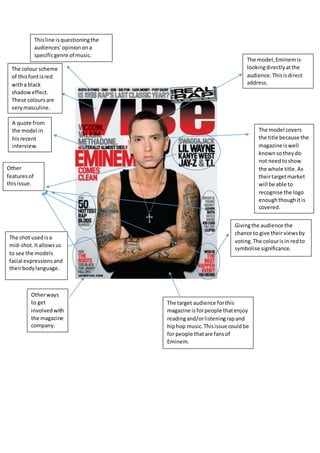
1. Thisline isquestioningthe
audiences’opinionona
specificgenre of music.
The model,Eminemis
lookingdirectlyatthe
audience.Thisisdirect
address.
A quote from
the model in
hisrecent
interview.
Givingthe audience the
chance to give theirviewsby
voting.The colourisin redto
symbolise significance.
Otherways
to get
involvedwith
the magazine
company.
The model covers
the title because the
magazine iswell
knownsotheydo
not needtoshow
the whole title.As
theirtargetmarket
will be able to
recognise the logo
enoughthoughitis
covered.
Other
featuresof
thisissue.
The target audience forthis
magazine isforpeople thatenjoy
readingand/orlisteningrapand
hiphop music.Thisissue couldbe
for people thatare fansof
Eminem.
The colour scheme
of thisfontisred
witha black
shadoweffect.
These coloursare
verymasculine.
The shot usedisa
mid-shot.Itallowsus
to see the models
facial expressionsand
theirbodylanguage.
2. The magazine name is
covered.Thisshowsthat
the magazine companydo
not have to showtheir
whole logoastheir
readerswill recognisethe
name of the magazine.
Collector’s
editionof
this
magazine
cover.
Barcode,price and issue
numberprintedhere.
The price has a small
typographysoit doesn’t
put off potential buyers
of thisissue.
A quote whichis
featuredfrom
someone inthisissue
of the magazine.
The colour pallet
usedismainlyblue
and pink.
The model’s
clothing
contrastswith
the white
background.
Newcontent
fromartists
whichare
featuredinthis
issue.
The word ‘plus!’has
an exclamationmark
afterit whichcan
show importance.
The colour redmakes
the word standout
alongwiththe bold
fontused.
The name of the
model isfeatured
here to show
those whoare
unaware of who
it is.
The target audience
for Q magazine isfor
olderpeople.Who
wouldlike toreada
more sophisticated
magazine compared
to kerrangfor
example,whichis
aimedat younger
musicfans.
3. The title isnot
inthe centre
but itis still
clearand
easily
readable.The
explanationof
whatNME
standsfor,this
ismost likely
for new
readers.
Blue andwhite
writingis
differenttothe
otherpiecesof
text.
The black against
the yellowmakes
thispiece of the
coverstand out.
The target audience
for thismagazine is
people whoare in
theirandup to
people intheir
thirties.
The model inthe
centre lookslike the
mostimportant
memberof thisband.
Otherbandswhichcan
keepthe readerupdated
aboutwhat ishappening
withthem.
The name of the band is
printedhere.The wobbly
writingof the word‘the’
can suggesttheir
personalityasaband.
Thispersonalitycouldbe
crazy possibly.
Referral tothe
magazines
website.
4. Rollingstone hasa
large audience and
withlarge age group
as it containsa
mixture of genres.
The magazine’slogois
coveredasit isvery
well knownsothey
oftenhave the artist
overlapthe logo.This
will appeal toreaders.
Thisimage of
Rihannaisa close up
shot.Thistype of
shotis more eye
catchingand it can
have an impacton
the reader.
Rihannaisaddressing
the audience directly
despite herlookingto
the side.
The layoutis simple
and isbasedaround
the artist onthe cover.
The headingtointroduce
Rihannaisnot bigand
bold.Thisbecause the
coveralreadyhas a large
image of her.