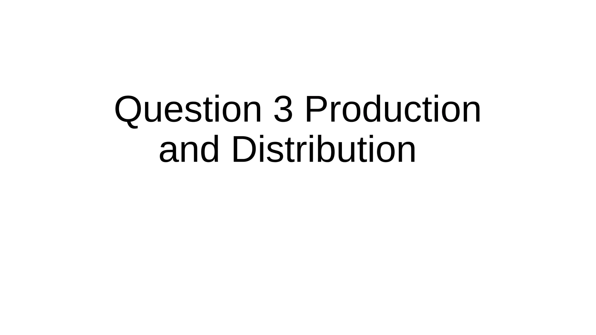
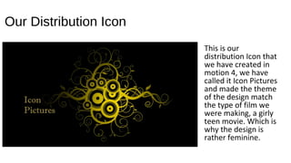
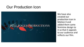
2. Our Distribution Icon
This is our
distribution Icon that
we have created in
motion 4, we have
called it Icon Pictures
and made the theme
of the design match
the type of film we
were making, a girly
teen movie. Which is
why the design is
rather feminine.
3. Our Production Icon
We have also
created our
production icon in
Motion 4 and
added them same
feminine design to
it so that it appeals
to our audience and
reflects our film.
4. Big Talk Productions
This was one of the companies we first thought about when creating
our own icons for production and distribution.
Our film is an independent British film so it is only appropriate if the
distribution of our film fits certain criteria, the production company
would have to be
- Low budget
- Independent
- British
- Local (In London)
5. Revolver Entertainment
This is another potential company that could have distributed our film
as it also fits the realistic criteria of our film. Both these companies
have also in the past distributed something out of the genre of our film.
6. Why these companies would work
When thinking of a company you also have to think about what kind of
audience a certain production would get, for example when you think
of a Disney movie you would automatically expect the audience to be
little kids. Both these companies have an audience which is at an
acceptable age group and therefore would have worked in the
production, distribution and exhibition of our film.
7. Inappropriate Companies
We couldn’t make our companies be major high budget American
companies as this would be unrealistic for our film. An example of a
company like this would be Walt Disney or Paramount. So when
creating our own icons we thought about the fact that our distribution
and production would have to be low budget and local.