The document discusses the fundamentals of typography including:
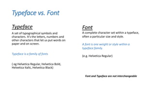
- Typeface refers to a set of characters within a font family, while font refers to a specific style within a typeface like bold or italic.
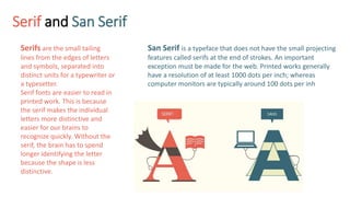
- Serif fonts have small lines at the end of strokes that make letters more distinctive for print, while sans serif fonts are better for online reading with lower resolution.
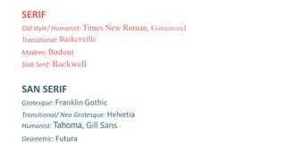
- Common type classifications include old style, transitional, modern, slab serif, grotesque, neo-grotesque, humanist, and geometric.
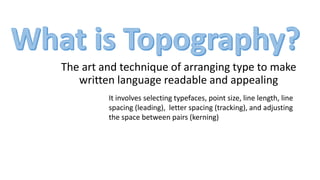
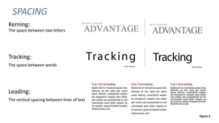
- Proper spacing includes kerning between letters, tracking between words, and leading between lines of text.