SlideShare a Scribd company logo
1 of 16
LAB#13 Responsive Web Design 
By Yaowaluck Promdee, Sumonta Kasemvilas 322432 Web Design Technology
What is “Responsive Web Design” ?
Getting Started 
1. Add a viewport 
2. Apply simple styling 
3. Set your first breakpoint 
4. Constrain the maximum width of the design 
5. Alter the padding and reduce text size 
6. Adapt elements to wide viewport 
7. Wrapping up 
https://developers.google.com/web/fundamentals/getting-started/your-first-multi-screen-site/responsive?hl=en
Content and structure Final Site
Add a viewport 
<meta name content="width=device-width, 
initial-scale=1"> 
Using the meta viewport value width=device-width instructs 
the page to match the screen’s width in device independent 
pixels. This allows the page to reflow content to match 
different screen sizes, whether rendered on a small mobile 
phone or a large desktop monitor.
Apply simple styling
Constrain the maximum width of the design
Adjusting Screen Resolution 
This shows the the most significant screen 
sizes, from the smallest to the largest.
Relative Fluid Layouts (%) 
Example 
http://learn.shayhowe.com/advanced-html-css/responsive-web-design
Set your first breakpoint
Meta Viewport
Apply media queries based on viewport size 
@media (query) { 
/* CSS Rules used when query matches */ 
} 
Example 
@media screen and (min-width: 800px) and (max-width: 
1200px) { .test { font-size: 14pt; } } 
http://www.designil.com/what-is-responsive-web-design-1.html
Media queries 
attribute Result 
min-width 
Rules applied for any browser width over the value defined in the 
query. 
max-width 
Rules applied for any browser width below the value defined in the 
query. 
min-height 
Rules applied for any browser height over the value defined in the 
query. 
max-height 
Rules applied for any browser height below the value defined in the 
query. 
orientation=portrait 
Rules applied for any browser where the height is greater than or 
equal to the width. 
orientation=landscape Rules for any browser where the width is greater than the height.
Assignment#13 
Create a Web page to present 
“Search Engine Optimization” 
from information provided using HTML5 and 
CSS can be Responsive on mobile screen 
In hours time
Q / A? 
Email:322432webdesign@gmail.com

More Related Content

What's hot

What's hot (20)

Style and Selector
Style and SelectorStyle and Selector
Style and Selector
 
Good/Bad Web Design
Good/Bad Web DesignGood/Bad Web Design
Good/Bad Web Design
 
CSS Basics
CSS BasicsCSS Basics
CSS Basics
 
Introduction to HTML and CSS
Introduction to HTML and CSSIntroduction to HTML and CSS
Introduction to HTML and CSS
 
CSS3, Media Queries, and Responsive Design
CSS3, Media Queries, and Responsive DesignCSS3, Media Queries, and Responsive Design
CSS3, Media Queries, and Responsive Design
 
Flexbox and Grid Layout
Flexbox and Grid LayoutFlexbox and Grid Layout
Flexbox and Grid Layout
 
CSS Dasar #9 : Inheritance
CSS Dasar #9 : InheritanceCSS Dasar #9 : Inheritance
CSS Dasar #9 : Inheritance
 
CSS Lists and Tables
CSS Lists and TablesCSS Lists and Tables
CSS Lists and Tables
 
CSS Dasar #8 : Pseudo-class
CSS Dasar #8 : Pseudo-classCSS Dasar #8 : Pseudo-class
CSS Dasar #8 : Pseudo-class
 
CSS3 Media Queries
CSS3 Media QueriesCSS3 Media Queries
CSS3 Media Queries
 
Intro to HTML and CSS basics
Intro to HTML and CSS basicsIntro to HTML and CSS basics
Intro to HTML and CSS basics
 
CSS - OOCSS, SMACSS and more
CSS - OOCSS, SMACSS and moreCSS - OOCSS, SMACSS and more
CSS - OOCSS, SMACSS and more
 
HTML and CSS crash course!
HTML and CSS crash course!HTML and CSS crash course!
HTML and CSS crash course!
 
Css animation
Css animationCss animation
Css animation
 
CSS Dasar #3 : Penempatan CSS
CSS Dasar #3 : Penempatan CSSCSS Dasar #3 : Penempatan CSS
CSS Dasar #3 : Penempatan CSS
 
Page layout with css
Page layout with cssPage layout with css
Page layout with css
 
Introduction to flexbox
Introduction  to  flexboxIntroduction  to  flexbox
Introduction to flexbox
 
Media queries A to Z
Media queries A to ZMedia queries A to Z
Media queries A to Z
 
Dynamic CSS: Transforms, Transitions, and Animation Basics
Dynamic CSS: Transforms, Transitions, and Animation BasicsDynamic CSS: Transforms, Transitions, and Animation Basics
Dynamic CSS: Transforms, Transitions, and Animation Basics
 
CSS Dasar #7 : Selector
CSS Dasar #7 : SelectorCSS Dasar #7 : Selector
CSS Dasar #7 : Selector
 

Similar to Lab#13 responsive web

How to Develop Responsive Websites - Website Development
How to Develop Responsive Websites - Website DevelopmentHow to Develop Responsive Websites - Website Development
How to Develop Responsive Websites - Website Development
Mukesoft - IT Consultants
 
Introduction to Responsive Web Design
Introduction to Responsive Web DesignIntroduction to Responsive Web Design
Introduction to Responsive Web Design
Shawn Calvert
 
Responsive Web Designs
Responsive Web DesignsResponsive Web Designs
Responsive Web Designs
Nusrat Khanom
 
Why should we build our website responsive
Why should we build our website responsiveWhy should we build our website responsive
Why should we build our website responsive
Omkarsoft Bangalore
 

Similar to Lab#13 responsive web (20)

How to Develop Responsive Websites - Website Development
How to Develop Responsive Websites - Website DevelopmentHow to Develop Responsive Websites - Website Development
How to Develop Responsive Websites - Website Development
 
Introduction to Responsive Web Design
Introduction to Responsive Web DesignIntroduction to Responsive Web Design
Introduction to Responsive Web Design
 
Responsive Web Designing Fundamentals
Responsive Web Designing FundamentalsResponsive Web Designing Fundamentals
Responsive Web Designing Fundamentals
 
Responsive web designing ppt(1)
Responsive web designing ppt(1)Responsive web designing ppt(1)
Responsive web designing ppt(1)
 
Responsive design: techniques and tricks to prepare your websites for the mul...
Responsive design: techniques and tricks to prepare your websites for the mul...Responsive design: techniques and tricks to prepare your websites for the mul...
Responsive design: techniques and tricks to prepare your websites for the mul...
 
Responsive Web Design
Responsive Web DesignResponsive Web Design
Responsive Web Design
 
Responsive_Web_Design
Responsive_Web_DesignResponsive_Web_Design
Responsive_Web_Design
 
Responsive Web Designs
Responsive Web DesignsResponsive Web Designs
Responsive Web Designs
 
Responsive Web Designed for your communication and marketing needs
Responsive Web Designed for your communication and marketing needsResponsive Web Designed for your communication and marketing needs
Responsive Web Designed for your communication and marketing needs
 
How to Project-Manage and Implement a Responsive Website
How to Project-Manage and Implement a Responsive WebsiteHow to Project-Manage and Implement a Responsive Website
How to Project-Manage and Implement a Responsive Website
 
Responsive web design
Responsive web designResponsive web design
Responsive web design
 
New
NewNew
New
 
Media queries and frameworks
Media queries and frameworksMedia queries and frameworks
Media queries and frameworks
 
Responsive web designing
Responsive web designingResponsive web designing
Responsive web designing
 
ResponsiveWebDesign
ResponsiveWebDesignResponsiveWebDesign
ResponsiveWebDesign
 
What is responsive web design
What is responsive web designWhat is responsive web design
What is responsive web design
 
Why should we build our website responsive
Why should we build our website responsiveWhy should we build our website responsive
Why should we build our website responsive
 
Responsive Web Design
Responsive Web DesignResponsive Web Design
Responsive Web Design
 
Optimizing Sites for Mobile Devices
Optimizing Sites for Mobile DevicesOptimizing Sites for Mobile Devices
Optimizing Sites for Mobile Devices
 
Responsive Web Design
Responsive Web DesignResponsive Web Design
Responsive Web Design
 

More from Yaowaluck Promdee

More from Yaowaluck Promdee (20)

A basic of UX for beginner
A basic of UX for beginnerA basic of UX for beginner
A basic of UX for beginner
 
TCAS 2563
TCAS 2563TCAS 2563
TCAS 2563
 
Portfolio design
Portfolio designPortfolio design
Portfolio design
 
Concept to creation story and storyboard
Concept to creation  story and storyboard Concept to creation  story and storyboard
Concept to creation story and storyboard
 
Observation and interviewing
Observation and interviewingObservation and interviewing
Observation and interviewing
 
Requirement gathering-and-lean-canvas
Requirement gathering-and-lean-canvasRequirement gathering-and-lean-canvas
Requirement gathering-and-lean-canvas
 
Good bad design
Good bad designGood bad design
Good bad design
 
Bootstrap Framework
Bootstrap Framework Bootstrap Framework
Bootstrap Framework
 
Graphic, Color and tools
Graphic, Color and toolsGraphic, Color and tools
Graphic, Color and tools
 
Page layouts flexible and fixed layout with CSS
Page layouts flexible and fixed layout with CSSPage layouts flexible and fixed layout with CSS
Page layouts flexible and fixed layout with CSS
 
Style and Selector Part2
Style and Selector Part2Style and Selector Part2
Style and Selector Part2
 
HTML 5
HTML 5HTML 5
HTML 5
 
Overview HTML, HTML5 and Validations
Overview HTML, HTML5 and Validations Overview HTML, HTML5 and Validations
Overview HTML, HTML5 and Validations
 
Web Interface
Web InterfaceWeb Interface
Web Interface
 
Game design
Game designGame design
Game design
 
Powerpoint
Powerpoint Powerpoint
Powerpoint
 
Program Interface
Program Interface Program Interface
Program Interface
 
Mobile Interface
Mobile Interface   Mobile Interface
Mobile Interface
 
Personas and scenario
Personas and scenarioPersonas and scenario
Personas and scenario
 
Ux design process
Ux design processUx design process
Ux design process
 

Recently uploaded

1029 - Danh muc Sach Giao Khoa 10 . pdf
1029 -  Danh muc Sach Giao Khoa 10 . pdf1029 -  Danh muc Sach Giao Khoa 10 . pdf
1029 - Danh muc Sach Giao Khoa 10 . pdf
QucHHunhnh
 
Beyond the EU: DORA and NIS 2 Directive's Global Impact
Beyond the EU: DORA and NIS 2 Directive's Global ImpactBeyond the EU: DORA and NIS 2 Directive's Global Impact
Beyond the EU: DORA and NIS 2 Directive's Global Impact
PECB
 
1029-Danh muc Sach Giao Khoa khoi 6.pdf
1029-Danh muc Sach Giao Khoa khoi  6.pdf1029-Danh muc Sach Giao Khoa khoi  6.pdf
1029-Danh muc Sach Giao Khoa khoi 6.pdf
QucHHunhnh
 

Recently uploaded (20)

Z Score,T Score, Percential Rank and Box Plot Graph
Z Score,T Score, Percential Rank and Box Plot GraphZ Score,T Score, Percential Rank and Box Plot Graph
Z Score,T Score, Percential Rank and Box Plot Graph
 
This PowerPoint helps students to consider the concept of infinity.
This PowerPoint helps students to consider the concept of infinity.This PowerPoint helps students to consider the concept of infinity.
This PowerPoint helps students to consider the concept of infinity.
 
Mixin Classes in Odoo 17 How to Extend Models Using Mixin Classes
Mixin Classes in Odoo 17  How to Extend Models Using Mixin ClassesMixin Classes in Odoo 17  How to Extend Models Using Mixin Classes
Mixin Classes in Odoo 17 How to Extend Models Using Mixin Classes
 
Mehran University Newsletter Vol-X, Issue-I, 2024
Mehran University Newsletter Vol-X, Issue-I, 2024Mehran University Newsletter Vol-X, Issue-I, 2024
Mehran University Newsletter Vol-X, Issue-I, 2024
 
TỔNG ÔN TẬP THI VÀO LỚP 10 MÔN TIẾNG ANH NĂM HỌC 2023 - 2024 CÓ ĐÁP ÁN (NGỮ Â...
TỔNG ÔN TẬP THI VÀO LỚP 10 MÔN TIẾNG ANH NĂM HỌC 2023 - 2024 CÓ ĐÁP ÁN (NGỮ Â...TỔNG ÔN TẬP THI VÀO LỚP 10 MÔN TIẾNG ANH NĂM HỌC 2023 - 2024 CÓ ĐÁP ÁN (NGỮ Â...
TỔNG ÔN TẬP THI VÀO LỚP 10 MÔN TIẾNG ANH NĂM HỌC 2023 - 2024 CÓ ĐÁP ÁN (NGỮ Â...
 
On National Teacher Day, meet the 2024-25 Kenan Fellows
On National Teacher Day, meet the 2024-25 Kenan FellowsOn National Teacher Day, meet the 2024-25 Kenan Fellows
On National Teacher Day, meet the 2024-25 Kenan Fellows
 
Presentation by Andreas Schleicher Tackling the School Absenteeism Crisis 30 ...
Presentation by Andreas Schleicher Tackling the School Absenteeism Crisis 30 ...Presentation by Andreas Schleicher Tackling the School Absenteeism Crisis 30 ...
Presentation by Andreas Schleicher Tackling the School Absenteeism Crisis 30 ...
 
Energy Resources. ( B. Pharmacy, 1st Year, Sem-II) Natural Resources
Energy Resources. ( B. Pharmacy, 1st Year, Sem-II) Natural ResourcesEnergy Resources. ( B. Pharmacy, 1st Year, Sem-II) Natural Resources
Energy Resources. ( B. Pharmacy, 1st Year, Sem-II) Natural Resources
 
General Principles of Intellectual Property: Concepts of Intellectual Proper...
General Principles of Intellectual Property: Concepts of Intellectual  Proper...General Principles of Intellectual Property: Concepts of Intellectual  Proper...
General Principles of Intellectual Property: Concepts of Intellectual Proper...
 
Ecological Succession. ( ECOSYSTEM, B. Pharmacy, 1st Year, Sem-II, Environmen...
Ecological Succession. ( ECOSYSTEM, B. Pharmacy, 1st Year, Sem-II, Environmen...Ecological Succession. ( ECOSYSTEM, B. Pharmacy, 1st Year, Sem-II, Environmen...
Ecological Succession. ( ECOSYSTEM, B. Pharmacy, 1st Year, Sem-II, Environmen...
 
Holdier Curriculum Vitae (April 2024).pdf
Holdier Curriculum Vitae (April 2024).pdfHoldier Curriculum Vitae (April 2024).pdf
Holdier Curriculum Vitae (April 2024).pdf
 
Food Chain and Food Web (Ecosystem) EVS, B. Pharmacy 1st Year, Sem-II
Food Chain and Food Web (Ecosystem) EVS, B. Pharmacy 1st Year, Sem-IIFood Chain and Food Web (Ecosystem) EVS, B. Pharmacy 1st Year, Sem-II
Food Chain and Food Web (Ecosystem) EVS, B. Pharmacy 1st Year, Sem-II
 
1029 - Danh muc Sach Giao Khoa 10 . pdf
1029 -  Danh muc Sach Giao Khoa 10 . pdf1029 -  Danh muc Sach Giao Khoa 10 . pdf
1029 - Danh muc Sach Giao Khoa 10 . pdf
 
Sociology 101 Demonstration of Learning Exhibit
Sociology 101 Demonstration of Learning ExhibitSociology 101 Demonstration of Learning Exhibit
Sociology 101 Demonstration of Learning Exhibit
 
ComPTIA Overview | Comptia Security+ Book SY0-701
ComPTIA Overview | Comptia Security+ Book SY0-701ComPTIA Overview | Comptia Security+ Book SY0-701
ComPTIA Overview | Comptia Security+ Book SY0-701
 
Unit-IV- Pharma. Marketing Channels.pptx
Unit-IV- Pharma. Marketing Channels.pptxUnit-IV- Pharma. Marketing Channels.pptx
Unit-IV- Pharma. Marketing Channels.pptx
 
Unit-IV; Professional Sales Representative (PSR).pptx
Unit-IV; Professional Sales Representative (PSR).pptxUnit-IV; Professional Sales Representative (PSR).pptx
Unit-IV; Professional Sales Representative (PSR).pptx
 
2024-NATIONAL-LEARNING-CAMP-AND-OTHER.pptx
2024-NATIONAL-LEARNING-CAMP-AND-OTHER.pptx2024-NATIONAL-LEARNING-CAMP-AND-OTHER.pptx
2024-NATIONAL-LEARNING-CAMP-AND-OTHER.pptx
 
Beyond the EU: DORA and NIS 2 Directive's Global Impact
Beyond the EU: DORA and NIS 2 Directive's Global ImpactBeyond the EU: DORA and NIS 2 Directive's Global Impact
Beyond the EU: DORA and NIS 2 Directive's Global Impact
 
1029-Danh muc Sach Giao Khoa khoi 6.pdf
1029-Danh muc Sach Giao Khoa khoi  6.pdf1029-Danh muc Sach Giao Khoa khoi  6.pdf
1029-Danh muc Sach Giao Khoa khoi 6.pdf
 

Lab#13 responsive web

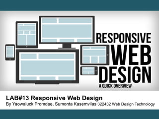
  • 1. LAB#13 Responsive Web Design By Yaowaluck Promdee, Sumonta Kasemvilas 322432 Web Design Technology
  • 2. What is “Responsive Web Design” ?
  • 3.
  • 4. Getting Started 1. Add a viewport 2. Apply simple styling 3. Set your first breakpoint 4. Constrain the maximum width of the design 5. Alter the padding and reduce text size 6. Adapt elements to wide viewport 7. Wrapping up https://developers.google.com/web/fundamentals/getting-started/your-first-multi-screen-site/responsive?hl=en
  • 6. Add a viewport <meta name content="width=device-width, initial-scale=1"> Using the meta viewport value width=device-width instructs the page to match the screen’s width in device independent pixels. This allows the page to reflow content to match different screen sizes, whether rendered on a small mobile phone or a large desktop monitor.
  • 8. Constrain the maximum width of the design
  • 9. Adjusting Screen Resolution This shows the the most significant screen sizes, from the smallest to the largest.
  • 10. Relative Fluid Layouts (%) Example http://learn.shayhowe.com/advanced-html-css/responsive-web-design
  • 11. Set your first breakpoint
  • 13. Apply media queries based on viewport size @media (query) { /* CSS Rules used when query matches */ } Example @media screen and (min-width: 800px) and (max-width: 1200px) { .test { font-size: 14pt; } } http://www.designil.com/what-is-responsive-web-design-1.html
  • 14. Media queries attribute Result min-width Rules applied for any browser width over the value defined in the query. max-width Rules applied for any browser width below the value defined in the query. min-height Rules applied for any browser height over the value defined in the query. max-height Rules applied for any browser height below the value defined in the query. orientation=portrait Rules applied for any browser where the height is greater than or equal to the width. orientation=landscape Rules for any browser where the width is greater than the height.
  • 15. Assignment#13 Create a Web page to present “Search Engine Optimization” from information provided using HTML5 and CSS can be Responsive on mobile screen In hours time
  • 16. Q / A? Email:322432webdesign@gmail.com

Editor's Notes

  1. ออกแบบให้เรียบง่าย เริ่มที่หน้าจอเล็กสุดเสมอ กำหนดขนาดแบบ Relative Fluid Layouts (%) หา Breakpoints แล้วเขียน Media Queries กำหนด Meta Viewport เช็คกับ Device
  2. เริ่มที่หน้าจอเล็กสุดเสมอ Following the principles of Mobile First web development, we start with a narrow viewport — similar to a mobile phone — and build for that experience first. Then we scale up to larger device classes. We can do this by making our viewport wider and making a judgment call on whether the design and layout look right. Earlier we created a couple of different high-level designs for how our content should be displayed. Now we need make our page adapt to those different layouts. We do this by making a decision on where to place our breakpoints — a point where the layout and styles change — based on how the content fits the screen-size.
  3. Even for a basic page, you must always include a viewport meta tag. The viewport is the most critical component you need for building multi-device experiences. Without it, your site will not work well on a mobile device. The viewport indicates to the browser that the page needs to be scaled to fit the screen. There are many different configurations that you can specify for your viewport to control the display of the page. As a default, we recommend:
  4. @media screen and (กฏ 1) and (กฏ 2) and ... { /* CSS ที่ต้องการใส่ถ้าเครื่องตรงตามกฏด้านบน */ }