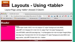
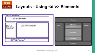
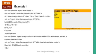
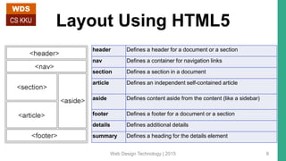
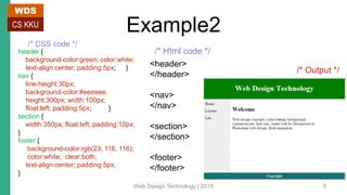
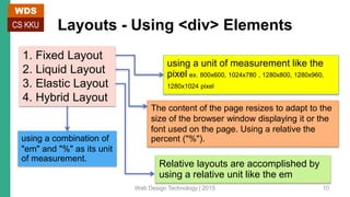
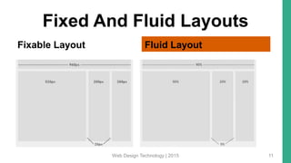
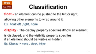
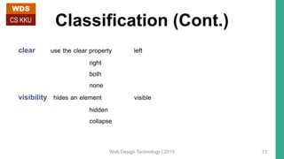
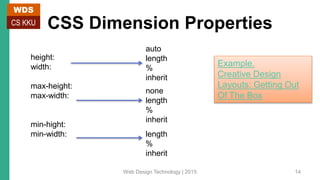
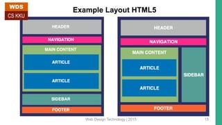
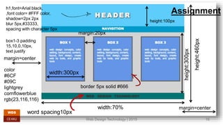
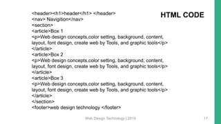
PAGE LAYOUTS (FLEXIBLE AND FIXED LAYOUT)
WDS
CS KKU
322 432 Web Design Technology
By Yaowaluck Promdee, Sumonta Kasemvilas
Computer Science Khon Kaen University
Web Design Technology | 2015 1
WDS
CS KKU
Web Design Technology | 2015 2
Layouts
Page Header
Page Body
Page Footer
{
{
{
WDS
CS KKU
Web Design Technology | 2015 3
Layouts – Using <table> vs <div>
WDS
CS KKU
Web Design Technology | 2015 4
Layouts - Using <table>
Layout Page using <table> showed 2 Column
<table style="width:100%"><tr><td colspan="2" style="background-color:#600;
color:#fff"><h1>Header</h1></td></tr><tr valign="top"><td style="background-
color:#FF0080; width:20%;text-align:top; "><b>Navigation</b></td><td style="height:200px;
text-align:top;">Content</td></tr><tr><td colspan="2" style="background-color:#600; text-
align:center; color:#fff">Footer</td></tr> </table>
WDS
CS KKU
Web Design Technology | 2015 5
Layouts - Using <div> Elements
WDS
CS KKU
Web Design Technology | 2015 6
Example1
<div id="container" style="width:500px”>
<div id="header" style="background-color:#FFA500;">
<h1 style="margin-bottom:0;">Main Title of Web Page</h1></div>
<div id="menu" style="background-color:#FFD700;
height:200px;width:100px;float:left;">
<b>Menu</b><br>
HTML<br>
CSS<br>
JavaScript</div>
<div id="content" style="background-color:#EEEEEE;height:200px;width:400px;float:left;">
Content goes here</div>
<div id="footer" style="background-color:#FFA500;clear:both;text-align:center;">
Copyright © W3Schools.com</div>
</div>
WDS
CS KKU
Web Design Technology | 2015 7
Layout Using HTML5
header Defines a header for a document or a section
nav Defines a container for navigation links
section Defines a section in a document
article Defines an independent self-contained article
aside Defines content aside from the content (like a sidebar)
footer Defines a footer for a document or a section
details Defines additional details
summary Defines a heading for the details element
WDS
CS KKU
Web Design Technology | 2015 8
Example2
header {
background-color:green; color:white;
text-align:center; padding:5px; }
nav {
line-height:30px;
background-color:#eeeeee;
height:300px; width:100px;
float:left; padding:5px; }
section {
width:350px; float:left; padding:10px;
}
footer {
background-color:rgb(23, 116, 116);
color:white; clear:both;
text-align:center; padding:5px;
}
<header>
</header>
<nav>
</nav>
<section>
</section>
<footer>
</footer>
/* Html code */
/* CSS code */
/* Output */
WDS
CS KKU
Web Design Technology | 2015 9
Layouts - Using <div> Elements
using a unit of measurement like the
pixel ex. 800x600, 1024x780 , 1280x800, 1280x960,
1280x1024 pixel
The content of the page resizes to adapt to the
size of the browser window displaying it or the
font used on the page. Using a relative the
percent ("%").
Relative layouts are accomplished by
using a relative unit like the em
using a combination of
"em" and "%" as its unit
of measurement.
1. Fixed Layout
2. Liquid Layout
3. Elastic Layout
4. Hybrid Layout
WDS
CS KKU
Web Design Technology | 2015 10
Fixed And Fluid Layouts
Fixable Layout Fluid Layout
Web Design Technology | 2015 11
Classification
float - an element can be pushed to the left or right,
allowing other elements to wrap around it.
Ex. float:left ,right, none
display- The display property specifies if/how an element
is displayed, and the visibility property specifies
if an element should be visible or hidden.
Ex. Display > none , block, inline
WDS
CS KKU
Web Design Technology | 2015 12
Classification (Cont.)
clear use the clear property left
right
both
none
visibility hides an element visible
hidden
collapse
WDS
CS KKU
Web Design Technology | 2015 13
CSS Dimension Properties
height:
width:
max-height:
max-width:
min-hight:
min-width:
auto
length
%
inherit
none
length
%
inherit
length
%
inherit
Example.
Creative Design
Layouts: Getting Out
Of The Box
WDS
CS KKU
Web Design Technology | 2015 14
Example Layout HTML5
Web Design Technology | 2015 15
WDS
CS KKU
Web Design Technology | 2015 16
WDS
CS KKU
Assignmenth1,font=Arial black,
,font color= #FFF color,
shadow=2px 2px
blur 5px,#33333,
spacing with character 5px
width:70%
height:460px
height:300px
height:100px
width:300px
border 5px solid #666
margin=center
margin=center
margin:20px
word spacing10px
box1-3 padding
15,10,0,10px,
text justify
color
#6CF
#09C
lightgrey
cornflowerblue
rgb(23,116,116)
Web Design Technology | 2015 17
<header><h1>header</h1> </header>
<nav> Navigition</nav>
<section>
<article>Box 1
<p>Web design concepts,color setting, background, content,
layout, font design, create web by Tools, and graphic tools</p>
</article>
<article>Box 2
<p>Web design concepts,color setting, background, content,
layout, font design, create web by Tools, and graphic tools</p>
</article>
<article>Box 3
<p>Web design concepts,color setting, background, content,
layout, font design, create web by Tools, and graphic tools</p>
</article>
</section>
<footer>web design technology </footer>
HTML CODE

Page layouts flexible and fixed layout with CSS

  • 1.
    PAGE LAYOUTS (FLEXIBLEAND FIXED LAYOUT) WDS CS KKU 322 432 Web Design Technology By Yaowaluck Promdee, Sumonta Kasemvilas Computer Science Khon Kaen University Web Design Technology | 2015 1
  • 2.
    WDS CS KKU Web DesignTechnology | 2015 2
  • 3.
    Layouts Page Header Page Body PageFooter { { { WDS CS KKU Web Design Technology | 2015 3
  • 4.
    Layouts – Using<table> vs <div> WDS CS KKU Web Design Technology | 2015 4
  • 5.
    Layouts - Using<table> Layout Page using <table> showed 2 Column <table style="width:100%"><tr><td colspan="2" style="background-color:#600; color:#fff"><h1>Header</h1></td></tr><tr valign="top"><td style="background- color:#FF0080; width:20%;text-align:top; "><b>Navigation</b></td><td style="height:200px; text-align:top;">Content</td></tr><tr><td colspan="2" style="background-color:#600; text- align:center; color:#fff">Footer</td></tr> </table> WDS CS KKU Web Design Technology | 2015 5
  • 6.
    Layouts - Using<div> Elements WDS CS KKU Web Design Technology | 2015 6
  • 7.
    Example1 <div id="container" style="width:500px”> <divid="header" style="background-color:#FFA500;"> <h1 style="margin-bottom:0;">Main Title of Web Page</h1></div> <div id="menu" style="background-color:#FFD700; height:200px;width:100px;float:left;"> <b>Menu</b><br> HTML<br> CSS<br> JavaScript</div> <div id="content" style="background-color:#EEEEEE;height:200px;width:400px;float:left;"> Content goes here</div> <div id="footer" style="background-color:#FFA500;clear:both;text-align:center;"> Copyright © W3Schools.com</div> </div> WDS CS KKU Web Design Technology | 2015 7
  • 8.
    Layout Using HTML5 headerDefines a header for a document or a section nav Defines a container for navigation links section Defines a section in a document article Defines an independent self-contained article aside Defines content aside from the content (like a sidebar) footer Defines a footer for a document or a section details Defines additional details summary Defines a heading for the details element WDS CS KKU Web Design Technology | 2015 8
  • 9.
    Example2 header { background-color:green; color:white; text-align:center;padding:5px; } nav { line-height:30px; background-color:#eeeeee; height:300px; width:100px; float:left; padding:5px; } section { width:350px; float:left; padding:10px; } footer { background-color:rgb(23, 116, 116); color:white; clear:both; text-align:center; padding:5px; } <header> </header> <nav> </nav> <section> </section> <footer> </footer> /* Html code */ /* CSS code */ /* Output */ WDS CS KKU Web Design Technology | 2015 9
  • 10.
    Layouts - Using<div> Elements using a unit of measurement like the pixel ex. 800x600, 1024x780 , 1280x800, 1280x960, 1280x1024 pixel The content of the page resizes to adapt to the size of the browser window displaying it or the font used on the page. Using a relative the percent ("%"). Relative layouts are accomplished by using a relative unit like the em using a combination of "em" and "%" as its unit of measurement. 1. Fixed Layout 2. Liquid Layout 3. Elastic Layout 4. Hybrid Layout WDS CS KKU Web Design Technology | 2015 10
  • 11.
    Fixed And FluidLayouts Fixable Layout Fluid Layout Web Design Technology | 2015 11
  • 12.
    Classification float - anelement can be pushed to the left or right, allowing other elements to wrap around it. Ex. float:left ,right, none display- The display property specifies if/how an element is displayed, and the visibility property specifies if an element should be visible or hidden. Ex. Display > none , block, inline WDS CS KKU Web Design Technology | 2015 12
  • 13.
    Classification (Cont.) clear usethe clear property left right both none visibility hides an element visible hidden collapse WDS CS KKU Web Design Technology | 2015 13
  • 14.
  • 15.
    Example Layout HTML5 WebDesign Technology | 2015 15 WDS CS KKU
  • 16.
    Web Design Technology| 2015 16 WDS CS KKU Assignmenth1,font=Arial black, ,font color= #FFF color, shadow=2px 2px blur 5px,#33333, spacing with character 5px width:70% height:460px height:300px height:100px width:300px border 5px solid #666 margin=center margin=center margin:20px word spacing10px box1-3 padding 15,10,0,10px, text justify color #6CF #09C lightgrey cornflowerblue rgb(23,116,116)
  • 17.
    Web Design Technology| 2015 17 <header><h1>header</h1> </header> <nav> Navigition</nav> <section> <article>Box 1 <p>Web design concepts,color setting, background, content, layout, font design, create web by Tools, and graphic tools</p> </article> <article>Box 2 <p>Web design concepts,color setting, background, content, layout, font design, create web by Tools, and graphic tools</p> </article> <article>Box 3 <p>Web design concepts,color setting, background, content, layout, font design, create web by Tools, and graphic tools</p> </article> </section> <footer>web design technology </footer> HTML CODE

Editor's Notes

  • #11 Fixed layout - A fixed layout in web design is one that uses a unit of measurement that does not depend on other factors, such as the size of the font or the dimensions of the browser window, to determine the width of a web page,  To put it another way, the website appears with a constant size no matter how big the browser window is, or what sort of font is chosen for the page. Liquid Layout - Such a page layout, which stretches or shrinks to fill the browser window according to its size, is called, among other things, a "relative" layout. Other names for such a layout include a "liquid" or "fluid" layout, since the page spreads itself to fill the width of a browser window the way a liquid spreads out to fill the entire surface of its container when poured into it. It is sometimes also called a "flexible" layout and an "elastic" layout. It is sometimes also called a "flexible" layout and an "elastic" layout. When you create a web page that uses the em to specify the width of a column, or what is termed "elastic" in Dreamweaver CS4 and CS3, the size of your columns depend on the size of the fonts used on your page. Some of you may be wondering at this point, "In what sense is such a layout relative? Can't I specify the font and thus effectively create a fixed width page?“ A hybrid layout uses a combination of "em" and "%" as its unit of measurement.
  • #12 Fixed Purpose - Fixed-width layouts are much easier to use and easier to customize in terms of design. - Widths are the same for every browser, so there is less hassle with images, forms, video and other content that are fixed-width. - There is no need for min-width or max-width, which isn’t supported by every browser anyway. - Even if a website is designed to be compatible with the smallest screen resolution, 800×600, the content will still be wide enough at a larger resolution to be easily legible. Fluid Purpose - Fluid web page design can be more user-friendly, because it adjusts to the user’s set up. - The amount of extra white space is similar between all browsers and screen resolutions, which can be more visually appealing. - If designed well, a fluid layout can eliminate horizontal scroll bars in smaller screen resolutions.
  • #13 float - ใช้กำหนดการจัดวางรูปภาพ หรือวัตถุที่ต้องการว่าจะให้วางอยู่ด้านไหน ของข้อความ None ไม่แสดงวัตถุนั้น Block แสดงเป็นบล็อกโดยขึ้นบรรทัดใหม่ก่อน Inline เป็นค่า default by element แสดงเป็นแบบ inline ไม่มีการขึ้นบรรทัดใหม่ visibility:hidden hides an element, but it will still take up the same space as before. The element will be hidden, but still affect the layout.
  • #14 Clear Elements after the floating element will flow around it. To avoid this, use the clear property. The clear property specifies which sides of an element other floating elements are not allowed. Add a text line into the image gallery, using the clear property: Visibility visibility:hidden hides an element, but it will still take up the same space as before. The element will be hidden, but still affect the layout.