Downloaded 229 times


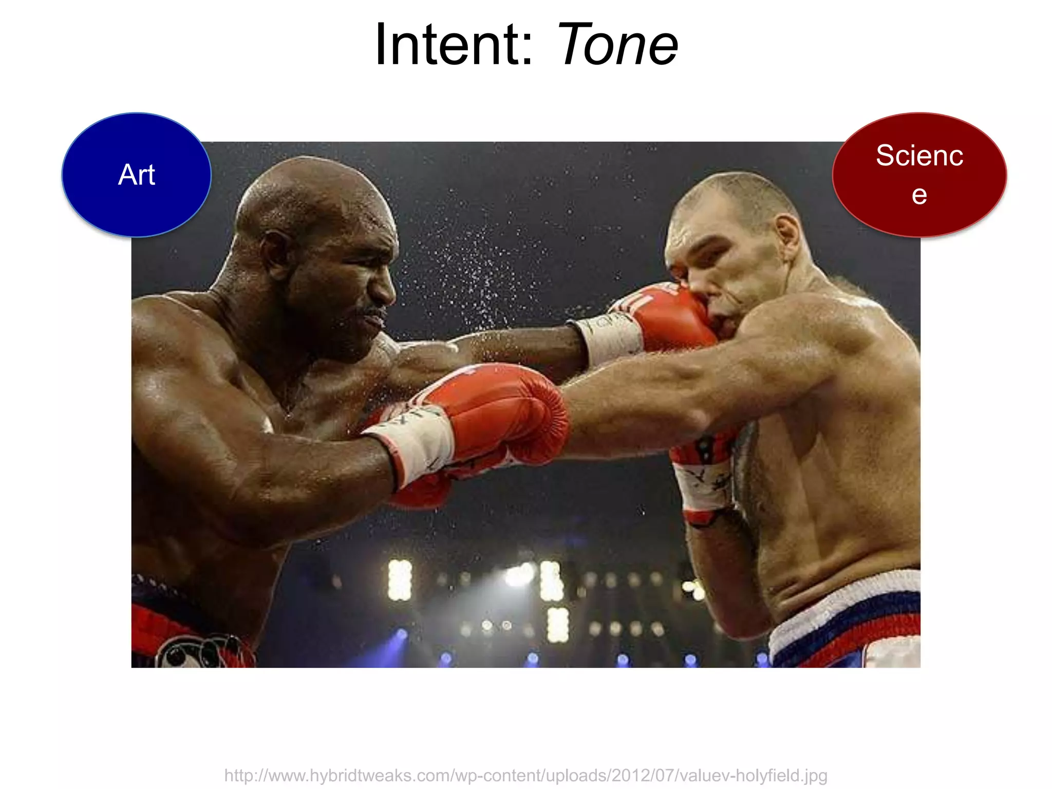
![Intent: Tone
Getting [visualisation] right is
much more a science than an
art,
which we can only achieve by
studying human perception.
Stephen Few
http://www.interaction-design.org/encyclopedia/data_visualization_for_human_perception.html](https://image.slidesharecdn.com/andykirk-facebooktalkslideshare-130110204144-phpapp02/75/Andy-Kirk-s-Facebook-Talk-17-2048.jpg)


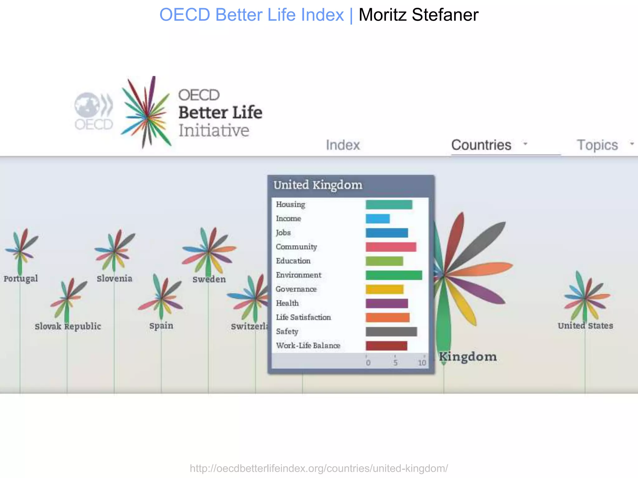

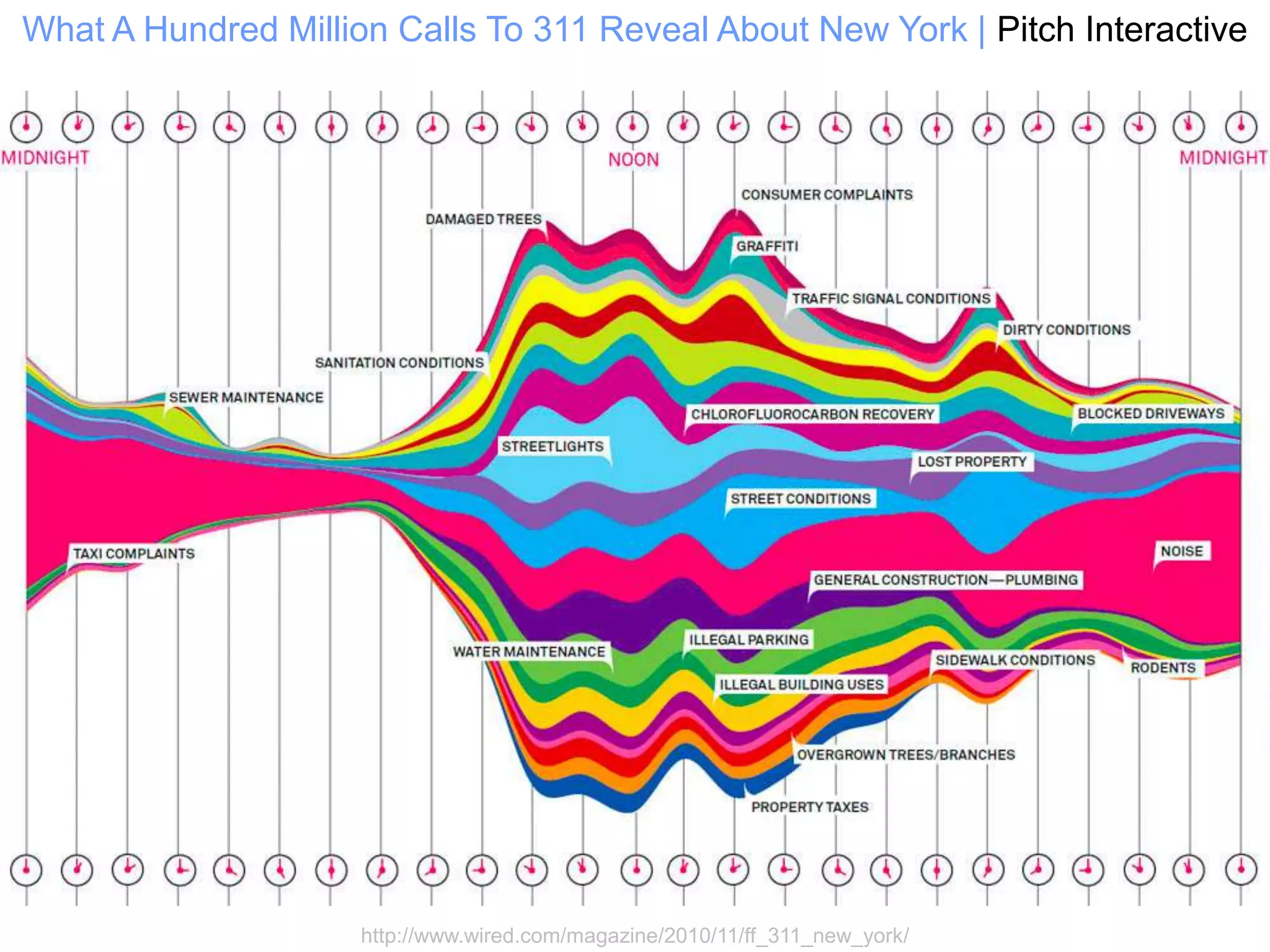


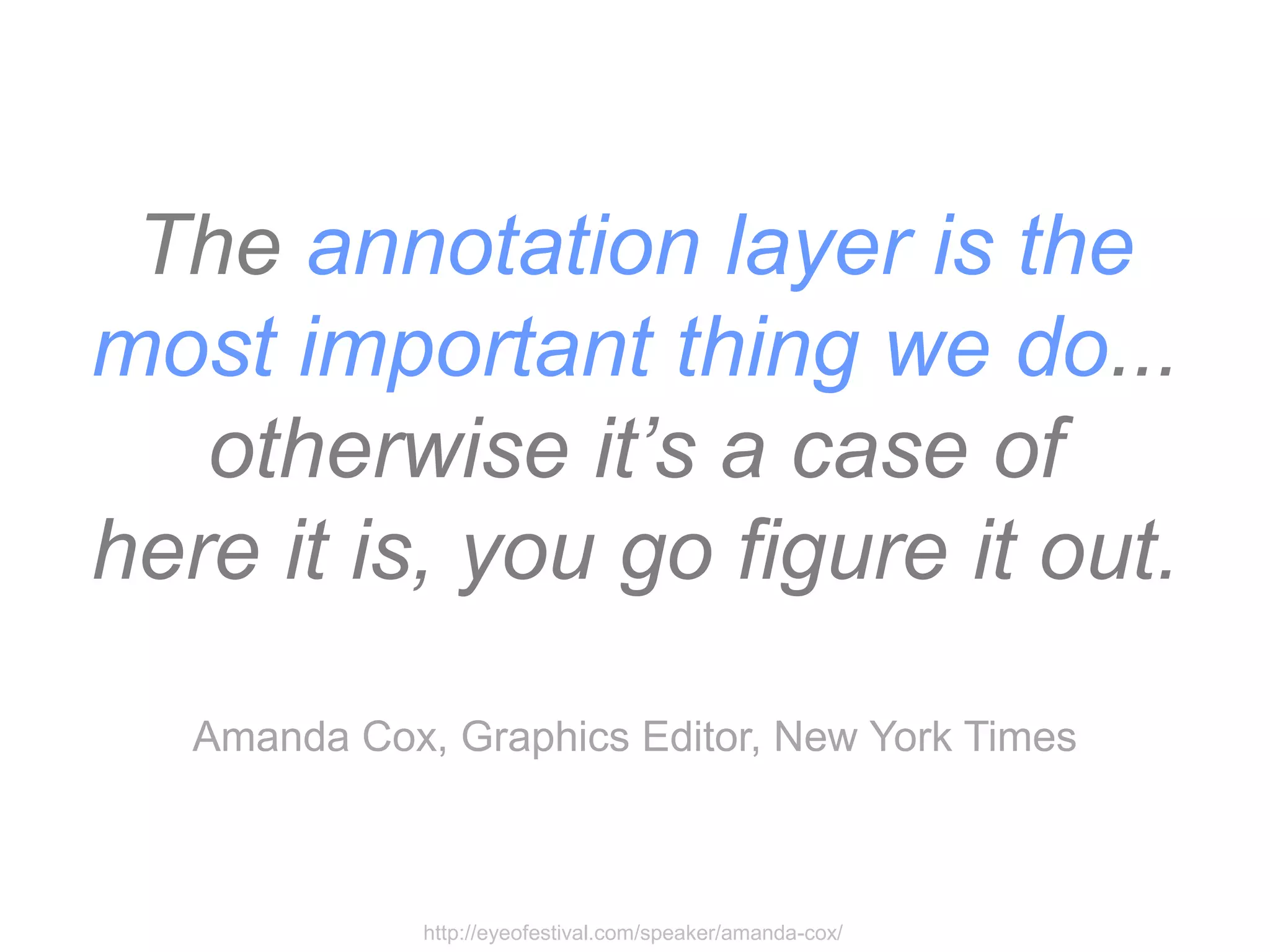
![Telling [or Framing]
Stories](https://image.slidesharecdn.com/andykirk-facebooktalkslideshare-130110204144-phpapp02/75/Andy-Kirk-s-Facebook-Talk-44-2048.jpg)


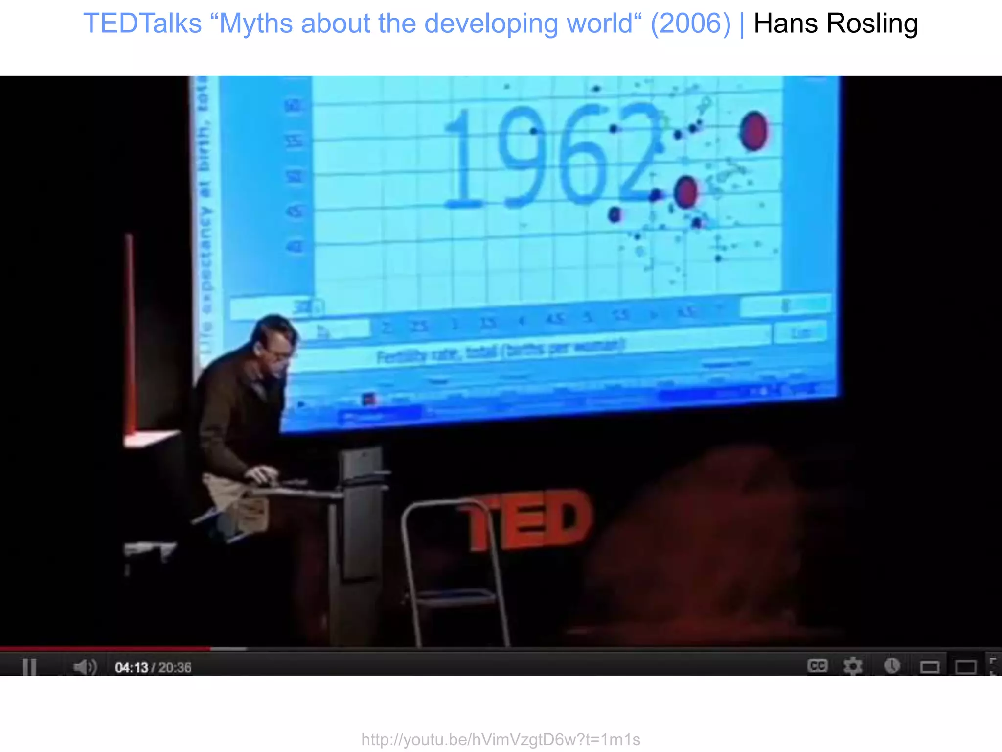
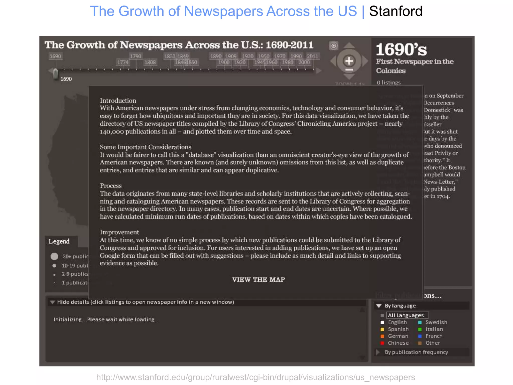
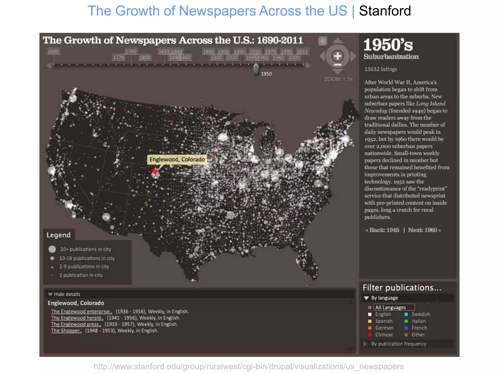


Here are 6 common narrative visualization styles: 1. Magazine Style - Uses a dot point map or outline to guide the reader through key events or findings. 2. Annotated Chart - Adds descriptive text, arrows, or other annotations directly onto a chart or graphic to provide context and explanation. 3. Partitioned Poster - Divides the space into sections or panels to sequentially unfold a story. 4. Flow Chart - Uses arrows, nodes, and other flow elements to depict the progression of a process or sequence of events over time. 5. Comic Strip - Adopts a comic book format using panels, speech bubbles, and other comic conventions to narrate. 6. Slide - Pre


