
Recommended
More Related Content
What's hot
What's hot (19)
Viewers also liked
Similar to Creating front cover and music magazine layout
Similar to Creating front cover and music magazine layout (20)
More from sarah06489
More from sarah06489 (20)
Recently uploaded
Recently uploaded (20)
Creating front cover and music magazine layout
- 1. Creating front cover and music magazine
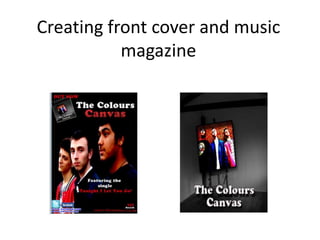
- 2. As a group we decided to take a picture of a canvas and then Photoshop the image of the band members on it.
- 3. We decided to use a low angle shot of the band members because this would make them look dominant and powerful. We put Jordan in the middle in order to emphasise that he is the leader singer and therefore we also made him look into the camera. We placed the band against a wall because we wanted the background to portray a natural look. We made the colours of their clothing look brighter by increasing the levels of lighting. The reason why we did this is because we wanted them to stand out. Also it would tie in with the other colour schemes on the cover. In addition, we lightened up the area around their face as in the original picture it was quiet dark and we were not able to see their expression.
- 4. We made the typography look simple in order to put more emphasise on the band members and therefore we also made the background dark so that the image on the canvas would stand out. We chose to write the bands name and album name in big bold white letters with using a shadow effect behind it.
- 5. Our first idea was to use the same image of the front cover for the music magazine because it would be easier for audiences to recognise the image if they want to buy to buy the album. We wanted to use floating quotes in order to show that audiences that the CD is worth buying because it has been rated by well known music companies and given 5stars. However, we decided to change the magazine layout slightly because when asking opinions from audience they told us that the magazine does not really look like a music music magazine advert. They also suggested that we should add typical magazine advert connotations i.e website of the band, face book and twitter links, record label etc. On the final cover, we decided to use the same image that is on the back cover of the CD because we wanted to upload the image of the front cover so therefore if we used the same image for the magazine it would have overlapped too much. We tried to keep the same colour scheme throughout in order to show the continuity between our products (fron cover, back cover and inlays). We also toke our audience feedback serious and applied typical magazine advert conventions ie we placed their facebook and twitter links as audiences might want to find more information about them.