1. Chris Brown – Fame Album
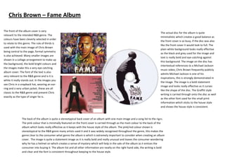
The front of the album cover is very
The actual disc for the album is quite
relevant to the intended R&B genre. The
minimalistic which creates a good balance as
colours have been cleverly selected in order
the front cover is so busy, if the disc was also
to relate to this genre. The rule of thirds is
like the front cover it would look to full. The
used with the main image of Chris Brown
plain white background looks really effective
being central to the page, formal symmetry
as the black and grey used for the image and
is also achieved. Many smaller images are
text is really bold and eye-catching against
shown in a collage arrangement to make up
this background. The image on the disc has
the background, the bold bright colours and
intertextual references to a Michael Jackson
the images make this a very eye catching
music video, Chris Brown frequently publicly
album cover. The font of the text is also
admits Michael Jackson is one of his
very relevant to the R&B genre and is it is
inspirations, this is strongly demonstrated in
white it really stands out. In the images you
the image. The image is a bold statement
see Chris in a snapback hat, wearing an ear-
image and looks really effective as it curves
ring and a very urban jacket, these are all
like the shape of the disc. The Graffiti style
classic to the R&B genre and present Chris
writing is carried through onto the disc as well
exactly as the type of singer he is.
as the other font used for the small print
information which sticks to the house style
and shows the house style is consistent.
The back of the album is quite a stereotypical back cover of an album with one main image and a song list to the right.
The pink colour that is minimally featured on the front cover is carried through as the main colour to the back of the
album which looks really effective as it keeps with the house style of the album. The pink/red colour shown is
stereotypical to the R&B genre many artists used it and it was widely recognised throughout the genre, this makes the
genre clear to the consumer what genre the album is which is extremely important to consider when creating an album
cover. The image is quite a statement image as it is really bold and really unusual and leaves the consumer wondering
why he has a helmet on which creates a sense of mystery which will help in the sale of the album as it entices the
consumer into buying it. The album list and all other information are neatly on the right hand side, the writing is bold
and clear and the font is consistent throughout keeping to the house style.