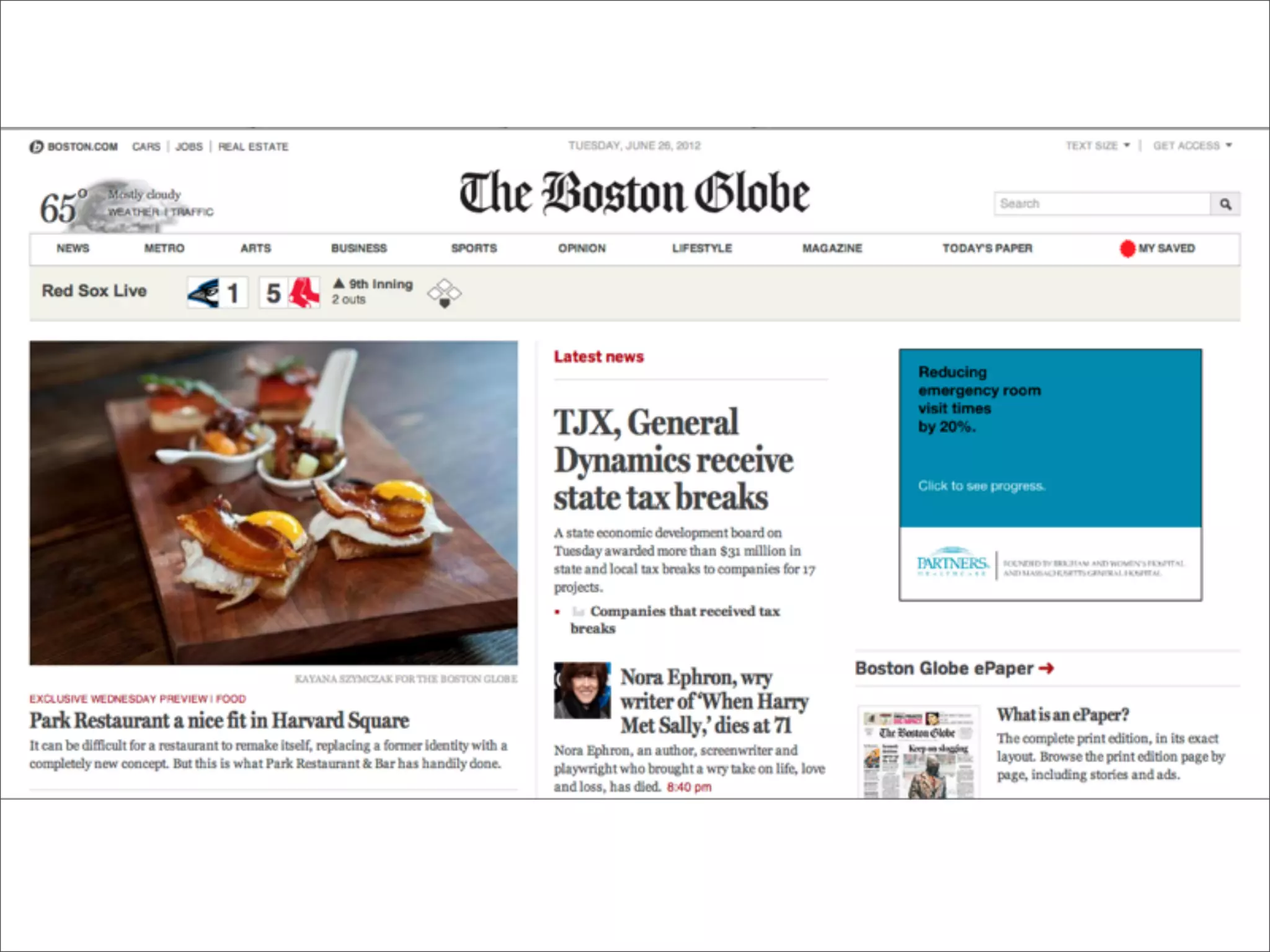
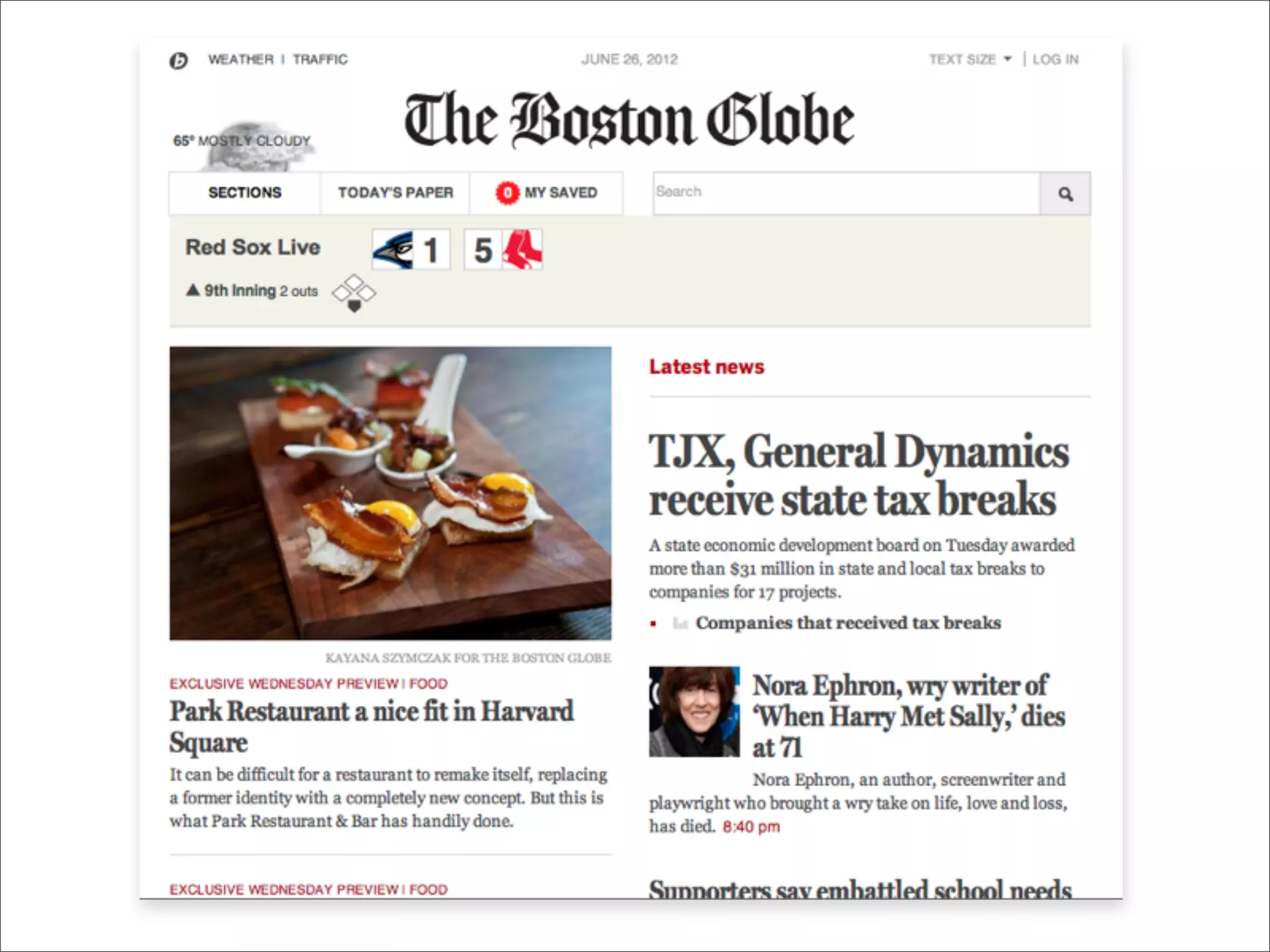
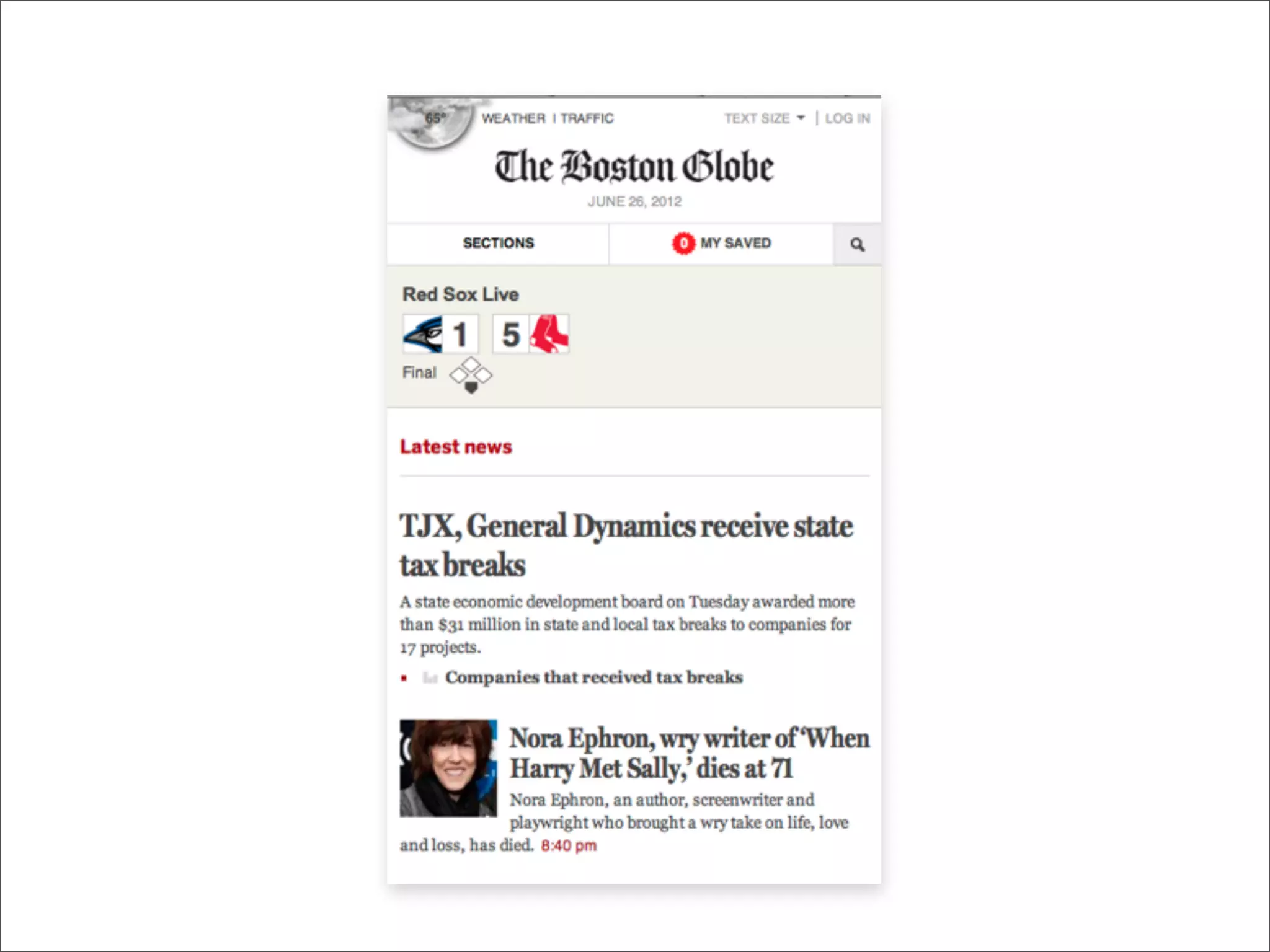
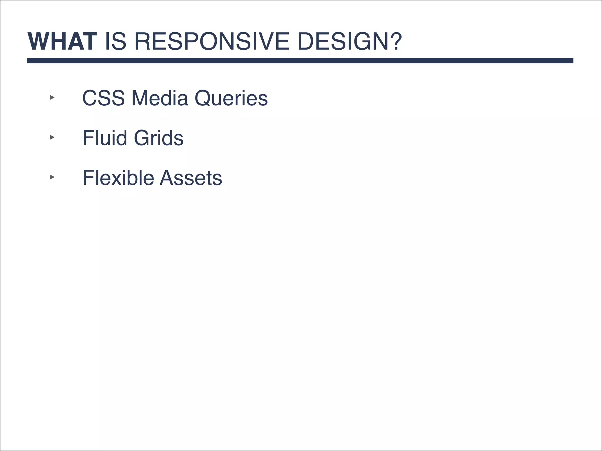
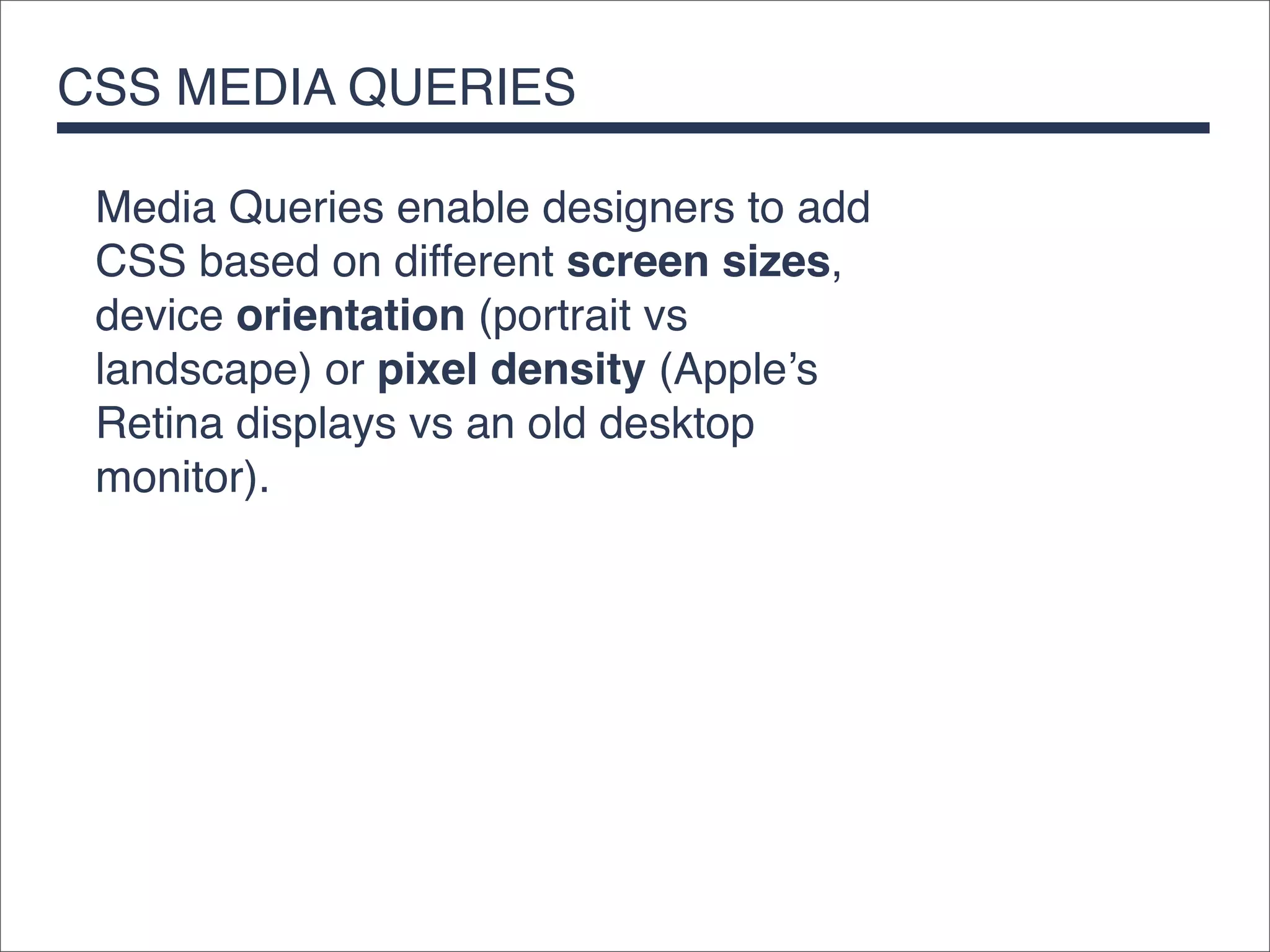
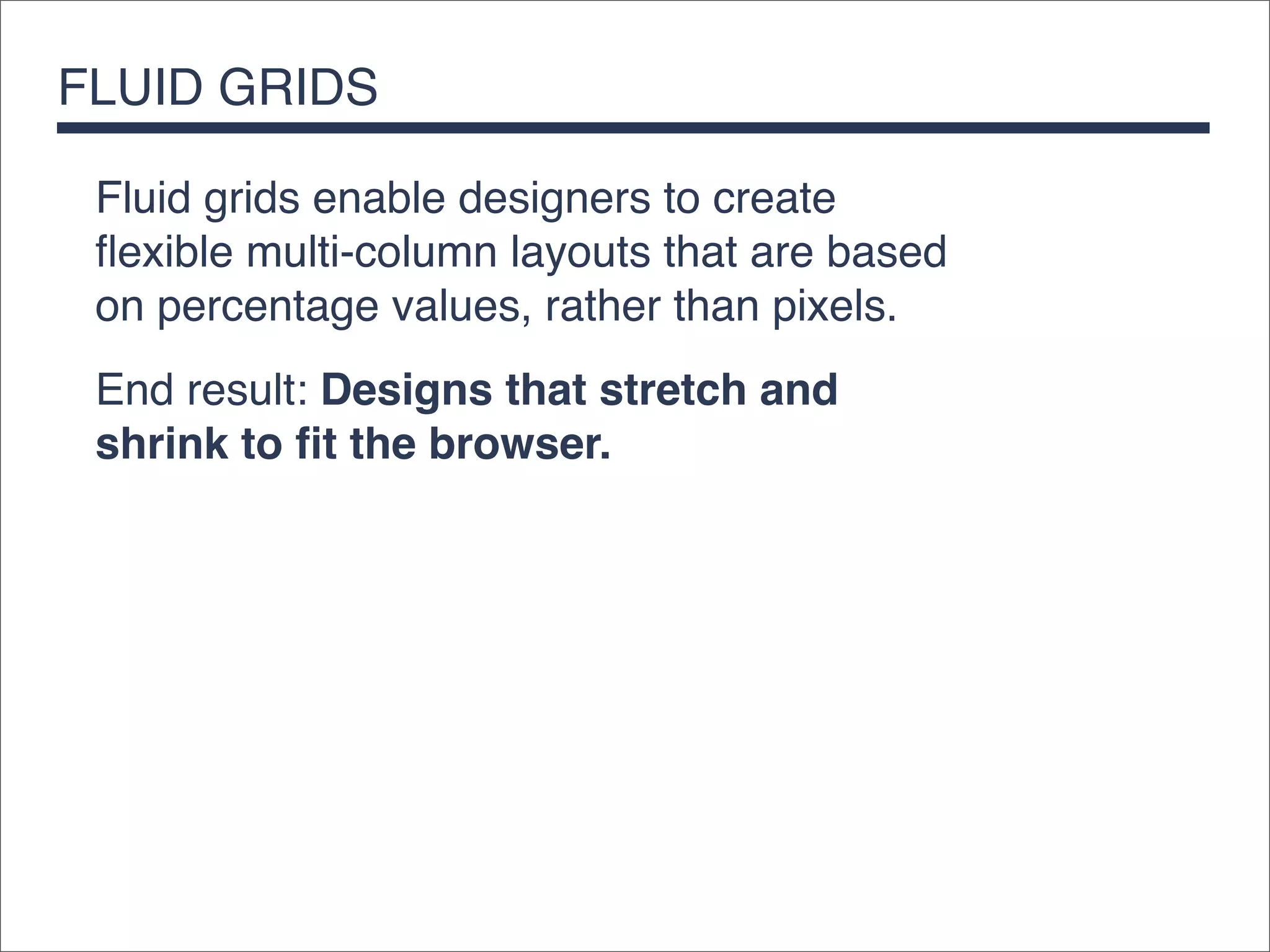
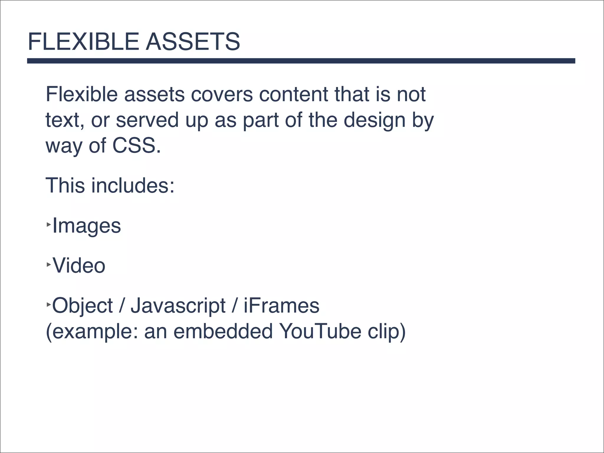
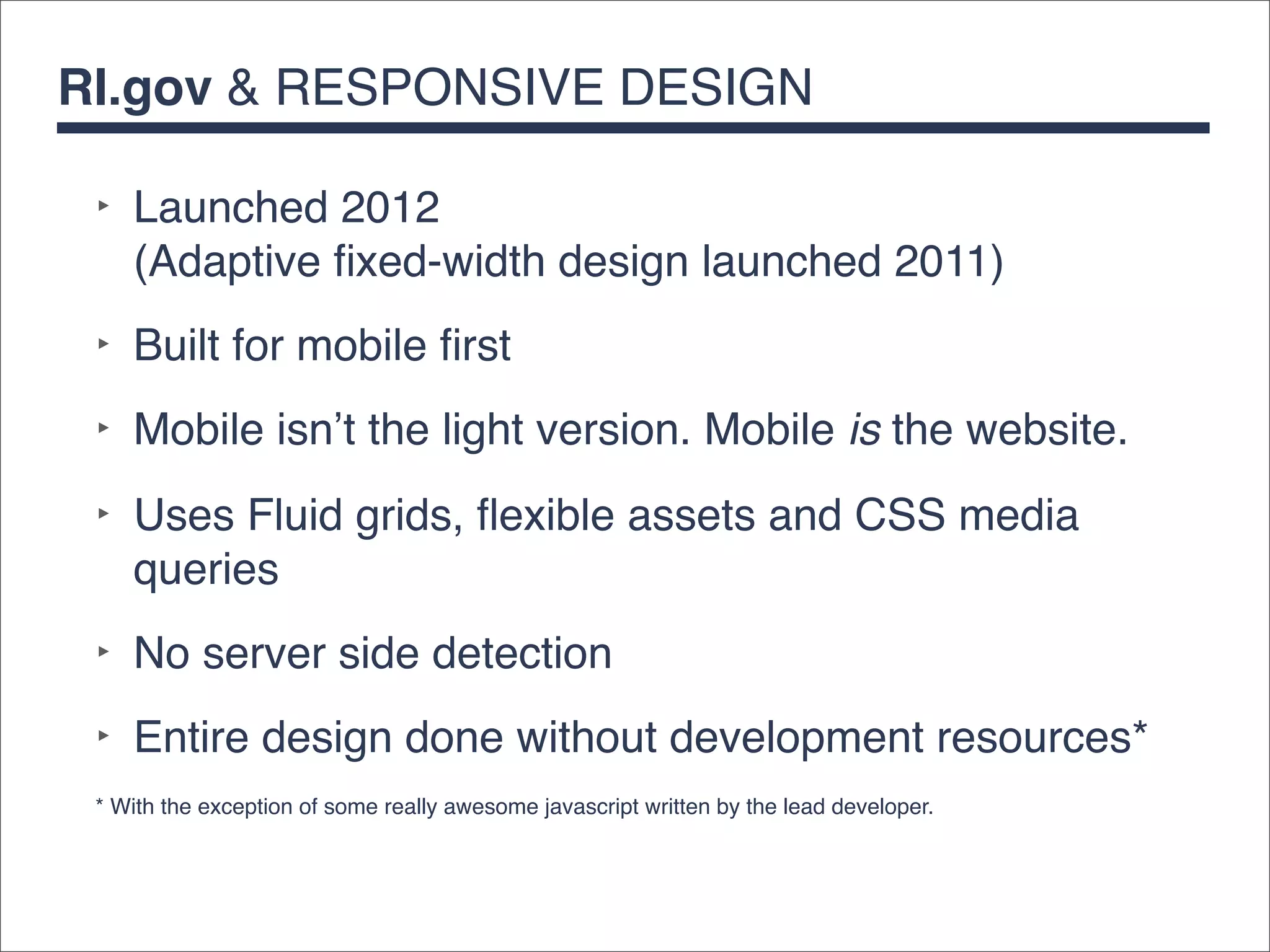
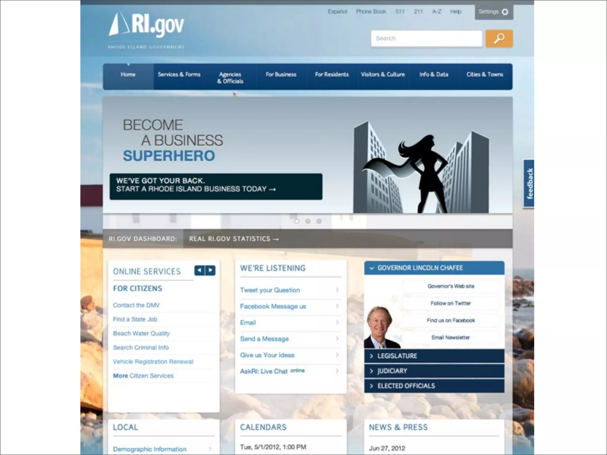
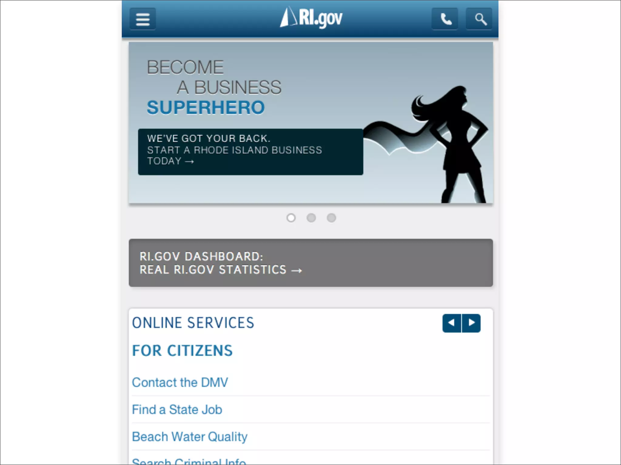
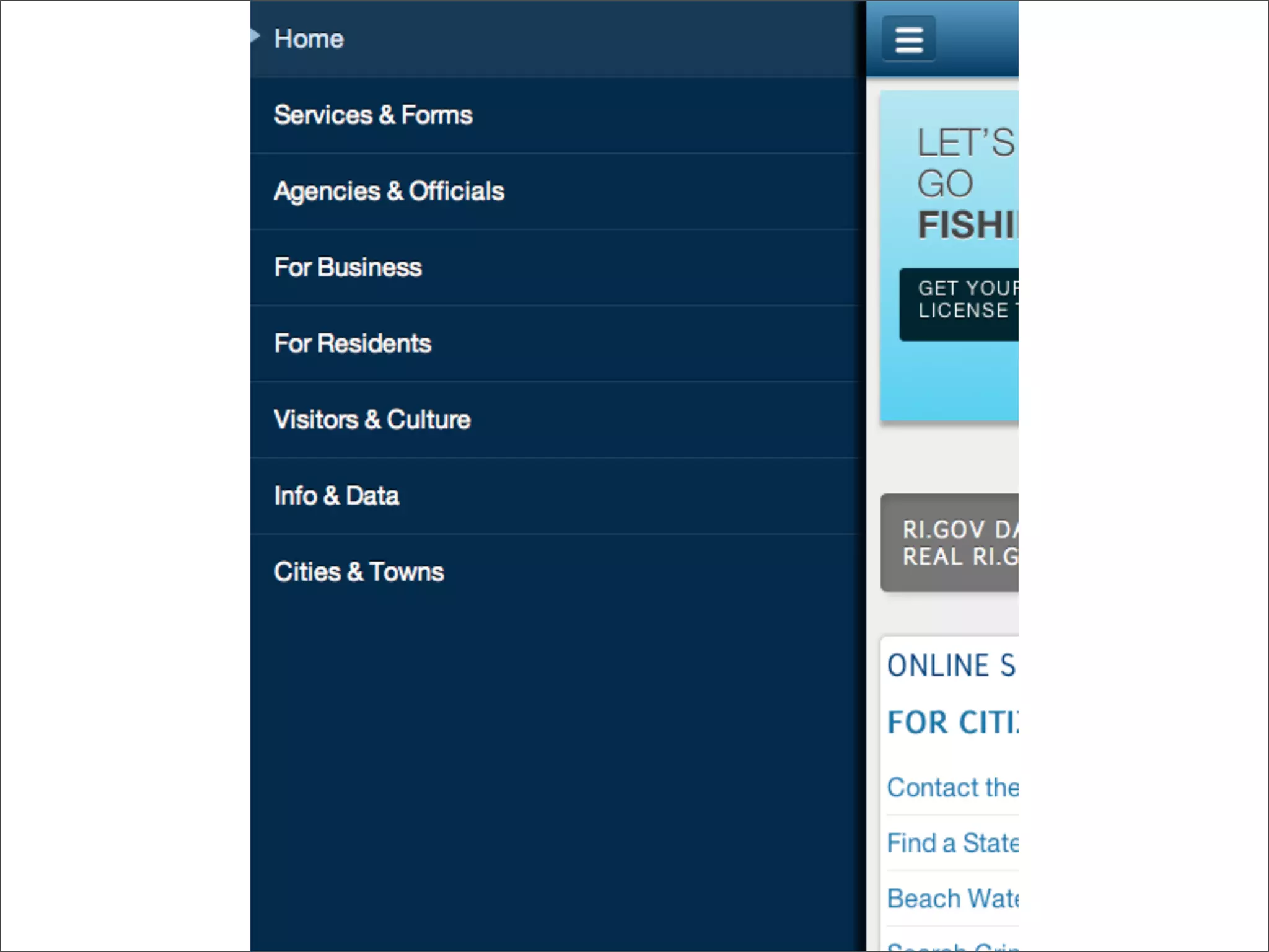
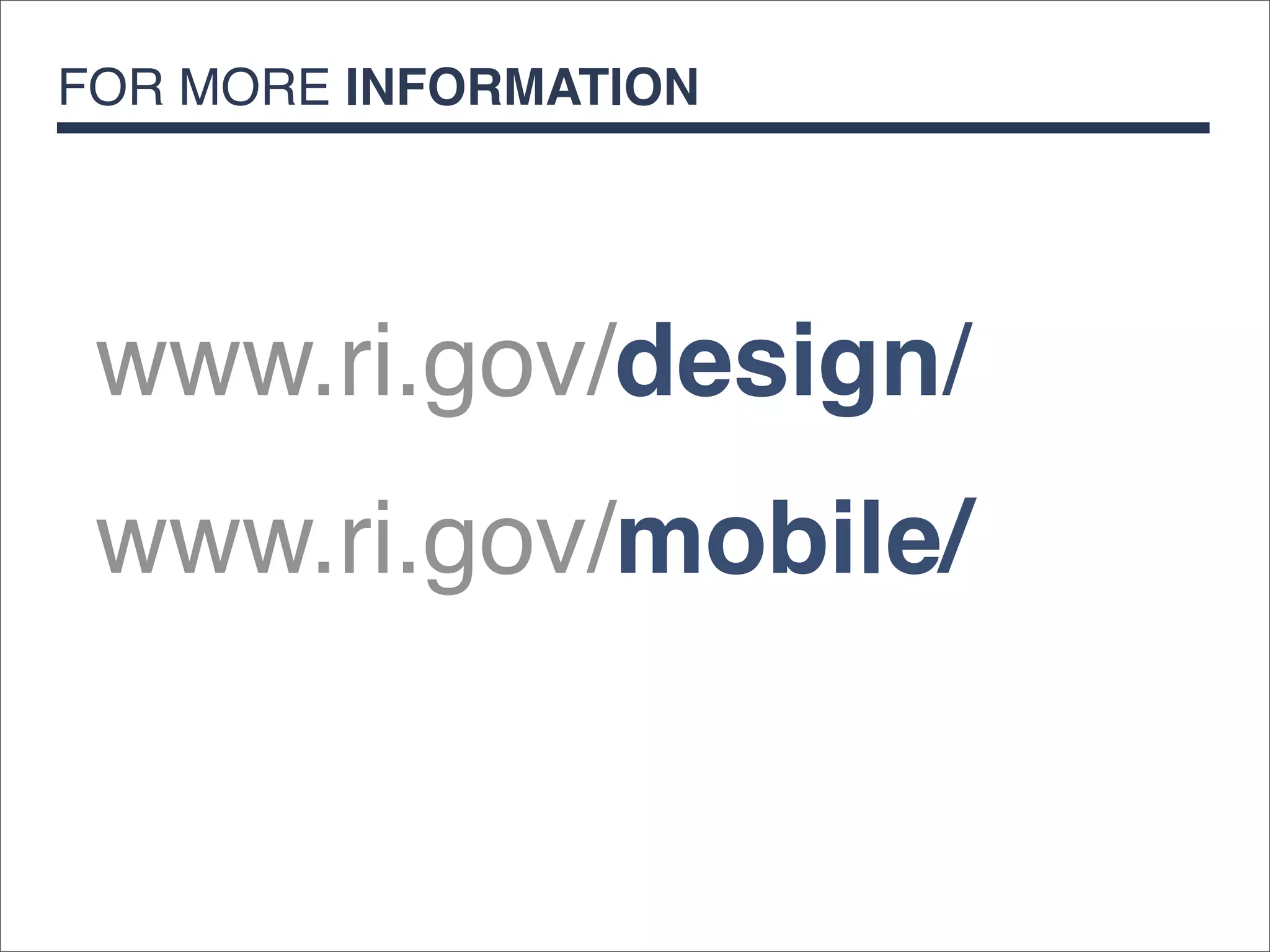
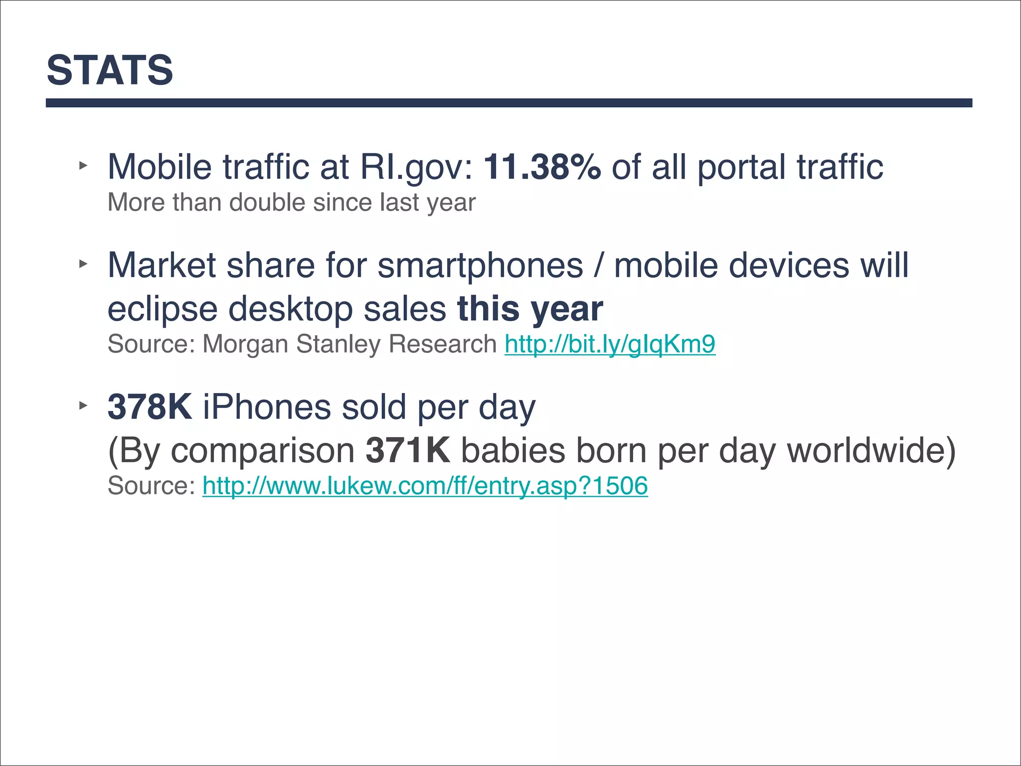
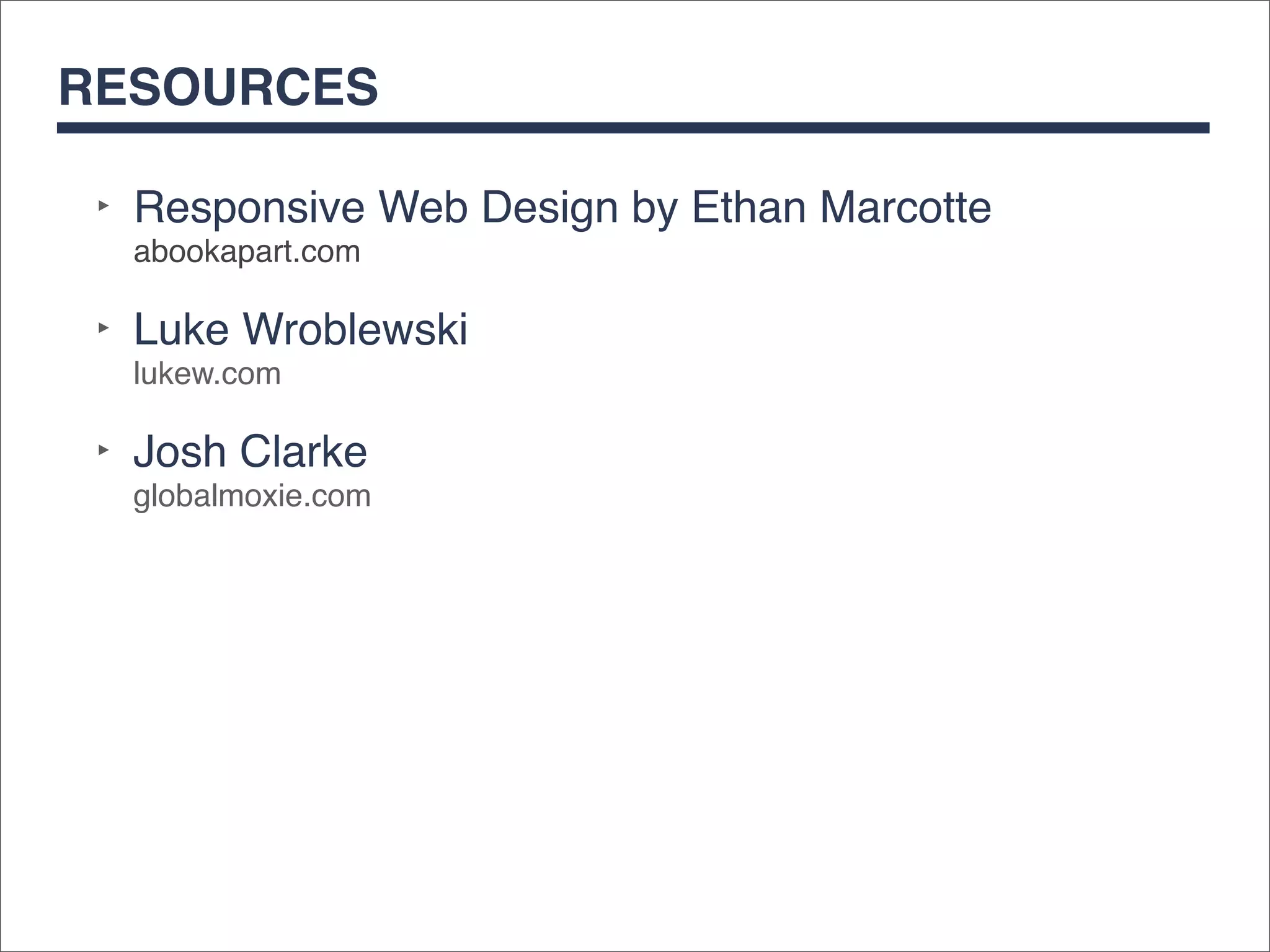
RESPONSIVE DESIGN
  Case Study at RI.gov


            Hillary Hartley
                   NIC Inc.
WHAT IS RESPONSIVE DESIGN?

 ‣   CSS Media Queries
 ‣   Fluid Grids
 ‣   Flexible Assets
CSS MEDIA QUERIES

 Media Queries enable designers to add
 CSS based on different screen sizes,
 device orientation (portrait vs
 landscape) or pixel density (Apple’s
 Retina displays vs an old desktop
 monitor).
FLUID GRIDS

 Fluid grids enable designers to create
 flexible multi-column layouts that are based
 on percentage values, rather than pixels.
 End result: Designs that stretch and
 shrink to fit the browser.
FLEXIBLE ASSETS

 Flexible assets covers content that is not
 text, or served up as part of the design by
 way of CSS.
 This includes:
 ‣Images

 ‣Video

 ‣Object / Javascript / iFrames
 (example: an embedded YouTube clip)
RI.gov & RESPONSIVE DESIGN

 ‣ Launched 2012
   (Adaptive fixed-width design launched 2011)
 ‣ Built for mobile first
 ‣ Mobile isn’t the light version. Mobile is the website.
 ‣ Uses Fluid grids, flexible assets and CSS media
   queries
 ‣ No server side detection
 ‣ Entire design done without development resources*
 * With the exception of some really awesome javascript written by the lead developer.
FOR MORE INFORMATION


 www.ri.gov/design/
 www.ri.gov/mobile/
STATS

 ‣ Mobile traffic at RI.gov: 11.38% of all portal traffic
   More than double since last year

 ‣ Market share for smartphones / mobile devices will
   eclipse desktop sales this year
   Source: Morgan Stanley Research http://bit.ly/gIqKm9

 ‣ 378K iPhones sold per day
   (By comparison 371K babies born per day worldwide)
   Source: http://www.lukew.com/ff/entry.asp?1506
RESOURCES

 ‣ Responsive Web Design by Ethan Marcotte
  abookapart.com

 ‣ Luke Wroblewski
  lukew.com

 ‣ Josh Clarke
  globalmoxie.com

RI.gov and Responsive Design

  • 1.
    RESPONSIVE DESIGN Case Study at RI.gov Hillary Hartley NIC Inc.
  • 6.
    WHAT IS RESPONSIVEDESIGN? ‣ CSS Media Queries ‣ Fluid Grids ‣ Flexible Assets
  • 7.
    CSS MEDIA QUERIES Media Queries enable designers to add CSS based on different screen sizes, device orientation (portrait vs landscape) or pixel density (Apple’s Retina displays vs an old desktop monitor).
  • 8.
    FLUID GRIDS Fluidgrids enable designers to create flexible multi-column layouts that are based on percentage values, rather than pixels. End result: Designs that stretch and shrink to fit the browser.
  • 9.
    FLEXIBLE ASSETS Flexibleassets covers content that is not text, or served up as part of the design by way of CSS. This includes: ‣Images ‣Video ‣Object / Javascript / iFrames (example: an embedded YouTube clip)
  • 10.
    RI.gov & RESPONSIVEDESIGN ‣ Launched 2012 (Adaptive fixed-width design launched 2011) ‣ Built for mobile first ‣ Mobile isn’t the light version. Mobile is the website. ‣ Uses Fluid grids, flexible assets and CSS media queries ‣ No server side detection ‣ Entire design done without development resources* * With the exception of some really awesome javascript written by the lead developer.
  • 14.
    FOR MORE INFORMATION www.ri.gov/design/ www.ri.gov/mobile/
  • 15.
    STATS ‣ Mobiletraffic at RI.gov: 11.38% of all portal traffic More than double since last year ‣ Market share for smartphones / mobile devices will eclipse desktop sales this year Source: Morgan Stanley Research http://bit.ly/gIqKm9 ‣ 378K iPhones sold per day (By comparison 371K babies born per day worldwide) Source: http://www.lukew.com/ff/entry.asp?1506
  • 17.
    RESOURCES ‣ ResponsiveWeb Design by Ethan Marcotte abookapart.com ‣ Luke Wroblewski lukew.com ‣ Josh Clarke globalmoxie.com