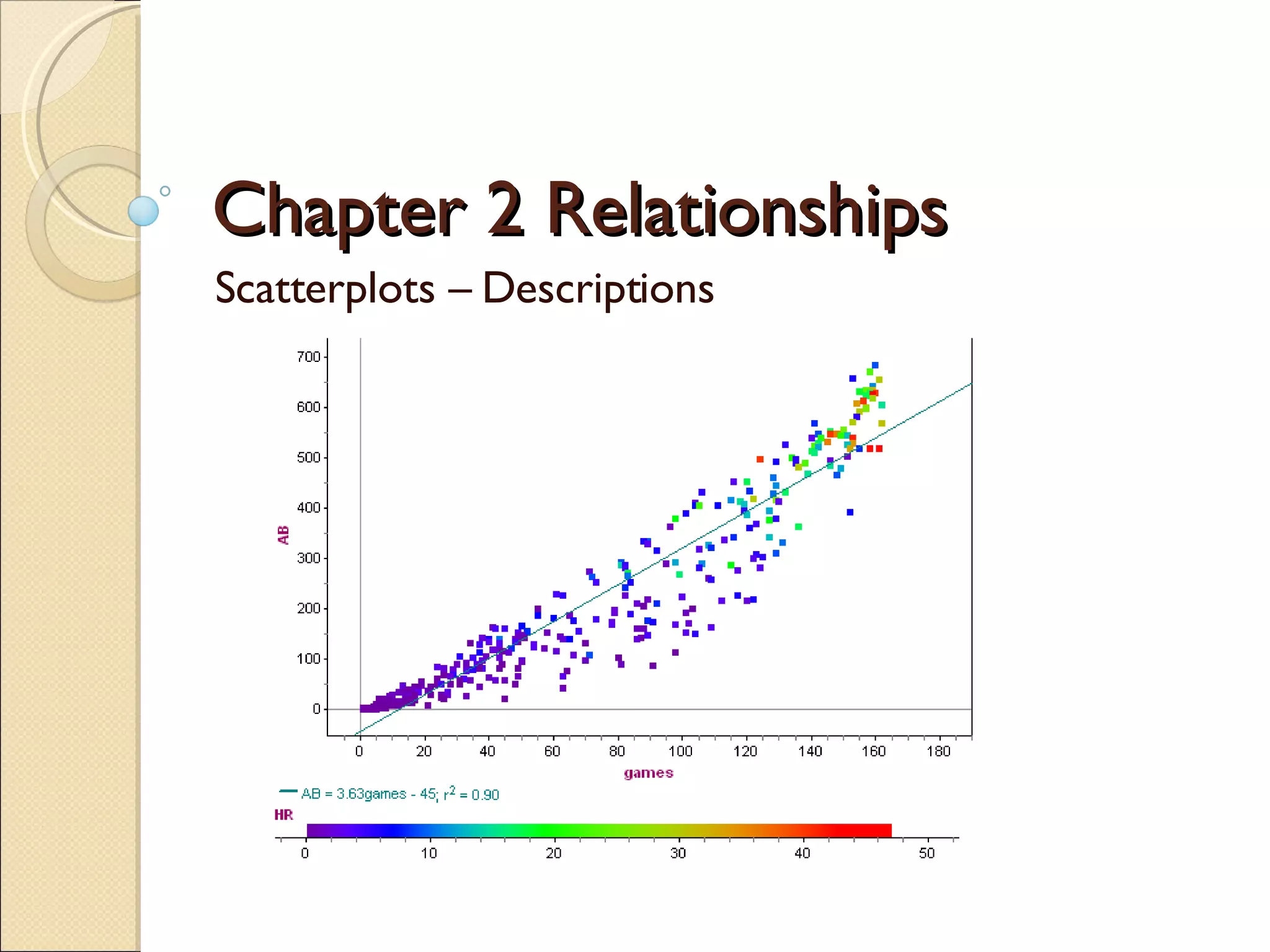
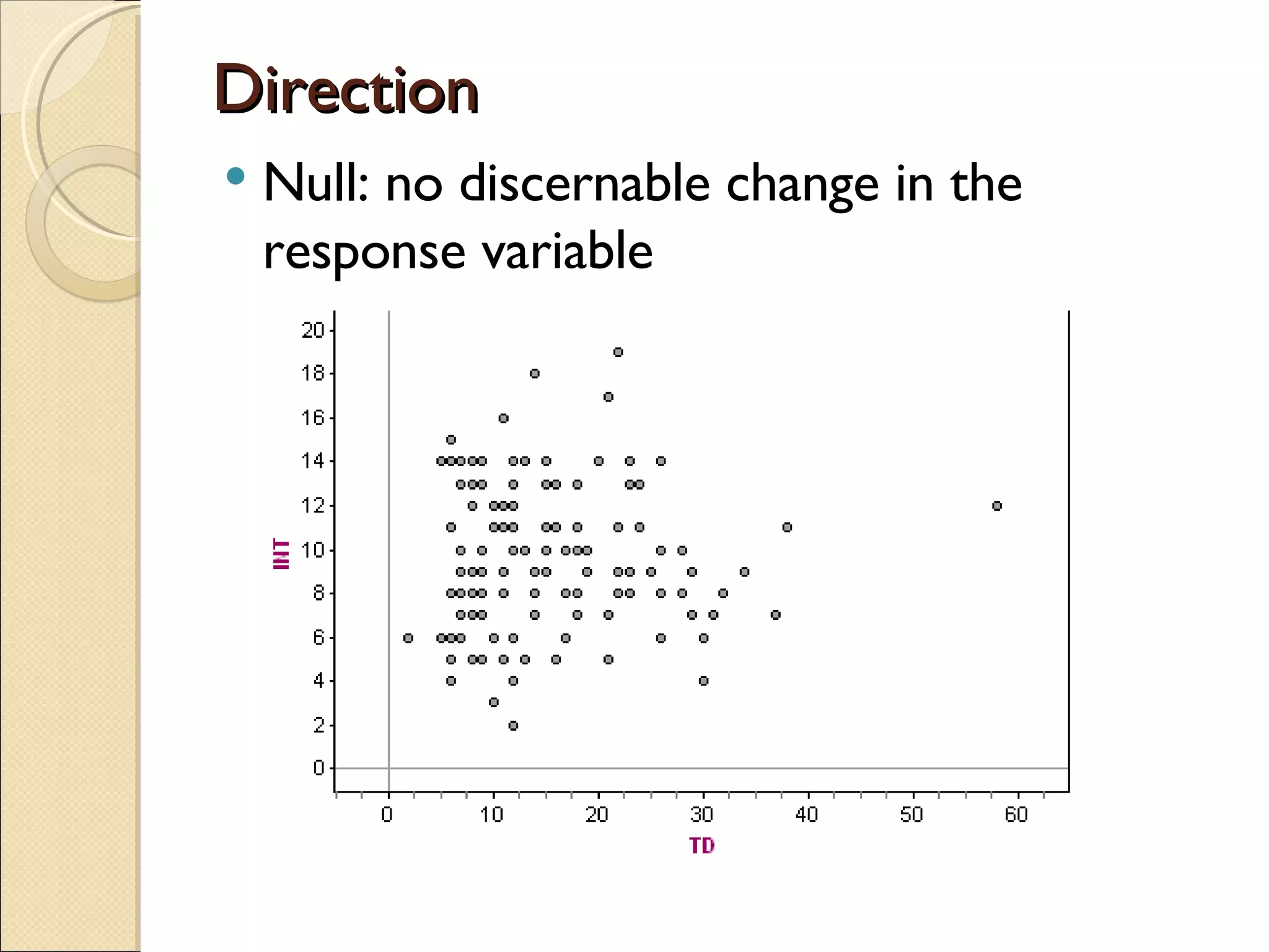
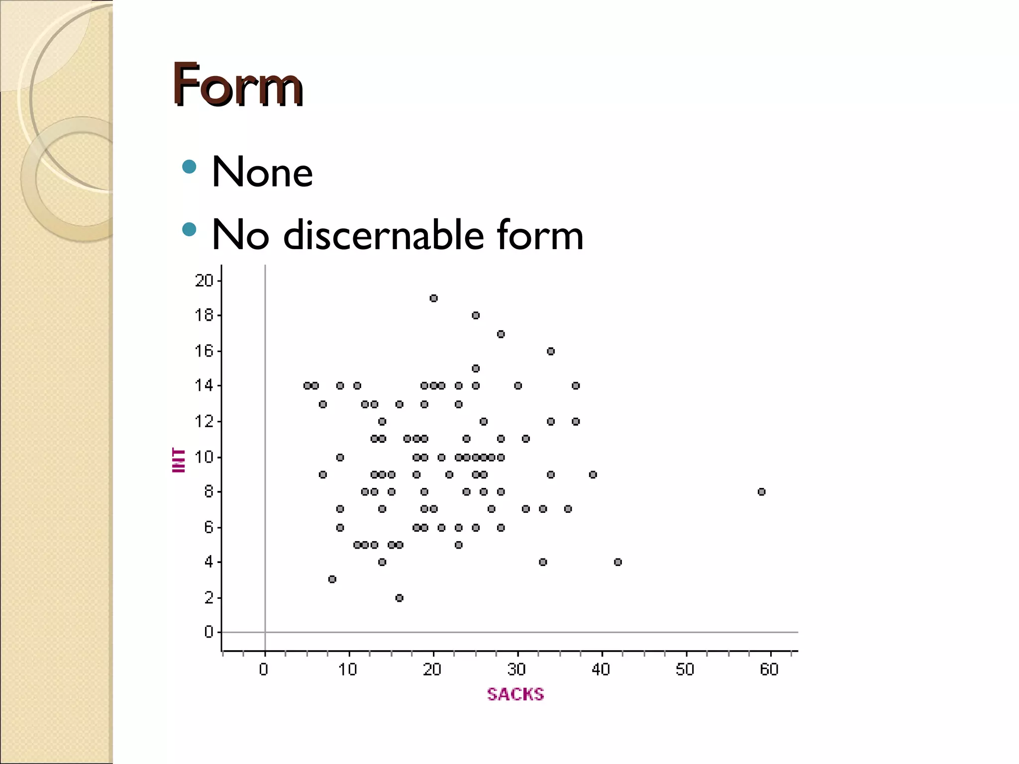
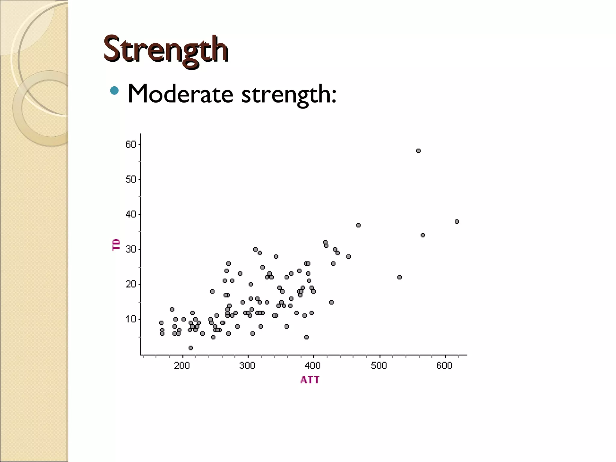
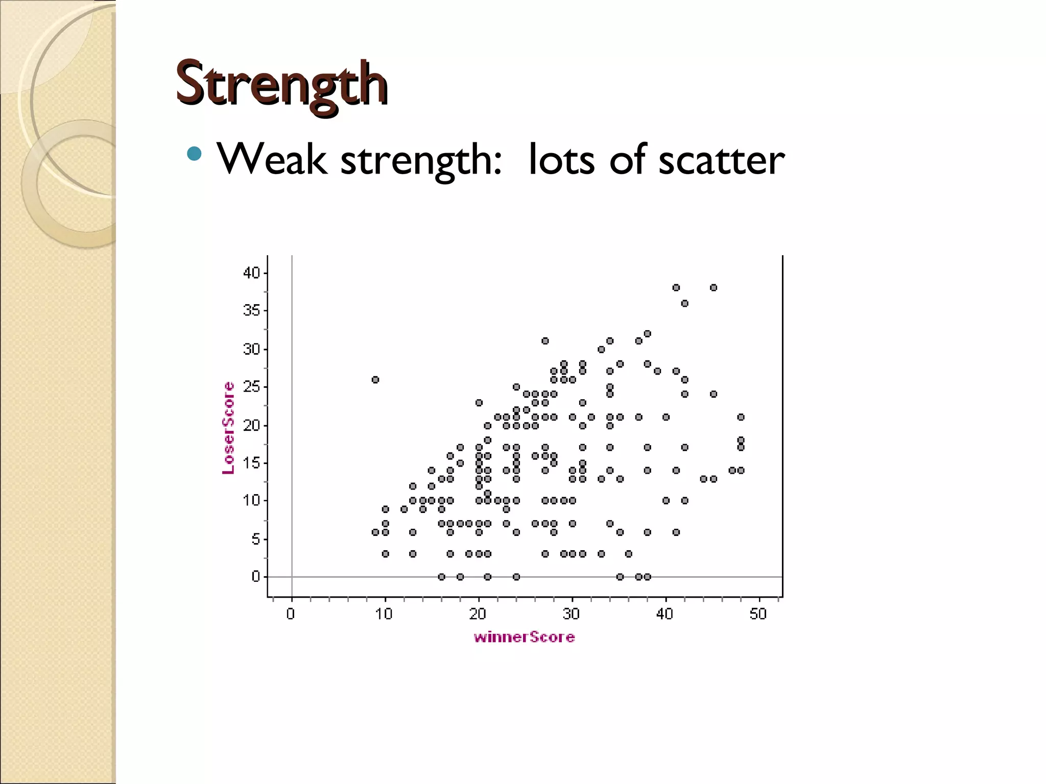
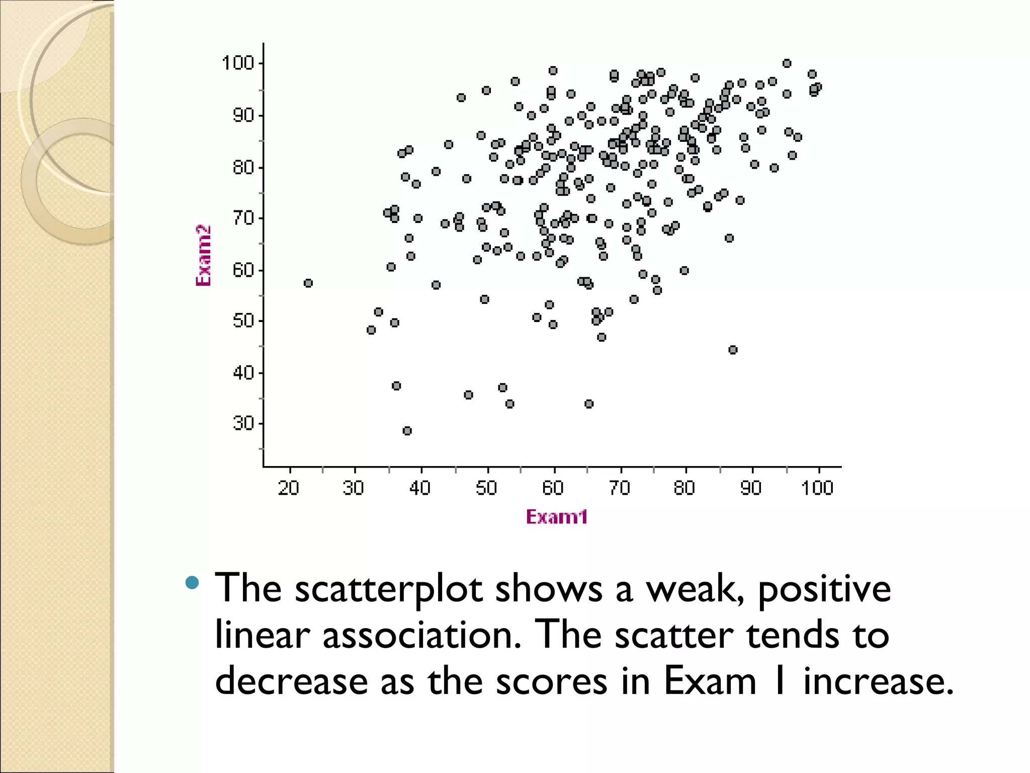
Chapter 2 Relationships Scatterplots – Descriptions
Scatterplots Graphical display of two quantitative variables We plot the explanatory (independent) variable on the x-axis and the response (dependent) variable on the y-axis Each dot represents a single observation and it’s two values
Describing Scatterplots 4 things that must be talked about: Direction Form Scatter Unusual elements
Direction Positive: as values of the explanatory variable increase, values in the response variable tend to increase
Direction Negative: as values of the explanatory variable increase, value in the response variable tend to decrease
Direction Null: no discernable change in the response variable
Form (Shape) Linear: The shape has the appearance of a linear relationship.  Does not have to fit it perfectly.
Form Curved Some can be transformed to linear graphs. (Coming Soon)
Form None No discernable form
Strength (Scatter) Strong association: very little scatter
Strength Moderate strength:
Strength Weak strength:  lots of scatter
Unusual Features Outliers
Unusual Features Look for changes in the scatter.  A horn shape:
Practice  The scatterplot shows a moderately strong, negative association that is curved.
The scatterplot shows a weak, positive linear association. The scatter tends to decrease as the scores in Exam 1 increase.
The scatterplot shows a moderately strong, positive linear association.  There appears to be an outlier around (9, 35).
The scatterplot shows no apparent association.  There is great scatter and an outlier around (60,8).
 

Chapter 2 Relationships