SlideShare a Scribd company logo
1 of 8
Flat Plan Evaluation
I drew my flat plans up free hand of graph paper so that I could get a more clear idea on the
layout, creating these flat plans allowed me to test different designs and get a glimpse into
what my finishing magazine will look like.

Front Cover
Masthead- The masthead represents the name of my title which is “volume” the name volume
came up after looking through hundreds of different musical words. I thought that “volume” was
straight to the point and my target audience would know straight away that my magazine was
based on music, my peers agreed that this was a good name for a music magazine. I then went on
to creating the design for my title before drawing it I looked through a range of different style on
dafont.com I eventually found one called disco deck which is had an urban edgy look to it I
instantly liked it and thought it would be suited to my style of magazine.


                            Main Image- I decided to situate my main image on the right
                            hand side of the page to leave space for my cover lines and
                            anchor text, this is a traditional layout and found on many
                            different professional magazines. I decided to dress my actor in
                            Ray Bans as I said in my organization, I thought the use of sun
                            glasses was effective and gave a mysterious look to the actor
                            and make the audience want to read more on the actor.

                            I decided to also use a mid shot as when doing the preliminary
                            task I thought a mid shot worked well and fitted on the page
                            nicely. I also personally believe it draws the audience in more.


                             Text- I’ve decided to place my cover lines on the left third of the
                             page as this is a more natural for the audience to read it this
                             way. Not only this but I have also used arrows underneath and
                             between the text pointing towards the main image this will lead
                             the audience to the main image but still allow them to read the
                             headlines at the same time, I think this is an effective way of
                             getting my audience to appreciate everything featured on the
                             page. I would also like this text to be in a different font from my
                             title to give more variation on the page I think that keeps the
                             page looking interesting.
Masthead- I have decided to position my title just below the top of the page and slightly over
lapping the main image as I feel this links the features all together. I have decided to use arrows
again to place under the title like I did on the front cover I like the look of this and feel it just adds
to the page and starts a theme throughout my magazine. Not only this I’m going to make sure
that my text it large and bold so that people know that they are on the contents page and can
then navigate through the magazine from this point.


                                 Main Image- My main image take up the majority of the
                                 page and is going to be one of the main focuses of the
                                 magazine. Im going to use a different actor/actress in the
                                 image as I did on the front cover to show the audience what
                                 is available on other pages also not just the main article.
                                 This may attract a bigger audience as if they are not
                                 interested in the first article they maybe on the second.

                                 I would also like to add a hint of colour in this image
                                 however still keep some of the colour scheme of black and
                                 white which I may use as the background.


                                    Contents- The main part of information is going to place
                                    on the right side of the page and will be used to navigate
                                    round the magazine. I would like to use white writing as I
                                    feel I’m going to make my background black meaning the
                                    text will stand out on the page and be easily readable. I
                                    want the numbering to be quite big so people know
                                    exactly what is on each page and don’t get confused.
Double Page Spread
Masthead- This is where the title of the article will be positioned, I want it to be simple and link to the article
and the images so my target audience know what the article I about before reading it.

I want the text to be in large lettering and bold so that it stands out on the page drawing my target audience in.


Just below the title I will be placing a quote from the article these are usually comical or key points in the article
and make the reader want to read on. I want this to be in a different colour to the title and maybe a different
font to add variation.


                                     Article- The start of my main article will be positioned on the left side
                                     of the page as I said on the analyze of my front cover I feel it’s easier
                                     for my target audience to read it that way. It will also but structured in
                                     columns which is a common structure for an article and sets a clear
                                     layout for text.


         Main Image- The maim image will be positioned manly on the left
         hand side of the page however slightly filter on to the right hand side
         also. I am going to use a long shot of my main character which will
         stretch from the top to the bottom of the page similar to one of the
         existing products that I researched. I feel this is a good design and one
         that shows the entire body of the person you are speaking about
         giving the audience and clearer image of the actor/actress.
Article- The main article will be on the right page
                                                    and I will again structure it in columns starting from
                                                    the left and ending in the right, I feel this is an easy
                                                    structure enabling my audience to follow the article
                                                    with ease. I will also be starting my article with a
                                                    drop cap, I feel this is a fun way to start an article
                                                    and allows you to add a different font to add to the
                                                    design of the page.


Again I would like to use a quote from the article to break up the large chunks of information. Not only
this if there is too much text on the page it can sometimes discourage people from the page and lead
them to skip to another, I believe that with a quote from the article to split the information more
people will want to read on.


                                  Page Number- My page number will be positioned in the corner of
                                  the page and not taking focus of the main content. I would like it to
                                  link to the contents page by using the same font and colour.

More Related Content

What's hot

First bullet finished
First bullet finishedFirst bullet finished
First bullet finishedBeth940417
 
Development diary
Development diaryDevelopment diary
Development diaryloisbeare
 
Evaluation question 1
Evaluation question 1Evaluation question 1
Evaluation question 1smithy_tom
 
Draft double page spread process
Draft double page spread processDraft double page spread process
Draft double page spread processCeri Lewis
 
Research and designs for my mag
Research and designs for my magResearch and designs for my mag
Research and designs for my magrhaines07
 
Developmental diary 3
Developmental diary 3Developmental diary 3
Developmental diary 3DarbySavage
 
Bhangra Music Magazine Evaluation
Bhangra Music Magazine EvaluationBhangra Music Magazine Evaluation
Bhangra Music Magazine Evaluationkomalvekaria
 
Production of front cover
Production of front coverProduction of front cover
Production of front coverrhiannonbescoby
 
7. evaluation(1)
7. evaluation(1)7. evaluation(1)
7. evaluation(1)Ben Wincup
 
Task 10 evaluation
Task 10   evaluationTask 10   evaluation
Task 10 evaluationolibrandon
 
Production of front cover
Production of front coverProduction of front cover
Production of front coverrhiannonbescoby
 
Flat plans of contents page and double page improved1
Flat plans of contents page and double page improved1Flat plans of contents page and double page improved1
Flat plans of contents page and double page improved1jessclarkmedia1
 
Contents page statement of intent
Contents page statement of intentContents page statement of intent
Contents page statement of intentRayrayy
 

What's hot (19)

Flat plan
Flat planFlat plan
Flat plan
 
Double Page Pp
Double Page PpDouble Page Pp
Double Page Pp
 
First bullet finished
First bullet finishedFirst bullet finished
First bullet finished
 
Development diary
Development diaryDevelopment diary
Development diary
 
Designing
DesigningDesigning
Designing
 
Evaluation question 1
Evaluation question 1Evaluation question 1
Evaluation question 1
 
Draft double page spread process
Draft double page spread processDraft double page spread process
Draft double page spread process
 
Research and designs for my mag
Research and designs for my magResearch and designs for my mag
Research and designs for my mag
 
Developmental diary 3
Developmental diary 3Developmental diary 3
Developmental diary 3
 
Construction & development
Construction & developmentConstruction & development
Construction & development
 
Bhangra Music Magazine Evaluation
Bhangra Music Magazine EvaluationBhangra Music Magazine Evaluation
Bhangra Music Magazine Evaluation
 
Production of front cover
Production of front coverProduction of front cover
Production of front cover
 
7. evaluation(1)
7. evaluation(1)7. evaluation(1)
7. evaluation(1)
 
Evaluationnnnn
EvaluationnnnnEvaluationnnnn
Evaluationnnnn
 
Task 10 evaluation
Task 10   evaluationTask 10   evaluation
Task 10 evaluation
 
Production of front cover
Production of front coverProduction of front cover
Production of front cover
 
Flat plans of contents page and double page improved1
Flat plans of contents page and double page improved1Flat plans of contents page and double page improved1
Flat plans of contents page and double page improved1
 
contents page
contents pagecontents page
contents page
 
Contents page statement of intent
Contents page statement of intentContents page statement of intent
Contents page statement of intent
 

Viewers also liked

プロ野球チームの セントラルリーグの年間順位と総得失点の関係の 相関係数と重相関係数による考察
プロ野球チームのセントラルリーグの年間順位と総得失点の関係の相関係数と重相関係数による考察プロ野球チームのセントラルリーグの年間順位と総得失点の関係の相関係数と重相関係数による考察
プロ野球チームの セントラルリーグの年間順位と総得失点の関係の 相関係数と重相関係数による考察Toshiyuki Shimono
 
Composition slide show
Composition slide showComposition slide show
Composition slide showcynkat94
 
ADR Motors Pvt. Ltd.
ADR Motors Pvt. Ltd.ADR Motors Pvt. Ltd.
ADR Motors Pvt. Ltd.Rheetam Mitra
 
What's the Half-Life of Your Data?
What's the Half-Life of Your Data?What's the Half-Life of Your Data?
What's the Half-Life of Your Data?Kalido
 
JumpToGoal opportunity analysis project
JumpToGoal opportunity analysis projectJumpToGoal opportunity analysis project
JumpToGoal opportunity analysis projectNatalia Sergeeva
 
Free market update: 22/11/2012
Free market update: 22/11/2012Free market update: 22/11/2012
Free market update: 22/11/2012Abhijit Mitra
 
職場生存之道:內向心理學(二)
職場生存之道:內向心理學(二)職場生存之道:內向心理學(二)
職場生存之道:內向心理學(二)Wan Jen Huang
 
Quatrepetitescantonades grup 2 DRIADES
Quatrepetitescantonades grup 2 DRIADESQuatrepetitescantonades grup 2 DRIADES
Quatrepetitescantonades grup 2 DRIADESparvularielsagrer
 
τι προσφέρει το Wiki στο μάθημά μου
τι προσφέρει το Wiki στο μάθημά μουτι προσφέρει το Wiki στο μάθημά μου
τι προσφέρει το Wiki στο μάθημά μουLoukia Orfanou
 
Room key
Room keyRoom key
Room keycmhagc
 
Webinar Acelera la velocidad de tu software con Metodologías Ágiles
Webinar Acelera la velocidad de tu software con Metodologías ÁgilesWebinar Acelera la velocidad de tu software con Metodologías Ágiles
Webinar Acelera la velocidad de tu software con Metodologías ÁgilesGlobe Testing
 
Outsource Communications Company Presentation
Outsource Communications Company PresentationOutsource Communications Company Presentation
Outsource Communications Company PresentationOutsource Communications
 

Viewers also liked (20)

プロ野球チームの セントラルリーグの年間順位と総得失点の関係の 相関係数と重相関係数による考察
プロ野球チームのセントラルリーグの年間順位と総得失点の関係の相関係数と重相関係数による考察プロ野球チームのセントラルリーグの年間順位と総得失点の関係の相関係数と重相関係数による考察
プロ野球チームの セントラルリーグの年間順位と総得失点の関係の 相関係数と重相関係数による考察
 
Composition slide show
Composition slide showComposition slide show
Composition slide show
 
Storyboard
StoryboardStoryboard
Storyboard
 
ADR Motors Pvt. Ltd.
ADR Motors Pvt. Ltd.ADR Motors Pvt. Ltd.
ADR Motors Pvt. Ltd.
 
What's the Half-Life of Your Data?
What's the Half-Life of Your Data?What's the Half-Life of Your Data?
What's the Half-Life of Your Data?
 
JumpToGoal opportunity analysis project
JumpToGoal opportunity analysis projectJumpToGoal opportunity analysis project
JumpToGoal opportunity analysis project
 
Free market update: 22/11/2012
Free market update: 22/11/2012Free market update: 22/11/2012
Free market update: 22/11/2012
 
Knowledge-driven Finite-State Machines. Study case in monitoring industrial ...
Knowledge-driven Finite-State Machines.  Study case in monitoring industrial ...Knowledge-driven Finite-State Machines.  Study case in monitoring industrial ...
Knowledge-driven Finite-State Machines. Study case in monitoring industrial ...
 
MUN Student Portfolio
MUN Student PortfolioMUN Student Portfolio
MUN Student Portfolio
 
Fades ondines
Fades ondinesFades ondines
Fades ondines
 
Analytical Exposition
Analytical ExpositionAnalytical Exposition
Analytical Exposition
 
My ideal home
My ideal homeMy ideal home
My ideal home
 
My ideal home
My ideal homeMy ideal home
My ideal home
 
Accord pp001
Accord pp001Accord pp001
Accord pp001
 
職場生存之道:內向心理學(二)
職場生存之道:內向心理學(二)職場生存之道:內向心理學(二)
職場生存之道:內向心理學(二)
 
Quatrepetitescantonades grup 2 DRIADES
Quatrepetitescantonades grup 2 DRIADESQuatrepetitescantonades grup 2 DRIADES
Quatrepetitescantonades grup 2 DRIADES
 
τι προσφέρει το Wiki στο μάθημά μου
τι προσφέρει το Wiki στο μάθημά μουτι προσφέρει το Wiki στο μάθημά μου
τι προσφέρει το Wiki στο μάθημά μου
 
Room key
Room keyRoom key
Room key
 
Webinar Acelera la velocidad de tu software con Metodologías Ágiles
Webinar Acelera la velocidad de tu software con Metodologías ÁgilesWebinar Acelera la velocidad de tu software con Metodologías Ágiles
Webinar Acelera la velocidad de tu software con Metodologías Ágiles
 
Outsource Communications Company Presentation
Outsource Communications Company PresentationOutsource Communications Company Presentation
Outsource Communications Company Presentation
 

Similar to Flat Plan Evaluation PR

Similar to Flat Plan Evaluation PR (20)

Double page spread
Double page spreadDouble page spread
Double page spread
 
Development diary
Development diaryDevelopment diary
Development diary
 
Magazine plans
Magazine plansMagazine plans
Magazine plans
 
Evaluation
EvaluationEvaluation
Evaluation
 
Statement of intent for double page spread
Statement of intent for double page spreadStatement of intent for double page spread
Statement of intent for double page spread
 
Development diary
Development diaryDevelopment diary
Development diary
 
Media evaluation q 1
Media evaluation q 1Media evaluation q 1
Media evaluation q 1
 
Question 1
Question 1 Question 1
Question 1
 
Conventions of my magazine question 1
Conventions of my magazine question 1Conventions of my magazine question 1
Conventions of my magazine question 1
 
Task 7
Task 7Task 7
Task 7
 
Evaluation
EvaluationEvaluation
Evaluation
 
Skills dev'
Skills dev'Skills dev'
Skills dev'
 
Evaluation
EvaluationEvaluation
Evaluation
 
Formal Proposal
Formal ProposalFormal Proposal
Formal Proposal
 
Skills dev'
Skills dev'Skills dev'
Skills dev'
 
Skills dev'
Skills dev'Skills dev'
Skills dev'
 
How did i attract
How did i attractHow did i attract
How did i attract
 
Evaluation on main task
Evaluation on main taskEvaluation on main task
Evaluation on main task
 
Sketches ideas
Sketches ideasSketches ideas
Sketches ideas
 
Statement of intent
Statement of intentStatement of intent
Statement of intent
 

More from nctcmedia12

Music video conventions
Music video conventionsMusic video conventions
Music video conventionsnctcmedia12
 
Advanced portfolio checklist sf
Advanced portfolio checklist sfAdvanced portfolio checklist sf
Advanced portfolio checklist sfnctcmedia12
 
Advanced portfolio checklist_-_music_video
Advanced portfolio checklist_-_music_videoAdvanced portfolio checklist_-_music_video
Advanced portfolio checklist_-_music_videonctcmedia12
 
Timeline of proposal
Timeline of proposalTimeline of proposal
Timeline of proposalnctcmedia12
 
Conventions of a music video
Conventions of a music videoConventions of a music video
Conventions of a music videonctcmedia12
 
Knee Socks – Arctic Monkeys Presentation
Knee Socks – Arctic Monkeys PresentationKnee Socks – Arctic Monkeys Presentation
Knee Socks – Arctic Monkeys Presentationnctcmedia12
 
Actors, locations and props
Actors, locations and propsActors, locations and props
Actors, locations and propsnctcmedia12
 
Question 7 evaluation
Question 7 evaluationQuestion 7 evaluation
Question 7 evaluationnctcmedia12
 
Question 5.doc new
Question 5.doc newQuestion 5.doc new
Question 5.doc newnctcmedia12
 
Question 3 evaluation
Question 3 evaluationQuestion 3 evaluation
Question 3 evaluationnctcmedia12
 

More from nctcmedia12 (20)

Initial post
Initial postInitial post
Initial post
 
Music video conventions
Music video conventionsMusic video conventions
Music video conventions
 
Advanced portfolio checklist sf
Advanced portfolio checklist sfAdvanced portfolio checklist sf
Advanced portfolio checklist sf
 
Advanced portfolio checklist_-_music_video
Advanced portfolio checklist_-_music_videoAdvanced portfolio checklist_-_music_video
Advanced portfolio checklist_-_music_video
 
Timeline of proposal
Timeline of proposalTimeline of proposal
Timeline of proposal
 
Conventions of a music video
Conventions of a music videoConventions of a music video
Conventions of a music video
 
Knee Socks – Arctic Monkeys Presentation
Knee Socks – Arctic Monkeys PresentationKnee Socks – Arctic Monkeys Presentation
Knee Socks – Arctic Monkeys Presentation
 
Actors, locations and props
Actors, locations and propsActors, locations and props
Actors, locations and props
 
1
11
1
 
6
66
6
 
3
33
3
 
Evaluation q3
Evaluation q3Evaluation q3
Evaluation q3
 
Question 7 evaluation
Question 7 evaluationQuestion 7 evaluation
Question 7 evaluation
 
Q.3 evaluation
Q.3 evaluationQ.3 evaluation
Q.3 evaluation
 
Question 5.doc new
Question 5.doc newQuestion 5.doc new
Question 5.doc new
 
Question 4
Question 4Question 4
Question 4
 
Question 4
Question 4Question 4
Question 4
 
Question 3 evaluation
Question 3 evaluationQuestion 3 evaluation
Question 3 evaluation
 
Question 6
Question 6Question 6
Question 6
 
Question 6
Question 6Question 6
Question 6
 

Flat Plan Evaluation PR

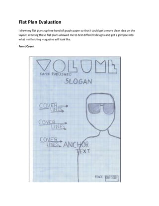
  • 1. Flat Plan Evaluation I drew my flat plans up free hand of graph paper so that I could get a more clear idea on the layout, creating these flat plans allowed me to test different designs and get a glimpse into what my finishing magazine will look like. Front Cover
  • 2. Masthead- The masthead represents the name of my title which is “volume” the name volume came up after looking through hundreds of different musical words. I thought that “volume” was straight to the point and my target audience would know straight away that my magazine was based on music, my peers agreed that this was a good name for a music magazine. I then went on to creating the design for my title before drawing it I looked through a range of different style on dafont.com I eventually found one called disco deck which is had an urban edgy look to it I instantly liked it and thought it would be suited to my style of magazine. Main Image- I decided to situate my main image on the right hand side of the page to leave space for my cover lines and anchor text, this is a traditional layout and found on many different professional magazines. I decided to dress my actor in Ray Bans as I said in my organization, I thought the use of sun glasses was effective and gave a mysterious look to the actor and make the audience want to read more on the actor. I decided to also use a mid shot as when doing the preliminary task I thought a mid shot worked well and fitted on the page nicely. I also personally believe it draws the audience in more. Text- I’ve decided to place my cover lines on the left third of the page as this is a more natural for the audience to read it this way. Not only this but I have also used arrows underneath and between the text pointing towards the main image this will lead the audience to the main image but still allow them to read the headlines at the same time, I think this is an effective way of getting my audience to appreciate everything featured on the page. I would also like this text to be in a different font from my title to give more variation on the page I think that keeps the page looking interesting.
  • 3.
  • 4. Masthead- I have decided to position my title just below the top of the page and slightly over lapping the main image as I feel this links the features all together. I have decided to use arrows again to place under the title like I did on the front cover I like the look of this and feel it just adds to the page and starts a theme throughout my magazine. Not only this I’m going to make sure that my text it large and bold so that people know that they are on the contents page and can then navigate through the magazine from this point. Main Image- My main image take up the majority of the page and is going to be one of the main focuses of the magazine. Im going to use a different actor/actress in the image as I did on the front cover to show the audience what is available on other pages also not just the main article. This may attract a bigger audience as if they are not interested in the first article they maybe on the second. I would also like to add a hint of colour in this image however still keep some of the colour scheme of black and white which I may use as the background. Contents- The main part of information is going to place on the right side of the page and will be used to navigate round the magazine. I would like to use white writing as I feel I’m going to make my background black meaning the text will stand out on the page and be easily readable. I want the numbering to be quite big so people know exactly what is on each page and don’t get confused.
  • 6.
  • 7. Masthead- This is where the title of the article will be positioned, I want it to be simple and link to the article and the images so my target audience know what the article I about before reading it. I want the text to be in large lettering and bold so that it stands out on the page drawing my target audience in. Just below the title I will be placing a quote from the article these are usually comical or key points in the article and make the reader want to read on. I want this to be in a different colour to the title and maybe a different font to add variation. Article- The start of my main article will be positioned on the left side of the page as I said on the analyze of my front cover I feel it’s easier for my target audience to read it that way. It will also but structured in columns which is a common structure for an article and sets a clear layout for text. Main Image- The maim image will be positioned manly on the left hand side of the page however slightly filter on to the right hand side also. I am going to use a long shot of my main character which will stretch from the top to the bottom of the page similar to one of the existing products that I researched. I feel this is a good design and one that shows the entire body of the person you are speaking about giving the audience and clearer image of the actor/actress.
  • 8. Article- The main article will be on the right page and I will again structure it in columns starting from the left and ending in the right, I feel this is an easy structure enabling my audience to follow the article with ease. I will also be starting my article with a drop cap, I feel this is a fun way to start an article and allows you to add a different font to add to the design of the page. Again I would like to use a quote from the article to break up the large chunks of information. Not only this if there is too much text on the page it can sometimes discourage people from the page and lead them to skip to another, I believe that with a quote from the article to split the information more people will want to read on. Page Number- My page number will be positioned in the corner of the page and not taking focus of the main content. I would like it to link to the contents page by using the same font and colour.