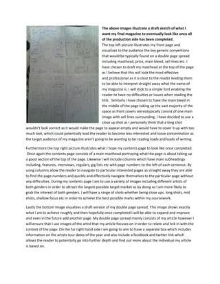
1. The above images illustrate a draft sketch of what I
want my final magazine to eventually look like once all
of the production side has been completed.
The top left picture illustrates my front page and
visualizes to the audience the key generic conventions
that would be typically found on a double page spread
including masthead, price, main bleed, sell lines etc. I
have chosen to draft my masthead at the top of the page
as I believe that this will look the most effective
and professional as it is clear to the reader leading them
to be able to interpret straight away what the name of
my magazine is. I will stick to a simple font enabling the
reader to have no difficulties or issues when reading the
title. Similarly I have chosen to have the main bleed in
the middle of the page taking up the vast majority of the
space as front covers stereotypically consist of one main
image with sell lines surrounding. I have decided to use a
close up shot as I personally think that a long shot
wouldn't look correct as it would make the page to appear empty and would have to cover it up with too
much text, which could potentially lead the reader to become less interested and loose concentration as
the target audience of my magazine aren't going to be wanting to be reading loads and loads of writing.
Furthermore the top right picture illustrates what I hope my contents page to look like once completed.
Once again the contents page consists of a main masthead portraying what the page is about taking up
a good section of the top of the page. Likewise I will include columns which have main subheadings
including, features, interviews, regulars, gig lists etc with page numbers to the left of each sentence. By
using columns allow the reader to navigate to particular interested pages as straight away they are able
to find the page numbers and quickly and effectively navigate themselves to the particular page without
any difficulties. During my contents page I am to use a variety of images including different artists of
both genders in order to attract the largest possible target market as by doing so I am more likely to
grab the interest of both genders. I will have a range of shots whether being close ups. long shots, mid
shots, shallow focus etc in order to achieve the best possible marks within my coursework.
Lastly the bottom image visualizes a draft version of my double page spread. This image shows exactly
what I am to achieve roughly and then hopefully once completed I will be able to expand and improve
and even in the future add another page. My double page spread mainly consists of my article however I
will ensure that I use images of the artist that my article focuses on in order to relate and link in with the
context of the page. On the far right hand side I am going to aim to have a separate box which includes
information on the artists tour dates of the year and also include a facebook and twitter link which
allows the reader to potentially go into further depth and find out more about the individual my article
is based on.