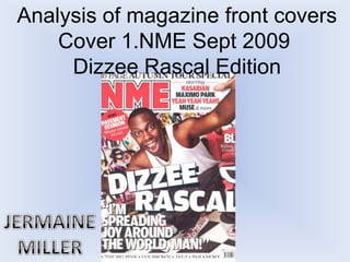
2. THE MASTHEAD THE HEADER/STRAPLINE
Often red , white & black Black font standing out in white
colour scheme representing background “Autumn Page Special” is
the seriousness of the more bold than “16 Page” to suggest
magazine but is the wildness of the front cover
contradicted by Dizzee linking with Dizzee rascals face
Rascals face expression to expression and gesture also giving
show that life can be fun. interest to the reader.
USE OF A FLASHER COVER LINES
Suits the story of this Mixture of red & black words
magazine special “Wowee attract the target
zowee” very bubbly audience/reader
language suiting the main
image of Dizzee Rascals face
THE MAIN IMAGE
expression and gestures and Flamboyant face expression and
caption giving the target gesture aiming at its target audience
audience the same as Outgoing and expressive through
excitement music making them feel closer to the
celebrity “Dizzee Rascal” Main image
BACKGROUND also relates to content and
The graffiti symbolising background.
Dizzee Rascals childhood THE MAIN COVER LINE
growing up in London “DIZZEE RASCAL” telling us who the
influenced by grime music celebrity is and the use of slant on
which originated from those words suggest his crazy life also
streets and has that theme. relating to the language of other
USE OF A PULL QUOTE content used and main image.
Linking with the main image
the pull quote seems full of Barcode-
joy and achievement and it date/issue/price
links with Dizzee Rascals
gesture of wide open arms -
Around The World Man”
3. This magazine special suggests that the target audience
are part the urban community with musical interests such
as: rap, Hip-hop, Grime or Street Garage. Their favourite
artists might be British due to the use of language used
and how it is presented.
Mainly male aged 15 - 20 due to the theme of the
magazine and background, also Dizzee Rascals lifestyle
and gesture in this magazine shows a sense of male
flamboyance and physicality.
Main methods used to attract the audience are: the
language used, very expressive and flamboyant “Around
The world man!”. The font sizes and structure and how
the main image takes up the whole background. All of
these methods link to Dizzee Rascals face expression and
gesture giving the target audience a sense that the
magazine get the theme/point across to the reader.
4. Layout
This contents page has quite a simplistic layout using a Rule of Thirds
column structure with a banner taking up 2 sections of that. There is 1
main image in the middle of the page with small text underneath; the
border around those separates it from either sides. The subscription
box in the corner shows it is not an important section in the magazine
but still must be noticeable for it to be on the contents page. Sub
headings on the right side tell the reader the different sections in the
magazine giving them a chance of faster research also with the index
and page numbers on the left side taking up the whole column.
Subscription
The subscription box stands out on the contents page because it
separates itself from the house style using yellow font, a different font
style and size. There is also 2 images of previous NME front covers to
let the reader know that it still relates to NME. Words such as
“Subscribe” “An Issue” are big and bold to show the reader that they
need to be seen by them due to it not being very direct.
House Style
The masthead from the front cover is placed on this page also: Red, black and white showing that this gives
recognition of NME keeping the same house style of the masthead through out. All the headings are bold, the
ones on the right side have a background to them which is black and the white font stands out in this. In the index
section the page stories are in red and the numbers are in black all in a white background; this al relates to
keeping the same house style to match the masthead keeping that theme. A drop cap is used in the middle
section with the text under the image to tell the reader that that is the main story on that page being under the
image also.
5. Layout
A very simple layout: the 1st page is filled with one image of Dizzee Rascal letting the reader know the
article is about him. On the 2nd page there is the by/headline which takes up half of the page, under it is an
introduction to the article and then the article is split into 4 columns. All of this content on the 2nd page is
on a watermarked image. There is also a Tag in the top right corner of the 2nd page which says “Dizzee” –
not very formal.
House Style
Headline – Very bold and some of the
words have different font sizes such as
“Tags” and “Riches” being bigger to
represent the life of Dizzee rascal also
relating to the images shown how he is
tagging but wearing very stylish clothing
at the same time. Text – A drop cap is
used to start the article keeping the Main Image
same whole style as the contents and
the rest of the font is very small. This image relates to Dizzee Rascals life majorly. He’s
sneaky look and action of head turning over the shoulder is
Tag – The tag in the top right corner of suggesting the target audience being quite young, also with
the 2nd page says “Dizzee” this the wall background of all the taggings relating to street
informally tells us that the article is
youth. Dizzee is wearing a red jacket, this suggests that he
about him other than the main image,
had a dangerous life. This makes the reader feel much
Being informal it also shows us that
Dizzee doesn’t always have to be a closer with Dizzee Rascal giving them an idea of his
serious person childhood and showing how he has matured through music.
6. http://www.nme.com/magazine
The New Musical Express (NME) is a popular music
publication in the United Kingdom, published weekly since
March 1952, when it was first published by Maurice Kinn.
It started as a music newspaper, and gradually moved
toward a magazine format during the 1980s, changing from
newsprint in 1998. It was the first British paper to include a
singles chart, in the 14 November 1952 edition. In the
1970s it became the best-selling British music newspaper.
Over the years it has changed in structure, colour usage
and image quality improving as the years of technology
pass on. This is due to the target audience change in
different issues and the influence of different musicians
attracting that target audience. It aims at its target
audience through the celebrity used for main image and
the action/gesture that they are pursuing, the text used
and the colours which all relates back to the main image
and its background. Current musicians it uses nowadays
are from a variety of different genre’s such as Rock (Kiss),
Indie (Oasis), HipHop (Jay-Z) and even country (Taylor
Swift) This shows how the history not just in NME, but in
music has changed and has grown.