↑Top Model (Kolkata) Call Girls Rajpur ⟟ 8250192130 ⟟ High Class Call Girl In...
Analysing Double Page Spreads
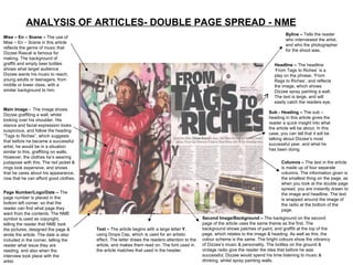
1. ANALYSIS OF ARTICLES- DOUBLE PAGE SPREAD - NME Mise – En – Scene – The use of Mise – En – Scene in this article reflects the genre of music that Dizzee Rascal is famous for making. The background of graffiti and empty beer bottles shows what target audience Dizzee wants his music to reach; young adults or teenagers, from middle or lower class, with a similar background to him. Main Image - The image shows Dizzee graffiting a wall, whilst looking over his shoulder. His stance and facial expression looks suspicious, and follow the heading “Tags to Riches”, which suggests that before he became a successful artist, he would be in a situation similar to this, graffiting on walls. However, the clothes he’s wearing juxtapose with this. The red jacket & rings look expensive, and shows that he cares about his appearance, now that he can afford good clothes. Page Number/Logo/Date – The page number is placed in the bottom left corner, so that the reader can find what page they want from the contents. The NME symbol is used as copyright, telling the reader that NME took the pictures, designed the page & wrote the article. The date is also included in the corner, telling the reader what issue they are reading, and also when the interview took place with the artist. Byline – Tells the reader who interviewed the artist, and who the photographer for the shoot was. Sub - Heading – The sub – heading in this article gives the reader a quick insight into what the article will be about. In this case, you can tell that it will be talking about Dizzee’s most successful year, and what he has been doing. Headline – The headline ‘From Tags to Riches’ is a play on the phrase, ‘From Rags to Riches’. and reflects the image, which shows Dizzee spray painting a wall. The text is large, and will easily catch the readers eye, Columns – The text in the article is made up of four separate columns. The information given is the smallest thing on the page, as when you look at the double page spread, you are instantly drawn to the image and headline. The text is wrapped around the image of the radio at the bottom of the page. Text – The article begins with a large letter Y , using Drops Cap, which is used for an artistic effect. The letter draws the readers attention to the article, and makes them read on. The font used in the article matches that used in the header. Second Image/Background – The background on the second page of the article uses the same theme as the first. The background shows patches of paint, and graffiti at the top of the page, which relates to the image & heading. As well as this, the colour scheme is the same. The bright colours show the vibrancy of Dizzee’s music & personality. The bottles on the ground & vintage radio give the reader the idea that before he was successful, Dizzee would spend his time listening to music & drinking, whilst spray painting walls.
2. ANALYSIS OF ARTICLES- DOUBLE PAGE SPREAD - Q Image/Mise – En - Scene – For the Double Page Spread in Q magazine, the image is dominant, and takes up half of the spread. The image of Lady Gaga is a mid – shot, with only her upper torso & head visible. Her hair is wild & untamed, which reflects her style of music, and her individuality as a person & artist. The image has been edited into black and white, giving the impression of old Hollywood glamour, as well as creating a dramatic effect. The blank background ensures that all of the attention is on the image . Gaga is looking directly at the camera, and therefore the reader, which establishes a relationship. Page Number/Logo/Date – The page number/logo and date are all important parts of the issue.. The page number is there so that readers can go straight from the content page to the article they want. The logo is found in the bottom corner of the page, and is there for copyright purposes, Text – The use of Drop Capitals at the start gives the article a more artistic feel, and clearly shows where the interview starts and ends. The black text gives connotations of maturity & sophistication, reflecting the image on the opposite page. As well as this, the text stands out clearly against the red L behind, which gives the magazine an edgy look, as this layout isn’t the norm in other music magazines. Title – In the top corner of the article, the name of the artist can be seen. The name stands out, and informs the reader of who the artist is. As well as this, the style of text is different to the rest of the article, making it stand out. Headline/Sub – Heading – The Double Page Spread doesn’t contain any sub – headings or headlines. This gives the article are more minimalistic & edgy feel to it, reflecting not only the style of music Lady Gaga makes, but also the target audience of Q magazine. By using a popular artist in a controversial shoot, they are attracting audiences aged 15 – 25, who are interested in pop music.
3. ANALYSIS OF ARTICLES – DOUBLE PAGE SPREAD - KERRANG Pull Quote/Headline – A pull quote from a member of the band is used as a headline for the article, and encourages the person who bought the magazine to keep on reading. As well as this, the quote breaks up the page. The red font emphasises the words, and presents them as important. Image – The image of My Chemical Romance shows the entire band. However, the lead singer is at the front of the picture, and the main focus, showing how prominent he is in the music, and how important he is to the band. However, he is not looking directly at the camera, giving the impression that he is arrogant, and doesn’t want to connect whit the audience Mise – En – Scene – The band are standing against a blank background, which allows the colours of their clothes to stand out. The bright colours they are wearing reflect the style of their music, they are energetic and young, which is shown by their style. As well as this, the bands hair styles suggest that they are individual and unique, reflecting rock music and the image that Kerrang portrays to its audience/ Columns /Text– In this article, the text only takes up a small part, whereas the image is prominent. The text is in two columns, making the Double Page Spread look simplistic & minimal. The black against white makes the writing stand out to the reader. Adverts – At the end of the article, and advert is shown for the next episode of Kerrang, and the continuation of the interview. This invites people who are interested in My Chemical Romance, or this type of music, to buy the next issue, as it will contain more information about them. Anchorage of Image. Colour Theme - The colours on the Pull Quote match the colours on the jacket of Gerard Way, the lead singer of My Chemical Romance. This highlights his importance as a member of the band, and singles him out. Target Audience – The target audience for this Double Page Spread would be teenagers & young adults, ages around 15 -25. This can be seen by the clothes the band are wearing, and the general layout of the page.