My evaluation – question 2
•Download as PPTX, PDF•
0 likes•334 views

The combination of the main horror film trailer product and two ancillary texts (a poster and magazine cover) was effective in establishing a recognizable brand. A consistent serif font style was used for the film title across products to link them, except for the magazine cover where a conventional font was used. Photographs from the trailer filming were also used for the magazine to coincide visuals. Color palettes including black, dark red and blue filters were mirrored across products to further connect them under one identifiable brand.

Recommended
More Related Content
What's hot
Viewers also liked
Viewers also liked (15)
Similar to My evaluation – question 2
Similar to My evaluation – question 2 (20)
More from Gc Howard
My evaluation – question 2
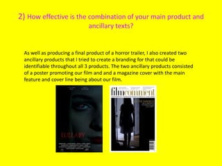
- 1. 2) How effective is the combination of your main product and ancillary texts? As well as producing a final product of a horror trailer, I also created two ancillary products that I tried to create a branding for that could be identifiable throughout all 3 products. The two ancillary products consisted of a poster promoting our film and and a magazine cover with the main feature and cover line being about our film.
- 2. The most important component for me in creating a brand was to keep an identifiable font style for my title. The only product that I could not use this same font on is the cover of my magazine as this would not be conventional of professional existing magazine covers. The use of the serif font is a typical convention of the horror genre and this is a characteristic that I used to make my products as realistic and authentic as possible.
- 3. Another way that I tried to keep the three products linked was that, mainly focused on my magazine inspiration, I acted upon the opportunity to take my photographs for the shoot, while filming our trailer, as this is a convention that 'Film Comment' magazine adopts. This keeps the visuals of all three products coinciding and the photographs that I chose were drawn from scenes in our trailer, again to make them identifiable at a glance.
- 4. The final component that I tried to mirror across the products was the use of colour that would link them as one product. The main colours I used were black, dark red and blue filters for the lighting. The standout colour that links all three products would be the blue filters to create a cold and mysterious feel, however the deep red used for my main title of my poster and the title in the trailer, reinforced by the blood and 'coming soon' featured at the end of the trailer, all connote a sense of danger, which is a key convention of a horror genre production. This can be seen through my research.