1. Chosen Design Evaluation
By Daniel Silva
I chose the last design on the list, because I think it is very simple
and informative and the same time, which makes it easy to understand.
That to me is critical in a poster.
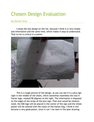
This is a rough picture of the design, as you can see it is a plus sign
right in the middle of the sheet, which somewhat resembles the real X-
Factor logo, rotated 90 degrees to the right. The information is disposed
on the edges of the strips of the plus sign. That text would be medium
sized, the ISM logo will be placed in the center of the sign and the whole
poster will be colored with the colors of the Italian flag. I think it will
become a very good poster, since it can`t be seen in the poor drawing.
2. It is eye-catching, as I think it relates to the most of the people that will
attend the event (Italians). The equal sign will be red and the rest of the
sheet will be divided diagonally, being white and green. The images will
be about the school, referring to where specifically the event will happen,
and other places such as where the appetizers will be served.