
Recommended
More Related Content
What's hot
What's hot (19)
Viewers also liked
Viewers also liked (20)
Similar to Research 2 page spread
Similar to Research 2 page spread (20)
Research 2 page spread
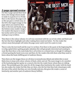
- 1. 2-page spread review For this 2-page spread there have been a few design choices made to make it as good as it is. Firstly there is the layout, the page is set so the eye goes a certain way, on the left is the largest image on the page where you look first then there is the text and finally along the bottom some smaller images. For readers this layout is simple but works well it isn’t cluttered making it easy to follow. Then there is the colour scheme; it is all very consistent with the use of red, white and black and the fact that these highlight each other making them stand out better. For the reader the colours mean that people will notice the page easier and it won’t be a pain to read. There is also the text itself and the way it is written. First there is the quote at the beginning this is in big capital letters getting peoples attention this will get people interested and wanting to read. But then there is the main body this is all written in a relaxed tone as though it’s talking to a friend quoting the band every now and then, for the readers this tells them what they want to know about the band, fulfilling part of audience theory. Then there are the images these are all done in monochrome (black and white) this is most likely done to keep with colour scheme of black, white and red. The main image is of a member of the band playing their guitar at a concert; this lets the reader know whom they are talking about. This probably goes the same for all the images they familiarize the reader with the band but also makes the reader feel like they are there, also the fact that they look relaxed goes with the tone of the article that they are very friendly and nice, this gives the reader a sense of familiarity and another part of audience theory fulfilled.