Download as PDF, PPTX


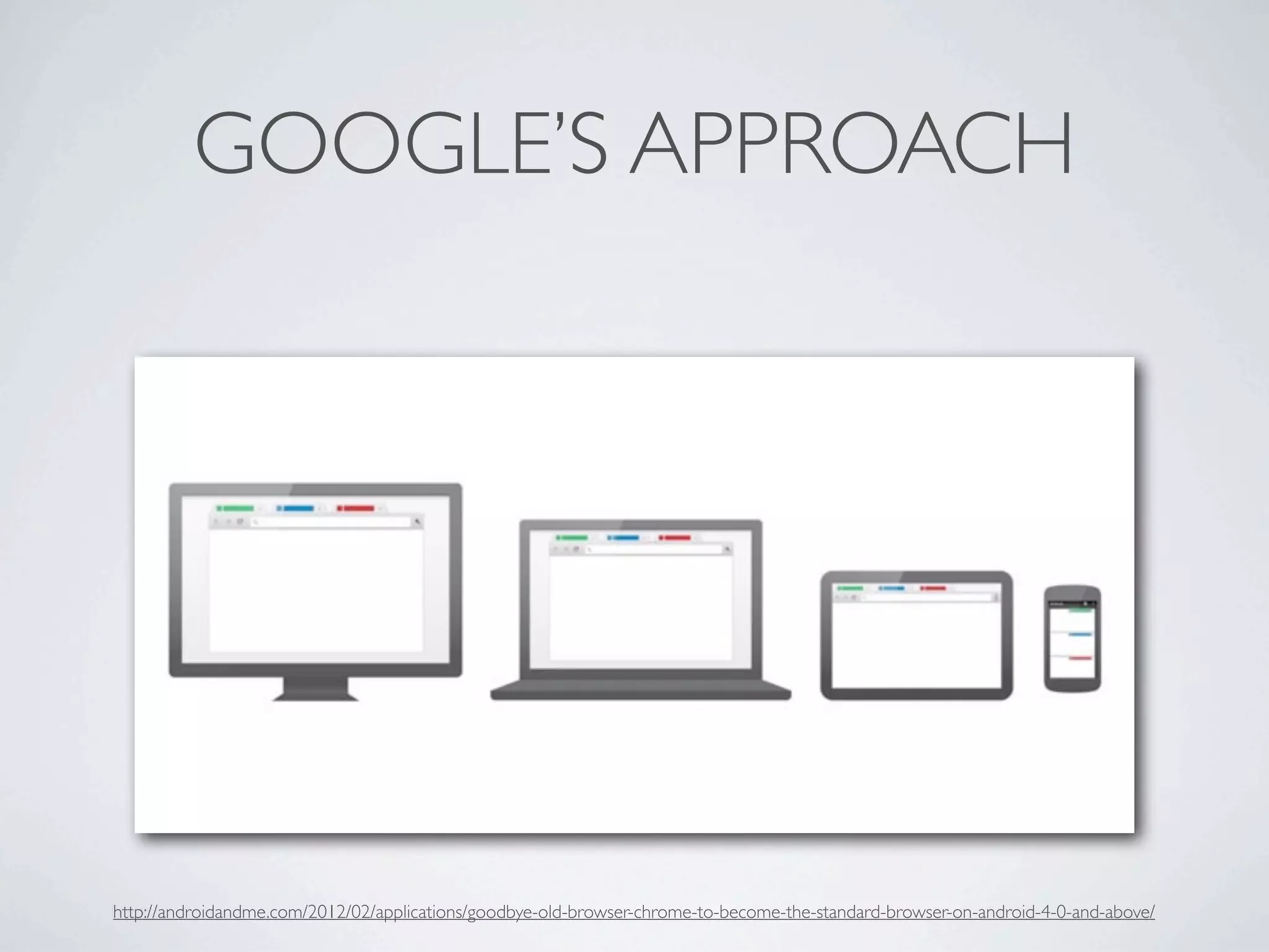
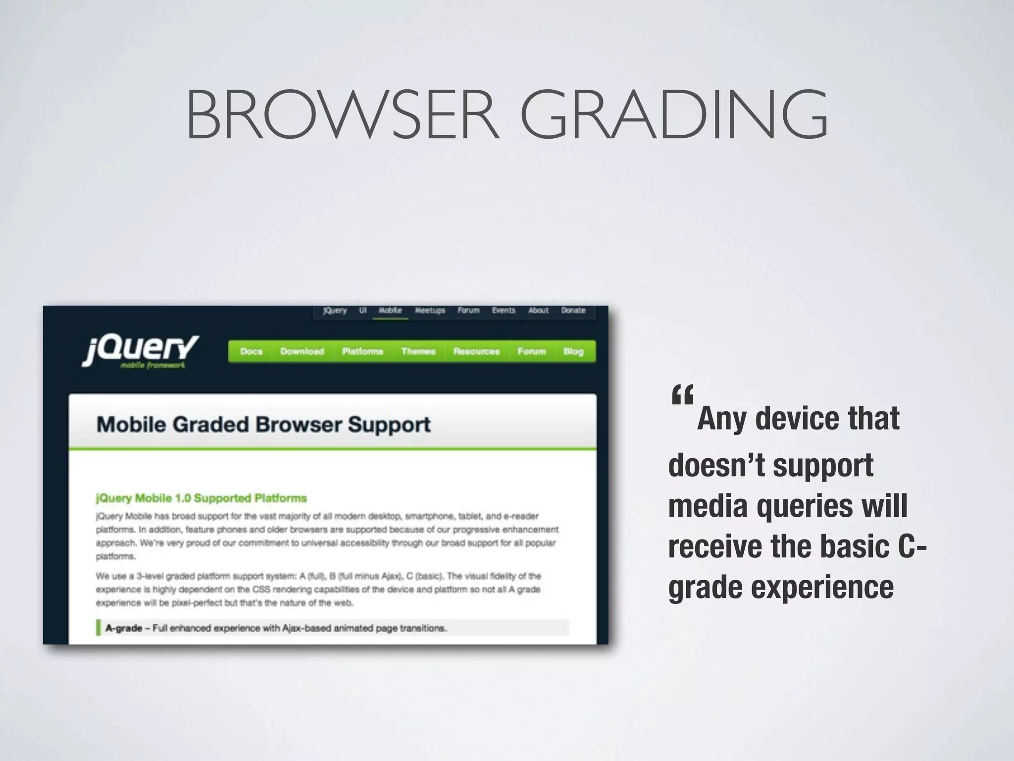

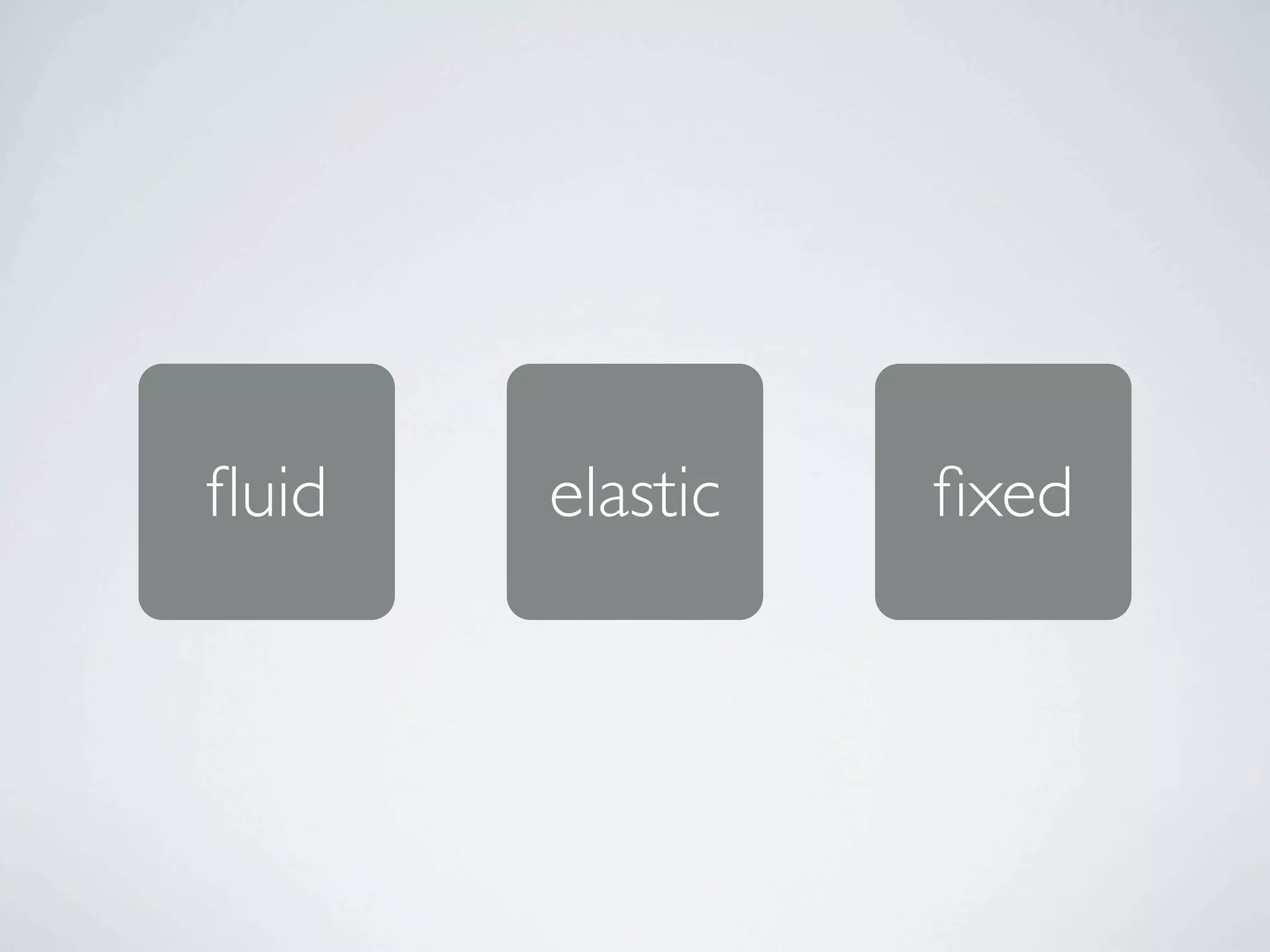
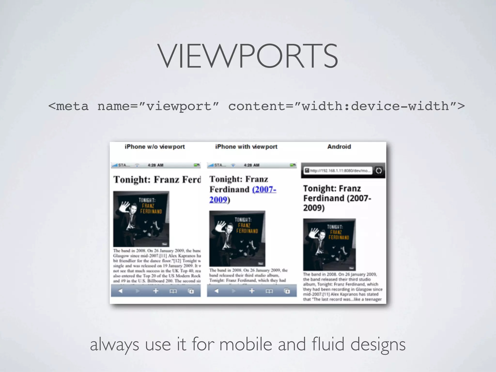
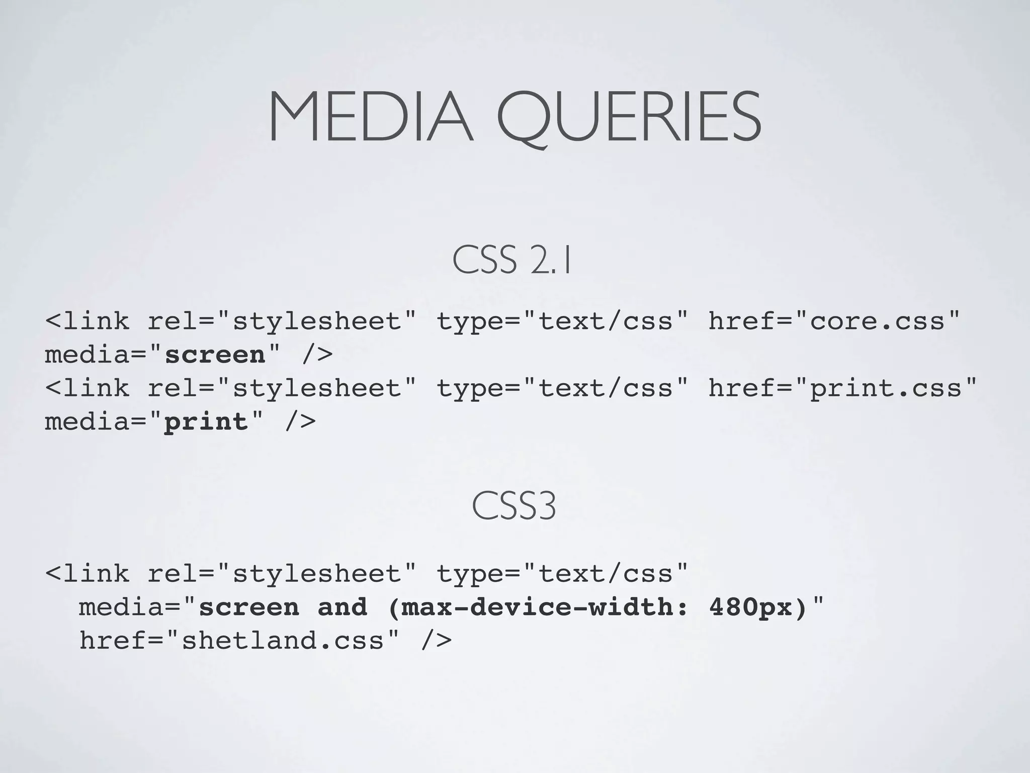
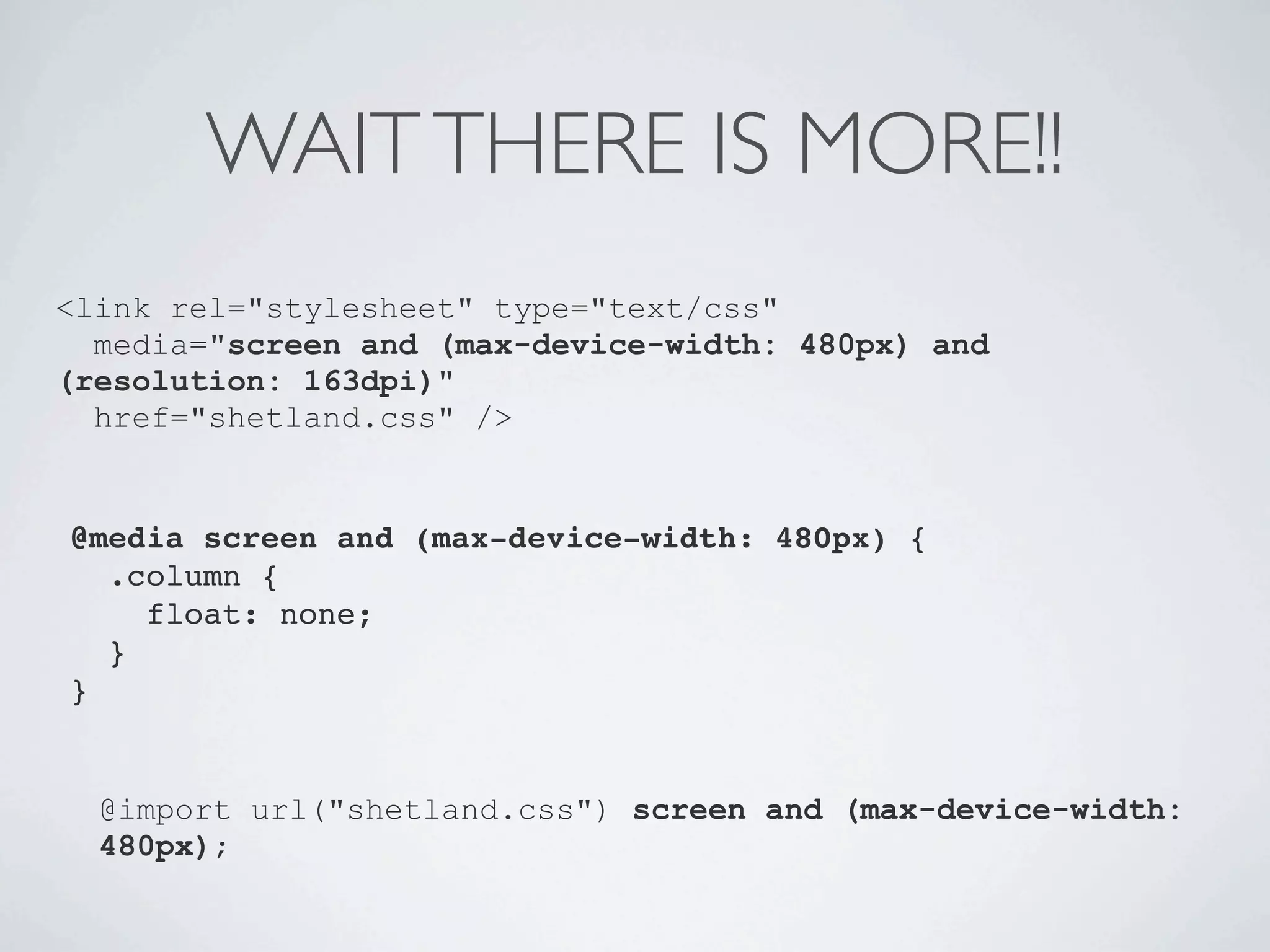


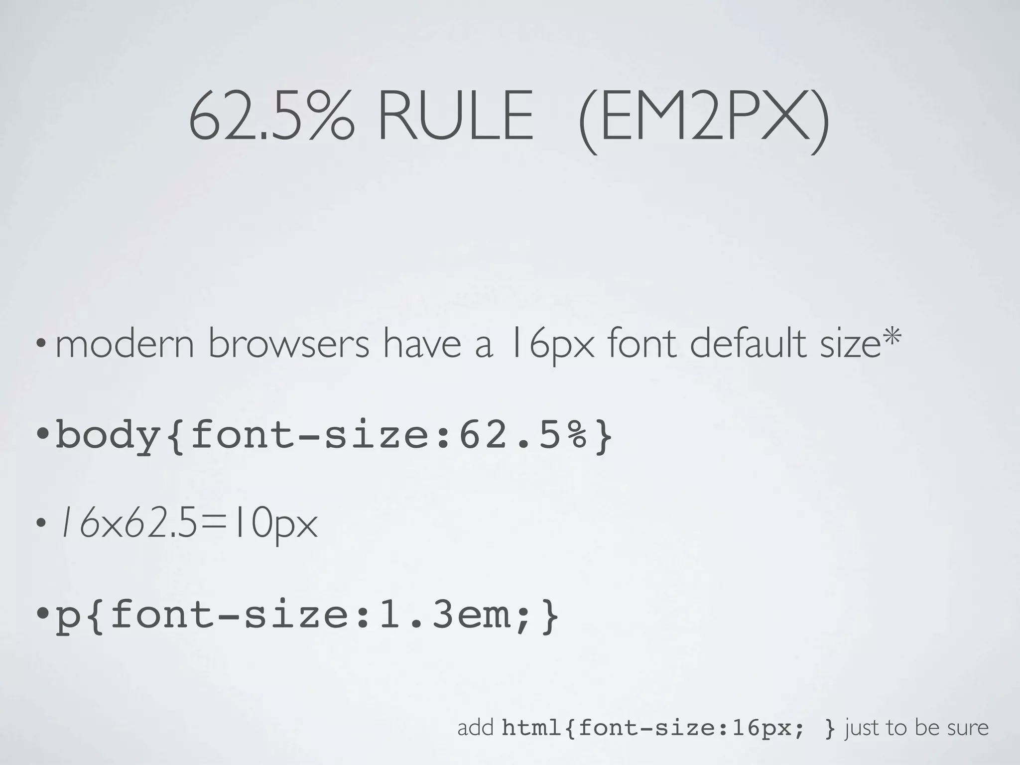

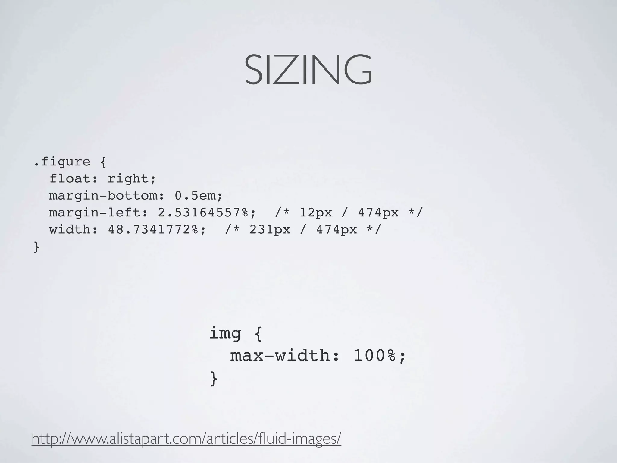
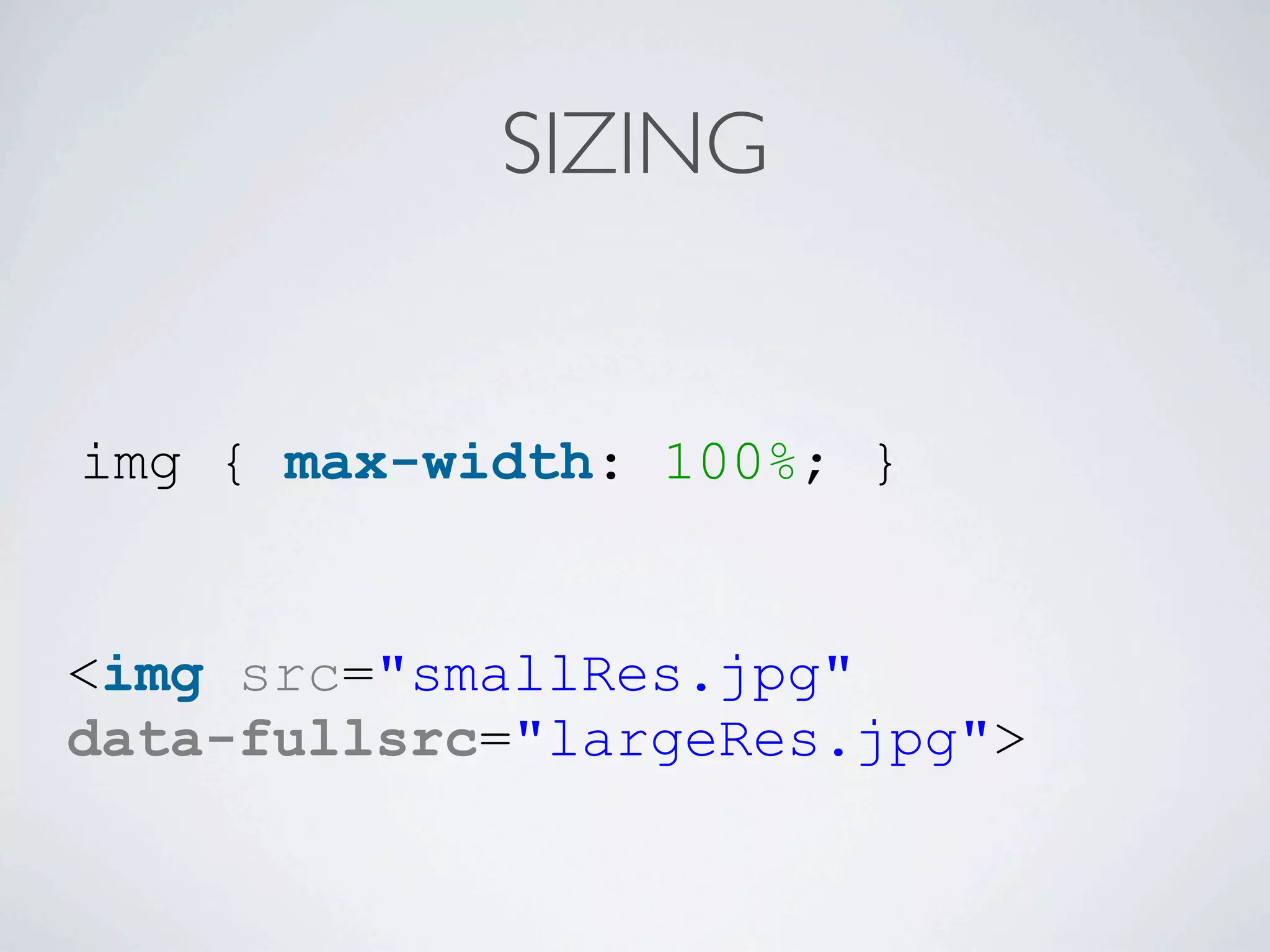


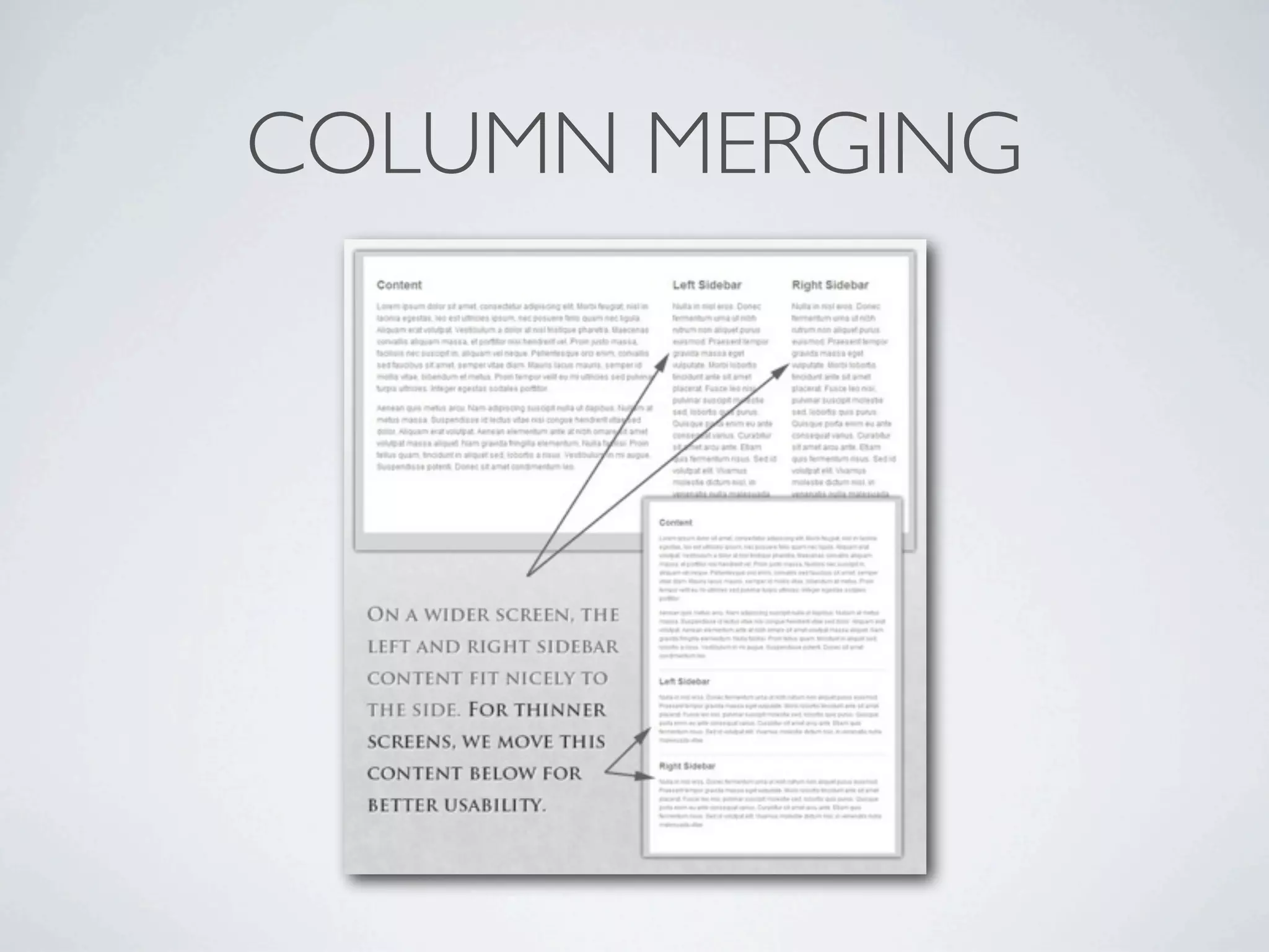
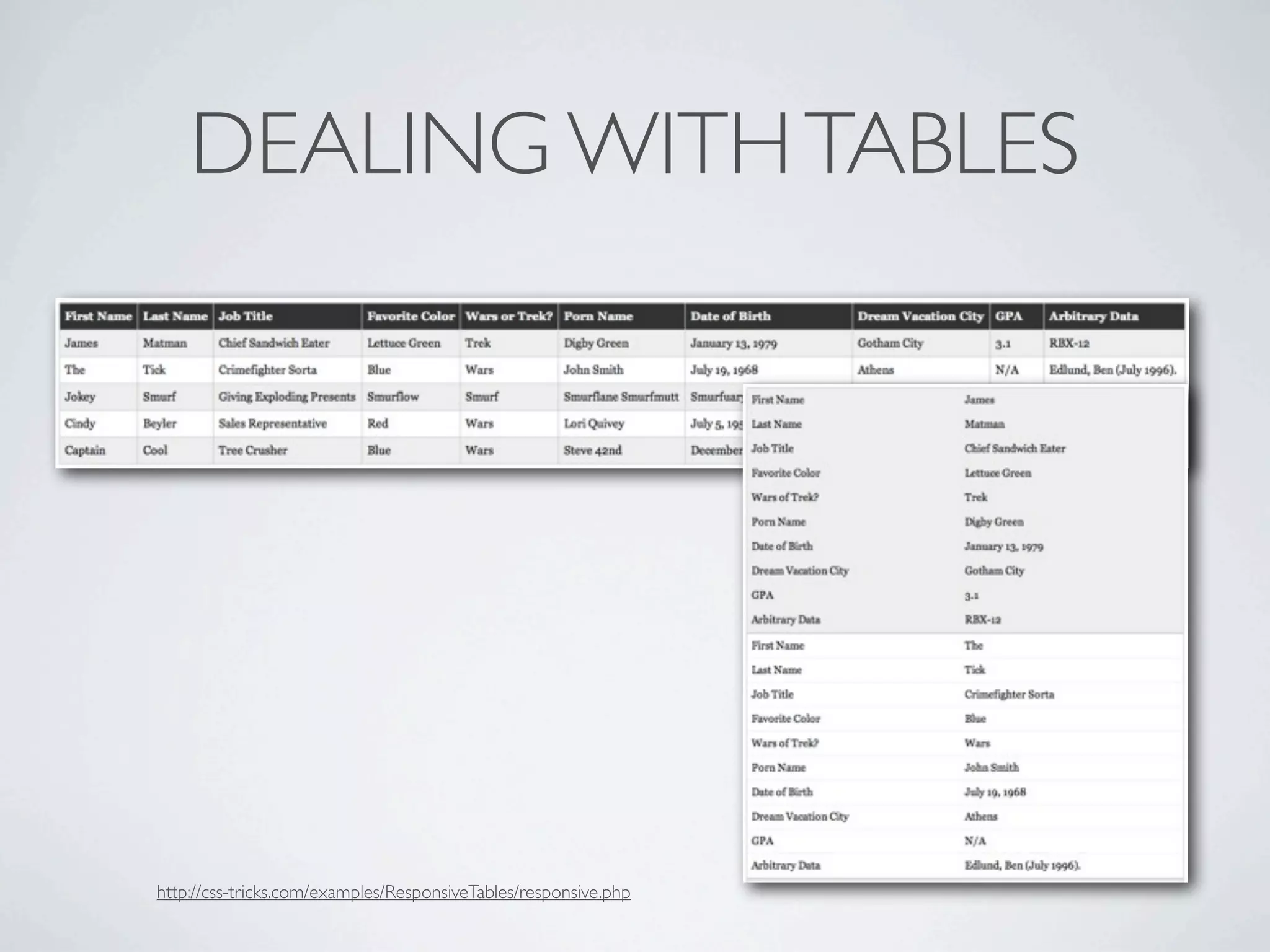
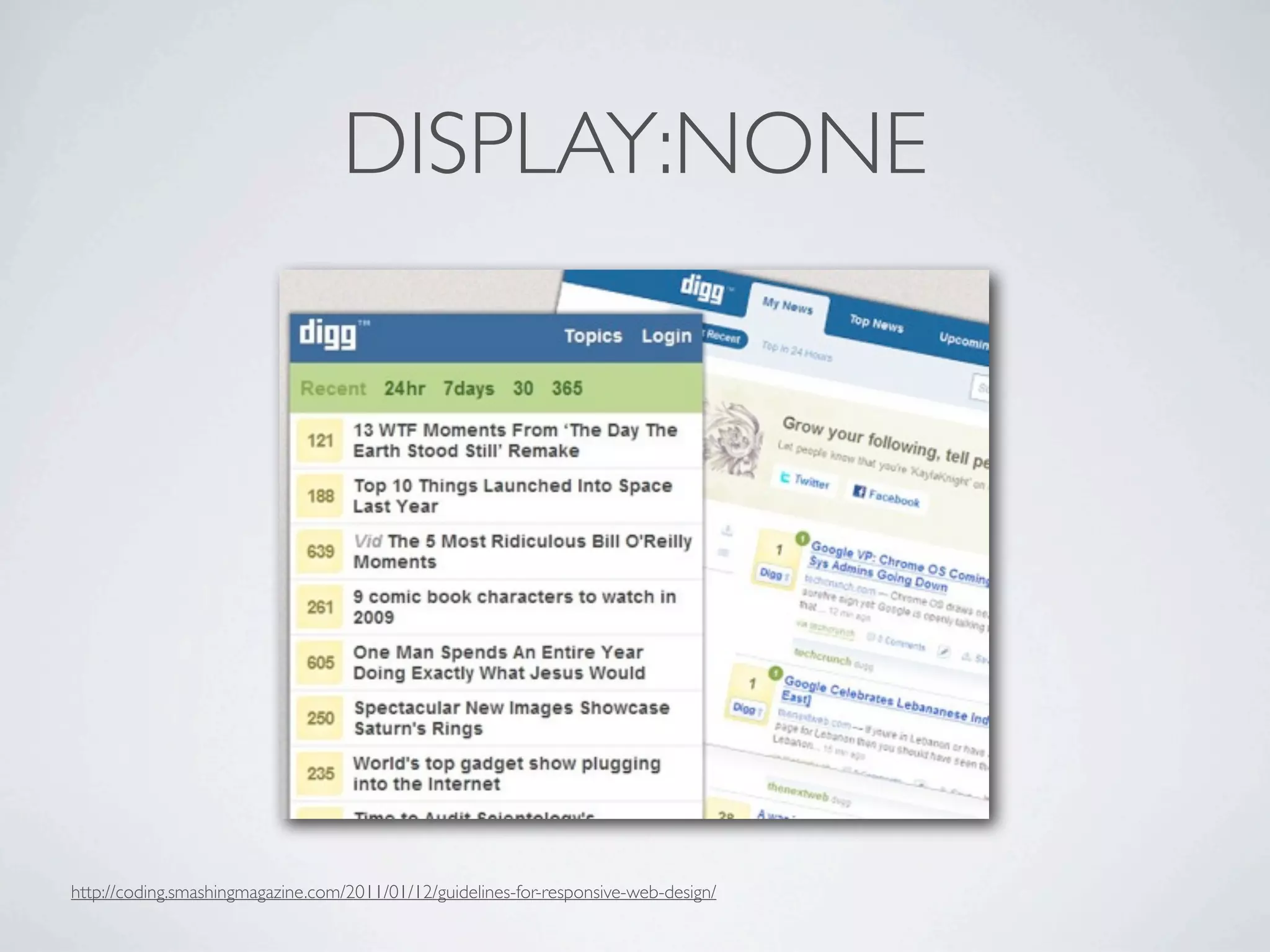
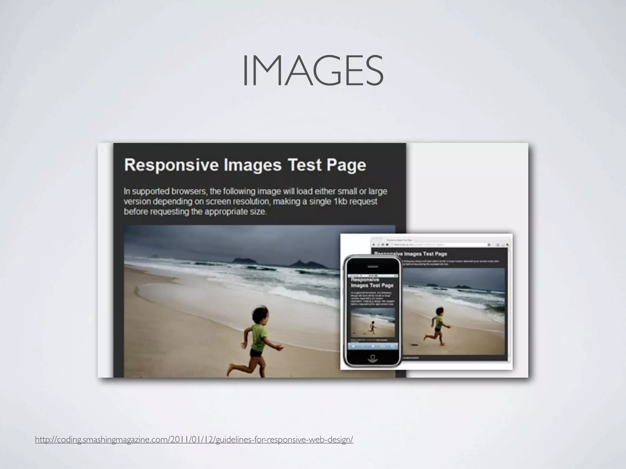
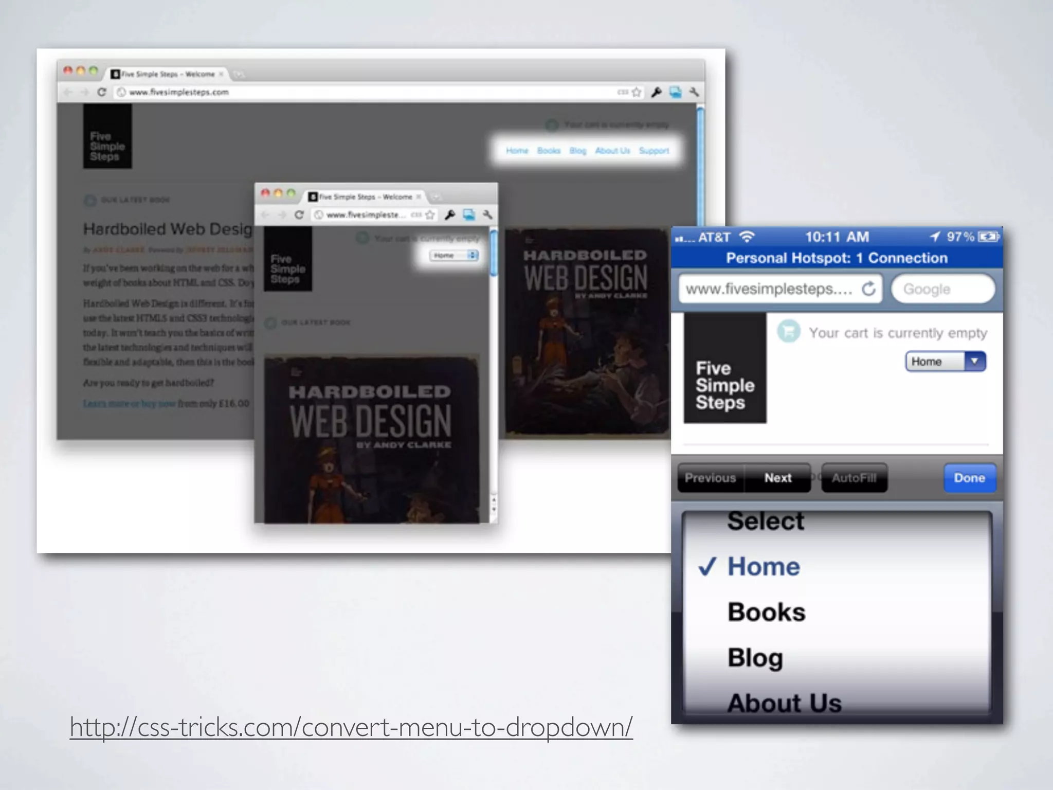


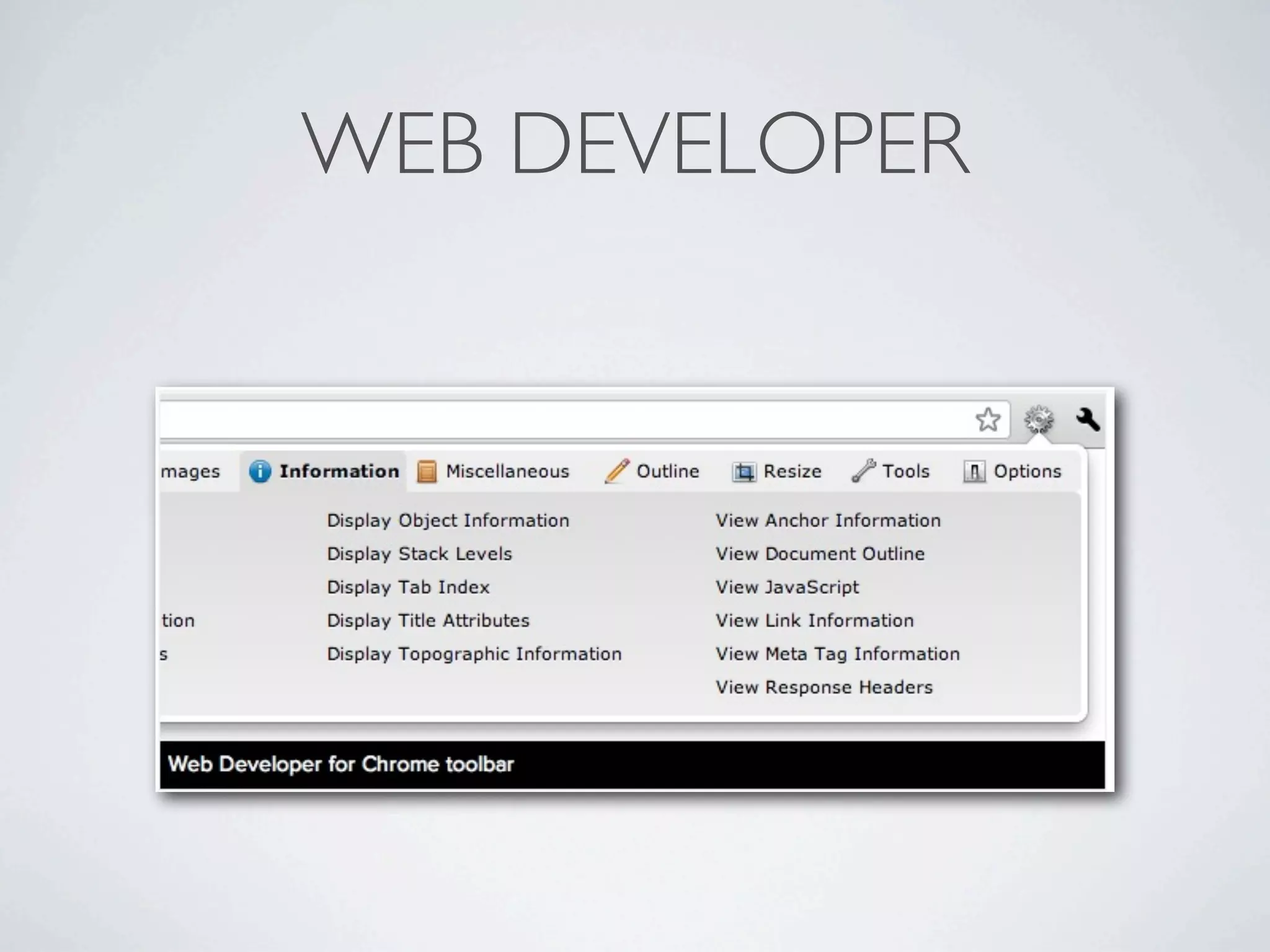
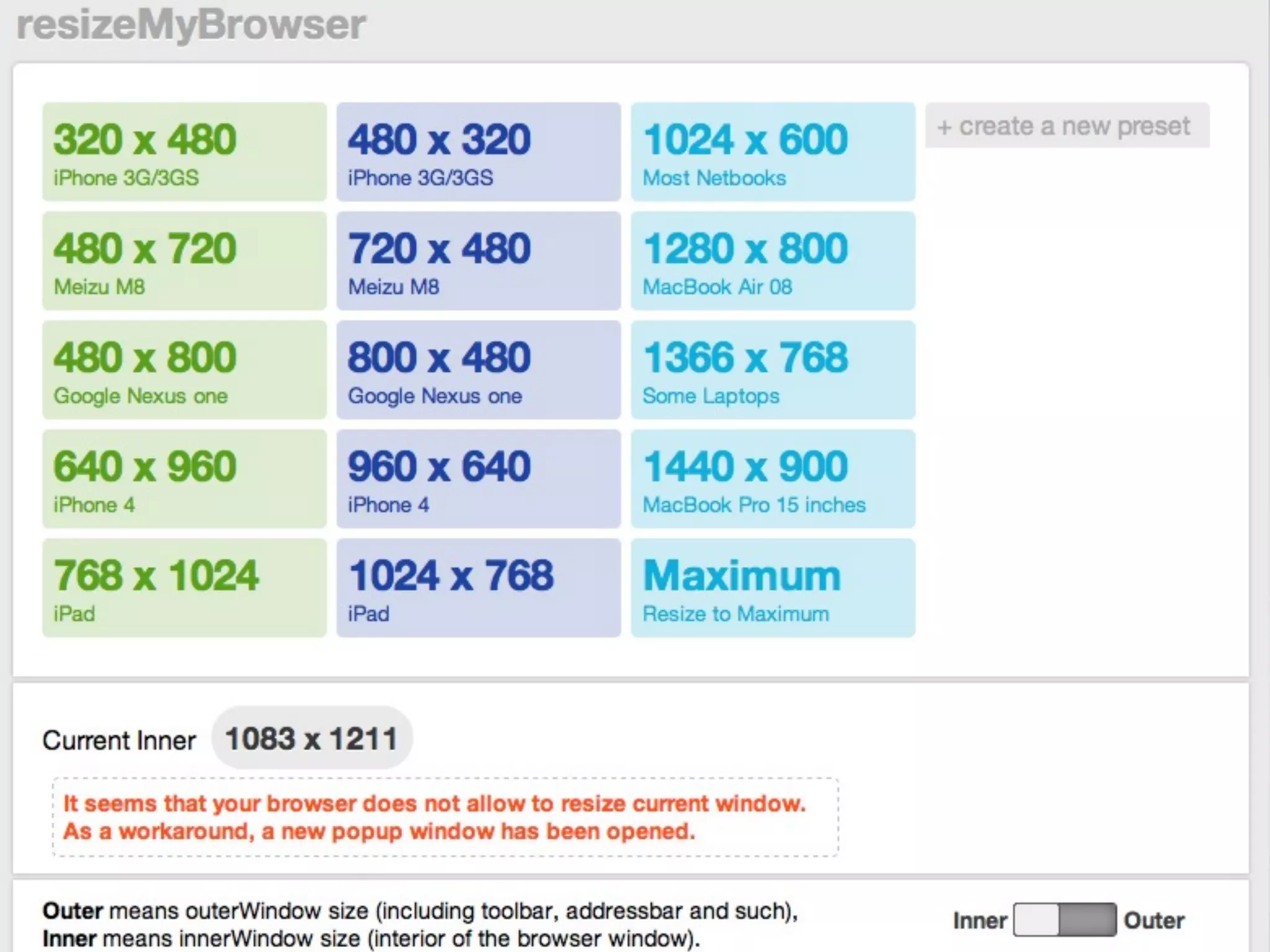
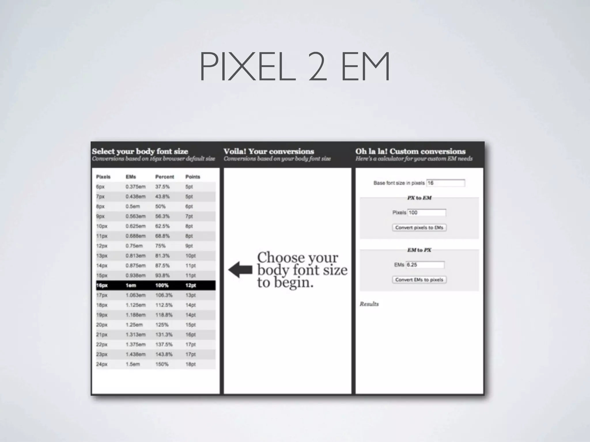
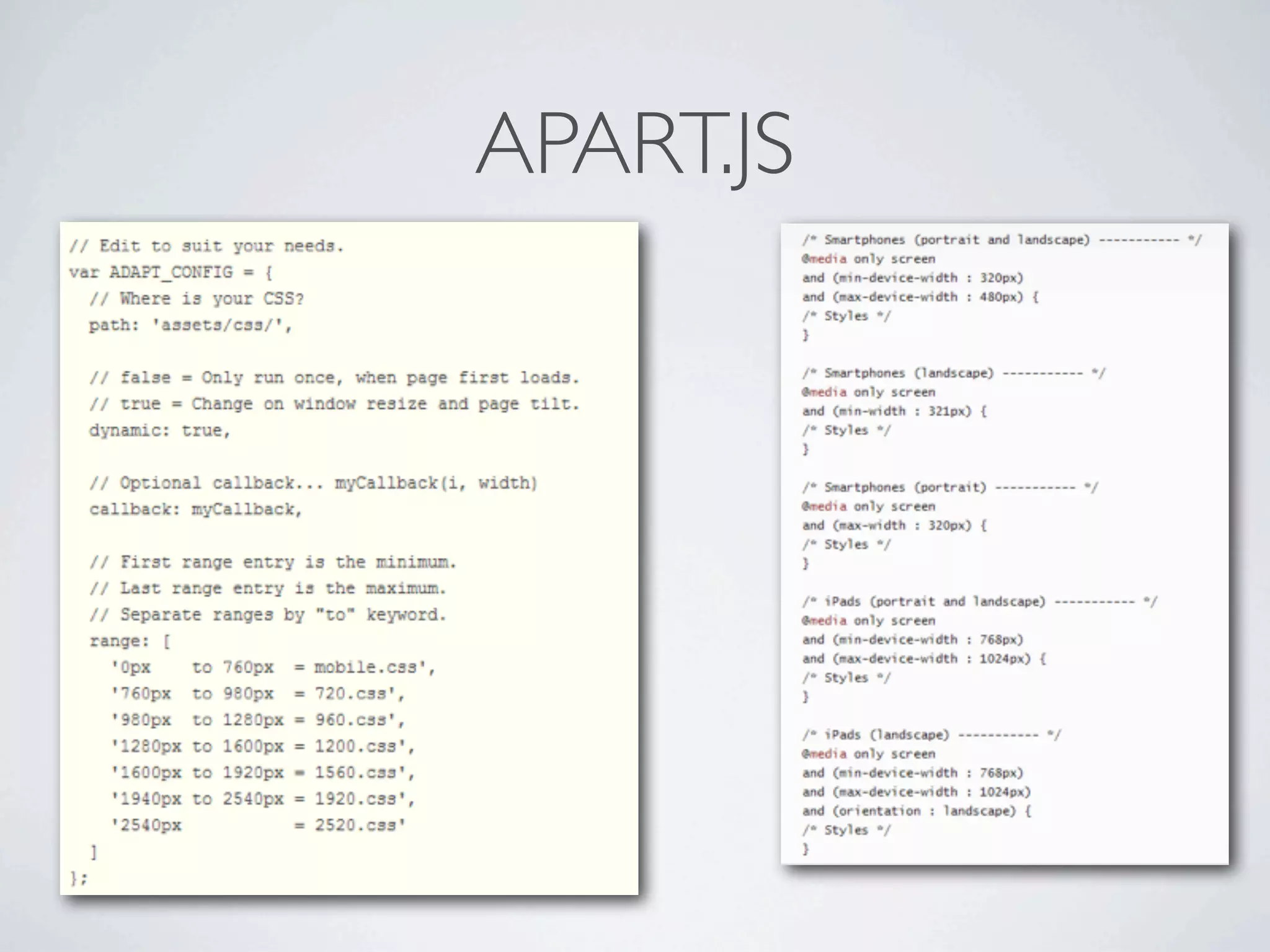
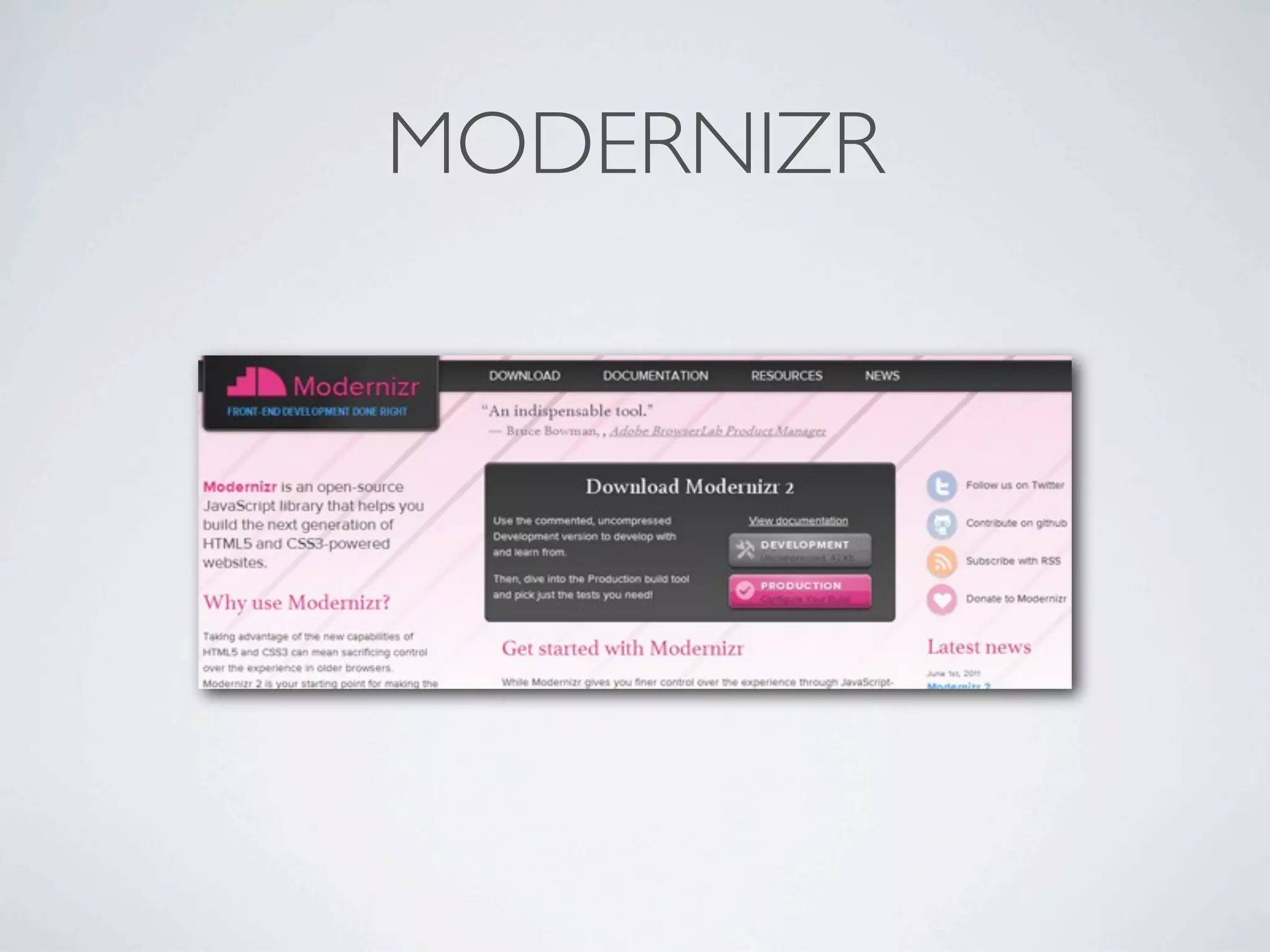
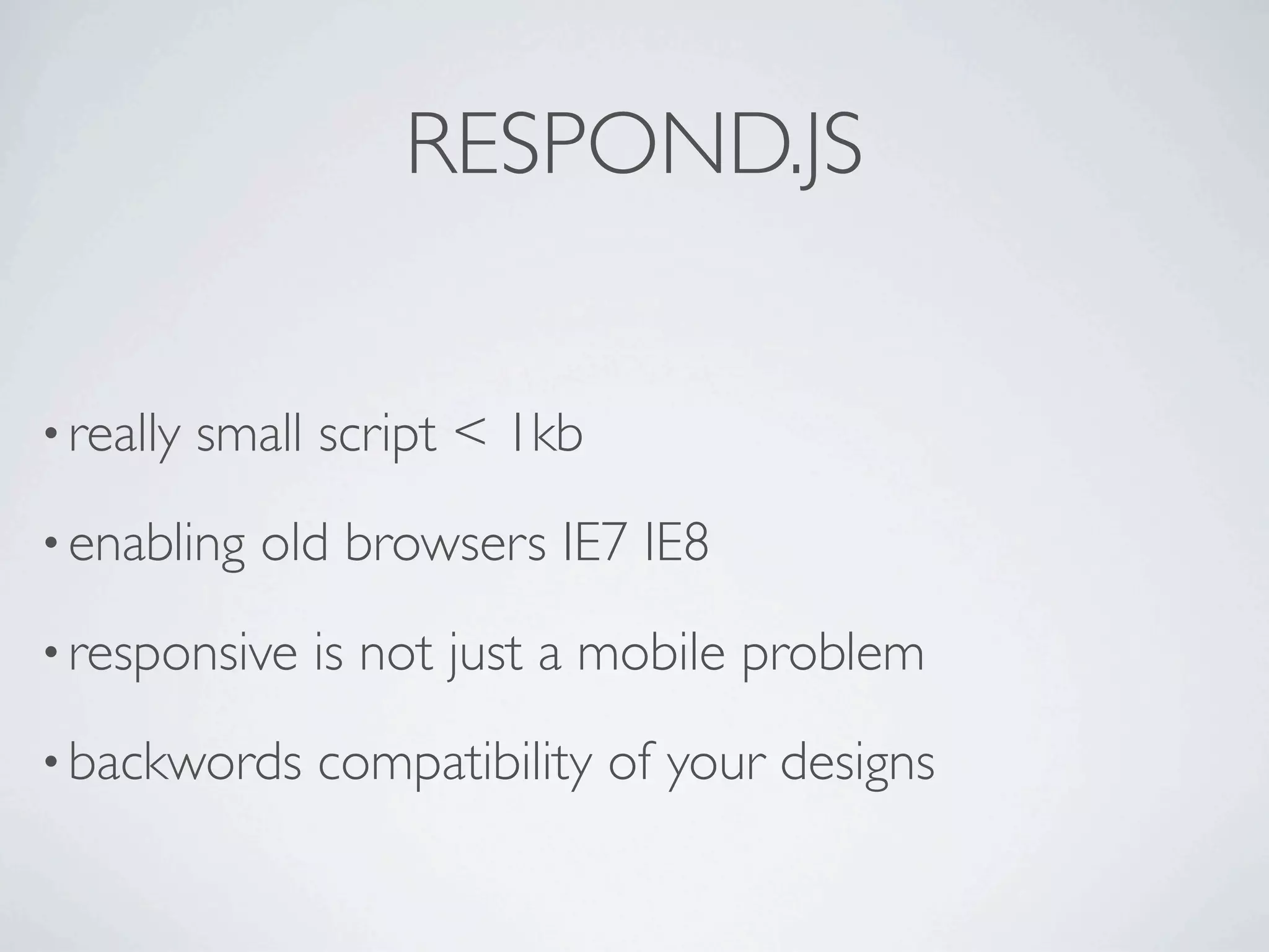
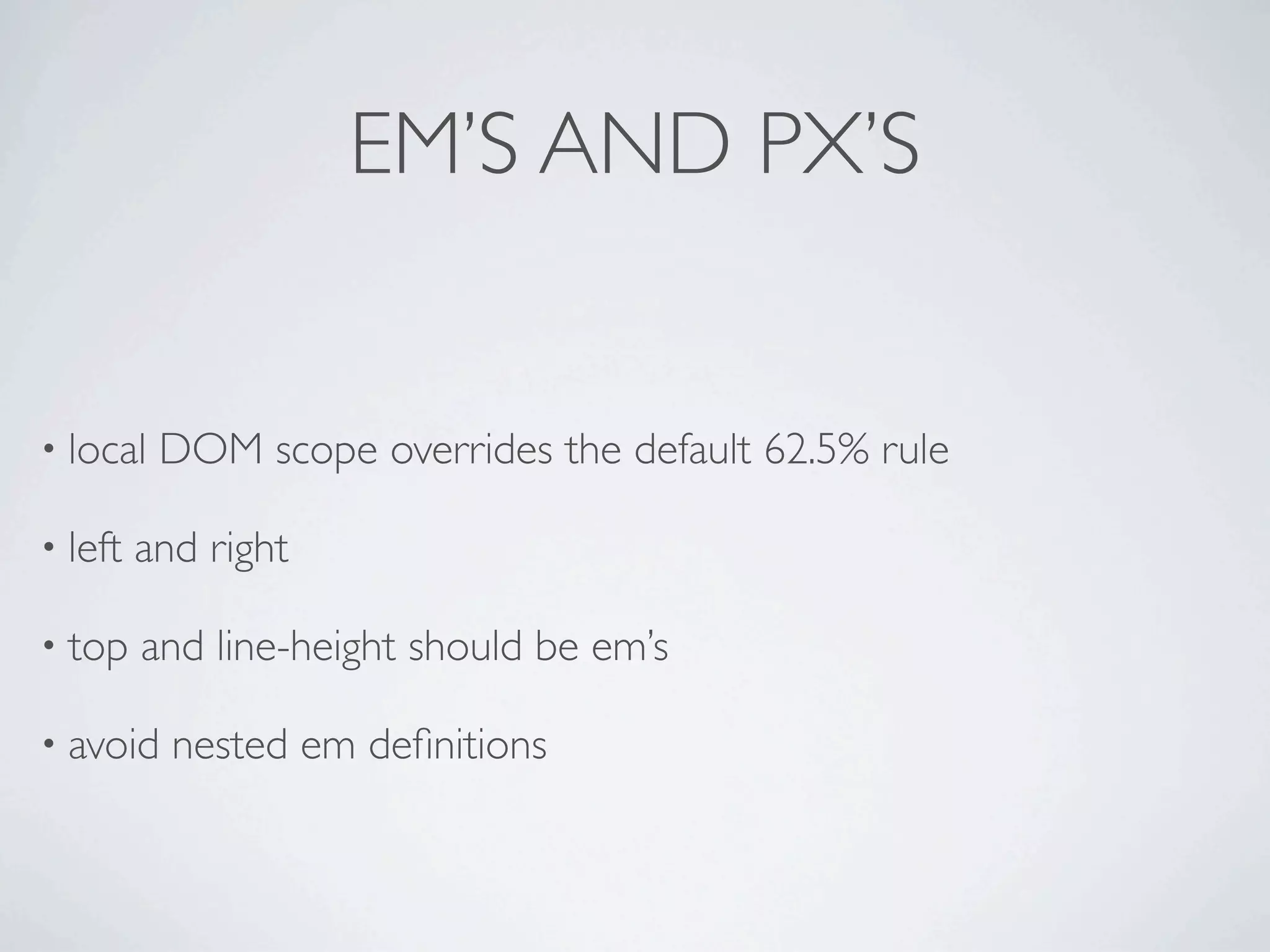
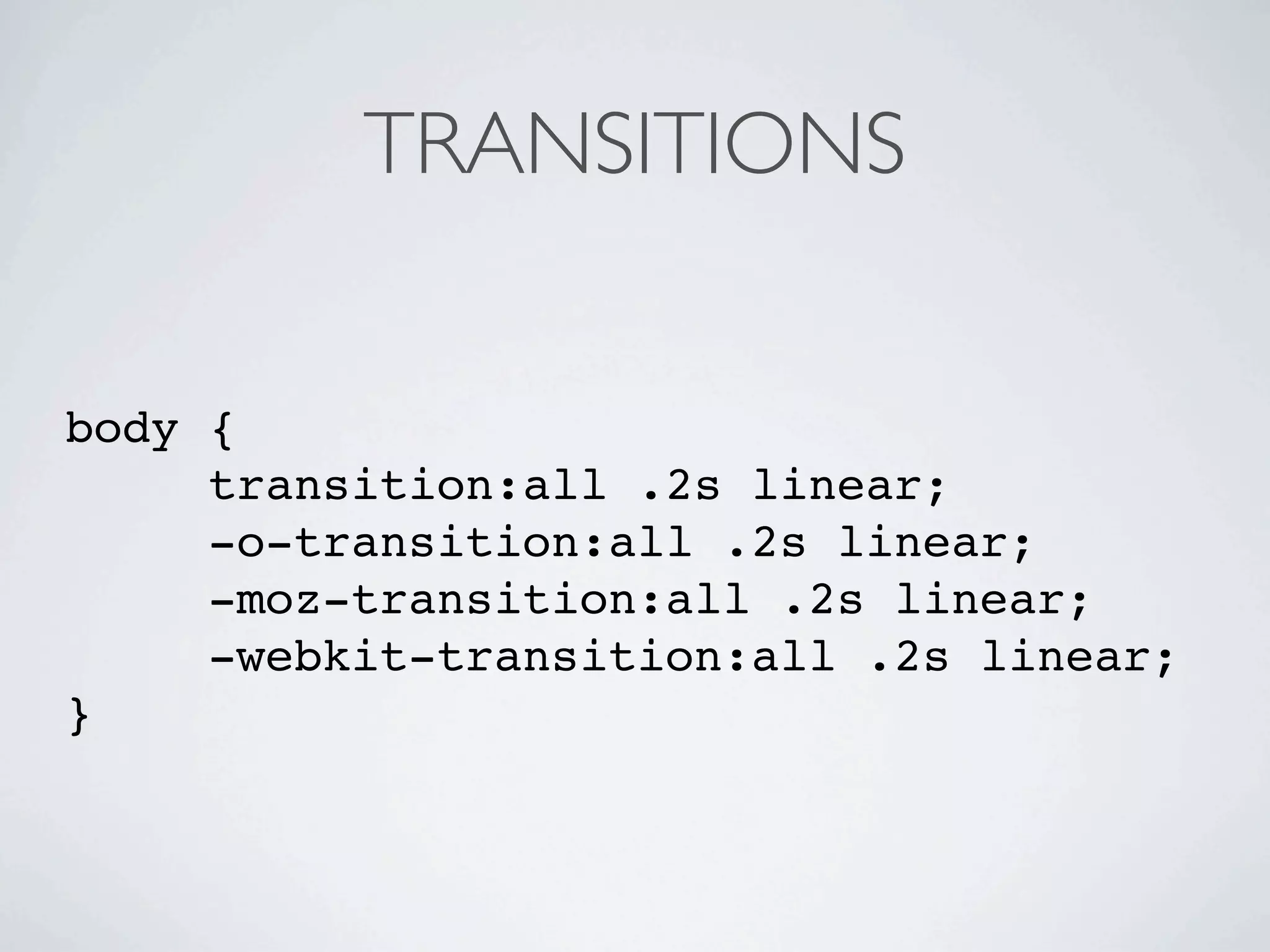
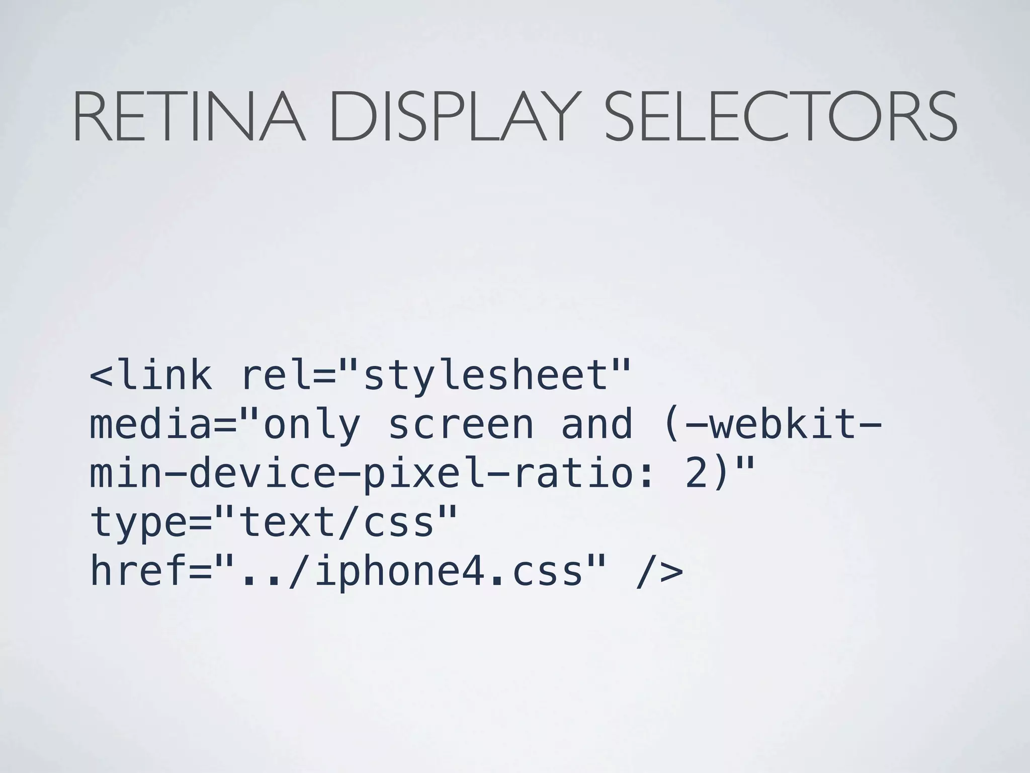
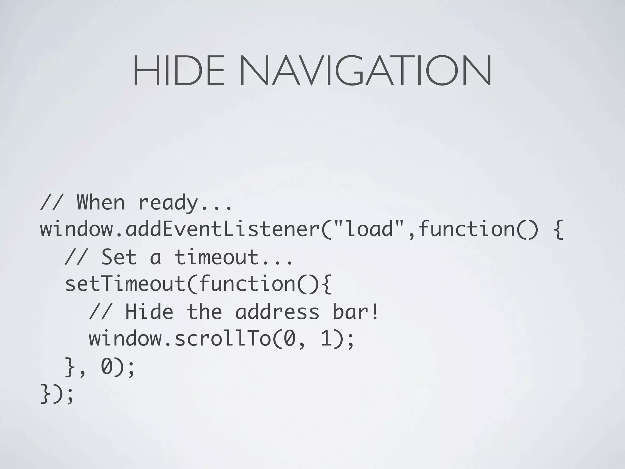

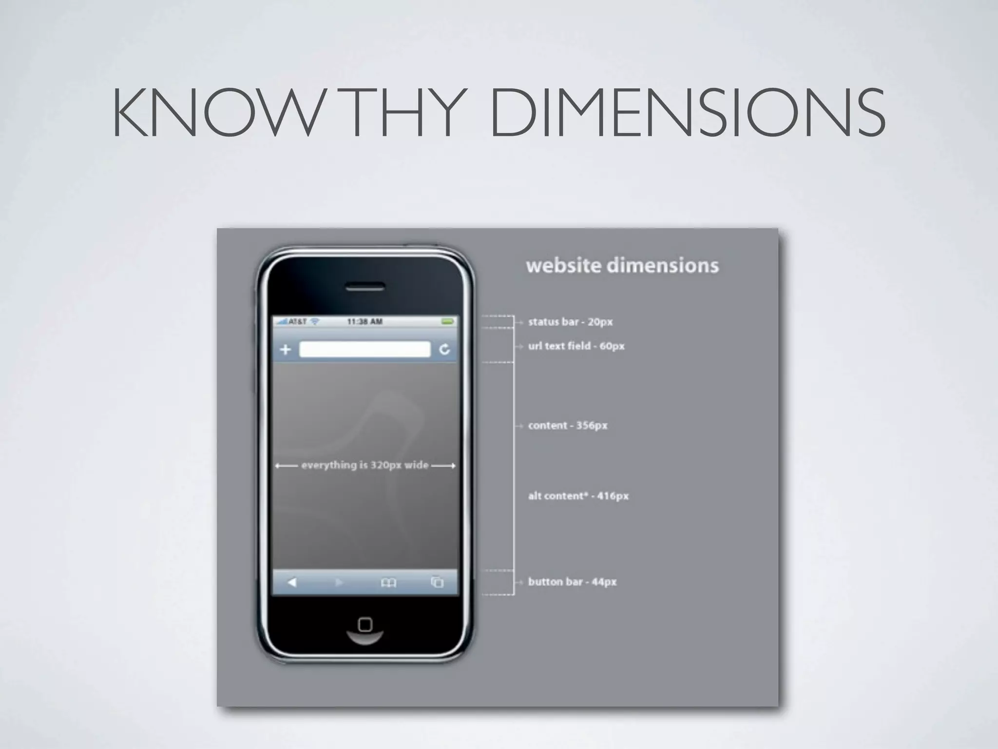

This document discusses responsive web design techniques including: - Using viewports and media queries to adapt layouts for different screen sizes. - Sizing images fluidly using max-width: 100% so they are responsive. - Design patterns for responsive tables, hiding/showing content, and converting menus to dropdowns. - Tools like Modernizr, Respond.js, and frameworks like LESS to support responsive design goals. - Tips like using relative units (ems/percentages) over fixed pixels and transitions for visual changes.


![[jqconatx] Adaptive Images for Responsive Web Design](https://cdn.slidesharecdn.com/ss_thumbnails/adaptive-imagesv14-130911193737-phpapp01-thumbnail.jpg?width=640&height=640&fit=bounds)


![Coded Agents – with UiPath SDK + LangGraph [Virtual Hands-on Workshop]](https://cdn.slidesharecdn.com/ss_thumbnails/codedagentsdeck-251215155422-5497c599-thumbnail.jpg?width=640&height=640&fit=bounds)


