1. Colour Schemes
Iconography
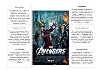
The colour scheme for the poster has
deep blue and steel hues that has
connotations of strength which is
important for the action genre. The
bright reds and orange flames clash
loudly with the serious, darker shades
expression the action and the
destruction that are portrayed
throughout the movie.
The marvel logo above the movie title is
iconic as it is used for all of its products
such as films, TV shows, comics etc. and
has a very strong brand identity for its
merchandise and large fan base. The
characters themselves iconic as they each
have their individual movies so this ties in
with those movies. The A is also iconic as
it’s the logo for The Avengers.
Position of Images & Text
Institutional Information
The image of the people are right in the
middle, Iron Man is reaching out to
something which will attract the
audiences attention. The characters are
spread apart in various stances and
positions to suggest that they're fighting
- enhancing that it's an action film. The
movie title is directly under the picture
which makes it stand out.
The institutional information for the
poster is directly underneath the title of
the film, which is efficient and draws
attention to the extra details. The date of
when the film is out is in the centre of the
institutional information for the film and
larger, with the letters bold and inthe
similar font to the actual title.
Film Title Design
Guttenberg Principle
The title of the film is rather steely,
giving a sci-fi effect and also an action
feel. The A is in the typical logo for the
film which creates brand identity.
Because it's in capital letters it gives
the effect of being loud much like the
film itself.
The main character, Iron man, is in the
middle of the page which draws
attention to him. This creates a strong
brand identity for previous Marvel films,
which is a similar effect with having thor
next to him. The text is directly bellow
the image and in the centre of the page,
which attracts the audiences attention.