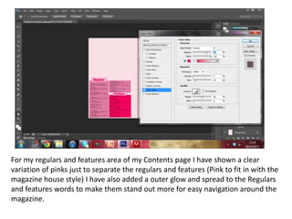
1. For my regulars and features area of my Contents page I have shown a clear
variation of pinks just to separate the regulars and features (Pink to fit in with the
magazine house style) I have also added a outer glow and spread to the Regulars
and features words to make them stand out more for easy navigation around the
magazine.
2. For the editors note I just included different fonts for the writing
and signature to make it look more legit. Similar to a pop
magazine. I’ve also included the editors picture as a circle again so
it looks more official.
3. With my twitter advertisement for the magazine I just used a
twitter icon and a red variation of text to make the logo stand
out more.
4. For all the numbers for the navigation of the cover and the contents page again I
have just added outer glow and used quite a lot of spread to make the numbers
looks almost glittery. Keeping with the house style of the magazine and to make
the numbers stand out for navigation.
5. I’ve used a sharp pink outer glow around the model again to make
the pictures blend together and with the layout of the page.
6. I’ve used outer glow on inside this issue and contents. It gives them a sense
of looking glittery and almost 3D in fitting with the house style of the
contents page and overall magazine.