Downloaded 3,506 times
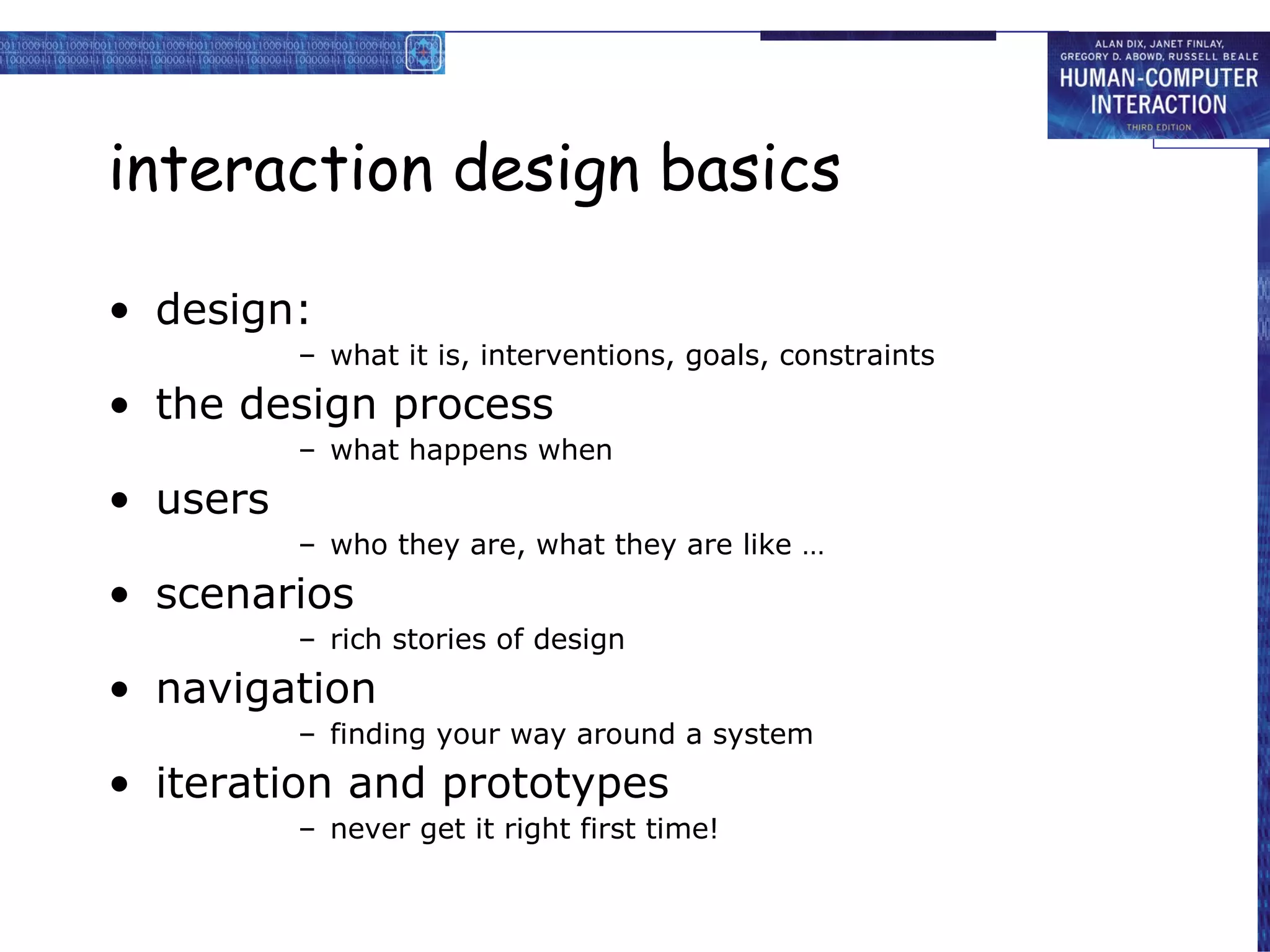
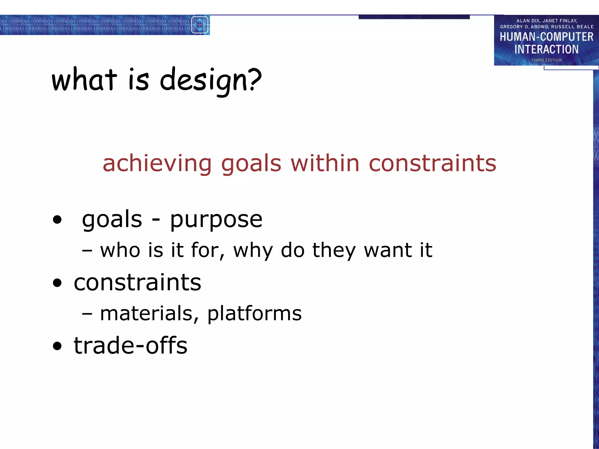
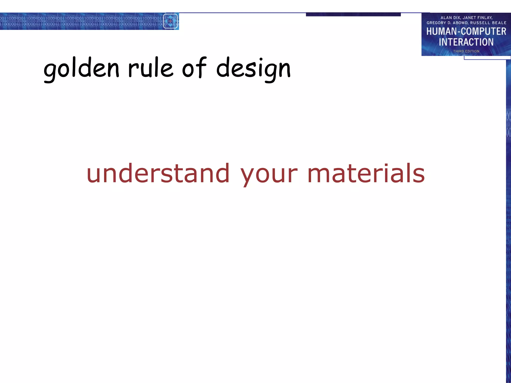
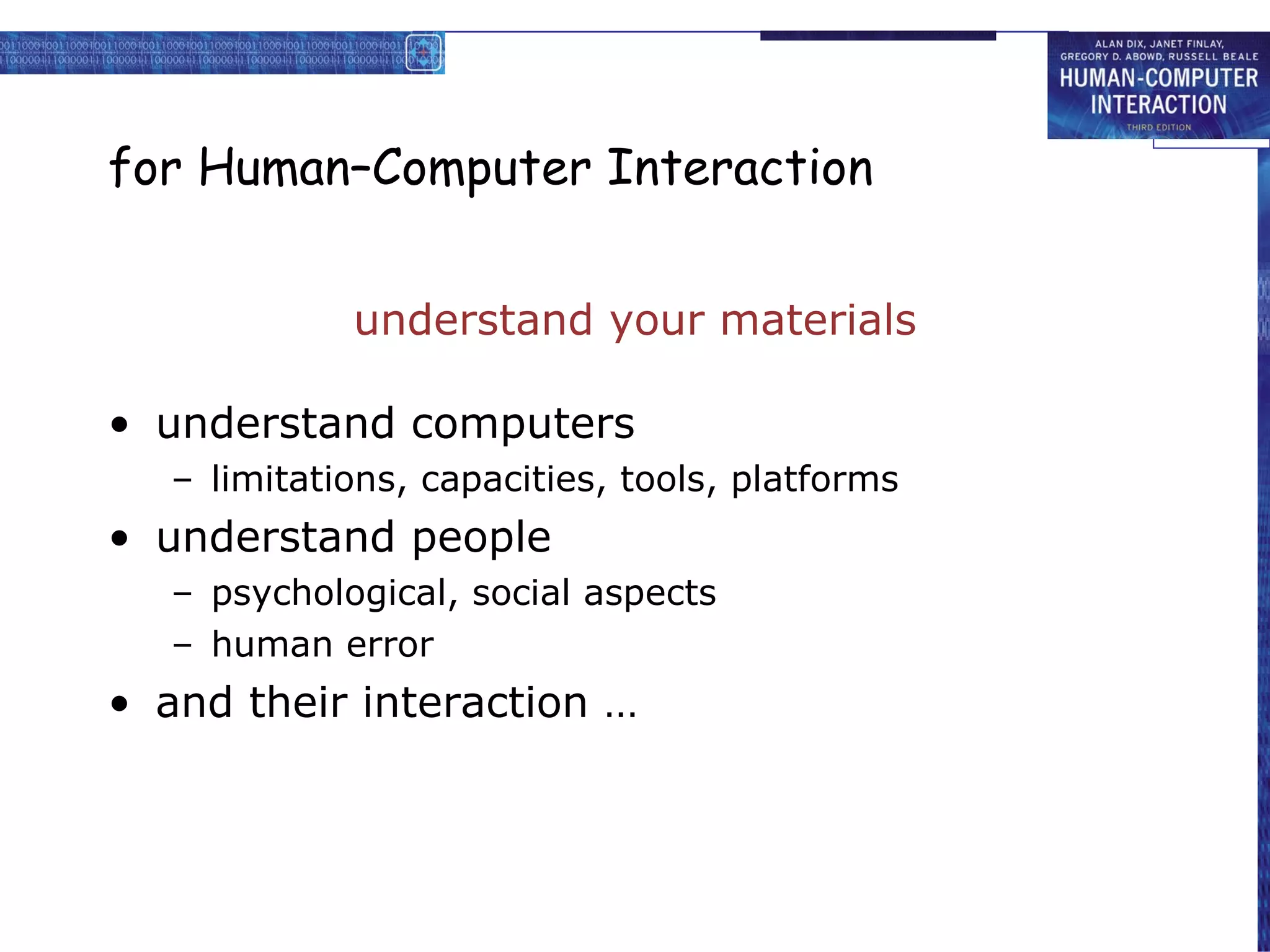
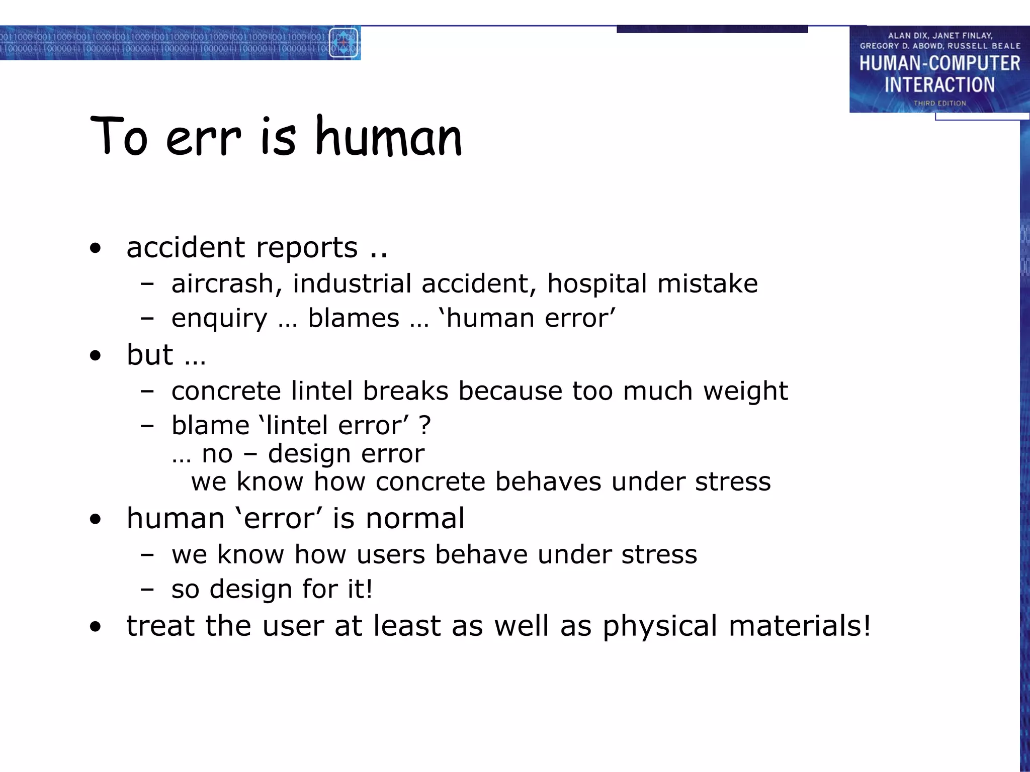


The document discusses various topics related to interaction design basics including goals and constraints of design, understanding users through personas and scenarios, prototyping and iteration, navigation design, screen design principles, and more. It emphasizes the importance of an user-centered design approach and provides examples and guidelines to help design intuitive interactions.


![Hci [6]interaction design](https://cdn.slidesharecdn.com/ss_thumbnails/hci-6interactiondesign-140116110647-phpapp02-thumbnail.jpg?width=640&height=640&fit=bounds)


