Download as KEY, PPTX

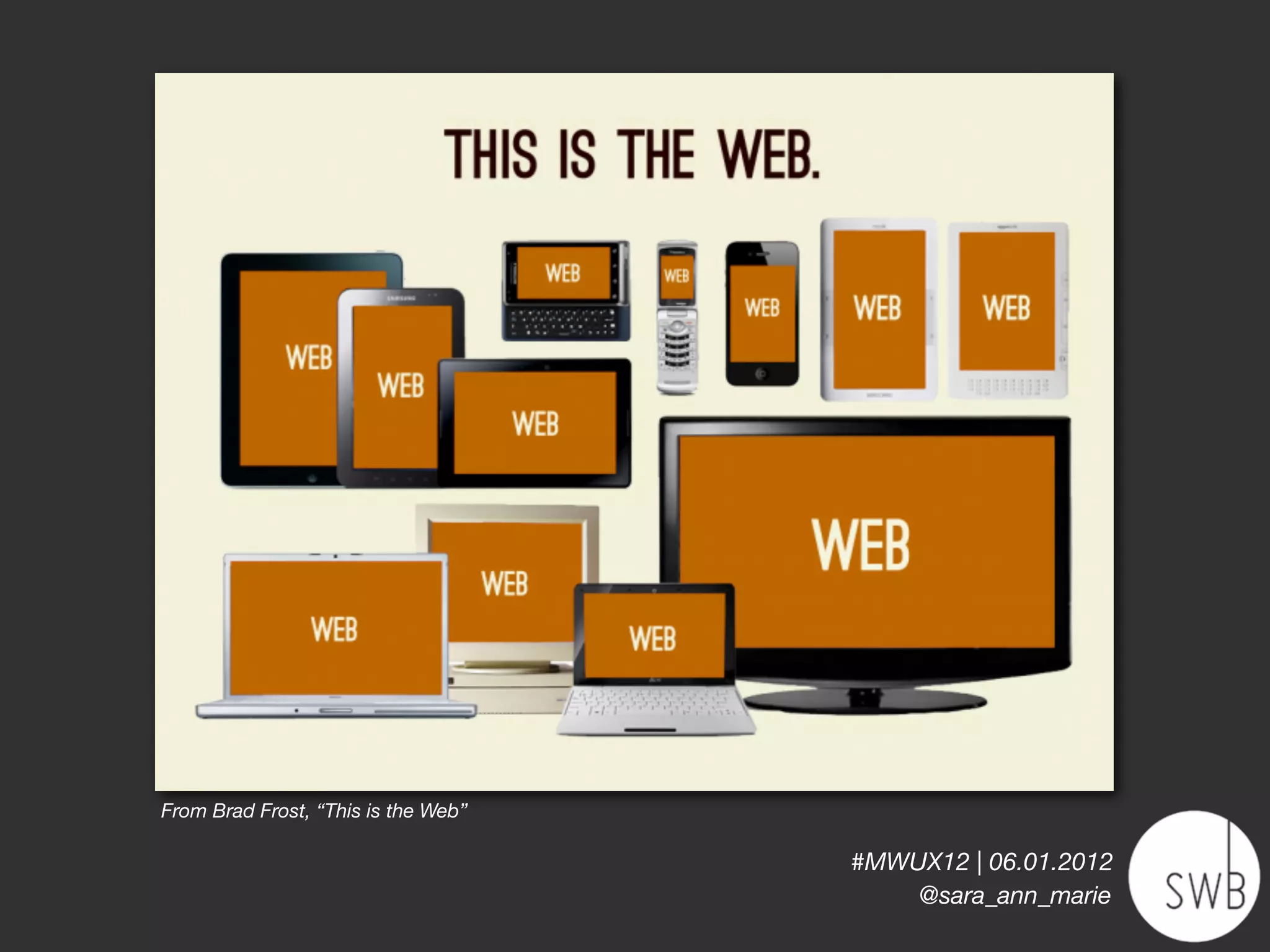
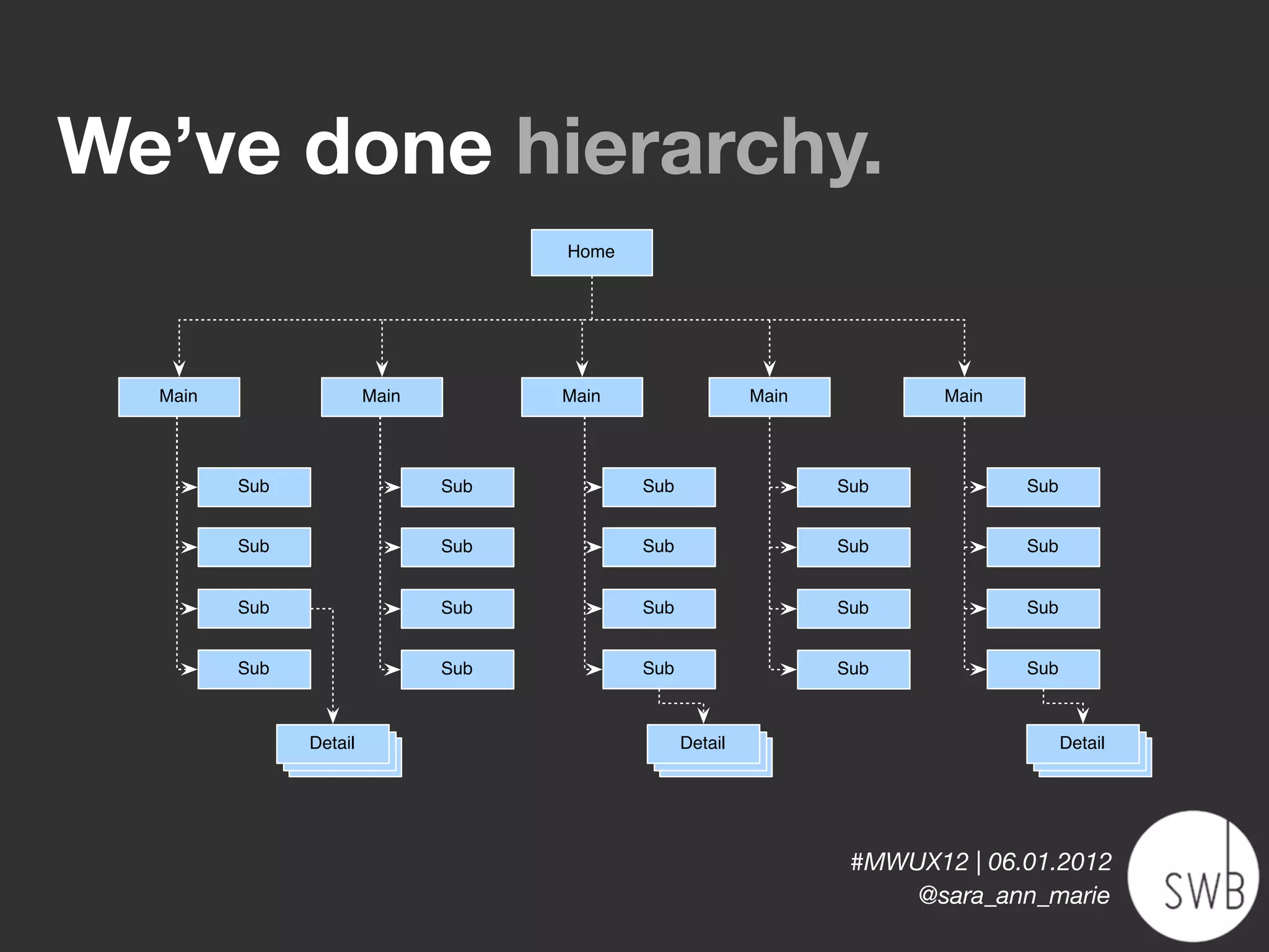
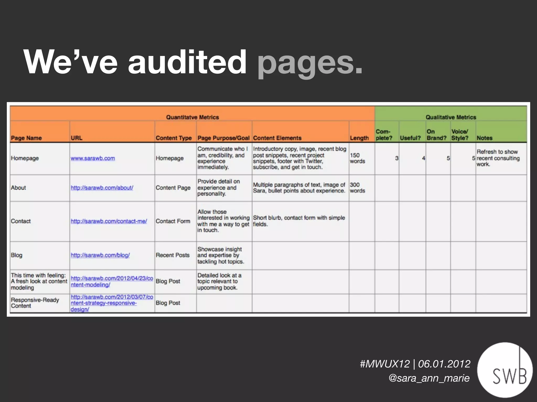
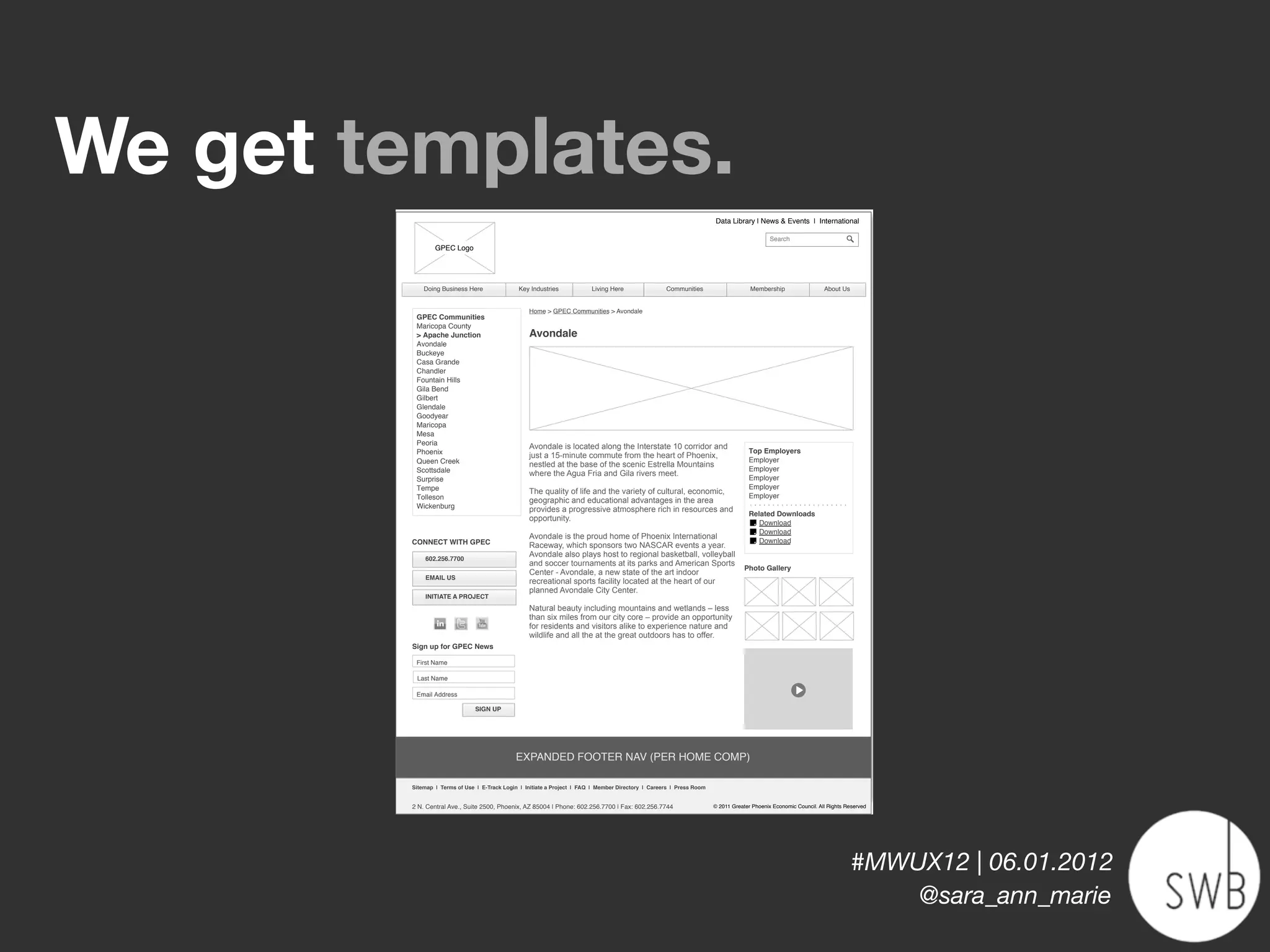


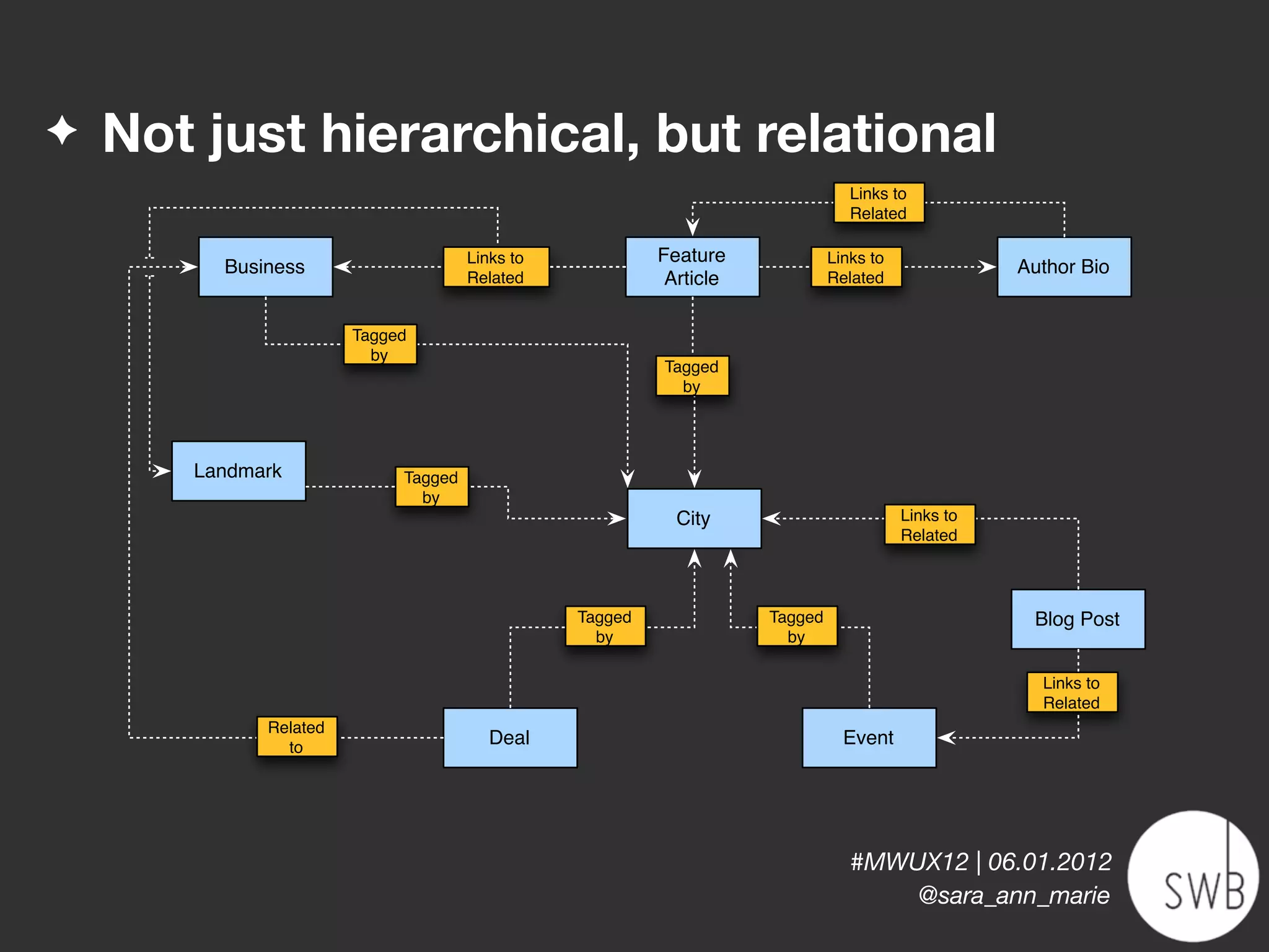
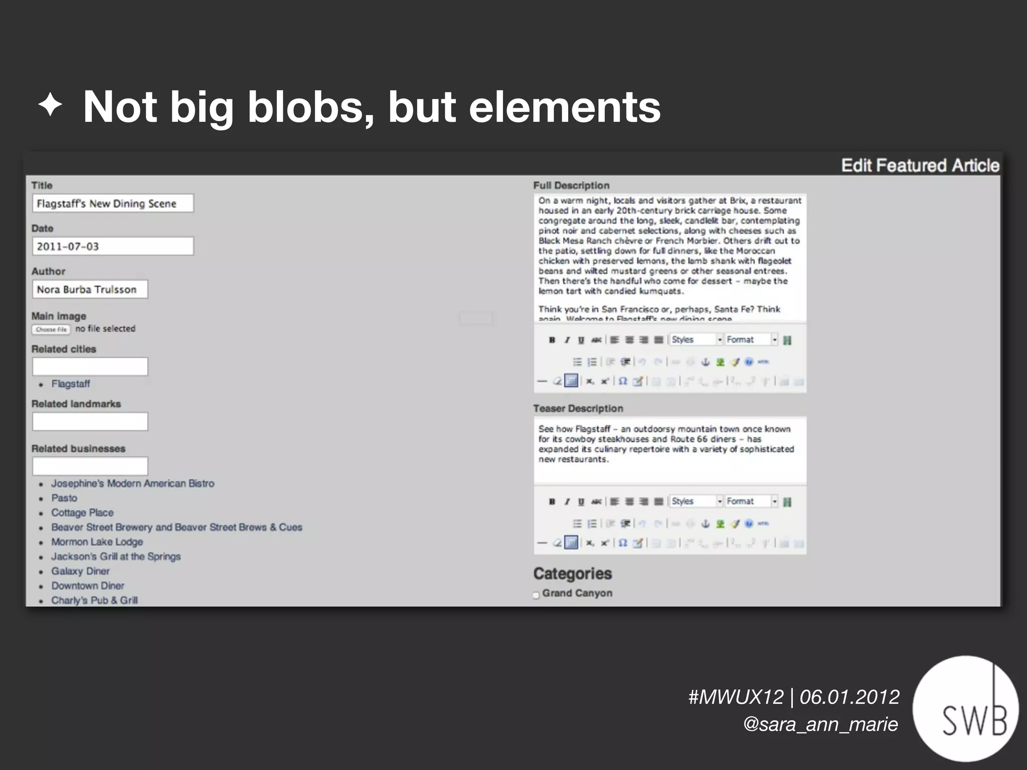
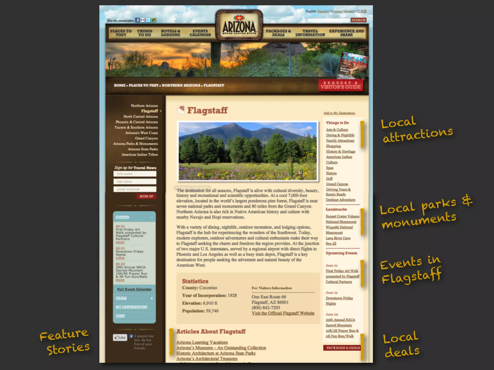


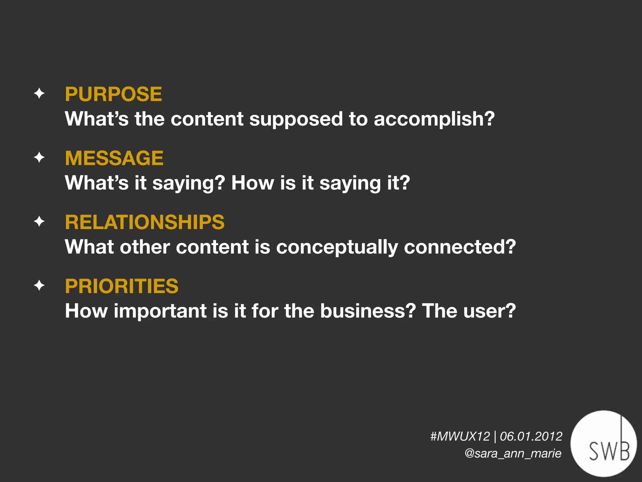


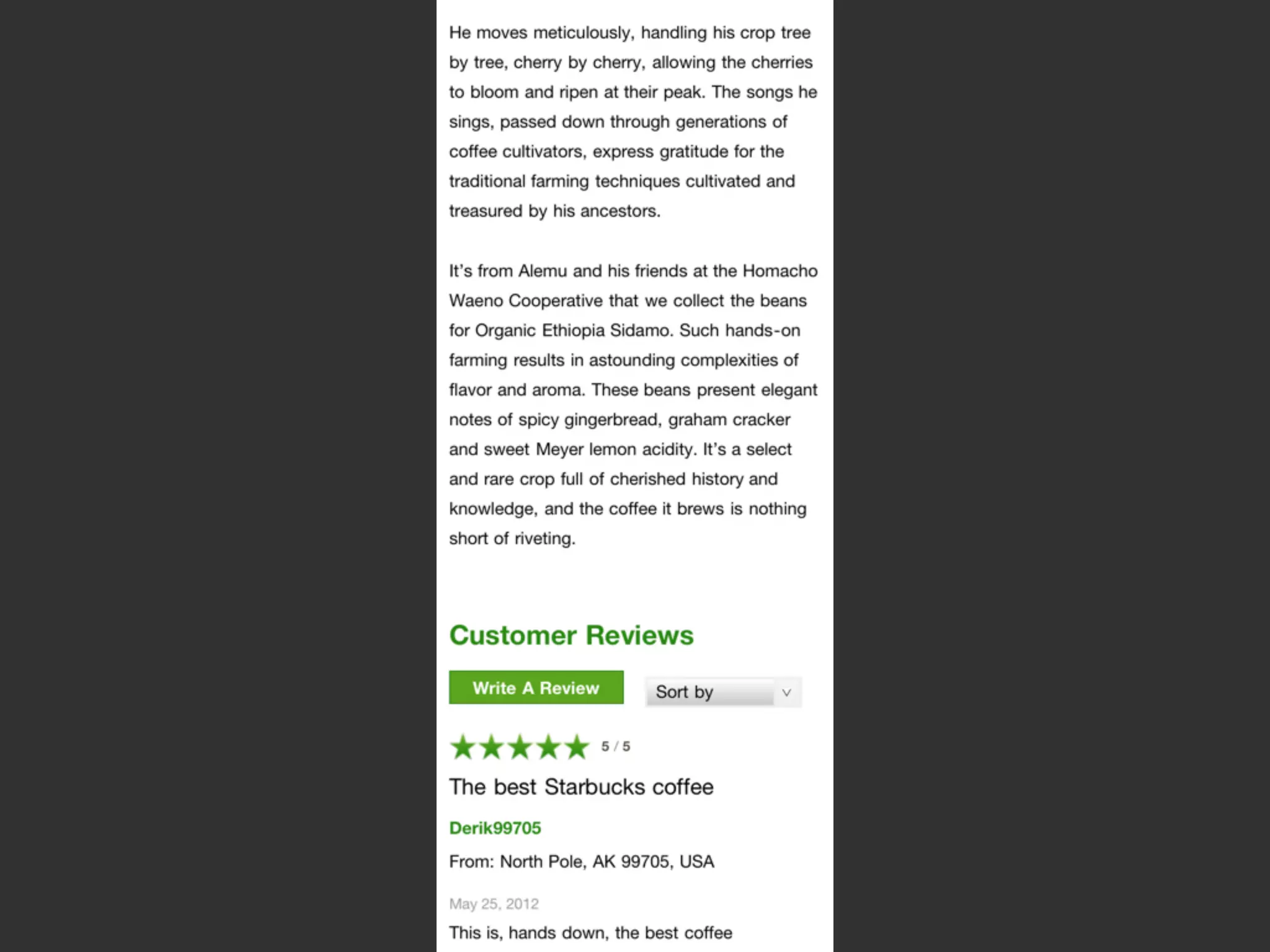
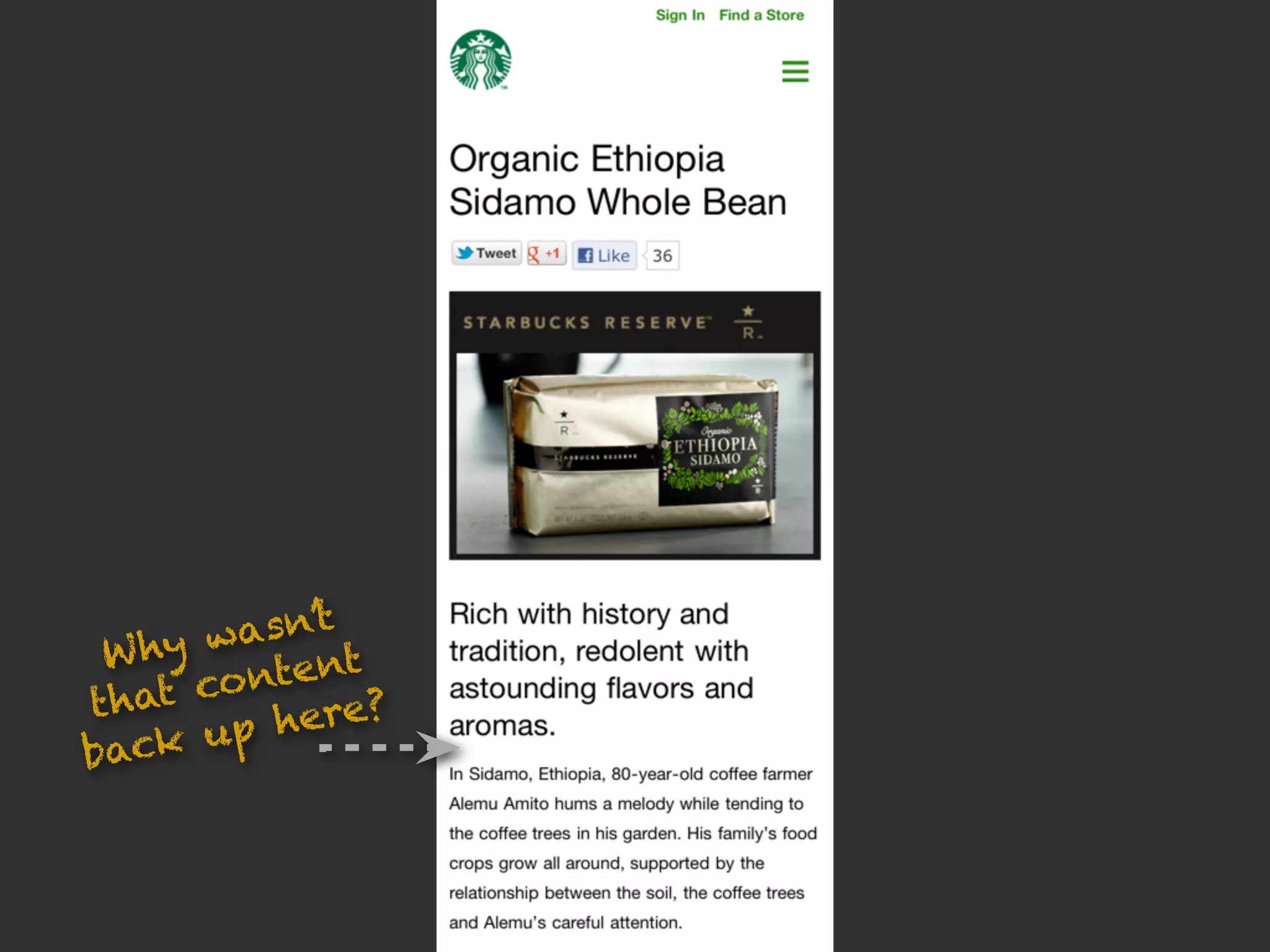
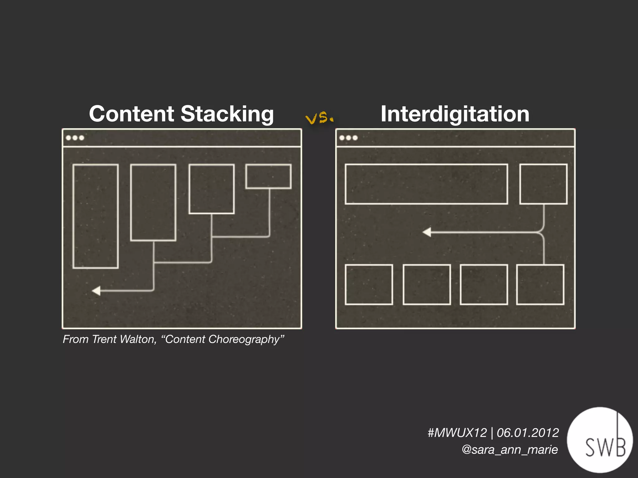

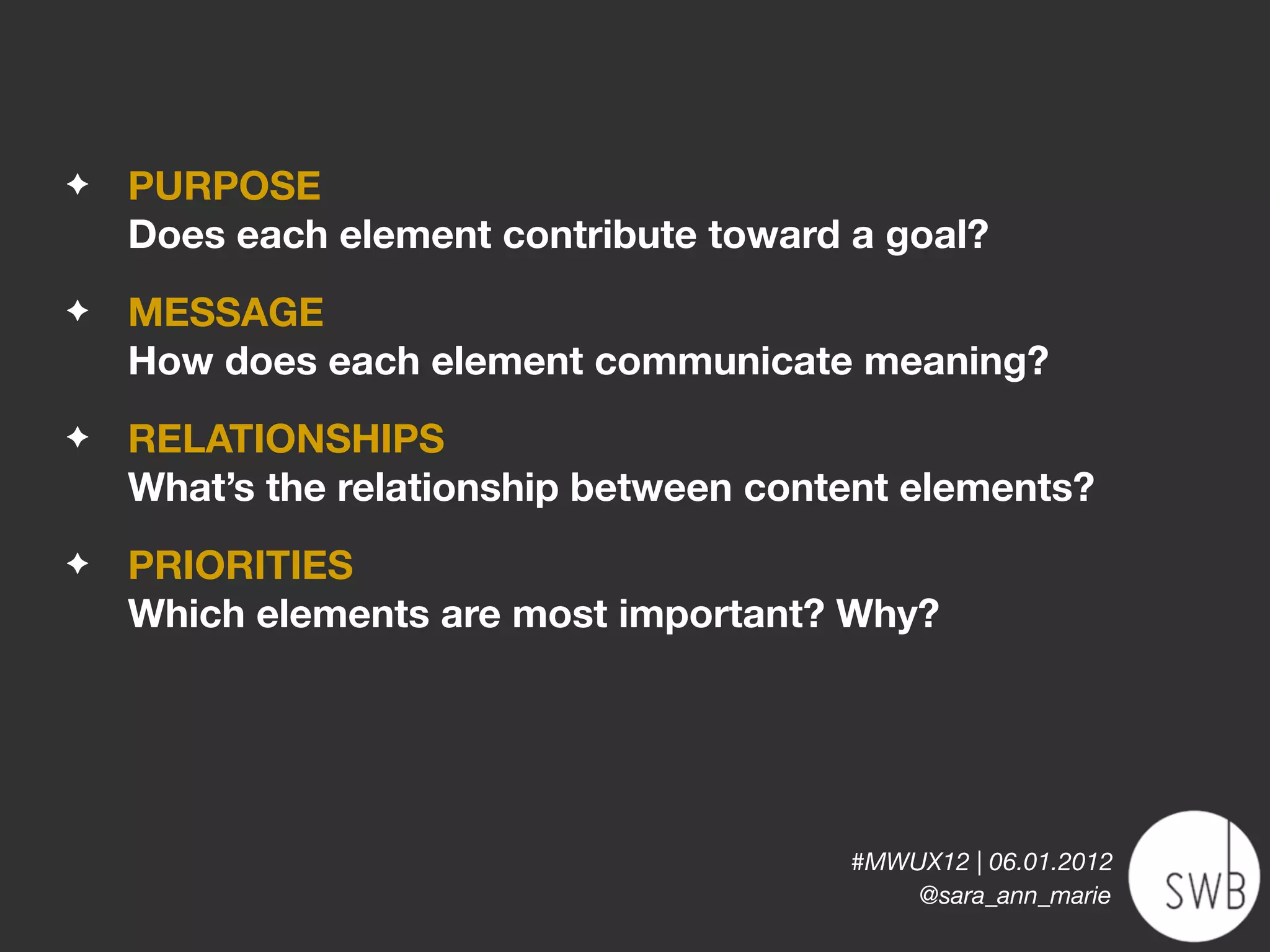


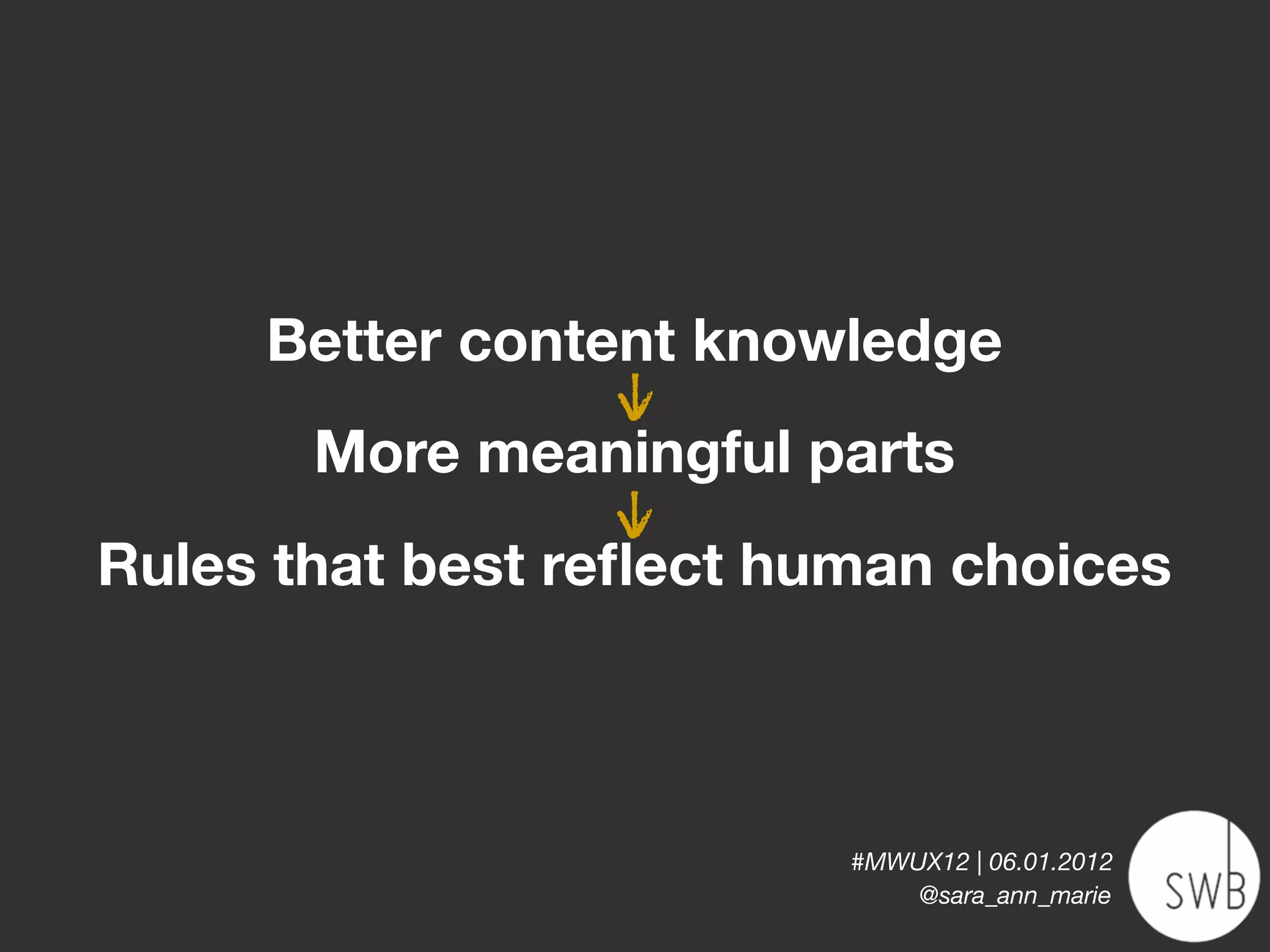
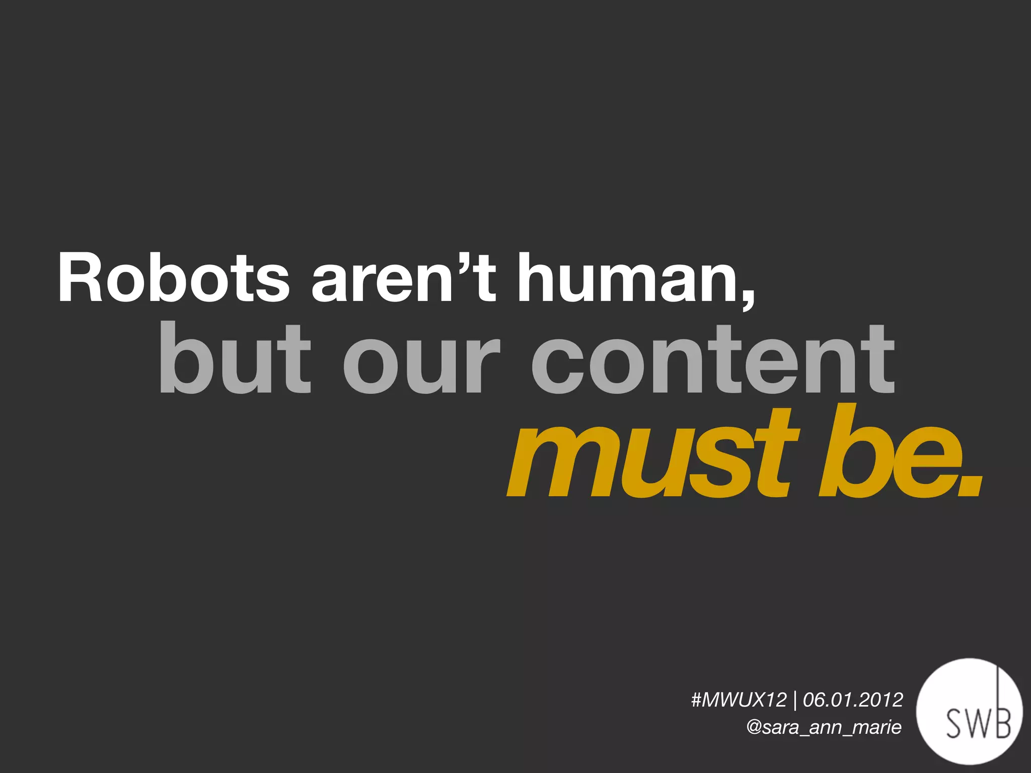

The document discusses the evolving landscape of web content and the need for content-focused information architecture (IA) to adapt to mobile-first, multi-device environments. It emphasizes the importance of creating flexible, structured content that can be easily republished across different platforms. The author advocates for a shift from traditional hierarchical content structures to a more dynamic approach that prioritizes relationships, meaning, and user experience.


