Contemporary philippine arts from the regions_PPT_Module_12 [Autosaved] (1).pptx
Poster analysis slideshare
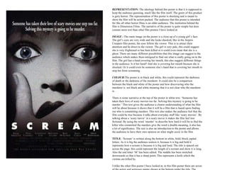
1. REPRESENTATION: The ideology behind this poster is that it is supposed to
keep the audience guessing, much like the film itself. The genre of this product
is gory horror. The representation of this poster is shocking and is meant to
show the film will be action packed. The audience that this poster is intended
for like all other horror films is an older audience. The institution behind the
film is Dimension Films. The narrative of the poster is quite simple but does
contain more text than other film posters I have looked at.
IMAGE : The main image on the poster is a close up of a young girl’s face.
The girl’s eyes are very wide and she looks shocked, like in the Jeepers
Creepers film poster, the eyes follow the viewer. This is to attract their
attention and be direct to the viewer. The girl is very pale, this could suggest
she is very frightened or has been killed or it could even mean that she is a
ghost. There are many different possibilities that this image can suggest to the
audience which makes them intrigued to find out what is really going on in the
film. The girl has a hand covering her mouth, this also suggest different things
to the audience. Is it her hand? And she is covering her mouth because she is
shocked. Or it could even be someone else’s hand that is covering her mouth to
stop her from screaming.
COLOUR:The poster is in black and white, this could represent the darkness
of death or the darkness of the murderer. It could also be a comparison
between the black and white of the poster and how discovering who the
murderer is not black and white meaning that it is not clear who the murderer
is.
There is some narrative at the top of the poster in white text. ‘Someone has
taken their love of scary movies too far. Solving this mystery is going to be
murder.’ This text gives the audience a clearer understanding of what the film
will be about because it shows that it will be a film that is based upon finding
out who is committing murders. This text also makes the audience feel that the
film could be true because it talks about everyday stuff like ‘scary movies’. By
talking about a ‘scary movie’ in a scary movie it makes the film feel less
fictional. By using the word ‘murder’ to describe how hard it will be to find the
killer who committed the murders give the word a double meaning, it also has
a lot of significance. The text is also an introduction to the poster and allows
the audience to have their own opinion on what might occur in the film.
TITLE: ‘Scream’ is written along the bottom in white, bold, block capital
letters. As it is big the audience notices it, because it is big and bold it
represents how a scream is because it is big and loud. The title is spaced out
across the page; this could represent the length of a scream and show it is long.
Also the end letter ‘M’ has been edited. The middle has been stretched
downwards so that it has a sharp point. This represents a knife which the
victims are killed by.
Unlike the other film poster I have looked at, in this film poster there are seven
2. This is the poster used to advertise the film ‘Jennifer’s Body’ which can
be seen as either a horror or a thriller. The colours used in this poster will
distinguish to the target audience that this film is a horror with the
colours; red, black and white. Which are all typical of a horror film
poster and the school desk, whiteboard tells the audience that this film
will be set in a high school so that this will appeal to the people at college
and people around the age range 15-24 which is usually what horror
films are aimed at.
Jennifer’s Body is a very important way of constructing the narrative
image of the film. It contains a colour scheme of red, black and shades of
grey including white. The main text, ‘Jennifer’s Body’, is in a typical
high school baseball font which denotes that the film is set in a high
school. This text is also in contrasting bold red connoting danger, anger
and blood. High school is a typical teenage dwelling and therefore works
as an anchorage to prove that Jennifer’s Body falls into the teen horror
genre. The title is also in capitals which allows it to appear quite striking
which helps it to be identifiable.
The main image on the cover and poster is of a full length shot picture of
the main star within the film, Megan Fox. She wears a short grey skirt
and a low cut red top with shoes to match. Not only does this fit in with
the colour scheme of the poster, it also provides the gratification of sexual
desire for many adolescent males. The image of Megan Fox is also
influential to teenage girls as they aspire to look and be like her. Fox is
sitting on a typical American high school desk which anchors the
denotation of the film being set in a school. These are all factors that
would appeal to the target audience of teenagers. The conventions of this
image force the audience to pay attention because the only image is of
Megan Fox alone, staring straight into the camera. Fox Atomic have
decided to market the film ‘Jennifer’s Body’ by using the biggest star
within the film as this then means that teenagers will see a face they can
recognise. Megan Fox is the unique selling point for this poster.
In the background of this picture on the poster cover more text is used
and this reads ‘Hell yes!’ Not only is this a play on words it also again
secures the denotation of the film being set in a highs school as the white
text appears to have been ‘written’ on a blackboard. Within this image,
the lighting is very dark apart from the lighting on the star, Fox. The
writing behind Megan Fox on the poster is also in the same font, however
it gives potential viewers and insight into what other people thought about
the film before they decide to watch it themselves. Therefore all
comments are positive to receive as many viewers as possible.
3. IMAGE: The main image is a close up of a skull
Wearing a tiara with thorns. This
re-establishes the teen horror genre
This image suggests
Someone has drawn or scribbled on a piece of
Paper . There is doodling on the paper written in
Pencil e.g. the picture of the axe., bff crossed out ,
There is also a paper clip and pencils on the image
this connotations of this stationery’s tells the audience that the film is
going to be set in a high school. There is also a picture of
3 characters on the right side of the poster , this
Indicates the important protagonist of the film.
Starring : Josh Hutcherson, Dane Cook
Spencer Locke. These are popular actors that
Teenagers will easily recognise so it will force
Them to want to watch the film. In this film poster there are four of the
actors and actresses names shown at the bottom under the title. The actors
that star in this film are quite well known which is why they have been
shown to try and entice the audience to want to watch the film. This has
been intentionally done to attract the audience.
COLOUR: The poster is in a white background . It has a colour scheme
of red and black. The outline of
The skull is in black. Black is associated with the fear of the unknown it
connotes darkness and mystery. Black is a symbol of grief. The black also
Represents the colour of the ink. The splatters of ink. It foreshadows the
action. Red is the colour of blood it symbolises death and
Danger. The red splatter suggest someone dead. (blood ).The poster is
very youthful and vibrant .
Looks a little bit like pop art with the bright colours.
It also reinforces the target audience of the poster and film.
TITLE: ‘Detention’ is written along the bottom in grey, bold, block
capital and lower case letters. Grey is also associated with industry and
man-made materials like concrete and metal . Grey also represents
technology,moder n and futuristic but on the other hand dull and lifeless.
The letters are indented, this symbolises detention (punishment) isolation,
the feeling of being locked/closed up after school hours (detained) . Also
the second to the last letter ‘O’ has been edited. Its a head of a skull . This
is significant and represents the skull is the main invader of the plot. The
doodling equation beneath the title represents someone doing maths
homework this again reinforces the high school setting and audience of
the film.
REPRESENTATION: The ideology behind this poster is that it is
supposed to keep the audience guessing, much like the film itself. The
scary skull head and the bright colours connote humour and vibrancy.