
Recommended
More Related Content
What's hot
What's hot (17)
Similar to Feedback about our ancillary texts
Similar to Feedback about our ancillary texts (20)
Recently uploaded
Recently uploaded (20)
Feedback about our ancillary texts
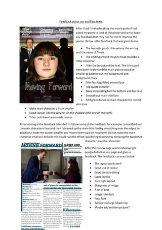
- 1. Feedback about our ancillary texts AfterI hadfinishedmakingthe movieposterIhad askedmypeersto lookat the posterand write down any feedbackthattheyhadfor me to improve the poster.Below isthe feedbackthatwasgiventome. The layoutis good- I like where the writing and the name of filmis The editingaroundthe girlsheadcouldbe a little smoother I like the layoutandthe text.The title could have beenneaterandthe mainpicture couldbe smallertobalance outthe backgroundand foregroundmore Filmfestlogo?Redaroundface Top quotessmaller More interestingfontforbottomandtop text Smoothout maintitle font Addgreentonesonmain characterto correct skintone Make maincharacter a little smaller Good layout- like the way he’sinthe shadows(the one onthe right) Title couldhave beenmade neater Afterlookingatthe feedbackIdecidedtofollow some of the feedback,forexample,Ismoothedout the maincharacters face and thenI cleanedupthe maintitle fontbysmoothingoverthe edges.In addition,Imade the quotessmallerandmovedthemupabit howeverIdidnotmake the main character small as I believe thiswouldruinthe effectIwastryingto create by showingthe twoother characters overhershoulder. Afterthe review page wasfinishedwe got people tolookat ourpage andgive us feedback.The feedbackisasseenbelow: The layoutworkswell Good use of colour Good colourediting Good layout Nice tightlayout Sharpnessof image A lotof text Image isto dark Poorfont Bordertoo large//badcrop Maybe addanotherpicture?
- 2. More photos Spacingon columnsseemstotight Don’ttitle the conclusionorplot Afterreadingthroughthe feedbackwe triedtoaddmore photosbutwe decidedthatthe one image that we had workedthe bestwithoutaddingmore pictures. The image seemedlike agoodimage as it wasn’tas darkas theyhad beensaying.We lookedatalready existingmoviereview magazinesand we made ours lookedlike theirsin design.Thatiswhywe chose the font tolooklike we did. The borderwas alsobasedona magazine and we have seenothermagazine thattitledtheirconclusion to theirreview.