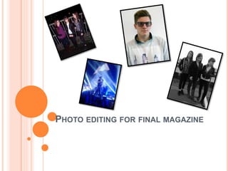
2. FRONT COVER:
For my main front cover image, I decided to try and make it as similar to the image that I have used on my drafts
as I could. To do this, I lowered the brightness of the image and added a blue tone to it. I also created a ‘brokeh’
effect by putting white circles around the image. I feel that this makes the image look similar to the one I used on
my drafts, as well as helping to make it fit in to the genre of my magazine.
I feel that my image could present a negative view of the younger social group, as they don’t look happy and
they could be stood in quite negative positions. However, I feel that for my magazines genre this fits in well as it
will help relate to my target audience and their age group. It also reinforces the ‘grunge’ theme that I have seen
in the other indie/rock magazines that I have studied.
3. CONTENTS PAGE:
I already has this image saved from a
concert that I have previously been to, so I
simply cropped it to make Dan Smith (lead
singer of indie/rock band Bastille) the main
focus of the image, as well as making it the
right shape for the area of the page that I
want it on. This has no representation of
social groups, however it will help to relate
to my target audience as they are well-known
to often go to gigs and concerts.
For my second image, I decided to try and make it
as similar to the original image that I used on my
draft as possible. I changed the lighting mainly,
making it brighter and changing the colour
balance in order to make it less red/more blue. I
also slightly edited his face, getting rid of any flaws
on his face as generally on indie/rock magazines
the model is flawless in order to attract the
female gaze. I feel that this juxtaposes against the
‘grunge’ theme of some of the other images that I
have used, however it also opens up a different
class for my target audience, thus widening
my demographic. It also has a positive
representation of they younger social
group, as he looks quite classy and happy.
4. DOUBLE PAGE SPREAD
The editing for my double page spread image was relatively simple, as all I had to do to the image was slightly increase
the brightness and make it black and white. I did this so it would be similar to the image I had used in my drafts, and I
felt that by putting the image in black and white, it made it contrast more against the bright background and also made
it more interesting to look at. It also matches my indie/rock theme well, as most of the magazines I have studied used
black and white images for the double page spread. It also makes my subjects look more menacing, which could give
them a negative representation of their social group however it is contrasted with the bright background that I have
used within my magazine double page spread.