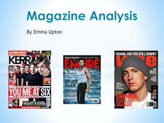
3. • This is the front cover for the heavy
rock/metal magazine ‘Kerrang!’. By
looking at this magazine, we can analyse
many different aspects just from the front
cover alone. For example, we can see that
the target audience for Kerrang would be
early teens to late teens (13-25), both
genders however the majority would be
male and of the social status of D1 to E on
the social status demographic table.
• The target audience would also be
alternative/rock/heavy metal music fans,
as that is the genre of music ‘Kerrang!’
bases itself around, as we can see from the
bands on the front cover (A Day to
Remember, Green Day, Architects etc…)
4.
5. • The title of this magazine is a form of onomatopoeia,
‘KERRANG!’ sounds like the strum of a guitar or a loud
bang like a drum. This is used to clearly show this
magazine is a rock/metal/alternative music
magazine, which will entice the target audience. The
title is also shown as cracked, to pair with the
onomatopoeia used. It is also bold and in the colour
black, which is often associated with the rock music
genre. All the words on the front page are in bold and
capitals, this is used to again entice the audience and
grab their attention.
• The main story is clearly shown on the front page
about the band A Day To Remember, a very popular
rock band, which most of the target audience will
know and most likely listen too. So again, this is used
to entice the target audience. Because the main story
is bold and larger than the rest of the text on the
page, it is a form of anchorage, it anchors the
audience’s attention to that main story.
• The language used on the front page is very informal
and even uses slang. This is used because the target
audience is for a young, teenager age range, and they
most likely use this slang. So this definitely fits the
target audience for the magazine.
6. • The colours used on the front page are
black, white, red and yellow. The black is
often associated with the rock genre,
which fits the rock magazine, as rock
music can be viewed as quite dark and
deep. The red, white and yellow are all
used to help information stand out against
the front page models (e.g: the name of
the band and the pull quotes). The colour
red is also associated with rock music for
its relation to anger and rock music can
often be seen as quite angry, loud,
emotional and danger. The use of the
black masthead shows that this is clearly
a rock magazine, being in full black to
show the darkness of rock music.
7. • The masthead of the magazine is
stretched out across the top of the page
from the primary optical area, they have
placed it there because that is the first
place the audience will look at and it will
grab their attention. A Day to Remember
is the main focus of the front page, and
that is why they have placed the image
directly in the middle and along the Axis
of Orientation. The barcode has been
placed in the Terminal Area, this is quite
unconventional as majority of magazines
will place the barcode in the weak fallow
area as that is the last place the audience
will look at.
8. *This magazine has followed a lot
of the common codes and
conventions used in magazines.
They have put the main focus, A
Day to Remember on the front
cover. This is conventional due to
this being a very popular rock
magazine, and the band are
widely known for their rock music
and are quite iconic. The style is
quite messy and all over the
place, this is to draw attention to
all the different aspects of the
magazine and not just the main
band. By using the very popular
band along with contrasting
colours and large bold text, it
definitely anchors the audience.
11. *This film magazine is aimed
at an audience of the age of
18-40, mainly males and
from lower middle class to
upper class (C1 to A) on the
demographic social class
table. This magazine is
aimed at a very specific
audience, film fans, because
of how much the magazine
costs and the kind of
products that pay to
advertise in the magazine.
Most advertisements
included in this magazine is
cars and alcohol, which
shows this is targeted at
people aged 18+
12. *The cover page is quite full,
with a lot of text throughout
the front page with the
main lead article in the bold
large font in front of the
model. The text used
throughout this magazine is
very formal and the
language used is very
sophisticated, which again
suggests that the target
audience is for more mature
adults that will understand
and enjoy reading the
articles included.
13. *There are only 3 colours
used throughout the cover
page, black, red and white
(not including the models
clothes). The colour red is
associated with danger,
blood and also love. This is
used because this front
cover is all about super hero
films, which are all
associated with the above.
The words and main article
is in a white/grey colour and
looks like metal, to go with
the ‘steel’ word used, it
also helps that piece of text
stand out against the rest of
the words on the page.
14. *The masthead of the magazine
is stretched across the top of
the page from the Primary
Optical Area to the Strong
Fallow Area, this is because
those areas are the first thing
the audience will view. The
character, Superman, is placed
in front of the masthead this is
because he’s the main focus of
the front cover, and makes him
stand out even more. He’s also
been placed along the Axis of
Orientation, this is because it
is very iconic in Superman films
and will attract an audience.
The barcode has been placed
in the weak fallow area which
is very conventional because it
is the least important thing on
the front cover and the last
thing the audience will look at.
15. *This magazine definitely
follows a few of the common
codes and conventions
throughout the front page.
They have chosen a very iconic
character and put him as the
focus of the front page. The
style is quite hectic because of
all the text, but because the
main title ‘man of steel’ is
slightly different, it stands out
from the rest of the page. By
using the popular actor, the
contrasting colours and large
text are all conventional ways
to anchor the reader.