Strategies for Landing an Oracle DBA Job as a Fresher
House style rty
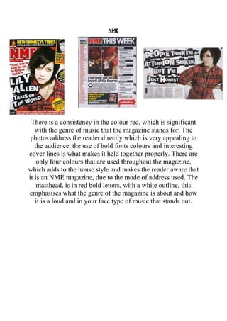
1. NME
There is a consistency in the colour red, which is significant
with the genre of music that the magazine stands for. The
photos address the reader directly which is very appealing to
the audience, the use of bold fonts colours and interesting
cover lines is what makes it held together properly. There are
only four colours that are used throughout the magazine,
which adds to the house style and makes the reader aware that
it is an NME magazine, due to the mode of address used. The
masthead, is in red bold letters, with a white outline, this
emphasises what the genre of the magazine is about and how
it is a loud and in your face type of music that stands out.
2. VIBE
There is a consistency in font throughout the magazine with
the headings, subheadings and cover lines all included. The
masthead is very eye catching and grasps the reader’s
attention as it is one of the first things that the reader sees
when they pick up the magazine. On the contents page, the
word contents is typed in a creative way "CO-NTEN-TS" this
is effective as it goes against the normal convention of how
the word should be spelled but rather, it offers a spin and it
sticks in the reader's mind as they know that it comes from
Vibe magazine. On the double page spread. One of the first
things that is noticeable is the, large "L" imprinted on the page
like a stamp, this makes it stand out and draw the reader’s
attention. Although it fills the whole page, the text can still be
read.
3. CONCLUSION
To conclude, I have found that, on all 3 pages that I will
produce, there has to be a unified house style that is shown, in
order for my target audience and whoever looks at the
magazine, can tell that all 3 pages have come from the same
magazine. It is also important that, the house style is
maintained as it makes it look more professional and well
thought about.