1. REVIEW PROJECT
Graphic Design Project
In the project, we had to create a poster for Helpinghand Saigon for people to volunteer to do
something to help the orphans in the orphanage. We learned how to use the magic wand, the gradient
tool, to duplicate the layer and make one layer black and white then select the whole black and white
layer. After that, use the eraser and erase the part you that want to make it stand out.
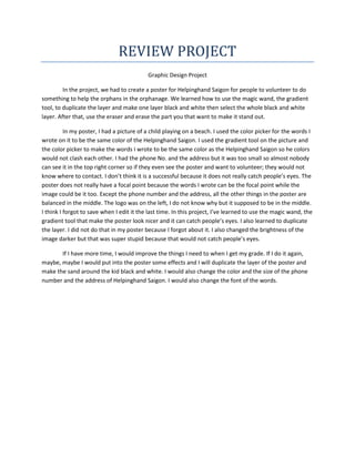
In my poster, I had a picture of a child playing on a beach. I used the color picker for the words I
wrote on it to be the same color of the Helpinghand Saigon. I used the gradient tool on the picture and
the color picker to make the words I wrote to be the same color as the Helpinghand Saigon so he colors
would not clash each other. I had the phone No. and the address but it was too small so almost nobody
can see it in the top right corner so if they even see the poster and want to volunteer; they would not
know where to contact. I don’t think it is a successful because it does not really catch people’s eyes. The
poster does not really have a focal point because the words I wrote can be the focal point while the
image could be it too. Except the phone number and the address, all the other things in the poster are
balanced in the middle. The logo was on the left, I do not know why but it supposed to be in the middle.
I think I forgot to save when I edit it the last time. In this project, I’ve learned to use the magic wand, the
gradient tool that make the poster look nicer and it can catch people’s eyes. I also learned to duplicate
the layer. I did not do that in my poster because I forgot about it. I also changed the brightness of the
image darker but that was super stupid because that would not catch people’s eyes.
If I have more time, I would improve the things I need to when I get my grade. If I do it again,
maybe, maybe I would put into the poster some effects and I will duplicate the layer of the poster and
make the sand around the kid black and white. I would also change the color and the size of the phone
number and the address of Helpinghand Saigon. I would also change the font of the words.