Chandigarh Escorts Service 📞8868886958📞 Just📲 Call Nihal Chandigarh Call Girl...
Content page analysis
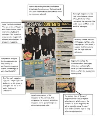
1. The issue number gives the audience the
knowledge of what number the issue is and
the Cover date lets the audience know when
the cover was released. ‘Kerrang!’ magazines house
style uses the same colours;
White, Black and Yellow
throughout the magazine. The
Using a mainstream band text is a sans serif font as it is
‘You Me At Six’ as they are a aimed at teenagers.
well known popular band
internationally towards
teenagers. This is used to
show who the magazine is
aimed at and to show it’s a Headings for new sections
one genre magazine. of the pages highlight what
the pages are. This shows it
is easier for the reader to
find the page from the
categories
Competition intrigues
the teenage audience Page numbers help the
into wanting to audience to find their pages
purchase the magazine which they are looking for
as they could hang out faster. As the numbers inform
with ‘You Me At Six’. them on where the pages are in
the magazine.
The ‘Kerrang!’ magazine
layout is a simple layout for
audiences as it is aimed at
teenagers and has to be
easier for them to
understand.
Note from the editor of the The bottom right of ‘Kerrang!’
magazine to the audience. This magazine there is a subscription
shows who the person is behind the advertisement which ensures the
magazine and to give an insight on audience to by the magazine; this
what the magazine is for. will be placed in every ‘Kerrang!’
issue on the contents page to keep
advertising subscription.
2. ‘Uncut’ magazines house style uses very simple
formal colours, black, red and white. The writing is
Like ‘Kerrang!’ the issue number informs
written in a serif font which shows the magazine is
the reader of what issue they are reading
aimed at the older generation of 24-35 years old.
and the date lets them know of the date it
Unlike ‘Kerrang!’ as the magazine is aimed at
was released. Both magazines include an
teenagers and not older people, the magazine
issue number and date in order to inform
uses sans serif, not serif.
the reader of the issue.
The page numbers in
‘Uncut’ are used in the
same way that ‘Kerrang!’
has used page numbers.
They help the audience ‘Uncut’ uses one main image as the
locate the page that they picture on the Contents page, Unlike
are looking for and what is the numerous amount of pictures
featured in the issue. they have used in ‘Kerrang!’. Having
the main image in black and white
informs the reader that the
magazine is sophisticated and for
older people.
This red box, which is titled
‘Reviews’, informs the reader that
these pages include reviews of
artists and films. This red box
highlights the reader on what they Unlike ‘Kerrang!’, ‘Uncut’ uses a lot of dead space. Keeping
should look at. As the box is red, it the contents page simple and sophisticated and not
catches the eye of the reader. cluttered as ‘Kerrang!’ is. This gives the audience the
knowledge of who the magazines are aimed at. The layouts
are both simple as it is set in ways that generation can read
and understand the magazine.