1. The document provides guidance on designing effective dashboards, including understanding the user and their needs, choosing the appropriate dashboard type (operational, strategic, or analytical), grouping data contextually, ensuring data relevance, and keeping the dashboard simple.
2. It discusses key dashboard design principles such as targeting a single user role, using color meaningfully, and refreshing data at appropriate intervals depending on the dashboard type.
3. Examples of good, bad, and ugly dashboards are presented to illustrate proper and improper dashboard design.
4 Steps to Better Dashboard Design - ZingChartZingChart
Relying on Lillian Pierson’s Data Science for Dummies, the ZingChart team has assembled 4 easy steps to designing better dashboards. Check out the tips with real world examples and click through to a live interactive demo using ZingChart's JavaScript charting library.
10 Questions to Increase Tableau Dashboard AdoptionArkatechture
Have you ever been involved in a project to develop an amazing Tableau dashboard that answers everyone's questions- only for it to never be used?
Arkatechture has 10 questions for you to use to stop this from ever happening again.
Guide to Bleeds—Using Print Design for MarketingJP Enterprises
Every marketer and designer should understand whether or not their file should be printed with bleeds, how to set up the file, and how to save it for your printer. This guide will walk you through the process.
Looking for a platform to take your web design agency to the next level? Our comprehensive design studio and advanced business features - CMS, White Label Branding, Client Billing + more - will help you do just that (and don't skip the business models at the end).
Take a tour through the Webydo Studio and Dashboard for a complete look at how you can start growing your business without code.
Request a Live Demo: http://www.webydo.com/demo.html
Style This: Your Essential Toolkit for Dashboard DesignLogi Analytics
Learn the principles of dashboard design and how to leverage tools of the trade. Plus we'll give practical styling tips to make data visualizations pop.
Learn more with The Definitive Guide to Dashboard Design at https://goo.gl/2IPpZL.
Effective Dashboard Design: Why Your Baby Is Ugly (Big Design Conference 2010)Aaron Hursman
[Note: This version was presented at the Big Design Conference on May 29, 2010]
As enterprises and other organizations look to sift through and make sense of the all the structured and unstructured data available to them, dashboards are being positioned as the solution to their problems. However, a dashboard needs special attention to the visual design or the dashboard will fail to meet expectations. If not carefully designed, a new dashboard can leave consumers unsatisfied, frustrated, confused, and even overwhelmed.
Aaron Hursman will share his experiences designing effective dashboards that deliver on the promise of targeted, accessible, and actionable information. He will discuss examples from both his personal work and contributions of thought-leaders in this space. Through these examples, he will present practical dashboard design techniques. He will also present effective approaches to take during design and construction. Finally, Aaron will explain the challenges and obstacles that dashboard designers face today, and how to mitigate the risks that result.
WSO2Con EU 2016: Building Awesome Personal Dashboards with WSO2 Dashboard Se...WSO2
Data is meaningless without proper representation. It is most useful when understood through interaction. WSO2 Dashboard Server brings the ability to design interactive dashboards that can give you insights into data through drill-down views.
Dashboards can be shared among and customized by users to match their preferences. WSO2 Dashboard Server allows each visualization gadget to be wired in the user interface. Each gadget is limited to interacting with a well defined set of input and output data types. This makes it possible for gadgets, even in an interactive dashboard, to be loosely coupled. In this session we will explore some of the enterprise use cases that can be achieved with WSO2 Dashboard Server via its multiple interactive elements.
Gemba Solutions allows customers to understand the what, where, how, who and why of their production facility helping them to improve customer satisfaction, increase production, reduce waste, use less energy and reduce cost
10 best practices and design principles to create effective dashboards using Tableau. View the webinar video recording to hear the narrated version of the good, the bad…and the downright ugly in dashboard design: http://www.senturus.com/resources/10-best-practices-for-tableau-dashboard-design/.
Senturus, a business analytics consulting firm, has a resource library with hundreds of free recorded webinars, trainings, demos and unbiased product reviews. Take a look and share them with your colleagues and friends: http://www.senturus.com/resources/.
BI Dashboard Formula Methodology: How to make your first big data visualizati...BI Brainz
BI Dashboard Formula Methodology Webinar:
http://bidashboardformula.com
Learn how to with Mico Yuk:
Qualify your dashboard project before starting
Transform your KPIs into actionable KPIs
Tell a story with your KPI's and Data
Build mockups right the first time
Boost user adoption using our hacks
Build in any tool!
Slides from my talk at the World Information Architecture day (2015) at Ann Arbor. This talk was about the life lessons I learnt from designing dashboards, and how these lessons can help you in making your users happy.
Designing Great Dashboards for SaaS and Enterprise ApplicationsDesign for Context
Presentation by Lisa Battle at the UXPA2016 conference in Seattle, WA, on June 3, 2016.
Many SaaS and enterprise applications today provide dashboards giving users an overview of how their business is performing and summarizing the work that needs to be done. Dashboards present a great opportunity to improve user experience by providing quick answers to users’ common questions, but they are also full of potential pitfalls for design. As UX design consultants, we are frequently asked to design (or redesign) dashboards for applications, and through that experience we have established best practices for dashboard design. We will discuss our approach to ensuring a good user experience for dashboards, focusing on 8 principles of UX design that are particularly relevant and illustrating them with real project examples.
For a dashboard to truly provide value
and actionable insights, dashboard design must be approached leveraging meaningful data and analytics with the stakeholder in mind.
Operational Analytics: Best Software For Sourcing Actionable Insights 2013Newton Day Uploads
Actionable Insights are those views of data that cause managers to ask new questions about how processes work and take action. They differ from traditional key performance measures and daily operating reports that focus on delivering a picture of progress against a strategic objective, operating budget or forecast. What software is best for your business to source these game-changing perspectives of your enterprise?
Chapter 3 • Nature of Data, Statistical Modeling, and Visuali.docxpoulterbarbara
Chapter 3 • Nature of Data, Statistical Modeling, and Visualization 185
of thousands of BI dashboards, scorecards, and BI interfaces used by businesses of all
sizes and industries, nonprofits, and government agencies.
According to Eckerson (2006), a well-known expert on BI in general and dash-
boards in particular, the most distinctive feature of a dashboard is its three layers of
information:
1. Monitoring: Graphical, abstracted data to monitor key performance metrics.
2. Analysis: Summarized dimensional data to analyze the root cause of problems.
3. Management: Detailed operational data that identify what actions to take to re-
solve a problem.
Because of these layers, dashboards pack a large amount of information into a sin-
gle screen. According to Few (2005), “The fundamental challenge of dashboard design is
to display all the required information on a single screen, clearly and without distraction,
in a manner that can be assimilated quickly.” To speed assimilation of the numbers, they
need to be placed in context. This can be done by comparing the numbers of interest to
other baseline or target numbers, by indicating whether the numbers are good or bad,
by denoting whether a trend is better or worse, and by using specialized display widgets
or components to set the comparative and evaluative context. Some of the common
comparisons that are typically made in BI systems include comparisons against past val-
ues, forecasted values, targeted values, benchmark or average values, multiple instances
of the same measure, and the values of other measures (e.g., revenues versus costs).
Even with comparative measures, it is important to specifically point out whether a
particular number is good or bad and whether it is trending in the right direction. Without
these types of evaluative designations, it can be time consuming to determine the status
of a particular number or result. Typically, either specialized visual objects (e.g., traffic
lights, dials, and gauges) or visual attributes (e.g., color coding) are used to set the evalu-
ative context. An interactive dashboard-driven reporting data exploration solution built by
an energy company is featured in Application Case 3.8.
Energy markets all around the world are going
through a significant change and transformation,
creating ample opportunities along with significant
challenges. As is the case in any industry, oppor-
tunities are attracting more players in the market-
place, increasing the competition, and reducing the
tolerances for less-than-optimal business decision
making. Success requires creating and disseminat-
ing accurate and timely information to whomever
whenever it is needed. For instance, if you need to
easily track marketing budgets, balance employee
workloads, and target customers with tailored mar-
keting messages, you would need three different
reporting solutions. Electrabel GDF SUEZ is doing
all of that for its marketing and sales business .
Dashboard is a visual display of the most important information needed to achieve one or more objectives which fits entirely on a single computer screen so it can be monitored at a glance
What is the relationship between Accounting and an Accounting inform.pdfannikasarees
What is the relationship between Accounting and an Accounting information system? (2.5
Marks)
Accounting-Methods, procedures, and standards followed in accumulating, classifying,
recording, and reporting business events and transactions. The accounting system includes the
formal records and original source data. Regulatory requirements may exist on how a particular
accounting system is to be maintained (e.g., insurance company).
Accounting Information System-Subsystem of a Management Information System (MIS) that
processes financial transactions to provide (1) internal reporting to managers for use in planning
and controlling current and future operations and for nonroutine decision making; (2) external
reporting to outside parties such as to stockholders, creditors, and government agencies.
• What has happened to the relationship over the years? (2.5 Marks)
Accounting and Information technology are two terms which are the used in every business .
Because both are needed for effective working of a corporate or company. It is the need of time
that we should understand the relationship between Accounting and Information Technology .
Accounting is related recording and utilisation of recorded data . Information technology is
scientific , technological , engineering disciplines and management technique used in
information handling and processing , their application , computers and their interaction with
men and machines and associated , economical and cultural matters . In Simple wording IT is
that technique which and get and utilize the information with effective and efficient way.
Now , we are ready for giving the relationship between Accounting And Information
technology.
Both are related to get information and utilization of that information . So both are
interconnected with each other . If our specialize of both area merge both system with scientific
and technical way , then they easily overcome the different problems due to lack of correct and
adequate information related to business.
• What is accounting information? (1 marks)
Accounting information can be classified into two categories: financial accounting or public
information and managerial accounting or private information. Financial accounting includes
information disseminated to parties that are not part of the enterprise proper—stockholders,
creditors, customers, suppliers, regulatory commissions, financial analysts, and trade
associations—although the information is also of interest to the company\'s officers and
managers. Such information relates to the financial position, liquidity (that is, ability to convert
to cash), and profitability of an enterprise.
Managerial accounting deals with cost-profit-volume relationships, efficiency and productivity,
planning and control, pricing decisions, capital budgeting, and similar matters. This information
is not generally disseminated outside the company. Whereas the general-purpose financial
statements of financial accounting are assumed.
Top Big data Analytics tools: Emerging trends and Best practicesSpringPeople
For many IT experts, big data analytics tools and technologies are now a top priority. Let's find out the top big data analytics tools in this slide to initialize and advance the process of big data analysis.
By Idealware—Your senior staff and board of directors can benefit from the ability to view high level metrics for your organization, but it’s not obvious how to easily pull such a thing together. We'll outline what has worked for other organizations to define the metrics that should be tracked, strategies for compiling data from different systems, and then possibilities for putting it all together into a visual dashboard.
How to create an analytics dashboard (with examples).pdfWebMaxy
Heads up, business owners! 📣
Are you wanting to create a data-driven analytics dashboard?
We've got you covered!
Learn how to create an analytics dashboard with examples!
Check out our latest blog post to learn some simple steps for creating an analytics dashboard to track your business performance! http://bit.ly/3Y1CaFf
And get started with WebMaxy for free now: https://calendly.com/webmaxy/30min
SAP Lumira is a reporting data visualization and business intelligence software used to manipulate and visualize data.
Translates data and metrics into charts and graphs to help companies track business metrics and key performance indicators (KPIs) in real time so they can better understand performance and goals.
Developed and marketed by SAP Business Objects
Users can build analytics reports and interactive dashboards that are tailored to their specific needs.
What are actionable insights? (Introduction to Operational Analytics Software)Newton Day Uploads
What Are Actionable Insights? In this presentation I outline what Actionable Insights are and the Operational Analytics Software that can produce them. And because Business Intelligence and the Business Intelligence Software market can be so confusing for buyers I've attempted to position where Actionable Insights and Operational Analytics fit in the Business Intelligence 'story'.
CHAPTER 8 User InterfaceDesignChapter 8 is the first of thre.docxchristinemaritza
CHAPTER 8 User Interface
Design
Chapter 8 is the first of three chapters in the systems design phase of the SDLC. This chapter explains how to design an effective user interface, and how to handle data security and control issues. The chapter stresses the importance of user feedback and involvement in all design decisions.
OBJECTIVES
When you finish this chapter, you will be able to:
· Explain the concept of user interface design and human-computer interaction, including basic principles of user-centered design
· Explain how experienced interface designers perform their tasks
· Describe rules for successful interface design
· Discuss input and output technology issues
· Design effective source documents and forms
· Explain printed output guidelines
· Describe output and input controls and security
· Explain modular design and prototyping techniques
INTRODUCTION
User interface design is the first task in the systems design phase of the SDLC. Designing the interface is extremely important because everyone wants a system that is easy to learn and use.
After discussing the user interface, human-computer interaction, and interface design rules, the chapter describes output, data security and control issues, prototyping, and the next steps in the systems design process.
PREVIEW CASE: Mountain View College Bookstore
Background: Wendy Lee, manager of college services at Mountain View College, wants a new information system that will improve efficiency and customer service at the three college bookstores.
In this part of the case, Tina Allen (systems analyst) and David Conroe (student intern) are talking about user interface design issues.
Participants:
Tina and David
Location:
Mountain View College Cafeteria, Monday afternoon, November 25, 2013
Project status:
Tina and David have examined development strategies for the new bookstore system. After performing cost-benefit analysis, they recommended in-house development of the new bookstore system. Now they are ready to begin the systems design phase by working on user interface design for the new system.
Discussion topics:
User interface design concepts and principles
Tina:
Hi, David. Ready to start work on user interface design?
David:
Sure. Will we start with output because it’s important to users?
Tina:
Output is very important, but the most important issue for users is the interface itself. For example, is it easy to learn? Is it easy to work with? We’ll try to design everything — output, input, and all the other elements — from a user’s point of view.
David:
How do we do that?
Tina:
Well, many sources of information about effective design concepts and principles are available. We’ll study those, and then ask our own users for their input and suggestions.
David:
What about input and data entry?
Tina:
Good question, You’ve heard the old saying, “garbage in, garbage out.” User interface principles apply to user input generally, but repetitive data entry deserves special attention. We need to creat ...
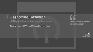
1. “ IBM ECM
Design Studio
The goal is to turn data into information,
and information into insight.
-Carly Fiorina, former CEO, HP
Dashboard Research
-dashboard: brief overview (experience and web research)
Tina Adams: UX/Visual Design Hybrid Lead
2. 2
warning
It is very easy to confuse a dashboard vs notification use case.
Before you embark on the lengthy process of developing a
dashboard for your users, ensure that you really understand
what your user’s need.
Sometimes, all a user really needs is a simple notification
delivered via email or text or desktop icon, that a system or
process is in need of attention, or a threshold has been breached.
vs
3. 3
dashboards
Dashboards are an extremely effective tool for showing a
large amount of key data at a glance. They distill a large
amount of data into actionable insights.
4. 4
basic principles
1. know your user (singular)
2. choose your dashboard type
3. contextually group your data
4. ensure data is relevant to the audience
5. keep it simple
6. different dashboards need different data refresh rates
5. 5role
know your user.
A dashboard should be targeted to one user role.
If you try to serve >1 roles, you’re doing it wrong.
Surface only that data that is useful to one role. if you have other roles that need
dashboards, create specific ones for each of those other user roles.
In order to deliver the correct dashboard to the right user, think about a
dashboard call based on back-end ACL mapping or have the user be able to
select a role that defines the dashboard display at log in or in the ui.
[sometimes users have multiple roles, they can switch roles/dashboards using
a common control]
1
6. 6type
choose your dashboard type.
There are 3 common types of dashboard, each performing a specific purpose.
operational strategic/executive analytical
2
7. 7type: operational
choose your dashboard type.
operational
These dashboards display data that facilitate the operational side of a
business. Think of an operational dashboard as monitoring the nerve
centre of your operation. Operational dashboards often require real-time
or near real-time data.
For example, in a business with a website, it’s important to ensure that
your website remains up and running, so you would monitor server up-
time and resource utilization. In a business with an inside sales function,
you may want to create a dedicated sales dashboard that displays
number of calls made and number of appointments booked.
2
9. 9type: strategic
choose your dashboard type.
strategic/
executive
Strategic dashboards will typically provide the KPIs (Key Performance
Indicators) that a companies executive team track on a periodic (daily,
weekly or monthly basis). A strategic dashboard should provide the
executive team with a high-level overview of the state of the business
together with the opportunities the business faces.
2
11. 11type: analytical
choose your dashboard type.
analytical
An analytical dashboard could display operational or strategic data.
However, this type of dashboard will offer drill-down functionality -
allowing the user to explore more of the data and get different insights.
Often dashboards include this functionality when it is not required. Do
not simply provide this functionality because you can.
Bear in mind that different user groups may require a different type of
dashboard. The Supervisor may need both a Strategic and Operational
view of their data. Where possible create two separate dashboards.
2
13. 13contextual data grouping
contextually group your data.
A well-designed dashboard will ensure that data is displayed in logical groups. For
example, if a dashboard includes Financial KPIs and Sales Pipeline, ensure that the
financial data is displayed next to each other, with the Sales Pipeline data displayed
together in a separate logical group.
3
14. 14relevancy
ensure data is relevant to the audience.
An Executive dashboard can have a number of different audiences. Ensure that the data
you display is relevant to the users. Think about the scope and reach of your data; the
whole company, department, individuals, suppliers
Ensure that you understand exactly who the intended audience is and the scope of their
requirements. Understand that smaller companies may have overlapping roles.
4
15. 15key info only
keep it simple.
Don’t clutter. Cluttered displays deflect the focus from the important messages. Some
are cluttered with useful and relevant information and some are cluttered with useless
and irrelevant information. Neither of these situations are desirable.
Each dashboard type may require different amounts of data (for example an Executive
dashboard may only need 6 numbers, whereas an Operational dashboard may need
upwards of 20) There is no hard and fast rule to follow here, except ensuring that
everything you display is relevant and meaningful to the audience. Do not add a graph or
text simply because you can.
5
16. 16data refresh
different dashboards need different data
refresh rates.
Ensuring that your data is being refreshed at the right intervals saves time during
development and can ensure optimal performance for your usrs.
Refresh rates on dashboards include:
Real-time (or near real-time)
Daily, weekly, monthly
As a rule of thumb, operational dashboards require data in real-time or near real-time,
whereas executive/strategic dashboards may require data refreshed on a less frequent
basis.
6
18. 18
the good.
• simple
• clean
• good legend use
• decent color
usage-would
modify for
accessibility
• only surfaces
needful
information
19. 19
the good.
• simple
• clean
• colors
correspond to
thresholds
• excellent usage
for this market
20. 20
the good-ish.
• simple
• clean
• decent color
usage
• black
backgrounds can
be difficult for
daylight users (as
opposed to
dashboards for
police in cruisers
at night)
21. 21
the bad.
This is tied for bad
and ugly.
• legends should
be simple and
easy to read
• skeuomorphic
design is dated
and distracting
• readability is
difficult
• no threshold
notification
23. 23
the bad.
A report is NOT a
dashboard.
This is
unsuccessful in
every way.
• ll information is
not ‘glanceable.’
Merely delivering
data to the user is
not the purpose
of a dashboard.
Delivering usable
information is the
key. This is not
immediately
consumable.
24. 24
the bad.
• skeuomorphic
design is dated
and distracting.
• hard to read
• difficult to discern
usage since the
full spectrum is
represented in all
the scales at the
bottom.
25. 25
the bad.
• dimensionality is
not useful when
used in this
manner, it is
distracting and
clutter.
• gradients are also
not useful and are
distracting
• overall design is
not pleasing
26. 26universal rule
Transform raw, back-end data, into consumable information.
Show impact.
Show relation to thresholds.
Use color meaningfully, not as a decoration.
Keep it as simple as possible.
27. 27universal rule
Users need role-based data, grouped and
visualized in a manner that is immediately
consumable, in order to take immediate
informed actions and make crucial
decisions.